Project Brief:
“I am a junior designer for McCann World Group. My team’s senior designer decides to test my skills and assigns me to redesign a logo for one of McCann clients. She gives me free reign to choose which one of their clients to work on.
This unit will develop my skills, knowledge and understanding for the confident application of visual language in support of graphic design activities.”
McCann World Group Research:
McCann World Group is a company that help build successful brands, the company was founded in 1902 and they have offices in over 120 countries.
McCann World group believes that to inspire people and to move people by your brand you need to find the ‘big truth’, this is by connecting with people, understanding them and understanding how they live their lives. The ‘big truth’ is a message that the brand promises to stand by and this will be portrayed in their company. McCann World group provides the truth by doing many studies on the public; by the public being highly involved it allows the customers to create an emotional connection to the brand, thus providing the best outcome for the client because customers will gain brand loyalty.
McCann world Group also reach the public through social media platforms, websites and technology, therefore allowing them to get as much feedback as possible. This feedback creates a meaningful campaign that adapts and changes to meet customer’s needs. McCann World Group also promises to keep the client at the “forefront” of their industry, this ensures emotion isn’t lost. So McCann World Group are a successful company because they inspire the community and change how brands are perceived to customers.
Visual Elements and Principles:


Coca-Cola History:

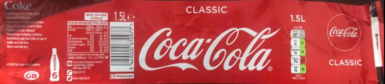
A pharmacist named Dr John S Pemberton founded Coca-Cola in 1886; Pemberton’s partner Frank M Robinson gave the drink the famous name of Coca-Cola. Coca-Cola is a world famous drink with 1.9 billion beverages being sold every day, compared to just nine drinks a day being sold in 1887. In the 1970’s Coca-Colas brand reflected ‘fun, friends and good times’ but their slogan is forever changing. In 1929 one of the most famous ever slogans was born ‘the pause that refreshes’. Coca-Cola have never changed the message that they want to portray to the world, in 2009 a new slogan was produced and parts of the 1929 slogan are echoed within it, ’open happiness’, the motif of pausing and refreshing for a drink still lies within this current slogan.
Coca-Colas campaign of delivering happiness is the reason I chose to work with this client, I strongly believe in their message and their intentions of trying to make people smile. I studied the evolution of Coca-Colas logo, I saw that it changed multiple times throughout the years but the logo always managed to display its brand name, so I will ensure to keep aspects of the old logos in the new one.
Coca-Colas Logo Analysis:
Coca-Colas 1886 logo lacks many visual principles. This is due to the  time of which it was produced. The logo lacks movement, this therefore reduces the emotions conveyed throughout the logo, and this does not give the logo any power. There is balance throughout the logo but the lack of emphasis on anything in the logo means that my attention is not drawn to anything, it’s not visually appealing. This is why Coca-Colas logo has changed so much over time – to benefit the audience and to adapt to societies changes.
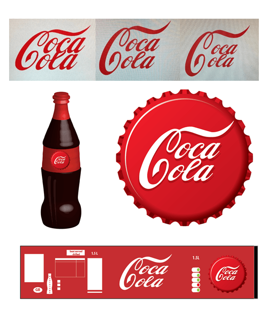
Coca-Colas current logo is written in Spencerian script, this font is ‘flowy’ and curly, this encourages you to believe that the beverage will be smooth flowing and enjoyable to drink, furthermore, the movement of the letters also depicts calmness, all the letters are flowing in the same direction. The logo is in great harmony and balance, the two large C’s and the two four lettered words create repetition, this repetition creates an image of safety for the customer because they know what they are getting. In addition, the letters are in unity, which creates a familiar and pleasing image. The emphasis on the C’s is portrayed through their size, this gives the words a sense of importance because they are larger than the other letters and this gives the drink character, enticing customers to buy the product. The logo is also very appropriate as it just has the brand name, this is what makes the logo so memorable and enduring.
Netflix Logo Analysis
Visual Elements and Principles Analysis:
 Similar to Coca-Colas logo, the Netflix logo is red, this makes the logo very memorable because it’s a bold colour, furthermore red promotes excitement and action. This mirrors what the company wants to portray as Netflix is used for movies and shows, making the logo very relevant and appropriate. The form of the logo emphasises the importance of the company, the logo appears to be 3D, this makes the logo striking and powerful which will entice more customers to use the app. The Netflix logo is in perfect balance, the letters are equally spaced apart which creates harmony throughout the image, this method of the elements being balanced creates a sense of calmness for the customers using Netflix.
Disney Logo Analysis.
Visual Elements and Principles Analysis:
 The Disney logo connects to its audience through its use of movement, the flowy design creates tranquility by mirroring the calmness of a winding river. The direction of the writing conveys the emotion of happiness as the writings ‘moving forward’, this signifies to the audience that the movies may emotionally ‘move’ them to a sense of happiness or calmness. This makes the logo very appropriate as its signifying what the company want to make their audience feel. There is emphasis on the letter ‘D’, this shows importance as your attention and focus is brought straight to that letter, by it being written in an unusual manner conveys the use of imagination in the design, this further implies that nothing is usual in Disney movies, they’re all full of imagination, all this information is gathered from the pattern of the logo.
I chose to compare Disney’s logo to Coca-Colas logo because both companies are trying to portray the same intention, ‘to create happiness’ by studying Disney I have come to the conclusion that I may incorporate some pieces of Disney’s logo into my new Coca-Cola logo.
Kelloggs Logo Analysis:
 Brothers W.K Kellogg and Dr. J.H Kellogg founded Kelloggs in 1898. The logo is a representation of W.K Kellogg’s signature; this gives the brand a sense of loyalty as a signature is portrayed as personal information and it should never be changed hence why Kelloggs logo has stayed relatively the same since it was first made.
Visual Elements and Principles Analysis:
I researched different fonts and the closest font to Kelloggs logo is Ballpark Weiner. This font is very similar to that of italic handwriting, this therefore allows the customer to feel a sense of security as the logo conveys an image of everyday life, furthermore this enhances the brand as Kelloggs is a food company that many people use in everyday life. In addition the weight of the line is large yet controlled, this suggests that the brand holds a lot of power as the writing is thick, yet by it being controlled suggests that the brand is trustworthy, which is a very important trait for a logo.
Artwork Analysis:


Banksy is a famous graffiti artist, the form of his artwork relies heavily on shading and negative space, he uses negative space to complete his picture, the lack of light gives the impression that his artwork is quite dark and meaningful, potentially signifying how he may feel inside, this is because so many people disagree with his artwork, paint over his artwork and say that his work is like a ‘bomb’ has gone off.
I chose to study Banksy because I feel like the absence of colour and texture gives a huge impact on the public. His work still has movement which is emphasised by the lack of anything else, I feel moved by his artwork as the lack of detail highlights the raw emotions Banksy is trying to convey in his work. I would potentially echo some of his work in my new logo designs, by keeping the new logo simple I feel like the emotion of happiness will affect the customers more; this is because their focus and attention isn’t drawn to anything else- just Coca-Colas message.
What I Gained from doing Research:
By researching the visual elements and principles of the different logos it gave me knowledge on how a good logo should be portrayed. I now understand how to format a logo with the customers in mind, how to create a visually appealing logo with the different techniques I learnt from doing visual principles research and what to avoid when creating a logo (for example: using contrasting colours for text). By studying Banksy I learnt how the use of negative space can impact a design and make it more meaningful. Next I will begin to think of potential themes and ideas for my logo.
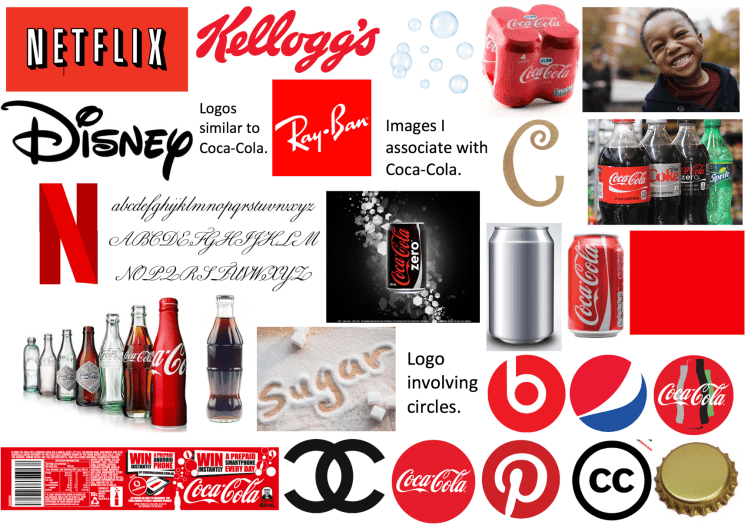
Mood Board:
Mind Map:

Conclusion:
From my research upon analysing logos I have learnt the crucial elements that need to be combined within a logo to make it appropriate for the client, I will therefore be able to apply this knowledge for when I create new logos for Coca-Cola. To research for Coca-Cola I read information on websites and in books.To improve my research I could watch videos on the evolution of Coca-Colas logo. Next I will begin to sketch some rough ideas for a new logo.
Initial Rough Designs:


Firstly I sketched 24 rough initial designs, this was to get ideas out of my mind. I annotated each design stating visual elements and principles on each, I also discussed why I didn’t like some of the designs, for example; some lacked movement and emotion. I asked my friends and family which of the 24 designs where their three favourites, there were different answers throughout but the main one that was in multiple peoples answers was the sketch labelled 1. My friends said their favourite was the sketch labelled 2. and lastly my family also stated that they like the sketch labelled 3.
1.  2.
2.  3
3 .
.
Idea Development:
I then took their three favourite designs and developed them further. I tried different colour combinations and different thicknesses of lines, I also tried to format them in a style of a label to see what it would look like in production.
Idea One:
 1. I like this design because of the leading lines, the ‘C’ directs where your eyes should go which creates motion in a still image, because the line of the ‘C’ flows upward it evokes happiness because it uplifts your mood. The elements are very balanced because there’s repetition of the ‘oca’ ‘ola’, this repetition gives a sense of familiarity to the customers. The second part of the logo is it being in a bottle cap, this frames the logo and gives you a point to focus on, similar to the current Coca-Cola label, the main logo is in the middle of the label then the logo is in a smaller circle located on the right. After a lot of debating I decided to choose this as my final piece mainly because the movement of the design depicts happiness.
Idea Two:

2. I like this design because it incorporates a message of their campaign ‘enjoy’ into the logo. It gives the logo depth as there is both something in the background and the foreground; this gives the logo a lot of detail without overpowering the design. However this logo is very different to anything Coca-Cola have produced before, so if I was to choose this design I feel as if many people would not be able to recognise the brand as Coca-Cola as the logo is completely different to previous ones. I think that because there is a lot going and there are multiple thing to focus on this makes the logo hard to remember. So I don’t think I will choose this as my final design.
Idea Three:
 Out of the three, this is my least favourite design. I feel as if this logo resembles ‘Chanel’s’ logo, as the two ‘C’s’ are mirrored back to back. In addition, the new logo doesn’t have a flowy design, it lacks movement, this makes the logo very different to Coca-Colas previous logos which may lead it to lose some of its familiarity which, in turn, may negatively impact customers as their loyalty may change towards the brand. It’s also quite hard to read because the ‘C’ can appear as just a curl to some customers, this may decrease the amount of sales that Coca-Cola will get. So I don’t think this logo is beneficial to Coca-Cola in any way.
Final Design:
I decided to design a new logo for Coca-Cola. After a lot of adjustments I finally produced a design that I was happy with. This logo is a more compact version of the previous logo, the compact design makes the logo look sophisticated and polished. Its clear that a refined logo will entice more customers to buy the product because it gives an insight to what the brand conveys. It is inspired by 1950’s bottle caps and this celebrates classical American culture, by bringing the past into the future it shows that the brand has been a round for a long time and that consumers should be able to trust the brand.
References:
1000logos. (2018). netflix-logo. Available: http://1000logos.net/netflix-logo/. Last accessed 18 september 2018
biblioteca. (2018). /index.php/it/open-access/diritti-autori/item/237-licenze-creative-commons. Available: http://biblioteca.bo.cnr.it/index.php/it/open-access/diritti-autori/item/237-licenze-creative-commons. Last accessed 18 september 2018.
brandingsource. (2012). /2012/06/new-logo-kelloggs.html. Available: http://brandingsource.blogspot.com/2012/06/new-logo-kelloggs.html. Last accessed 20 september 2018.
brandingsource. (2018). new-logo-kelloggs.html. Available: http://brandingsource.blogspot.com/2012/06/new-logo-kelloggs.html. Last accessed 18 september 2018.
cemeterydance. (2018). video-visions-killed-video-store/netflix/. Available: https://www.cemeterydance.com/extras/video-visions-killed-video-store/netflix/. Last accessed 18 september 2018
coca-cola. (2018). the-logo-story. Available: https://www.coca-cola.co.uk/stories/the-logo-story. Last accessed 17 september 2018 .
colourbox. (2018). vector-realistic-metal-can-vector-6860703.Available: https://www.colourbox.com/vector/vector-realistic-metal-can-vector-6860703. Last accessed 18 september 2018
craftoutlet. (2018). 14-decorative-wooden-curly-letter-c. Available: http://www.craftoutlet.com/14-decorative-wooden-curly-letter-c. Last accessed 18 september 2018
creamline. (2018). coke-multipack-cans-4-x-330ml. Available: https://www.creamline.co.uk/shop/product/coke-multipack-cans-4-x-330ml. Last accessed 18 september 2018.
dollard-packaging. (2018). coca-cola_bottle-without-label/. Available: http://www.dollard-packaging.ie/iconic-packaging-britain/coca-cola_bottle-without-label/. Last accessed 18 september 2018.
fineprintart. (2018). the-history-of-the-coca-cola-logo. Available: https://www.fineprintart.com/art/the-history-of-the-coca-cola-logo. Last accessed 18 september 2018 .
fontmeme. (2018). /kelloggs-font/. Available: https://fontmeme.com/kelloggs-font/. Last accessed 20 september 2018
gogrocerchicago. (2018). gocatering/product/coke-diet-coke-sprite-coke-zero/. Available: http://gogrocerchicago.com/gocatering/product/coke-diet-coke-sprite-coke-zero/. Last accessed 18 september 2018
independent. (2018). /life-style/health-and-families/health-news/children-eat-half-of-daily-sugar-intake-before-9am-a7506676.html. Available: https://www.independent.co.uk/life-style/health-and-families/health-news/children-eat-half-of-daily-sugar-intake-before-9am-a7506676.html. Last accessed 18 september 2018
inkbotdesign. (2018). disney-logo-design. Available: https://inkbotdesign.com/disney-logo-design/. Last accessed 18 september 2018
istockphoto. (2018). bubble?sort=mostpopular&mediatype=photography&phrase=bubble. Available: https://www.istockphoto.com/fi/photos/bubble?sort=mostpopular&mediatype=photography&phrase=bubble. Last accessed 18 september 2018.
jakerainis. (2018). elegant-script-spencerian-and-copperplate-roundhand/. Available: https://jakerainis.com/blog/elegant-script-spencerian-and-copperplate-roundhand/. Last accessed 18 september 2018.
kawaiifabric. (2018). p6123-solid-red-fabric-Robert-Kaufman-USA-Red.html. Available: https://www.kawaiifabric.com/en/p6123-solid-red-fabric-Robert-Kaufman-USA-Red.html. Last accessed 18 september 2018
kelloggs. (2018). en_GB/who-we-are/our-history.html. Available: https://www.kelloggs.co.uk/en_GB/who-we-are/our-history.html. Last accessed 20 september 2018
kisspng. (2018). /png-pepsi-max-coca-cola-pepsi-globe-logo-pepsi-logo-881729/. Available: https://www.kisspng.com/png-pepsi-max-coca-cola-pepsi-globe-logo-pepsi-logo-881729/. Last accessed 18 september 2018.
logok. (2018). /chanel-logo/. Available: http://logok.org/chanel-logo/. Last accessed 18 september 2018.
marketingweek. (2018). coke-zero-387.jpg?auto=compress,format,&crop=faces,entropy,edges&fit=crop&q=60&w=387&h=336. Available: https://marketingweek.imgix.net/content/uploads/2014/01/coke-zero-387.jpg?auto=compress,format,&crop=faces,entropy,edges&fit=crop&q=60&w=387&h=336. Last accessed 18 september 2018.
mccannworldgroup. (2018). approach. Available: https://www.mccannworldgroup.com/. Last accessed 19 september 2018
parenttoolkit. (2018). responsible-decision-making/pre-k-responsible-decision-making-tips. Available: https://www.parenttoolkit.com/social-and-emotional-development/advice/responsible-decision-making/pre-k-responsible-decision-making-tips. Last accessed 18 september 2018.
preyoponno. (2018). coca-cola-coke-can-330-ml. Available: http://preyoponno.com/product/coca-cola-coke-can-330-ml. Last accessed 18 september 2018.
smithsonianmag. (2018). the-story-behind-banksy-4310304. Available: https://www.smithsonianmag.com/arts-culture/the-story-behind-banksy-4310304/. Last accessed 18 september 2018
stickpng. (2018). /search?biw=1440&bih=763&tbm=isch&sa=1&ei=ETGiW4mPGofEgAaW1K-YAw&q=pinterest+logo&oq=pinterest+logo&gs_l=img.3..0l10.816910.819855.0.820184.14.10.0.4.4.0.85.583.10.10.0….0…1c.1.64.img..0.14.610…. Available: https://www.google.co.uk/search?biw=1440&bih=763&tbm=isch&sa=1&ei=ETGiW4mPGofEgAaW1K-YAw&q=pinterest+logo&oq=pinterest+logo&gs_l=img.3..0l10.816910.819855.0.820184.14.10.0.4.4.0.85.583.10.10.0….0…. Last accessed 18 september 2018.
thebottlejarstore. (2018). /lids_and_closures/beer_crowns_26mm/metallic_gold_26mm_beer_crowns_pk_100_P577.html. Available: https://www.thebottlejarstore.co.uk/lids_and_closures/beer_crowns_26mm/metallic_gold_26mm_beer_crowns_pk_100_P577.html. Last accessed 18 september 2018
vector. (2018). ray-ban-logo. Available: https://vector.me/search/ray-ban-logo. Last accessed 18 september 2018
wintranslation. (2018). /cross-cultural-labels/. Available: http://www.wintranslation.com/cross-cultural-labels/. Last accessed 18 september 2018

Very good and colorful mind maps
LikeLike
Thankyou
LikeLike