Project brief:
I am working for Ogilvy on one of their branding teams to design a corporate identity, I will create a brand and then research similar companies; looking at their history, context, visual design work etc. This should all inform my design work. I will then produce a range of graphics to be used in my brands corporate identity e.g. letterheads, CD artwork, notepad covers, logos, slogans, typography, pens, business card templates, PowerPoint templates, lanyards, id cards, mugs, large format advertising, certificates etc. I will present these professionally.
![]()
Ogilvy Research:
Who Is Ogilvy?
Ogilvy are an agency that “make brands better”. They strive to help brands to become the best version of themselves. Ogilvy consists of 9 teams: Advertising, Customer Engagement, Design & Branding, PR & influence, Behaviour Change, Health & Wellness, Islamic Branding, Business to Business and Ogilvy Consulting which each are a major part in making the brand better.
Advertising:
Advertising is very important in making a brand known, with out advertising many brands would struggle to make a name for themselves. With advertising comes responsibility, you need to ensure that the advert is in no way offensive to any religion, sex or age. So Ogilvy have a team that make a sensible and socially relevant advertising scheme, fit for that brand. By researching advertising I have learnt that I need to take many factors into consideration in order to ensure I do not offend anyone.
Customer Engagement:
Customer engagement covers a huge spectrum, Ogilvy’s team takes many factors into consideration when thinking about their audiences. The first step in achieving a bond between the brand and the customer is to try to completely understand the customer, to fully empathise with them. There’s no other way to create a brand that customers will enjoy without putting yourself in their shoes, and becoming a customer yourself. What do you want to get from buying something from this brand? Did you feel welcome and will you go back again? This is crucial when trying to get brand loyalty, you want to create a strong bond between you and the customers. Ogilvy try to understand the customers “needs, desires” and their behaviour. They do this from analysing data, and from going beyond what initially meets the eye, Ogilvy are set to fill a void in peoples lives by creating a brand so suited to them that it creates harmony within their life. Customer engagement involves a team of “writers, designers, technologists” and more , this is to maximise the potential ideas to, in the end, make that brand better. Customer engagement comes in many forms, did you just have a friendly conversation with them? smile? or did the customer simply read a tweet about you- it is very vast, there are so many ways to reach out to customers and potential customers. By researching customer engagement I have learnt how to really understand what customers want from a brand, when creating my brand I will assure to empathise with my customers to achieve the best possible outcome for my brand.
Design and Branding:
Designing and branding is what could make or break your` brand, but with Ogilvy they will always make it. In this team, people come together to produce the most creative piece for that specific brand; be it packaging, experiences or communication. We want a brand to change the way we live our lives, this is achievable through the designing process. For example, packaging. It is very important to ensure that every part of the brand reflects the message you want to convey to the customers, if even the packaging of your brand is not correct this could mean that some customers would not stay loyal. So Ogilvy go the extra mile to ensure that the brand makes both logical sense whilst still connecting with the customers. How? This is through using neuroscience, so the brand works on paper yet still thrives in the real world rather than failing. By researching branding and design I have learnt to go beyond the ‘norm’, to try to portray my message through every aspect of my brand, even in the smallest things.
Public Relations and Influence:
What is a brands purpose? A brand is meant to change society – it’s meant to push us towards a new behaviour, to change the way we act and think. Ogilvy ensures that brands are culturally relevant, so they are not out of place within society, but are different enough to create changes towards a new society. This is through technology and social influence. I used secondary research to find out that 95% of households in the UK own a mobile phone. This suggests that social networking is a great way of influencing peoples mannerisms and thoughts. So a brand has to be strong enough to survive within social network sites such as Facebook, Instagram and Twitter. Ogilvy further ensure that this is the case by working closely with technology and social networking experts. From this research I have learnt that when creating my brand I need to take into account today’s society and the people within it, and how I could positively impact and influence their lives.
Behaviour Change:
Similar to social influence, behaviour change involves subtle nudges that change how customers live their lives. Ogilvy have teamed up with scientists and creative thinkers in order to come up with new and exciting ways to change peoples perception on life. Yet this is all done through the brand, the brand gives these all important ‘nudges’ that help today’s community to strive towards a new society. In my brand I want to involve these ‘nudges’ because I believe it’s very important to think of what society is going to be like for generations to come. In my opinion, it’s important that we protect the future generations and we can do this by brands pushing towards a better society for today’s generation.
Health and Wellness:
In order to produce the best outcome for their clients, Ogilvy focus on two main areas, transformation and wellness. Due to today’s society, people are becoming more involved in healthy eating and exercise, many people are more bodily aware as there has been an increase of stigma for the ‘normal’ body type. Therefore brands need to adapt quickly to suit how people act in society, so that’s where Ogilvy have a strong team of individuals that specialise in ensuring that the brand can readily change to suit society accordingly. Ogilvy take into consideration health and wellness by ensuring that everyone has a fair working life and that people know where to seek help if they need it. So in summary, Ogilvy transform suffering brands into strong ones where they will thrive in their industry, be it retail or services sectors.
Islamic Branding:
The worlds fastest growing consumer group is Muslims, In 2050 the Muslim population is expected to rise from 1.6 billion to 2.8 billion. This suggests that brands need to be able to engage with them effectively, by responding to their needs whilst making sure they’re being fully understood. By respecting their values and morals the brand will be able to connect to just over 14% of the population. Ogilvy have won multiple awards for their work of empathising and relating to the Muslim population, they have studied “Brands, Islam and the new Muslim Consumer” which helped them onto producing a book “Generation M: Young Muslims Changing the World”. Ogilvy have a team of experts including people “in the field of Muslim Marketing” who ensure that your brand engages and appeals to all religions. By researching Islamic Branding it has opened my eyes to different religions, I will need to make sure that my brand abides to the needs of every religion, this will also make my brand useful to a higher percent of the population.
Business to Business:
In order for your brand to become great you need to have a strategy and a plan, this is where Ogilvy thrive. Ogilvy help with marketing, sales and they always ensure that your brand has a goal. They will also help to create a brand that balances the rational and the emotional values to engage with the population as much as possible. By reading upon business to business I have learnt that in order for my brand to be successful I need to have a plan and I need to set myself goals for where I want my brand to go.
Ogilvy Consulting:
In the consulting region, Ogilvy nurture, change and develop rough brands into the perfect one, they use these other 8 teams and they all join together to “make brands better”.
In conclusion, by researching Ogilvy I have learnt that I need to empathise with customers, positively impact today’s society, protect future generations and include all religions, ages, genders and races. Next I will go onto researching what corporate identity is.
Corporate Identity:
You’ve heard of identity, it’s what makes us who we are. Our personality, our features the clothes we wear, the things we do. So it’s similar when applying it to a company, It’s what makes up that company, it’s slogan, it’s logo, specific colours and designs. A good corporate identity is enduring, recognisable and memorable, you should be able to see it at a glance and know what it is straight away. Corporate identity is what separates you from competition, it gives you your own sense of individuality so you don’t get lost within other brands. A brands corporate identity is how they are perceived in the world- without one it would be very hard to make a name for yourself.
I conducted some primary research within the college, I looked at the colleges corporate identity and I took some photos which are displayed below. The college’s corporate identity consists of three main colours, blue, purple and yellow and their logo symbolises a kite, due to it’s location near Dunstable Downs. By analysing the college’s corporate identity it allowed me to understand how you need to relate the slogan, logo and colours to the brand you’re creating, you cannot have something completely irrelevant to symbolise your brand. So therefore when I create my brand I will ensure to put thought behind what makes up my corporate identity because this will heavily influence what the consumers think.

A corporate identity helps a brand a lot, it creates consumer loyalty as people begin to recognise and relate to the brand. You create a persona through your corporate identity, so it needs to be appealing and welcoming, you want the consumers to connect with you so they begin to feel secure and trust the brand. This therefore enhances your business as it will draw in customers and then the customers will also begin to recommend the brand to others- which increase the amount of people that your brand reaches. By researching corporate identity I have learnt what it is and how important it is in the journey of creating a successful brand so I will ensure to apply my new knowledge when creating a corporate identity for my brand.
Why I chose to design my own brand:
Instead of choosing to redesign a corporate identity for one of Ogilvy’s clients, I decided to create my own brand. I made this decision because when looking at Ogilvy’s original clients there were no initial brands that jumped out at me, I wanted to put loads of time into a brand that I actually found interesting, so I thought it would be best to come up with my own brand. I feel like to redesign a corporate identity for an existing brand would also be very challenging because there’s already been so much thought and reasoning behind their existing corporate identity, to make up a different one and have the reasons to justify it would be very difficult. Although making up your own brand is still very challenging and difficult, I would much prefer to create a corporate identity from scratch rather than adapting an existing one. In addition, I will learn more in the process of creating my own brand, I will gain knowledge on what makes a successful brand and what makes a successful corporate identity. Now I have chosen to create my own brand I need to think of what my brand should be, what message I should convey, and what my corporate identity is going to be like.
Initial Brand ideas:

Research:
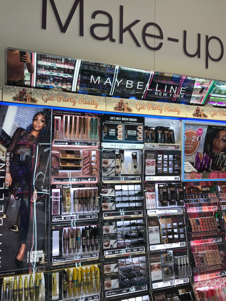
Maybelline:
Maybelline is a very famous and popular drugstore makeup brand.
In 1913 a 19 year old chemist called Thomas Williams who was from Chicago formulated the first ever mascara, his older sister wanted a product that would make her more appealing to the male she loved, so he came up with the idea to mix carbon dust with petroleum jelly which created a brand new product. Two years later in 1915 Thomas founded the Global industry called Maybelline, name after his sister, Maybel. Thomas then started to create new products like eye-shadow and lip liner, females across the nation were fascinated with the products however they were only available to get through the mail. Maybelline was also the first cosmetic company to be advertised on the radio. This massively increased sales and then the mascara was available to buy in drug stores at 10 cents each in 1932.
I decided to research Maybelline because I feel like if I collect as much knowledge as I possibly can on each initial idea I had then it will allow me to easily reach a conclusion on which idea I should chose for my final piece.
In order to aid my research I conducted primary research and went and took some photos of where I saw Maybelline advertised. I thought that if I was able to see the scale of the brand then I will be able to get a better understanding of it. This will also help me when I come to advertise my brand as I will know how to correctly display it.
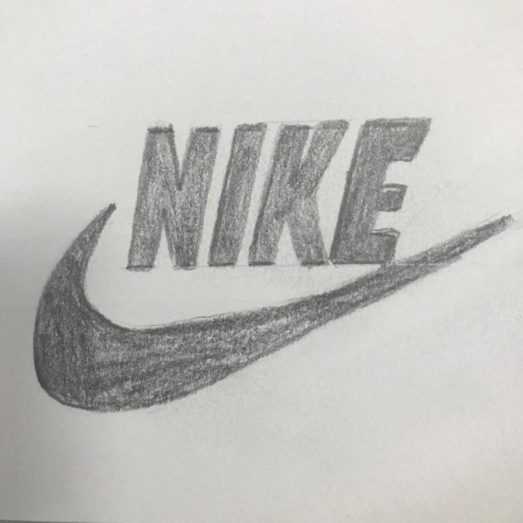
Nike:
Nike are a world famous clothing and fitness brand that sell clothes for both fashion and fitness purposes. I decided to research Nike because I’m hoping that it will inspire me to see the purpose behind the brand, and what they’re trying to convey to their consumers (their message). From this I may be able to see if I want to explore down the clothing route or if I should steer away from it.
Bill Bowerman founded Blue Ribbon sports in 1964, It wasn’t until 1978 when the brand was renamed to its famous name, Nike. The brand then went public in 1980. From then on the brand steadily grew, becoming more and more famous. In the early 21st century the brand had franchises and distributors in over 170 countries and the logo is now recognised all over the world.
Nike’s corporate identity includes their famous ‘tick’ logo which symbolises motion, relating to the people who use Nike as it’s mainly a brand for athletes, and their slogan of “Just Do It.”, inspired by a murderers last words ‘let’s do it’. Nike is a good example of a good corporate identity because whenever you see a tick you can relate this to Nike straight away. From researching Nike’s corporate identity I learned that it’s very important to have a straight forward slogan, something easy to remember and easily recognisable, I will ensure to imbed this idea within my corporate identity.
I drew Nike’s logo just so I could get a feel for it’s simplicity. This will teach me that you’re allowed to have minimalistic logos, not every logo needs to be packed with detail.
Chevrolet:
Chevrolet was founded in 1911 by a man called William Durant, he had a close friendship with a man called Louis Chevrolet who was a famous racing car driver, this is where the name of the brand was formulated. Just four years later, Louis resigned because him and Durant had a disagreement. William then bought a share of a company called General Motors, then by 1917 he was the president of General motors and by 1920 Chevrolet was the third most popular car brand. There was immense growth for the company in just a matter of a few years.
The brands slogan has changed a lot throughout the years, from “Chevy runs Deep” to “Find New Roads”, a slogan is a very important aspect of a good brand, the slogan is what draws people in, so by looking at how Chevrolet’s slogan has evolved allowed me to acknowledge that a brand can change and develop as time goes on. By researching Chevrolet I have decided not to create a car brand, this is because I believe you need to be very familiar with the car industry in order to be able to fill a gap within the market. I do not think I am that familiar with cars so I’m going to steer away from this idea.
Initial Ideas:
I had many initial ideas for a new brand. I wanted to come up with an original idea that would make a difference to the community. I wandered along the ideas of a makeup, clothing and a car brand, I researched Maybelline to see if I would be able to create a brand within this industry, I also researched a clothing brand (Nike) and a car brand (Chevrolet), I also dabbled across the shop industry, for example a candle shop, but then, again, I wasn’t fully happy with this idea. By researching these companies it allowed me to know what I am and what I am not interested in. So I changed my mind and I steered away from these ideas and started to focus on the food/drink industry.
I explored the food/drink region in more depth with multiple ideas about cafes and restaurants. I believe that because the food industry is so vast there are so many ways to create a new and inspiring brand and I may be able to put a spin on classical things like a coffee shop. My initial aim for creating a brand is to inspire people and to make a difference, even if it is just a small one. In order to convey this within my brand I am going to research multiple abstract food/drink companies, to see their message and to see what their aims and goals are.
Vegan cupcake store:
I’ve decided to research a vegan cupcake store as I believe it is something different, as I’ve previously stated, I want to make my brand and company different to any other companies out there. So I thought in order to get inspiration I will look into different yet similar companies.
I searched for some vegan cupcake stores and one of them was “Ms. Cupcake”. Ms Cupcake have a goal- they want to educate the population on how to create beautiful vegan cupcakes, hopefully changing the communities perception on veganism and striving towards a healthier lifestyle for all. I think it’s very important to have a goal within a company so you know where you’re heading and if you’re on track.
Ms Cupcake want you to have the best experience possible from the minute you enter their shop until the minute you leave. They achieve this through a system including lovely customer service, great cake, honesty and being inclusive. In my opinion these are all very important values. Being honest within your company (in this case Ms Cupcake are being completely honest that their cake is 100% vegan) is when you start to build bonds and trust between you and your clients, this only pushes your company and brand forward so it is crucial. Similarly, being inclusive is also very important. In this example, Ms Cupcake ensure that they welcome everyone, even if somebody isn’t vegan they can still go into the shop and enjoy the delicious cupcakes. I think that to create a successful brand you do need to include as much of the population as you can, so when I produce my company I will try to cater for everyone.
By researching Ms Cupcake I have learnt how important it is to have a message behind your brand, a message on how you want to impact and shape the community into a better place for everyone.
Next I will analyse some existing vegan cupcake logo’s.
1)

1) Ms. Cupcake:
To begin, I personally do not like this logo that much. I drew it so I could get a feel of the logo, it’s simplicity / complexity. I do like some parts of the logo, such as the colour, I think it is very striking and powerful, it looks like it’s trying to jump from the page. On the other hand, I do not like the typeface, I believe it’s too casual- the ‘C’ looks wonky and unprofessional. You want your logo to represent who you are as a company, and my initial thoughts of this logo is that it look’s messy- not something I would want my company to be perceived as. Furthermore, in my opinion, the stars have no relevance, they look out of place and they make the logo look tacky. From analysing Ms. Cupcakes logo I will ensure that the typeface of my company looks very professional (a smooth, clean look).
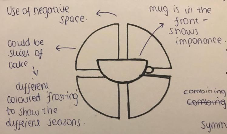
2)

2) Miriam’s Munchies:
I significantly prefer this logo, it’s very visually appealing. This is due to it’s symmetry, the matching ‘M’s’ give the logo an exquisite look, it’s easy to read, it’s very memorable and it’s also recognisable. The ‘double’ circle effect gives the logo importance, it’s an illusion that makes you focus on the centre; like a target. The typeface is very simple, the logo also informs you on what it is because it gives you the name of the company underneath, this simple typeface opens up the company to a higher percentage of the population because children and people who find English difficult will find this style of writing easier to read. From analysing Miriam’s Munchie’s logo I have learnt to try to include symmetry within my logo to give a more pleasing appearance.
3)

3) Lola’s Cupcakes:
Lastly is Lola’s Cupcakes. In my opinion this is a confusing logo, It’s very large and it doesn’t really sum up the company. I feel like to improve they could’ve included a small, memorable symbol- so in this case you wouldn’t need to remember a long company name. In contrary I do like the colours included in the logo, I feel like the blue and the red compliment each other well, this could also mimic the colours of cupcake frosting. The different typefaces used for the name gives emphasise on “Lola’s”, it makes them stand out from one another, which gives importance to her name. By researching Lola’s Cupcakes logo I have learnt to try to use colour as a way of symbolising what my company is about.
Cat Café:
Again I wanted to research a company that has put a twist on a simple idea. I thought a cat café would be interesting to research and I feel as if it would benefit me just in case I want to somehow include pets within my company, also I like animals so this idea intrigues me more than others.
I searched for Cat Cafes online and some include Lady Dinah’s Cat Emporium in London, Kitty Café in Nottingham and Cat Café in Manchester. Cat cafes first came about in England in 2017, although already being popular in Japan for roughly 10 years. The cat cafes involve rescue cats, you need to pay a fund to enter the café, all profit goes to helping the rescue cats live a healthy life. In 2017 Lady Dinah’s Cat Emporium raised over £100,000 for rescue cats, therefore I think Cat Cafes are a very god idea.
In my opinion it’s especially good for the older community, sometimes if you’re feeling lonely it can really get you down, so the cat café is a great way to meet people, to socialise and to feel happier as being around cats actually improves your happiness. This is what the cat cafes message is, they want to influence the wider community whilst saving animals. From researching cat cafes it has really inspired me to try to make a difference in my community, to impact loads of people of all ages and to potentially help animals in the process. I am going to look at cat café logos and, similar to Vegan Cupcake Stores, see how their message is conveyed through them.


Logo Analysis:
Tiny Cat Café:
This logo is very simplistic yet effective, I believe it shows you exactly what the company is about- which is what you want when you first see a logo. The nested image of the top of the cat gives the logo a very friendly and heart-warming appearance, it entices you to buy something from them. The tea cup is also informative- it symbolises who they are. Overall I do like this logo but I feel like to improve they could add a bit of colour to make it more visible and eye-catching.
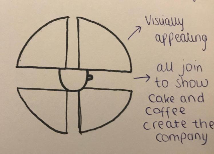
Cattery:
In my opinion this is a very well presented and thought out logo. Each cat is a different colour, I researched what each colour means to try to see their reasoning behind choosing them colours:
Light Green: This symbolises three main things, harmony, nature and money. By choosing green it proves that these aspects are important when creating a company, ensure that there’s harmony within the working environment as well as between rivalry companies. To consider the environment when creating a company; you do not want to be damaging the world around us. Lastly money, you want your company to produce profit so then you can thrive as a company.
Light Pink: This colour indicates love, a love for the cats within the café as well as a love for making people in the community happier. It’s a soft colour, one that doesn’t offend anyone so it’s a good colour to choose. The colours make you smile when you look at the logo because your subconscious is associating these colours with specific feelings, feelings that make you attracted to the company and their values.
Grey: On the contrary, grey is quite a dull colour. The colour lacks any sort of emotion or meaning, however grey does look sophisticated and professional. The colour grey was chosen because of its professionalism, but personally I would’ve chosen a different colour like purple which symbolises luxury.
Furthermore, the three cats combine to create and image of a coffee cup, this symbolises that without the cats there would be no coffee shop; the cats are the company. The typeface is script like, it flows which shows movement, as if the company have a goal that they want to move towards. This goal could be of helping the community and helping rescue cats.
Conclusion:
From analysing existing logos it has inspired me to create a good logo for my company that includes my favourite aspects of each logo I have analysed. I have learnt how colours majorly influence a design and how they influence potential customers. I’ve also learnt how important it is to get the typeface fit for as many customers as possible; so it’s easy to read. Next I am going to research artists that may inspire my final corporate identity for my company.
Artist Research:
In a separate unit I have been studying abstract art. I am going to research some abstract artists as I already have some background knowledge within this area and by linking these units together I feel like I will be able to gain the most from my research. In addition, I have learnt from other units how to critically analyse visual elements and principles (unit one), and I will apply my knowledge of this when analysing artists. In unit one I learnt how to create a logo and the elements of a good logo (framing, background, rule of thirds, ect..), so I can apply this knowledge when I design a corporate identity for my company.
Kandinsky:
Kandinsky was a Russian artist, he was born on the 16th December 1866 and he passed on the 23rd December 1944. He was an art theorist, art theorists try to bend the normal perception of art, they try to shed the layers of ‘classical’ art by changing the concept behind it, whether this is by creating a new form of art or simply changing existing ones. Kandinsky was an abstract artist, creating pieces where the viewers can interpret it as they wish. Kandinsky has got the credit of creating one of the first ever abstract pieces.
He graduated from an art school but then he went on to study economics and law; which he was very good at. It wasn’t until Kandinsky was 30 when he began his painting studies again, he studied at the Academy of Fine Arts where he learnt to draw anatomy and real life-drawings, once he finished his studies he moved back to his hometown of Moscow in 1914, when World War 1 started. Kandinsky them helped to create the ‘Museum of the Culture of Painting’, after the lack of opportunities rose he moved to Germany where he taught art to people in the ‘Bauhaus School of Art and Architecture’ he perused this career from 1922 to 1933. Kandinsky then moved to France where he created some of his most famous pieces including Composition X (1939) (labelled 1), Blu Di Cielo (1940) (labelled 2), Dominant Curve (1936) (labelled 3), and Brown With Supplement (1935) (labelled 4).
Kandinsky really took abstract art to the next level. There were many goals and ambitions Kandinsky had for his art, in 1911 he took away all objects in his work, he wanted his art to convey music, he wanted to stimulate both the ears and the eyes. His main goal was to evoke different emotions through the use of colour and shapes, this is what led his work to often get referred to as a “pictorial form of music”. This was Kandinsky’s aim because he had a condition called synaesthesia, the condition allows someone to hear colours. Kandinsky used this to his advantage by producing artwork that triggered his eyes and ears, so Kandinsky can actually hear his art, which I think is lovely concept.
1)
 by Wassily Kandinsky")
2)
 3)
3)
 by Wassily Kandinsky")
4)
I’ve decided to attempt to recreate some of Kandinsky’s work, I want to paint a piece that involves a lot of colour so I can really evaluate the colours and learn which each one represents. So after looking through most of Kandinsky’s work I have decided to paint ‘Squares with Concentric Circles’. I am going to use acrylic paint so I can get a bold and rough finish.
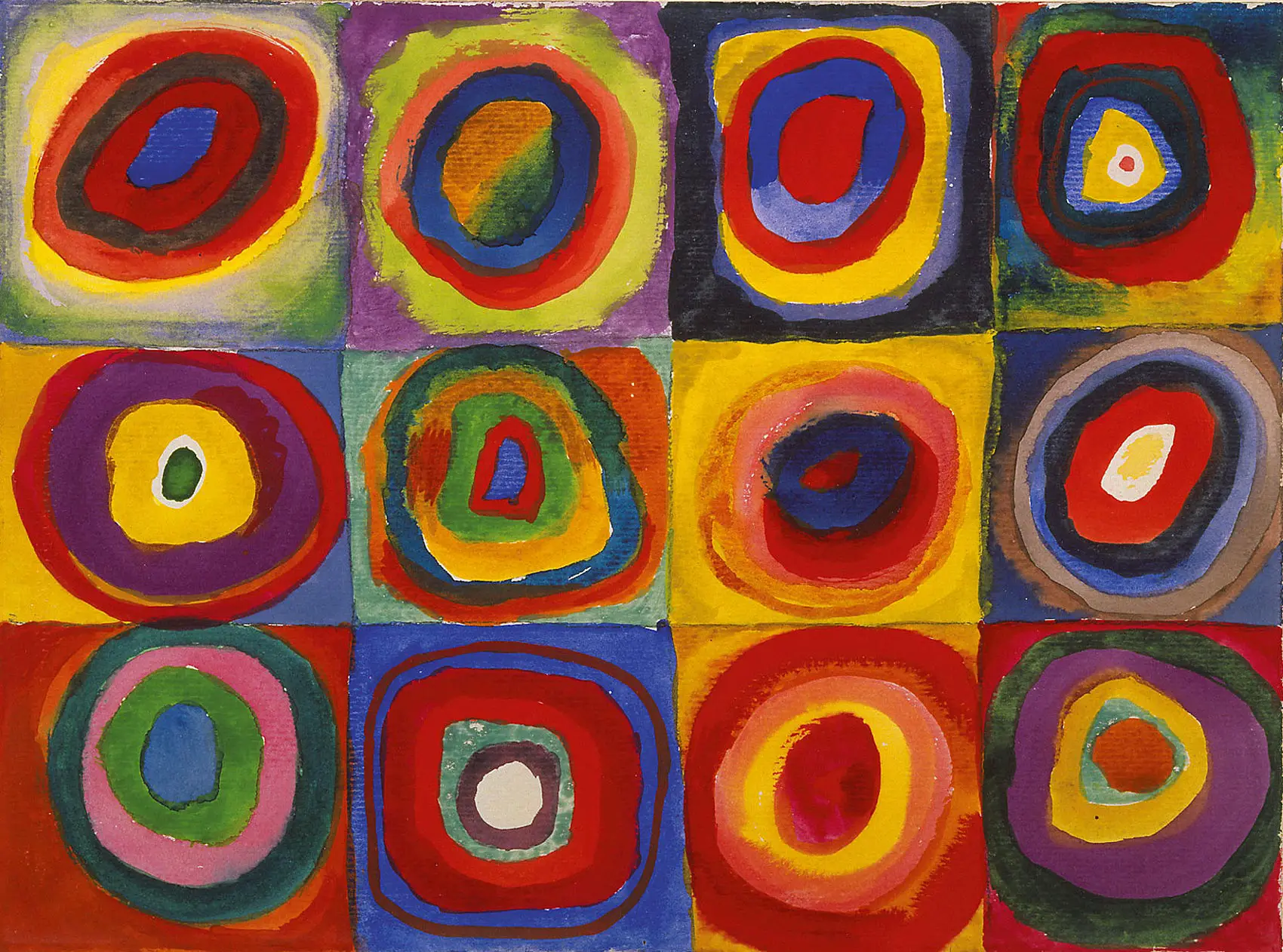

Not everybody likes Kandinsky’s paintings; you do need an acquired taste to enjoy his work. Personally I do like his work, I think it’s very unique, and because of the condition he has I feel as if it gives more meaning, more depth to his work. By researching Kandinsky and his work it has inspired me to attempt to create something new, something that nobody has ever seen before, which I know would be a difficult thing to do but Kandinsky has taught me to aim high and to really push to achieve my goals. I feel like he has changed my perception on art, which is what he would’ve wanted to achieve as he was an art theorist.
By recreating some of his work it allowed me to feel the emotions and passion behind his work, although I cannot hear colours I can understand what it would’ve been like for him whilst painting- calming and peaceful. I want to take these feelings along with me for when I design my own company, as I feel as if this will have a soothing effect on my customers. I feel like the painting turned out well, I enjoyed doing a rough painting where it didn’t matter if the circles were not perfectly circular, or if the squares weren’t all equal, this will help me in future design work as it will allow me to easily create rough designs without over thinking them too much.
The mixture of colours really emphasises the ‘music’ of the picture. When I see yellow I initially connote this with positive feelings, summertime when everything is warm and bright, this enlightens me and fills me with joy. However in this painting the warm yellow is always next to a darker colour, for example red and blue. Again this further opens the painting up because red can depict love and passion for some people but then it can also convey hatred and anger to others. This, I imagine, relates to Kandinsky’s condition, where you can see one thing (colour) but it means another (sound). In addition, the yellow is also next to purple, which is it’s complimentary colour, this foreshadows that the painting may evoke a sense of peace and harmony. So, to conclude, the colours in the painting are meant to make you feel calm yet this can be different for each and every person. Next I am going to research another artist so I can get more inspiration that I may be able to take into my company.
Theo Van Doesburg:
Doesburg was born in the Netherlands on the 30th August 1883 and he died on the 7th March 1931. Theo was actually the name of his stepdad, a man he saw as and treated as his biological father, his real name is ‘Christian Emile Marie Kupper’. Doesburg married four times during his lifetime. In 1912 he started writing for magazines, which aided him in his painting career which he perused in 1913 where he explored traditional styles of paintings; Theo was inspired by famous artists such as Vincent Van Gogh.
Doesburg was one of the founders of the De Stijl movement, he dedicated most of his life to this movement, studying it and producing work in this style. He created De Stijl exhibitions, published journals and he wrote multiple essays about the movement. Doesburg produced a lot of work during his time including furniture, paintings, sculptures, buildings and more, mainly in the style of De Stijl, and some abstract.
De Stijl consists of geometric shapes and primary colours, the aim being for the art to reach and to touch more of the population. De Stijl was meant to reflect the modern industrial world of that specific time, to show the downfalls and harmony within the world. When researching a topic I try to find a message behind what made them do what they do, in this case Theo wants his art to be an absorbing experience, it’s made to captivate you so you experience feelings and emotions only possible through the language of art.
Some famous pieces of Theo’s work include:
1. Russian Dance (1918):
Theo Van Doesburg took abstract art to a new level, his movement is meant to reflect times of the 20th century, at a first glance the picture looks simple, but this simplicity is then taken further as the more you look the more confusing the picture gets. Lines are meant to be straight, they’re meant to all be uniform, however in this picture the lines are broken, they’re all adjacent to each other, there’s no overall pattern to the lines, so the initial simplicity suddenly turns into a complex picture. This reflects the times of that period, where World War One was just ending, a very confusing time in history. This confusion is then heightened with the randomly selected colours. Yellow, pink and blue are all quite light colours, for them to be with black portrays the confusion even more as this dark colour contrasts the light, in this case the black symbolises war which is within the light representing ‘normal life’. Doesburg was one of the founders of De Stijl so he created the idea of these ‘broken’ lines, he wanted to change peoples perception on classical art and I feel as if he has achieved that.
2. Contra-Composition (1925):

In this piece, art has really been stripped down to it’s bare minimum. It is vulnerable. I think this vulnerability is what gives the picture such beauty, it’s pure and simple. There is no hidden meanings within the picture, it’s purely what meets the eye, you judge the painting on its visual elements, the shades of colours, the shapes involved, it all gives the picture its beauty. This is what I enjoy about the painting, I like the fact that it is so pure, I think that this style of art would’ve been very refreshing to the public of that time, there’s no confusion. So when I make my company and corporate identity I may try to repeat history and bring this vulnerability into it, I feel like the customers would then be able to empathise and sympathise with my company as I hope to evoke emotions of warmth and happiness.
3. Arithmetic Composition (1929):

This is different to his other paintings as it involves dark shades of grey and black instead of bright primary colours. Furthermore, this painting is symmetrical, the squares overlapping the grid gives them a sense of importance as their protruding from the page, wanting to get the limelight. Symmetry is perceived as beauty, so by the painting including symmetry it will give the viewers a sense of wholeness. In addition the squares completely fill the space, so the lack of negative space further implies the sense of wholeness as the painting looks complete.
I like this painting because of the feeling it gives me, it gives me satisfaction because it makes me feel complete, like nothing from my life is missing. For others this painting may be able to bring happiness, if someone feels empty inside or if they’re feeling down I feel as if this painting would be able to make them feel better about themselves. For that reason I feel like this is my favourite out of the paintings I have analysed.
4. Composition VIII (The Cow) (1918):

My Painting:

I attempted to recreate one of Theo’s famous pieces ‘The Cow’, I used liquid acrylic paint and I used masking tape to try to get straight lines. This was a lot harder than I thought it was going to be, the paint ran under the tape creating spillages on either side, the colours do not match the original painting, overall there are many mistakes. Next time I will use thicker paint so it doesn’t run and I will try to create more similar colours.
Despite my mistakes, I wanted to recreate this piece because I believe the story behind this painting is very fascinating. By painting it myself it allowed me to recognise the shapes and colours within it, and to appreciate all the thought incorporated within the painting. This painting was before his creation of De Stijl, he was still experimenting with abstract art, this piece is an abstract form of a grazing cow which has been simplified to very basic shapes. I like it because of it’s pureness and simplicity, even though a cow is not easy to see within the picture, once you know the story behind it, it becomes clearer. In my opinion this art style has changed peoples perception on art as you can bend and create new rules to try to influence the publics thoughts and opinions, which this piece has definitely done as I would never of thought to break an animal down into colours and shapes. So from researching Theo Van Doesburg I have learnt that I shouldn’t be afraid to experiment with colours and shapes, I’m allowed to break something down into it’s smallest components in order to try to make the audience feel specific emotions, be it satisfaction or happiness.
Next I will develop my initial ideas in attempt to come up with a company.
Developed Ideas:

I decided to create a mind map of ideas I had on how to make my company different to others. I feel like a mind map is an easy way to portray my thought process and you can clearly see all the different ideas I had. I listed properties that I think my logo should hold so I will be able to check this off the list when I have completed it. I am steering towards making an old peoples café which includes some sort of pets so the elderly have a place to go where they won’t feel lonely.
My Company:
The Theory Behind my Company:
I have decided to create an old peoples café. I feel like as you become an elderly person it’s easy to feel secluded and isolated, this leads to loneliness and depression. Over 2 million people who are aged 75 and up in the UK say they live alone (according to Age UK), this leads to a high depression rate in elderly people. This makes me feel sorrowful as many elderly people can go months without having a conversation with someone. It is not an ideal situation for the elderly, they may not have family nearby, or they may not have the ability to go out and walk- to socialise.
So I want to create a company that changes peoples lives, even if it is just a small percentage of people. I feel like an old peoples café is a great idea for those who do not have friends or family they can rely upon to make them feel content. I want to create an environment where people feel welcome, where they can enjoy their time there and not feel like they’re a burden to anyone.
I thought back to my Ogilvy research about customer engagement, I need to try to empathise with the elderly by putting myself in their shoes. I knew this was going to be a difficult task so I thought the best way to go about it was to really think what it would be like on my own, with no one to call upon, no one asking me about my day, or not even just a simple smile on the street. I thought what would be the reverse to all the scenarios? This is what I would want to include within my company. I want staff who are welcoming, people who truly care about your day, who are nice to you and have time to listen to every single word you have to say. I thought what do customers really want from my brand? I think the answer is just a place where it feels like home, as some elderly people might not of felt that for a while.
In addition I thought back to my research about public relations and influence. What is my brands purpose? How am I going to strive for a better society for those around me? How am I going to change peoples opinions and behaviour towards the elderly? I thought a lot about these questions and I’ve come to the conclusion that my brands purpose is really to provide consolation for those in need of comforting. I feel like my company may be able to influence those in the community to stop and think about any elderly people they know, I hope it will inspire them to take the incentive to give any elderly person a quick visit or even a phone call. I hope this changes peoples opinions towards the elderly. Therefore, like I previously stated, I feel as if this will provide a stable future for the next generations as I hope people will grow and learn that we need to protect and solace the elderly.
From researching Ms Cupcake I learnt that I need to be inclusive, so I thought how I could apply this to my company. So I’m slightly adapting my idea as I feel like it will be able to really benefit the community. I’m opening my café up to every body of any age. As I’ve said before, it is very important to be as inclusive as possible, and to really include as much of the population as you can within your company. Then I thought what would make my café different from any other café? If I open my company up to everyone then how is that going to benefit the elderly in any way? So I came to the conclusion that food and drink would be free for the elderly, as all my profit and income would come from those of the general public, who would have to pay a fixed fee for the food/drink. So therefore my company welcomes everybody of all genders, ages and religions.
I’ve also stated before that to make a successful company I need to set myself regular and achievable goals, this is also what I learnt from Kandinsky, to really push to achieve my goals. So I thought long and hard what my goals for my company would be and I think it is just to make people smile, to really change someone’s day by making them feel like they’re wanted and needed in life.
After more thinking, I have seen a few faults within my company. How would I stop people taking advantage of the offer? If someone orders 5 cups of coffee for free, I would then need to increase the prices of coffee for the general public, but then I would eventually lose their custom as it is cheaper for them to go somewhere else. In addition, how would I stop homeless people using my café as a way for them to survive, I’m not saying they’re not welcome, but I wouldn’t want them to abuse the system and equally I wouldn’t want other customers to be put off by them being there. To over-ride this issue I will only allow the first drink to be free for the elderly and anymore than one they will have to pay. I feel like this will still make a difference to their lives even if it is just the one hot drink- it still gets them out and about. In order for my company to thrive I cannot be giving away more drinks than I am selling.
Moreover, I have thought about including pets within my company. In my opinion, animals make a space seem warmer- having pets to love and who love you back is something we should treasure. So I feel like filling a space with pets will only entice more customers in and will it will make them stay longer as they’re in ore of the animals. Another way my company could make profit is to sell pet food which the customers could buy so they get to feed the animals, I also feel as if the elderly would enjoy this as it gives them a task to do- something to focus on to keep them entertained. I would only sell a limited of food each day to ensure the animals wouldn’t get over-fed.
So in summary, my company is a café where the elderly get their first drink free, I sell lunch food and afternoon drinks to members of the public whilst they enjoy a very comfortable home-like environment with the added bonus of there being friendly pets such as hamsters, bunnies and cats. I feel like my company is very different to other companies that already exist as I have the offer of the free drink whilst still catering for the public whilst allowing them to enjoy the company of cute animals.
As time went on, I realised that including pets within my company had downfalls too. I realised that I was putting too much on my plate by trying to help the general pubic, the elderly and animals. So I’ve decided to change my idea and not include pets. In addition, it may put some people off by having animals within a place of food and drink, people may think this will lead to poor hygiene within the café and I do not want people to associate my café with bad hygiene. Furthermore, some animals, like hamsters, don’t smell too pleasant so this could put people off from eating there. Although it was a good idea, I will not carry on with the idea of including pets due to the negatives overriding the positives.
History of the Alphabet:
Alphabets have been around for thousands of years- just not how we know them today. Alphabetic writing came apparent around 4000 years ago however there have been loads of variations since then. Before the alphabet existed there were many different forms of writing like hieroglyphics; which involved pictures rather than sounds. The first alphabet was produced by the Greeks at around 750 BC. They started to teach the alphabet in schools however that soon stopped when people were not really using it, and due to the Normans invading in 1066 the English alphabet was replaced with Norman/Latin. After several more years, the English alphabet began to get used more and more and some of the English Letters where replaced with Norman. This then produced the ‘middle English’ alphabet.
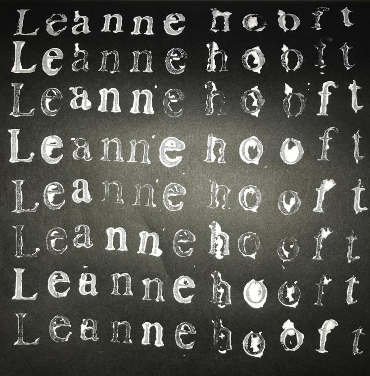
In the mid 15th century modern English appeared due to Gutenburg’s invention of the printing press, over the next century ‘V’ and ‘U’ became two separate letters and the letter ‘J’ was introduced. I experimented with the printing press, I used white acrylic paint on black coloured paper.
I decided to research the early alphabet as I was curious on how people could communicate without having words to write or things to read. By conducting this research it has allowed me to see how the way we talk and write has changed significantly over the years, this means when I start to create the name for my company I will need to use a word that is recognisable by all. I cannot use modern day slang as this can easily rule out old people as customers as they will not understand what my company is.
Typography Artist:
David Carson:
David was born in 1954, he dabbled with art and graphic design throughout his whole life, he graduated with an art bachelor degree. To pursue his graphic design career he started to work with a magazine talking about one of his hobbies (surfing). In 1984 he became art director for another magazine, this experimental work led him to create his own signature style of “dirty type photographic techniques”. In 1989 he then became an art director for a different company. For the next three years he was recognised for his abstract style of art and typography and he won hundreds of awards. In 1992 he was again recognised and he was taken on board for another magazine (Ray Gun), he made this magazine thrive by almost tripling it’s sales.
There is a lot of depth to David’s work. At a first glance his work seems meaningless, as it’s just words on-top of words which overlap pictures. However, this chaotic appearance does follow rules, every word written has a meaning behind it, each word conveys an emotion or a feeling. This new form of typography art enticed many people as it was something innovative, never seem before. I decided to analyse David’s work as he was born in the middle twentieth century, so he was born in the same generation as the elderly now, so I feel like some of the elderly will be familiar with his work.

I do like this piece of his work. I feel as if it has a lot of meaning behind it, ‘breaking all the rules of type’ seems to be quite an edgy phrase as he is really pushing the boundaries of art. In simpler terms, by him saying that phrase whilst breaking the rules of type is very powerful as it shows he lives up to his words and he isn’t afraid of changing the possibilities of art. He’s breaking the rules as the background is composed of the phrase over and over again but they’re so close to each other that you cannot even read them, this is breaking the rules as traditionally you should have equal spacing between words in order for it to be legible. I further like his work because I enjoy the ‘grunge’ style- in my opinion it’s really interesting as it’s always trying to push for new reasoning behind art.
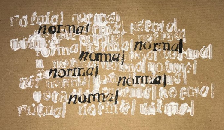
I decided to create a piece which is inspired by David Carson. I used the letterpress system, I chose the word ‘normal’ to repeat over and over again this was to show irony as this work is anything but normal, so I tried to change the context of the word, hoping to change the meaning behind art. I used liquid acrylic white to create the manic background, and I used black Indian ink to create the words in the foreground.
Rules of Typography:
I’ve decided to research typography because not only is it a crucial element within graphic design, it is also a very important step of creating a successful brand as it is what the customers will first read when viewing your company. I looked into the rules of typography and there are many to follow if you want to create an appropriate typeface.
Firstly I need to assess what my typeface is going to be written on and who my audience is. Within my corporate identity I am going to create menus, coffee cups, teacups and paper bags. My audience is mainly the elderly but I still want to cater for the general public. This means, as I’ve stated during my company research, I need to choose a professional, clean, smooth looking typeface because I want to make it appropriate for the older generation, I want them to have respect towards my brand and I feel like I would be able to achieve this through a professional looking typeface.
Secondly, I need to ensure when creating products for my corporate identity, that I involve visual hierarchy. This involves carefully placing certain words in specific places at a set size to show their importance. The largest word/sentence should always be the name of your company, It will be the first thing they read on a sign or menu, so it’s very important that it has a visual status. From then on you want to ensure that it’s is easy to read, you want to guide their eyes on a specific route so they can get the most important pieces of information first.
Next of all is kerning. Kerning refers to the space between individual letters. You can change and adapt this space in order to create a more visually appealing word, the letters could then either slot into each other or angle in the same direction so they’re almost nesting in each other. Kerning is especially important when creating titles, billboards, headings or big signs. It gives more visual beauty to the word as it’s softer for the eyes to read. It makes the image flow and creates harmony between the letters instead of having a fixed amount of space between each letter.
Tracking or spacing links to the space between each letter regarding a whole text. You may want to increase the space between each letter so you can fill out a space without writing any more words, it also allows the viewer to easily be able to distinguish between each letter, if the space between each letter is too close then it can be very difficult to read as some letters may appear to merge. This wouldn’t be good for my target audience as older people are more prone to sight impairments so I want my typeface to have enough spacing between each letter so it is as easy to read as possible.
Leading refers to the space between each line of text. It got it’s name because back in the mid 15th century when people printed using a printer press you would use strips of lead between each line to ensure you get an equal amount of space between them. Leading is important because if the gap between each line is too big then it will be hard for your eyes to follow on and if the gap is too small it will also make it very difficult to read as the writing will look very cramped.
Graphs are another great way of ensuring that you’re presenting your work appropriately, making sure that nothing is randomly placed on the page, grids allow you to purposely place things in relation to everything else to create harmony across the wider picture. When I come to design my logo I may use graphs to ensure that I have correctly placed everything and that it looks visually appealing to the community.
When creating my corporate identity I may use different typefaces for the name compared to the heading, this is so I draw attention to the title as I want to make it stand out. Similar to visual hierarchy, the heading is meant to be very eye-catching, you want them to read that before they read anything else.
Now I have researched the rules of typography I will be able to apply this new knowledge to my company. Next I will begin to create a name for my company.
My Company Name:
I need to create a name for my company. I want the name to reflect what my company is about and what my morals are. Firstly I started to look at synonyms for ‘old’, I wanted to see if there where any appropriate adjectives that I could imbed within my company name, however after looking I realised that there weren’t any suitable options that I could’ve used without offending anyone (for example, if I was to use the word ‘ancient’ I feel like some people may take offence).
So then I came up with the idea of using the word ‘café’ but with the Latin spelling, because Latin is a very old language I thought it relates to the ‘old people’ but then there weren’t any translations of café so I then had to think of other ideas.
After this I thought about naming my company ‘Whiskeys’. I came up with this idea because my grandmas favourite alcoholic drink is whiskey, I thought that whiskey is a drink mainly enjoyed by the elderly. Furthermore, when you drink whiskey it gives you a physical warm sensation down your throat, I thought that if I was to name my company this then people may associate it with that warm feeling conveying that my café will hopefully give you a sense of peace and harmony. However I don’t want the misconception that my company is a pub and not a café, I feel because the company has an alcoholic drink in the name it could give the impression that we sell alcohol.
I then thought of naming my café either fifties or sixties because that’s the time period where old people now-a-days were born. I thought it would be nostalgic for them. Someone then suggested that I spell it incorrectly so it reads fif’teas’ or six’teas’ because then it shows that we’re a café, this also gives the name a comedic feel as it’s an unserious title. In addition, I could write the name as in ‘6t’s’ to give a short and snappy appearance.
After this I then conducted some primary research and asked my class if they had any ideas I could use for my company name, I then got the suggestion of ‘seasons’ this conveys how the elderly have been through and seen may seasons. It could also reflect the products we sell-drinks to cater for every season- summer smoothies or hot chocolates. Moreover it could signify the food we sell as you give ‘seasoning’ to food. It’s also something familiar, something we all face four times a year. This implies that my company has a home-like feel (due to the familiarity of seasons).
Finally I thought of the idea of naming my café after a hardwood. Hardwoods take longer to grow and take ages to become fully mature so I thought that this relates to the elderly. I then looked into different types of hardwoods to see which name was the most suited, some examples include: oak, beech, teak, walnut. I then thought of using mahogany as it’s a treasured and valued wood, that we need to protect, this is similar to how we need to look after the elderly. However I thought this name was too long for a company name, I wanted something shorter so it was more memorable.
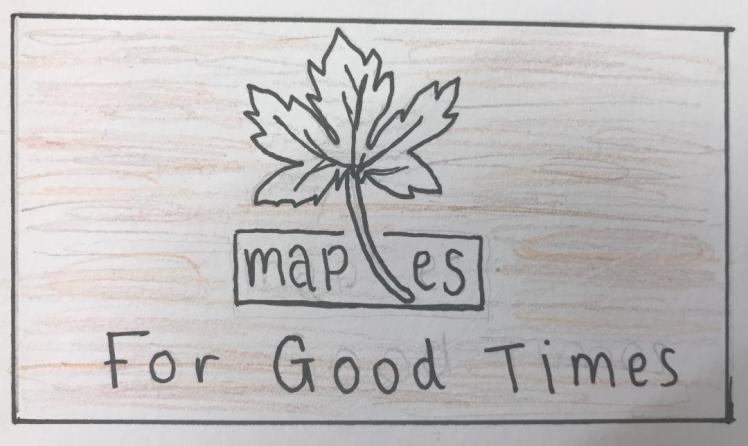
So I’ve decided to call my company Maple’s. Maple is another example of a hardwood. I like this as my company name because it’s a short-catchy name which makes it memorable and enduring. I think it correlates to a café because you can also relate it to maple syrup which is used on breakfast pancakes. Now I have a suitable name I am going to draw some initial designs for potential logos.
Typography experimentation:
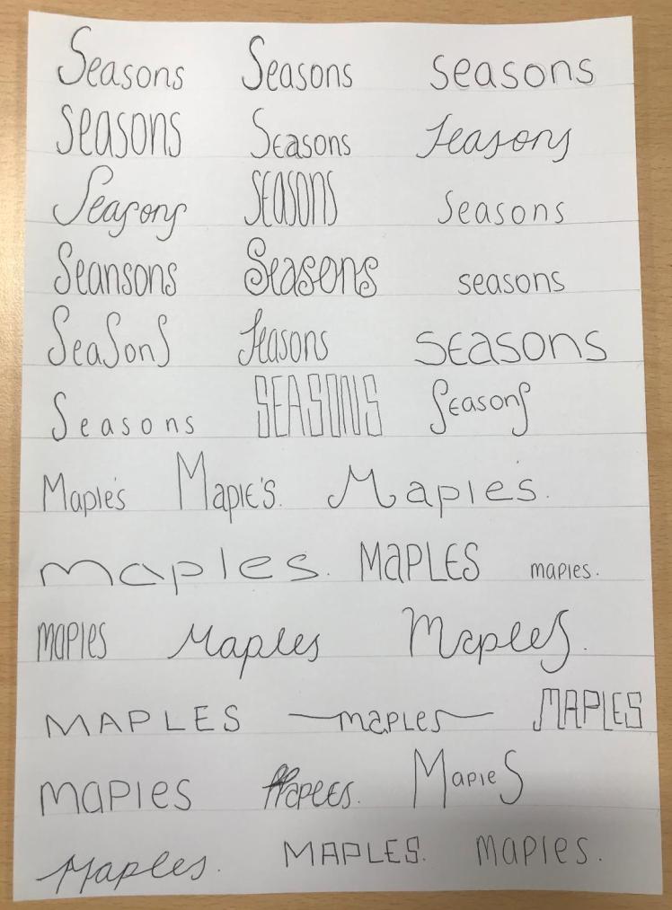
I decided to write different variations of the words maples and seasons down. This was just so I could get a feel for the way the name looks. I tried different typefaces just to see which one would be most suitable for my brand. This helped me because I was able to see which fonts where easy to read. As I’ve previously stated, I want to choose an easy-to- read typeface so it’s more suitable for the older generation, and I also want a font with a clean look as I think it will look more professional. By this experimentation I have decided that I want to go with a typeface that’s very simple and basic.
My Company Logo:
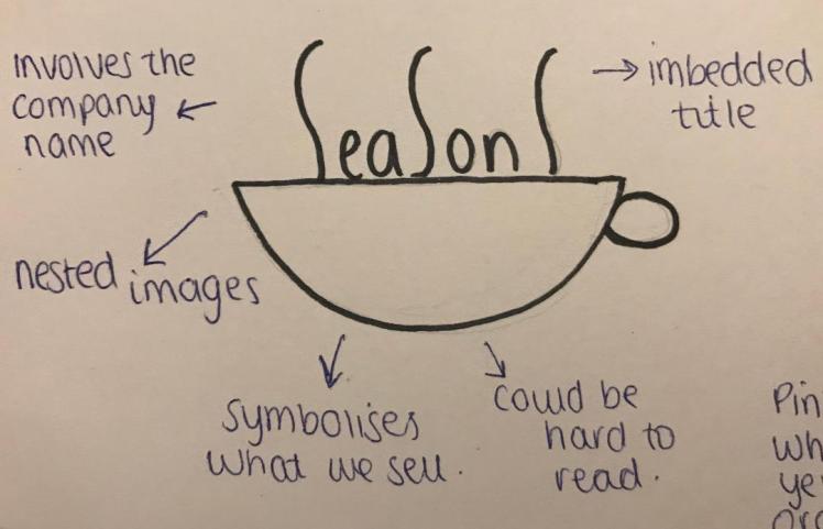
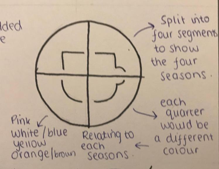
When I was thinking about calling my company ‘seasons’ I created some rough initial designs, but as I changed my company name I disregarded these drawings.
Firstly I started by drawing 18 rough initial designs. I annotated these with visual elements and principles,


I found it difficult to come up with a starting point of logos I could create, to help me I looked back at the logos I previously analysed and I also looked at different company logos when I was walking down the street, this helped me because I could see how the logos were portrayed on a larger scale, like a shop front. So I then decided to disregard all these initial designs as I didn’t think any of them were suitable.
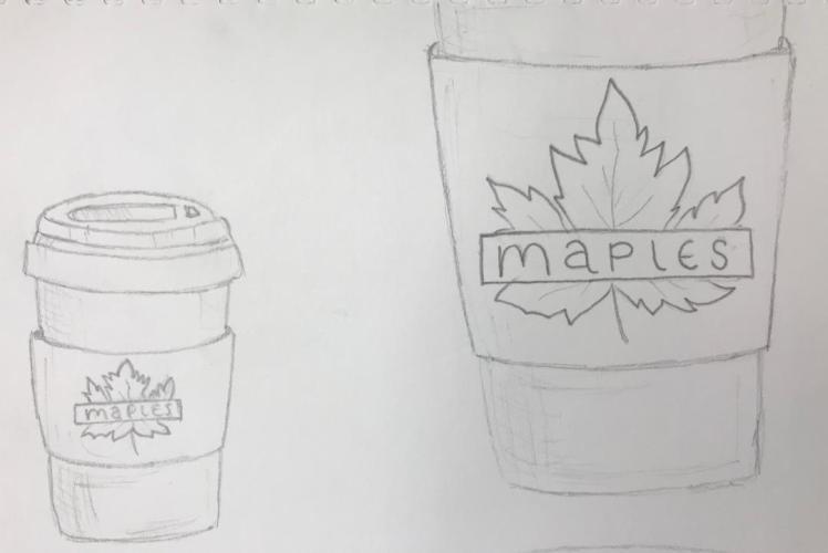
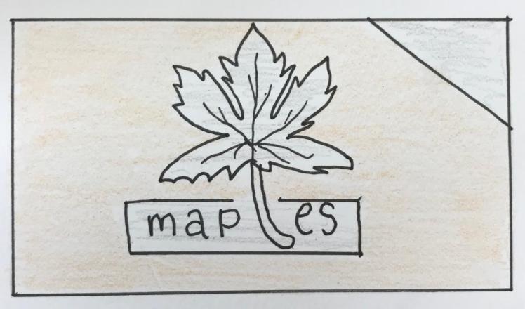
So I carried on developing my ideas and came up with the idea of having my company name on top of a maples leaf. I then tried different variations of this design, by slightly changing the typeface or the positioning of the banner.
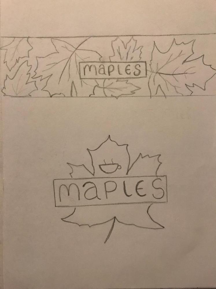
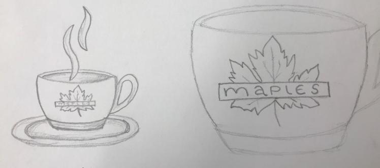
I was happy with the idea of this design but I didn’t like how it looked. So I learned how to draw a more professional looking maple leaf as I feel like this would make the whole design look more realistic, I also took away the teacup as I thought it was just a distraction. This was the outcome:

I tried placing the maple leaf ‘upside down’ this was to try to change peoples perception on typical cafes. Normally all leaves are viewed pointed upwards so I wanted to give the illusion that my café isn’t a typical café. I hope to change peoples thoughts and opinions, I thought I could signify this through the leaf. Furthermore I feel like if I were to have my logo on a shopfront then the leaf would be pointing towards the door; almost like an arrow, guiding people where to go. I also thought how this relates to how some of the elderly need constant help and guidance. However I then changed my mind as I didn’t want my logo to have negative connotations as the leaf was pointing downwards. So I decided to have the leaf pointing upwards so it has positive connotations as its uplifting. It also depicts my goals and aspirations as it’s pointing towards the sky.
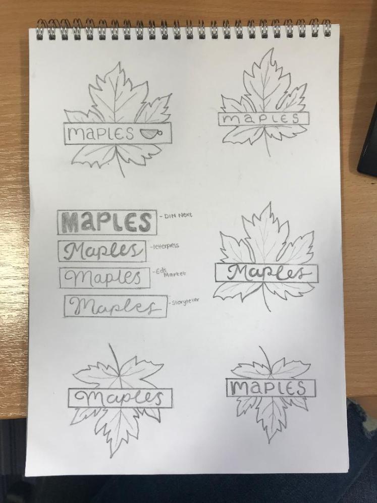
I kept this idea in mind and carried on developing ideas. I then thought of merging the images together to make them look more harmonised, so the ‘L’ in maples is actually the petiole of the leaf, I feel like this is a good idea because it shows unity between the two images. After choosing these two designs I decided to try multiple variations on illustrator.
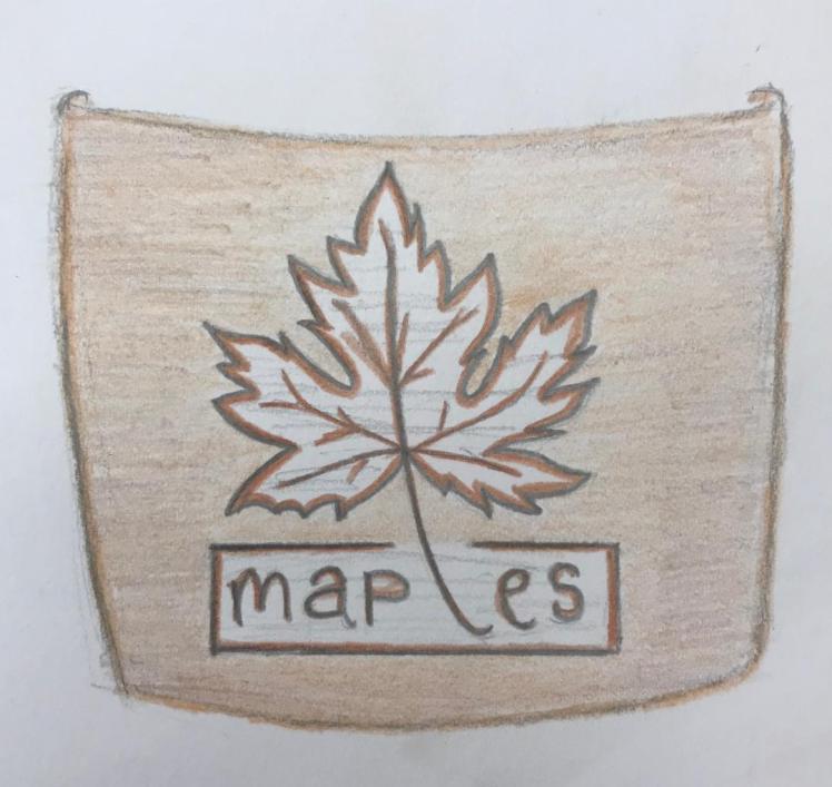
Firstly I imported the image of the leaf I drew onto illustrator, I traced the image with the pen curvature tool. I then tried one way of attempting to create a gradient, I then tried this with and without a stroke. However I didn’t like the way it turned out so I got some images off google of maple leaves and created a clipping mask of that leaf to gives the leaf a realistic look. I do like how it looks, I decided to choose a maple leaf in autumn because I feel like the autumnal colours of oranges, reds and yellows gives the leaves a sense of warmth, mirroring my company message of trying to give out happiness. I also tried a different shape of a maple leaf, however I feel like this looks really sharp and unwelcoming so I disregarded that shape and stuck to my original design. I also experimented with different coloured typefaces, but still sticking with the autumnal theme. In addition I also created a wood sign board, I thought this would give the logo depth and texture, however I feel like it’s hard to read the company name with dark wood behind it so I also disregarded this.
After my experimentation I decided I preferred the look of my other logo design so I began to try out different variations of this too.
Similar to the previous design, I imported a picture of a leaf and created a clipping mask. After changing the size of the leaf and the background of the sign board I thought what my logo could look like without colours. So there are different variations of my logo with just a coloured stroke and no filling. In the end I decided that I still didn’t like any of these designs, I felt like the leaf was too dark and also if my logo was to be blow up onto billboards or big sign posters then the leaf is going to go blurry because it’s just an imported photo.
After some time, I thought it would be best if my logo had a more neutral background. This is because I feel like it will be easier on the eye as its not as intrusive; it’s calming. In addition I feel like the light-grey wood effect gives the logo depth yet it still allows the company name to be easily read, which is very important for my target market of the elderly. (Final logo analysis can be found in my evaluation)
My Company Slogan:
Creating a company slogan was, in my opinion, quite a difficult thing to do. I wanted my slogan to reflect my morals and my aspirations for my café. I had several ideas for a slogan like: “for the purrfect cuppa” (when I was thinking about having cats within my café) but then I disregarded this idea as I was no longer having pets. I conducted some primary research and asked people in my class if they had any ideas for a slogan, someone suggested “café to connect” which I did think was a good idea- it reflects what my company is whilst showing what I want to achieve. However I didn’t want to jump straight to this slogan so I carried on thinking.
I thought that my slogan should be uplifting, by having comedic values- to try to involve something ironic like: “live for good times” as the ‘live’ is emphasised by the fact that my major target audience is the elderly, or “wakey wakey” as you would normally say this to children so the rules have been flipped. However I then thought that the language used was too informal and I wanted the elderly to view my slogan as something familiar and not as a joke. I then also thought back to my Ogilvy research where I learnt about trying not to offend anyone. So I disregarded these ides as I felt that some of the elderly make take it too seriously and I wouldn’t want them to be put off by the slogan.
I then came up with the potential idea of “home to home” or “home from home”- I did think this was a nice idea as it shows that my café is a familiar, welcoming place. It shows that it will be very comfortable and pleasant inside. Nonetheless, I didn’t want the elderly people who don’t really have a nice home life to correlate this with my café, additionally, I felt as this slogan was very similar to other companies like Dunelm (“The Home of Homes”).
Lastly I looked back at my previous ideas and I thought that I may be able to adapt them to be suitable, after discussing potential slogan ideas with my class, we adapted “live for good times” just to “for good times”. I was happy with this outcome as I believe it reduced the risk of offending anyone as it no longer has “lives” within the name. I also think that this slogan is very enticing and heart-warming as it’s straight to the point, just from reading the slogan you know that you’re going to enjoy your time there. Which is exactly what I wanted my slogan to portray, I want the elderly to feel as if they can go to my café when they’re feeling down or lonely and that they can enjoy their time there, I want them to be able to see a bright future for their generation and from “for good times” I believe you can see this. Now I have my slogan I will go onto choosing a typeface for my company.
My Company Typeface:
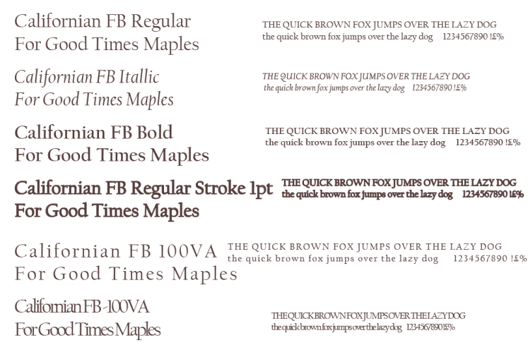
I created a board with different variations of the same font on. I wrote the name of the typeface, my company slogan and name, and text that involves every letter. I done this so it was clear to see each typeface, I would then be able to easily see which typeface would be the most suitable for my brand.
I decided to choose “Californian FB Regular” for my final typeface. When analysing Ms Cupcake I stated how I want my typeface to be smooth and clean looking so it shows professionalism. I do feel like this is a very professional looking typeface. In addition, the typeface I chose belongs to a the ‘serif’ group. This relates to the tiny lines on the stroke of each letter, by Californian FB being a serif typeface it correlates to my company as it shows movement and connectivity. I believe serif typefaces have a more visually appealing appearance as they’re not just ‘block’ letters, it gives them definition and smoothness. In addition, when analysing Miriam’s Munchies I stated how I wanted a simple typeface so more of the population will be able to understand and interpret my company name, I believe I have chose a suitable one. Now I have chosen my typeface I will be able to go onto designing mock-ups for my company.
Mock-up Designs:
Cups/Mugs:
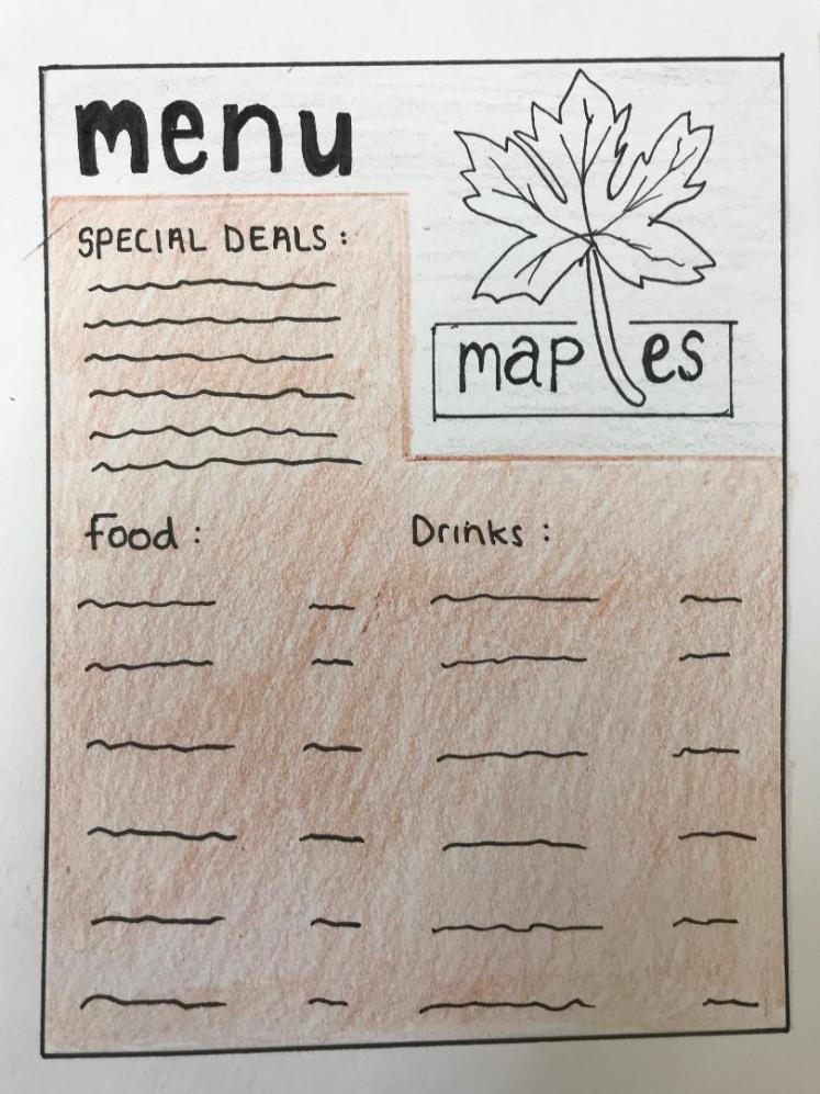
Menu’s:
Business Cards:
`
Corporate Identity Mock-ups:


Credit: <a href=’https://www.freepik.com/free-vector/paper-branding-mockup-vector-set_3439793.htm’>Designed by Rawpixel.com</a>

My Company Colours:

The four major colours used in my company are: warm brown, medium brown, brown and beige. These colours are very neutral. I decided to stick with very neutral colours because I believe it will be easier for the elderly to digest. If the elderly saw a café that had loads of bright colours (like reds, florescent colours, neon greens ect…) I feel as if they would then associate the café to be really upbeat and loud, so I thought if my café just consisted of neutral colours then the café will be perceived as calming and peaceful.
Browns are also very natural colours, this also links to my company name of “maples”, the brown would be associated with the wood of the trees, I feel like by having these colours link to what my company is actually about creates a good corporate identity. Linking back to when I researched the colleges’ corporate identity I stated how the colours need to be relevant and meaningful- I feel like I have accomplished that.
Evaluation:
Throughout my research and designing process I have involved both primary and secondary research. My secondary research included the use of the internet. When researching Ogilvy I ensured that I gathered information straight from their main website, this was so I knew that they were facts and they weren’t bias. In college we also had someone come in from Ogilvy, so I came up with some questions that I asked her. She gave me some advice on creating a logo (making sure to do loads of variations to see the best outcome) this primary research was reliable because the answers were based on experience rather than assumptions.
Furthermore when I was researching artists and different brands I got all my information from trusted websites, I also ensured that the websites were up to date with their information, so I didn’t have any out-dated facts. I also conducted primary research by taking photos of Maybelline’s displays, I feel like primary research is a great way to learn more things because you can see it in the everyday world.
This unit involved creating a corporate identity so I feel like I used a good balance between primary and secondary research- I couldn’t of conducted half as much research as I did if I didn’t include secondary research. I believe all my information is true because of the reliable sources I got it from. Next time I could use books as a way of secondary research- this would be to just broaden my viewpoints even more by getting more information from a different source.
I gained so much knowledge from this unit, including how to create a brand and a corporate identity, what Ogilvy is, how existing brands and artists inspire me and how I can use them to influence my work. I have previously talked about how the brands and artists I researched influenced my design.
I feel as if my research went well. I believe this is because of how deeply I went into some aspects, like analysing existing logos, and by carrying out the research myself, for example: asking questions, recreating artists work and drawing out logos. This all really helped me on my journey of coming up with my final piece. It was difficult when I tried to find where Maybelline was advertised, there were not as many advertisements or sections of Maybelline about than I thought, so next time I could use secondary research sources like Google Images to find how Maybelline is advertised rather than trying to find it myself; I feel like this would be beneficial because it wouldn’t take as long.
I do believe most of my initial designs for logos where suitable. I annotated each initial design so my opinion on each design can be found in my imported photos. I believe my skills on creating logos has improved from my first unit, additionally I am becoming a lot more confident with using illustrator. I feel as if my illustrator skills are good for a beginner as I have learned new things such as how to create a clipping mask (which I used when creating variations of my logo). I feel like my skills on illustrator will carry on growing as time goes on. To improve I could learn how to use photoshop as it may of helped me when creating my mock ups.
From this unit I also learned about colour and what makes up colour. On typical printers there are four colours: cyan, magenta, yellow and black. When creating my colour board I learned how colours are made up of different percentages of red, blue and green. When you print something the colours may be different to how they appear on screen, so by creating my colour board it allowed me to realise that I need to make sure the colours will be the same on everything website and printing, so I used Pantone colours to do so.
I believe my developed ideas are all suitable. I displayed my logo on such things like coffee cups and teacups, this was to show what my design may look like within the real world. The pieces I drew, I believe, are in proportion and are relevant. I am happy with my designs, although I didn’t like some of them, this allowed me to realise what I did like, so it was a helpful process as I will now be able to keep the designs I didn’t like for future units so I don make the same mistakes twice. I feel as if my drawing skills have remained the same throughout all the units I have done so far, I struggled with drawing a maple leaf at first, so I used a tutorial to help me learn how to produce a maple leaf shape. Next time I could try to keep the shape simple, so there is no difficulty when it comes to the drawing aspect of the project.
In the end I am happy with my chosen typeface, I’ve stated throughout the whole project that my typeface needs to be clean and professional looking so it’s easy to read for my chosen audience. When I created the typeface board this helped me to come up with an appropriate typeface. I have already talked about why I ended up choosing this typeface
Throughout my blog I ensured that all imported images are large enough to easily view, and that all my written text can easily be read. This is just so my blog looks as professional as it can, and so it’s not messy when other people view my blog. I decided to include a project brief so if members of the public were to stumble across my blog they would understand what I’m aiming for and what I’m striving to achieve. Moreover, I have been aware of the language I use throughout my blog, I used formal language throughout as I, again, believe this makes your blog more professional. Throughout my research I have also taken the time to assure that I haven’t said anything that could offend anyone. Also throughout the designing process, I kept in mind my target audience. I always ensured that what I was creating was suitable for the elderly, this was from all the research I previously done.
I feel like my work does meet the brief, I created a company from scratch, I researched loads of different topics that influenced and inspired me and I did create a corporate identity for my company. For my final design I decided to choose illustrator, this was because I was more familiar with illustrator, and I believe when you know how to use something then it’s easier to navigate around therefore leading you to have a better outcome. I have previously talked about how I created my logo on illustrator and the techniques I used to create it.
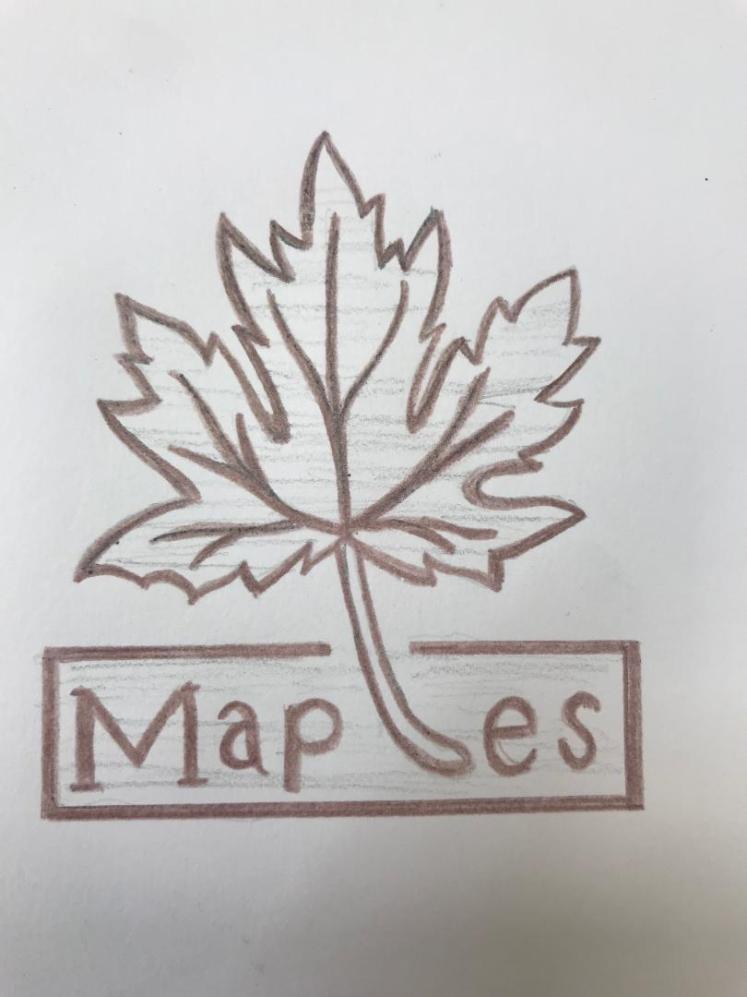
I believe my final logo came out very well. It is everything that I wanted my logo to convey, the simple colours are most effective on the elderly as they can connote these colours to calming experiences as they’re not vicious or vibrant. The shape of the maple leaf is very soft, there are no sharp edges or pointed angles, this further demonstrates my company as I want to be as calming and as soft for the elderly as possible, like I’ve stated before, we need to protect the older generations. I like the way my company name is nested within my logo, I feel like this is a nice touch as it further shows harmony throughout my company. I’ve also said throughout my blog that my logo needs to signify my morals and what my company is trying to convey, in my opinion I have been successful, I think my logo does display that we need to help the elderly who are struggling, and that we need to help them in every way possible.
I am happy with my final mock-ups. To begin with is my business card. I decided to have my logo in the middle of the card- I feel like this is powerful as it shows it’s importance through it’s visual hierarchy. I then added smaller versions of the logo around the front of the business card, I changed the opacity to 25%, I thought this gave the card a more interesting façade as it gives the card more depth, it also gives the card a background, which I’ve stated is important as it gives the eyes more things to view. In addition, I’ve added a ‘white wooden’ corner to my designs. I felt as if I needed something, as well as my logo, that ran through most of my designs, I believe this benefitted my corporate identity as it made my products more related and memorable. To improve I could’ve included my slogan within the business card.
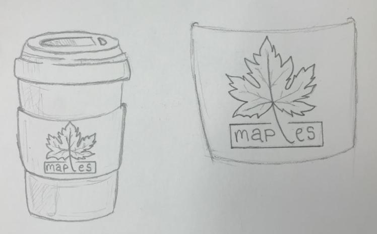
Secondly was the coffee cup. I do like how this came out, I believe that my logo is really suitable for the design, instead of adding a ‘white wooden’ corner to this design, I changed the colour of the lid to the ‘white wood’ effect. I did this because I still wanted that theme to run throughout my designs. Moreover, if the elderly keep seeing something on all of the packaging then they will become familiar with my products, this will allow me to gain their trust which heightens brand loyalty. To improve upon this design I could’ve placed the logo more central within the band of the coffee cup.
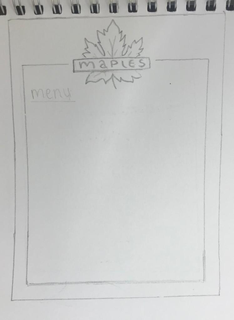
Next was my menu. Even though I do like this design, I believe there are a few things I could change to improve it’s appearance. Firstly I think my logo should’ve been bigger and my slogan should’ve been smaller, I think this because my logo is the most important part of my design, the logo is what people recognise and associate with my café. By the slogan being larger it might throw people off as they wouldn’t initially see the logo. So by evaluating this design, next time I will ensure that my logo is larger than my slogan to, again, show visual hierarchy between the two. Also, I didn’t include the ‘white wooden’ triangle, therefore my menu isn’t really related to any of my other products which may confuse the older generation.
I decided to have paper bags for my company as it’s more environmentally friendly. I have talked about how I want to provide a stable future for the upcoming generations so I think it would be very hypocritical of me if I were to use plastic bags. I like how this mock-up turned out. It’s similar to the business card design, I implemented the translucent logos within the background of the bag, again this gives the bag more detail/more depth. The bag also includes my company slogan. This is an example of good advertisement as people will carry the bag allowing others to view it, this will allow my brand to reach more of the population, they will read the slogan and then hopefully come to my café as they want to have good times too.
Personally, the clipboard is my least favourite mock-up. I think the brown is too dark and doesn’t match any of my other designs. I do like the fact that I imbedded the ‘white wooden’ corner into this design, this gives it some relevance to the rest of my mock-ups. Next time I will ensure to match the colours more, so there’s a motif throughout my ideas.
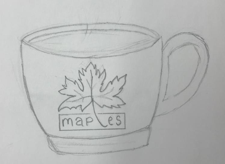
I think this teacup design came out really well. I feel like it looks realistic and polished. Finding appropriate mock-up templates was difficult but I do believe I chose suitable ones for my company. I think this mock-up accurately represents what my design would look like in the real world which is what I wanted to achieve throughout this process.
So overall I am happy with my project, I believe I have created an innovative company with a corporate identity that will thrive. Throughout the project I believe I have used my time effectively. I have learnt from previous units that I shouldn’t over-think my initial designs, So I’m glad I have taken that on board as I spent the right amount of time on my designing process. Due to me creating my own company, rather than choosing an existing one, I feel like the amount of research and the quality of research I have done is sufficient for the amount of time we had. I enjoyed this whole unit as it really tested me on my knowledge and my drawing/illustrator skills. From my last unit, the amount of research I have done has nearly trebled, I decided to do more research because I wanted to explore all the possible pathways for my design in order to get the best outcome. In conclusion I am proud of what I have created for this unit.
References:
ageuk. (2017). /information-advice/?gclid=EAIaIQobChMI4pKThb-p3wIVJ7XtCh2OhwHsEAAYASAAEgLqOPD_BwE&gclsrc=aw.ds. Available: https://www.ageuk.org.uk/information-advice/?gclid=EAIaIQobChMI4pKThb-p3wIVJ7XtCh2OhwHsEAAYASAAEgLqOPD_BwE&gclsrc=aw.ds. Last accessed 21st Nov 2018
artauthority. (2017). community.artauthority.net. Available: http://community.artauthority.net/work.asp?wid=106723&pos=44. Last accessed 29th Nov 2018.
artsy. (2018). /artwork/theo-van-doesburg-arithmetic-composition.Available: https://www.artsy.net/artwork/theo-van-doesburg-arithmetic-composition. Last accessed 2nd December 2018
batchgeo. (2018). /1918-history/. Available: https://blog.batchgeo.com/1918-history/. Last accessed 2nd Dec 2018.
behance. (2018). /gallery/14940705/North-Kaffe-(Identity-Design).Available: https://www.behance.net/gallery/14940705/North-Kaffe-(Identity-Design). Last accessed 13th Dec 2018.
blogspot. (2012). /2012/09/david-carsons-work.html. Available: http://cecisart.blogspot.com/2012/09/david-carsons-work.html. Last accessed 17th December 2018.
britannica. (2018). /topic/Nike-Inc. Available: https://www.britannica.com/topic/Nike-Inc. Last accessed 20th Nov 2018.
businessdictionary. (2018). /definition/corporate-identity.html. Available: http://www.businessdictionary.com/definition/corporate-identity.html. Last accessed 21st nov 2018.
codebeautify. (2018). /hex-to-pantone-converter. Available: https://codebeautify.org/hex-to-pantone-converter. Last accessed 13th Dec 2018.
colormatters. (2017). http://www.colormatters.com. Available: https://www.colormatters.com/the-meanings-of-colors/purple. Last accessed 27th Nov 2018.
color-wheel-pro. (2015). /color-meaning.html. Available: http://www.color-wheel-pro.com/color-meaning.html. Last accessed 27th Nov 2018.
creativemarket. (2018). /blog/typography-rules. Available: https://creativemarket.com/blog/typography-rules. Last accessed 4th Dec 2018.
dailymail. (2017). /news/article-2597571/A-purrfect-way-unwind-New-pictures-life-like-inside-Londons-cat-cafe.html. Available: https://www.dailymail.co.uk/news/article-2597571/A-purrfect-way-unwind-New-pictures-life-like-inside-Londons-cat-cafe.html. Last accessed 26th Nov 2018.
empower-yourself-with-color-psychology. (2017). http://www.empower-yourself-with-color-psychology.com. Available: https://www.empower-yourself-with-color-psychology.com/color-gray.html. Last accessed 27th Nov 2018.
famousgraphicdesigners. (2017). /david-carson. Available: https://www.famousgraphicdesigners.org/david-carson. Last accessed 17th December 2018.
freepik. (2018). freepik. Available: https://www.freepik.com/. Last accessed 13th Dec 2018.
google. (2018). /+RobertaPiana/posts/3ukAVtJZsA6. Available: https://plus.google.com/+RobertaPiana/posts/3ukAVtJZsA6. Last accessed 28th Nov 2018.
jazjaz. (2018). /2012/07/brandalism-street-artists-hijack-commercial-billboards-in-the-uk.html. Available: https://www.jazjaz.net/2012/07/brandalism-street-artists-hijack-commercial-billboards-in-the-uk.html. Last accessed 20th Nov 2018.
maybelline. (2018). /about-maybelline. Available: https://www.maybelline.co.uk/about-maybelline. Last accessed 20th Nov 2018.
moma. (2017). /collection/works/79189. Available: https://www.moma.org/collection/works/79189. Last accessed 3rd Dec 2018.
mscupcake. (2018). /vision/. Available: https://www.mscupcake.co.uk/vision/. Last accessed 21st Nov 2018.
nationmultimedia. (2017). /detail/Corporate/30347487. Available: http://www.nationmultimedia.com/detail/Corporate/30347487. Last accessed 13th Dec 2018.
nhs. (2018). /conditions/stress-anxiety-depression/loneliness-in-older-people/. Available: https://www.nhs.uk/conditions/stress-anxiety-depression/loneliness-in-older-people/. Last accessed 4th Dec 2018.
ogilvy. (2018). /our-teams. Available: https://ogilvy.co.uk/our-teams. Last accessed 20th Nov 2018.
reagordykesautogroup. (2018). /popular-car-brands/chevrolet.htm.Available: https://www.reagordykesautogroup.com/popular-car-brands/chevrolet.htm. Last accessed 21st Nov 2018.
statista. (2018). /statistics/289167/mobile-phone-penetration-in-the-uk/. Available: https://www.statista.com/statistics/289167/mobile-phone-penetration-in-the-uk/. Last accessed 20th Nov 2018.
tate. (2018). /art/artists/wassily-kandinsky-1382. Available: https://www.tate.org.uk/art/artists/wassily-kandinsky-1382. Last accessed 28th Nov 2018.
telegraph. (2014). /art/artists/wassily-kandinsky-who-was-he/. Available: https://www.telegraph.co.uk/art/artists/wassily-kandinsky-who-was-he/. Last accessed 28th Nov 2018.
theartstory. (2017). /artist-van-doesburg-theo-life-and-legacy.htm. Available: https://www.theartstory.org/artist-van-doesburg-theo-life-and-legacy.htm. Last accessed 28th Nov 2018.
todayifoundout. (2013). /index.php/2013/09/the-origin-of-the-english-alphabet/. Available: http://www.todayifoundout.com/index.php/2013/09/the-origin-of-the-english-alphabet/. Last accessed 4th Dec 2018.
treefrog. (2018). /what-is-corporate-identity. Available: http://www.treefrog.ca/what-is-corporate-identity. Last accessed 21st Nov 2018.
wassilykandinsky. (2018). /work-62.php. Available: https://www.wassilykandinsky.net/work-62.php. Last accessed 28th Nov 2018.
wikimedia. (2018). /wiki/File:Vassily_Kandinsky,_1935_-_Brown_with_supplement.jpg. Available:https://commons.wikimedia.org/wiki/File:Vassily_Kandinsky,_1935_-_Brown_with_supplement.jpg. Last accessed 28th Nov 2018.
wordpress. (2017). /de-stijl/theo-van-doesburg/rhythm-of-a-russian-dance/. Available: https://utopiadystopiawwi.wordpress.com/de-stijl/theo-van-doesburg/rhythm-of-a-russian-dance/. Last accessed 29th Nov 2018.
