Project Brief:
I will be working on packaging designs for Big Fish Packaging. My boss allows me to work on the designs for a client of my choice, from their client list. I must research and analyse current packaging designs that will inform my own design process. I will create new net designs for at least one product. I will construct at least one of these nets to a final assembled piece.
Big Fish Packaging:
Who They Are/What They Do:
When Big Fish Packaging started in 1994 they had one simple goal; they just wanted to live each day in enjoyment, to love everyday at work where it doesn’t even feel like work. They’ve stated how they feel as if they have achieved their goal, now everyday is just a bonus as they grow into a bigger, well-spread company.
Big Fish Packaging are an agency that help people build brands with a team of branding, advertising and consulting specialists. They were founded in 1994 and since then they have helped thousands of brands develop and become better, they help to give a company a name for themselves, an identity within the bigger, wider world. Big Fish really help brands/companies to thrive in the industry of retail. Without the help from Big Fish many companies wouldn’t be where they are now, they wouldn’t have an identity, any professional packaging, photos, illustrations, designs, campaigns etc… So, many companies rely on Big Fish to help them.
In addition, Big Fish Packaging only help companies that they believe have a good message, they have to have trust within the company in order to promote it. Big Fish have stated how they only help companies that they would be consumers of themselves, this way they will be able to fully understand the concept behind the company, whilst also seeing the company from a consumers point of view. I believe this is a very helpful attribute as Big Fish will then be able to adapt the brand to be fully suitable for their target audience, which, in the long run, is the most important step for a brand. If you do not connect with your audience then you’re going to struggle to survive as a company.
Big Fish is a successful agency due to the companies they have partnered up with, some include: Rodda’s, Harrods, Chesil Smokery, Yeo Valley etc.. In order for Big Fish to be successful they ask for the companies they help to give them credit, this allows Big Fish to promote themselves so they can reach out to more companies. Big Fish also asks their clients to keep an open mind throughout the whole process, if they’re pessimistic then they will not be able to accomplish their goals, to be successful you need to be readily available to adapt to sudden changes within the consumer world and today’s society. So as a client you need to agree to be optimistic in order to move forward with Big Fish.
Furthermore, Big Fish Packaging never pitch, they always need to get close to the owners of the company otherwise they feel as if they will not be able to truly understand what the company is attempting to evoke and convey. In addition, Big Fish Packaging do not work with companies who give them a design brief/design guidelines. Big Fish Packaging have stated how they’re are not good at ‘sticking to rules’, they believe you cannot be at your optimum creativeness by following or sticking to guidelines, therefore they always ensure that they’re allowed to let their creativity flow when working with a client.
Brand Master Classes:
Big Fish Packaging have a master class available for people trying to ‘tell their story’. It will teach you how to connect with customers on profitable and emotional levels. Connecting with consumers on an emotional level is the most important value of a company, without consumers there would be no brands. This master class is taught by a Creative director named Will Awdry. He will teach you through the process of answering difficult questions on how to connect with your audience, the basics of writing for consumers and this will be portrayed through a series of discussions and activities. The master class will teach people everything they need in order to be successful within their industry, this includes: always remembering the audience is your main focus, learning how to hold your side of the argument in times of need, how to professionally write persuasive and informative text and learn different techniques in order to become a prosperous individual.
In My Opinion:
As a whole, I like Big Fish Packaging. I believe their goal is very honest and innocent, by this I mean that I, as a consumer, feel as if I can trust them as an agency. I feel like they live up to their words and are not just saying certain things to get customers interested without following them up with justification and actions. Not only do I believe in their love to help struggling brands to revive themselves, but I also like the fact that they want you to enjoy everyday when you’re working within their company, as I’ve stated before, their aim is truly for you to feel as if you’re properly living everyday of your life.
I feel as if the work that Big Fish does is very effective for the companies they’re working with. I feel as if Big Fish makes huge improvements to a company, they turn them into a company that consumers will love. As I’ve researched Big Fish I came to the realisation that the majority of the companies they work with are ‘healthy’ companies, and the packaging they provide those companies are mostly environmentally friendly. This makes me like Big Fish as a company as I believe they’re trying to promote healthy lifestyles whilst still attempting to comply for the earths environment.
Now I have researched Big Fish Packaging, and I have learnt who they are and what they do, I’m going to research similar agencies to see if they have a different approach to helping companies, or if they follow the same mindset. I am still going to use secondary research sources such as the internet to conduct my findings.
Bloom:
What Is Bloom?:
Bloom are an agency that partner up with brands to allow them to reach their full potential, they help companies thrive and make a name for themselves in the wider world. It’s an agency that work a-long side brands so they can better them and help them without taking over the company completely. Bloom believes by creating a strong bond/partnership between themselves and the clients they’re working for it allows them to create lasting and strong bonds with the client’s audiences, which is an extremely important factor when creating a successful brand. Bloom was created in 2002 and has remained a strong company ever since then. Bloom uses strategical thinking to create innovative branding designs to a very high quality, these branding designs are then taken on by the company and used within marketing and packaging to help their company stand out from other competitors. In addition, Bloom creates a vision for your brand, and then peruses that vision, they act upon their words along side their client, rather than leaving their ideas to people who would not be able to follow them up correctly. I feel as if this is a good attribute of Bloom, they are with you throughout the whole journey until the client themselves are happy and are satisfied with the position that they’re in.
Bloom strongly believes that in order for a company to be successful they need to connect with their clients on every single level imaginable, they need to connect to the consumers from the moment they wake up till the moment they fall back asleep. Bloom agreed that this is achievable through great, innovative design, by changing how people perceive a product it can boost your company as people will begin to find a need to go back to your company, they will find a desire to buy from you. This is what you need to build a successful company, and that’s all due to Bloom’s help.
In my opinion:
I believe Bloom are a successful company because of their attempt to connect with all members of the public. I like the concept behind Bloom and I feel like another reason why they are successful is due to their strong team, each person enjoys what they do and that shows through their work. Bloom have helped many struggling brands become a strong, independent one, some of Blooms clients include; Nestle, Reebok, Unilever ect… Bloom really turn these brands around and help them out. I also believe they’re successful because they’re ready to change and adapt to societies needs in a very short period of time. I remember in my unit 5 when talking about Ogilvy, I explained how they’re successful because they are ready to change and adapt to become as inclusive as possible. Bloom carry these same attributes so I believe that is a strong reason why they are successful.
Pentagram:
Pentagram consists of many different elements, all these elements combine to make an agency that develop and restore brands. Some of the elements include: graphics, architecture, packaging, advertising and much more.
Pentagram are successful because the creators of pentagram are very ‘hands-on’ with the design work, they work hand-in-hand with the clients. All the people that work at pentagram are very dedicated and passionate about their work and their job, you can tell that they love their jobs, you can tell that because of the amount of imagination that is put into the designs they produce. All the people that work at pentagram put 100% effort into their job, I believe this is extremely important when creating designs for packaging or advertising.
In my opinion:
I really like the concept behind Pentagram, I like the fact that the creators get involved themselves, I feel as if that makes them very different to other competitors; it makes them stand out as an agency, in turn, getting more work. Also they have a very wide spectrum of clients they can approach, this is because they have a huge team, Pentagram have specialists in all areas, again, allowing them to thrive as a company as they can help many clients in all different areas where they’re struggling.
Conclusion:
I decided to research Bloom and Pentagram because I wanted to understand how and why certain companies decide to help struggling companies. I found out that most of these agencies just want to help others and by helping others they actually better themselves. I chose Bloom and Pentagram because I felt as if they were both similar to Big Fish, yet they still had different approaches, I wanted to see how each of these companies differ and how they are the same. I done this because I wanted to try to fully understand Big Fish as a company, this is so when I work with one of their clients I can use the same approach as they do. That approach being a love and passion for that client, a genuine interest in their message.
I only used secondary research sources throughout this whole process, that being the internet. I used the internet because I felt it was reliable and trustworthy source to get my information from because all the facts I’ve learnt have come straight from their own website- so I know that it is true. I’ve also learnt how to analyse companies as I’ve done it in the past; I’ve fully researched McCann in my first unit, and Ogilvy in my fifth unit, so I feel as if I know how to understand companies. I also believe I now fully understand Big Fish. Now I’m going to choose one of their clients and analyse them thoroughly in order to create new packaging designs for them.
Whole Earth:
Before Whole Earth was invented two brothers, Gregory and Craig started their own vegetarian, organic restaurant in London; this was back in 1967. The restaurant took off and became extremely popular, it turned out that people loved this organic food; they loved the concept behind it. That is when the brothers thought a little harder and they decided to create their own healthy, organic brand- that’s when Whole Earth was born. The brothers believed that food didn’t need to be genetically modified to have the perfect straight shape, they believed that it was perfect with all their ‘rough’ edges.
Whole Earth have one main message, they want to keep their food as simple and as natural as possible. They state “why tinker with something so perfect?”, meaning, they don’t add anything that isn’t pure into their products. All their ingredients are 100% natural, they state that it’s 100% natural, this provides trust to the consumers, like I learnt from previous units, it is very important to be completely honest with your customers, this is so you build trust and most importantly they will keep coming back to your brand.
Why I chose Whole Earth:
I decided to choose Whole Earth because I really believed in their message. I feel passionate about healthy eating, I like the fact that Whole Earth don’t attempt to change the way natural foods look and taste, they keep them looking ‘wonky’, I also believe that many people in the community would agree with me, that food should be kept as natural as possible, that there shouldn’t be any added preservatives or as Whole Earth say, ‘nasties’.
In addition, in order to benefit future generations, we need to take action of our well-being and the environment now, I’ve talked about how we need to protect future generations in a previous unit (unit 5), I feel strongly about the matter and if we don’t take action now, then when are we going to? That’s also what I like about Whole Earth, they’re taking action right away, they’ve taken that step forward towards a healthy lifestyle for those around them, they’ve seen a gap in the market for a healthy organic brand and they’ve filled it, not only have they filled it but they’ve also influenced many people around them to create their own healthy brand.
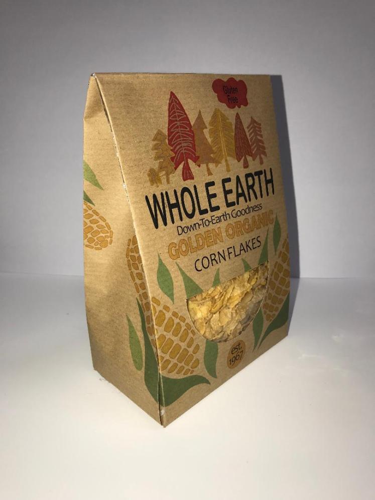
Whole Earth Logo:

Their logo involves several trees, this adds emphasis on the fact that they’re a very natural company, this also gives importance to the trees as they’re the main focus/viewpoint of the logo. The highlighted trees tell the audience that they are heavily related to nature. Their logo also involves a cloud, this gives the impression of delicateness and purity as clouds are very light and soft. As a consumer, after viewing this logo, I get the impression that this brand really wants to look after you and your well-being, they want their food to be delicious and enjoyable. The cloud also gives the logo a sense of movement, like the brand is flowing and ‘moving’, this movement gives the brand a sense of direction, a place to go forward- a goal to shoot for, that goal being a healthy lifestyle for everyone.
The logo is also very well balanced, there is a ‘triangle’ form, this gives the logo beauty as this triangle shape is very visually appealing, it further implies the fact that the brand is trying to strive forward/upwards. It’s balanced because it’s fairly symmetrical, the brand name also ‘underlines’ the trees, this, again, gives the trees importance; proving that the trees are a major part of their logo. The emotion portrayed through this logo is the sense of simplicity and purity, much like the cloud. You get this emotion through how the elements are related to one another, they have a very harmonised relationship, this makes me feel, as a consumer, very calm and relaxed, which I’m sure is what the brothers were trying to evoke.
I also like the fact that the trees in the logo barely have any detail, this further suggests how simple their brand is and how natural they’re trying to be. The use of negative space behind and in the trees make the trees stand out, it allows them to protrude from the page. This typeface is also extremely simple and basic. The brothers chose this typeface because it links with their brand, it’s very simplistic and easy to read. I’ve already explored the importance of an easy-to-read typeface in my previous unit, I stated how it makes your brand more inclusive as more of the population will be able to read it. By the company name being in capital letters it highlights that they’re almost ‘shouting’ their name, they want to be heard- they want to reach out to as much of the population as they physically can. This makes me feel empathetic to their company, it makes me, as a consumer, want to go and buy from them.
Whole Earth Slogan:
‘Down-To-Earth-Goodness’. Their slogan is very memorable and enduring, it relates well to their company and what their morals are. From their slogan you can infer what their company is and what they’re about, this is a good factor as everyone who reads the slogan will be able to understand what the company is. The use of colloquial language, ‘goodness’, makes the company seem genuine and friendly, it keeps a mild, casual tone throughout the company, without taking any professionalism away. As a consumer it makes me trust the company as the people who run it seem like friendly, everyday people. I also like the satire of ‘down to earth’, this is ironic because all their products are very natural and from the ‘earth’, they’re subliminally stating how none of there products are manufactured in labs, they’re all 100% made from mother nature. I like this because it gives an insight into their company without stating the obvious.
Whole Earth Colours:
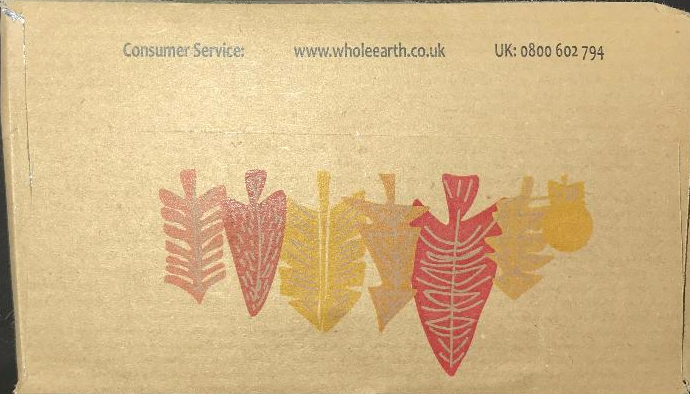
The colours of their logo are all, again, very natural. They mainly use greens throughout their ‘everyday logo’, the greens, as I’ve previously stated, heavily reflect and are influenced by nature. However on different products they use different colours to reflect that product, for example, on their organic cereal and maple syrup the logo is an orange colour, this is to give the product warmth and to reflect the warm colour of the syrup.

And for their ‘cocoa crunch’ the logo is a brown colour, this is to reflect the colour of cocoa. I really like this effect, in my opinion, it gives the brand a sense of character, it gives them individuality and differentiates them from other brands.
In a previous unit I completed (unit 5) I learnt about colours and how each colour can evoke and convey different emotions, this is where I learnt about the warmth of orange, and the peace of green. This is also why I find it fascinating when a brand change their colours depending on the product they’re selling, I think it is a great marketing strategy.
History of Packaging:
Many many years ago, food didn’t need to be packaged, this was because you would hunt down your own food then eat it right away- there was no need to package food, no need to preserve it. However as the years passed the need for food to be protected increased. This led to man creating containers, these containers were often made out of bamboo, shells or leaves. They contained the product for as long as they needed to, yet, they weren’t always reliable. More time passed and ores and chemicals were discovered, this led to packaging being made out of different metals. They also then discovered the art of pottery, so packaging was developing fast. This is when fabrics and certain types of paper were beginning to form. The main purpose of the packaging was to simply hold and protect the food it contained, there was no other functions the packaging had.
Around WW1 and the industrial revolution era there became a higher and higher demand for packaging. However it was expensive to produce, so only certain types of products were packaged, the ones seen as ‘luxury’. However, consumers then became more dependent on packaging as they saw it as a way of knowing what the food is going to be like. People in the retail industry started to notice this and they started to come up with innovative ways to try to contain this product, this included cardboard boxes and molded glass. Manufactures saw a trend, people started to buy more of the products that had detailed or ‘visually appealing’ packaging, so they started to produce packaging that had an identity, a different appearance that would entice customers to buy their product. This is when packaging had a new purpose, a purpose to try to sell the product. So now packaging needed to both contain the product, but also attempt to sell the product.
Before WW2 aluminium foil and plastic were invented, this then became heavily used in packaging as it was food safe and convenient. Consumers especially liked the packaging that you could use one time and then dispose of. This was the time period where people didn’t realise the effects of plastic on the environment, they didn’t realise just how much pollution it caused or how much waste it produced. So, many companies carried on using plastic in their packaging as this lightweight material was very appropriate and adaptable.
The late 20th century is when concerns about the environment began, people started to realise that certain materials used for packaging were negatively impacting the environment, and the search for new materials began. This is also the time when packaging needed to be ‘pretty’ and ‘different’, people bought from what they could see and not from what was inside. Packaging also started to become colourful and bright so people could easily know what was on the shelves from a distance. In addition, the rise of new technologies allowed manufacturers to really take a whole new approach to packaging, which is when packaging started to perform more functions than just protecting the contents, consumers wanted to find out what the packaging contained, what the ingredients in the food were and the health warnings about the product. So then packaging manufacturers began to adapt their designs and introduced informative labels onto all the packaging, this told consumers what they’re buying.
I decided to research how packaging has changed over time because I thought it would give me a better understand of how certain things need to change and adapt to the consumers needs as time goes on. I learnt that consumers are becoming more and more aware of the materials used within packaging and the ingredients used within food. By researching how packaging has changed it has inspired me to think of what consumers might need/want in the future, and I could try to implement these into my ideas so I’m ‘future ready’.
Analysing Packaging:
When analysing packaging there are many factors you need to take into account. Designers and manufacturers use a specific anagram ‘Accessfm’ to ensure they cover all bases of a good product and good packaging:
‘A’ in ACCESSFM is for aesthetics. Aesthetics relates to how the product is perceived to customers in the everyday world. In summary, its appearance. Aesthetics involves the form, shape, style, colours, images, illustrations etc.. on the product, the product needs to have an aesthetic or be aesthetically pleasing in order to get good sales. If the product involved dark, dreary colours, it’s more unlikely that the product will sell compared to a bright and uplifting one. Furthermore, as consumers in today’s society, we live off new and innovative products, we want something to look like it will benefit our lives, we want to be able to take away something from buying this product. So many people judge how good a product is going to be purely on the way it looks- so by including abstract shapes in packaging, or having a fascinating mechanism within the product, it will allow customers to be attracted to the product.
Aesthetics also relates to the finish and overall quality of the product. As a manufacturer you always need to question yourself throughout the design process if what you’re making is up to a very high standard of quality, if it’s not then this will affect sales. Many consumers buy from their eyes so the finish on a product/ packaging is important. Would you rather buy a product with a shiny, glossy finish, or a matte, dull one? The answer is very straight forward. Aesthetics also links to the reasoning and inspiration behind the design on a product. You can get inspiration from everything, your favourite artist or your favourite colour could inspire your product.
So when analysing a product/packaging, focus highly on the style and overall look of it. Question: why does it involve these colours? Why is it that shape? What inspired the product to look like this?
‘C’ in ACCESSFM is for cost. When in retail its very important that you’re making enough profit for the amount of effort you’re putting in. If the profit is too low then the price of the product will have to increase which could potentially lower the amount of sales you make as a company. So, to ensure you’re on track you need to critically analyse the cost of your product. Firstly, how much does it cost to make the product? How much does the packaging cost to produce? Is there a good relationship between the two? You need to forever question yourself in regards to cost because you need to be readily available to adapt and change to societies needs as prices for products are continuously changing.
Consumers would also pay a higher price if they know the product supports a good cause, such as andrex planting several trees for each one they cut down, or dairy milk and their fair-trade chocolate, which benefits farmers. This is because it will boost peoples morals as they feel as if they’re doing their bit for the environment/society. So you have to set the cost at an appropriate level in order to get the best possible sales.
‘C’ in ACCESSFM is for consumers/client/customer. Packaging is very important when thinking about your target audience. Is the product for children? If it is then, as a manufacturer, you need to be very aware of what is on the product/packaging, ensuring that there are no small parts that the child could injure themselves on. So how you package your product depends on the client you are making it for. For Whole Earth their clients are mainly middle aged people who are trying to start a healthy lifestyle by making small switches with-in their diets. So to mirror this with-in their products/packaging they need to ensure they have suitable images and colours on the packaging of the product. This is so they can reach out to and attempt to motivate those who need it.
You also need to think of clients needs, people want to buy products that are going to positively impact their life, otherwise it’s just going to be a waste. So by thinking of customers likes and dislikes it will allow you to open up your product to as much of the population as possible. When manufacturing a product you need to think about ergonomics and take into account anthropometric data. By researching the average body sizes it will allow you to make your product as suitable as possible, manufacturers make products fit for 90% of the population, (between the 5th and 95th percentile) this is so their product can be suitable for as many people as possible. However some manufacturers do try to cater for those with more needs, this makes them more inclusive as a company and it will therefore allow them to get more sales. For example, if you have a house phone and you want to make it more suitable for people with hearing impairments, the phone could flash a bright light when it is ringing, therefore they will know when its ringing.
When thinking about the client, you need to take into consideration social issues. You need to be respectful to all genders and religions. When packaging/advertising a product you need to ensure that you do not include any images or symbols that could potentially offend clients. For example, when advertising, if there were pictures of people, they will need to be moderately dressed so it will abide with certain religions, this is a way of including more of the population. Being respectful also makes customers want to buy from you as they will see that your company is trying to account for everyone.
So when producing products or packaging, ensure that you take into consideration your target audience, and try to be as inclusive as possible. I also learnt about being inclusive when researching Ogilvy in Unit 5, I applied this previous knowledge to my current unit as I talked about religions and genders. Also attempt to package your product so clients will want to buy it, make sure the packaging is relevant to the product and it reflects your company’s goals. In addition, keep in mind the percentile range in order to get the best sales for your product.
‘E’ in ACCESSFM is for the environment. How does your product affect the environment, does it negatively impact the landscape, animals, people? How harmful is your product to make, does it let out tonnes of air pollution? These are just some of the questions you need to ask yourself as a manufacturer. People are more likely going to buy your product if you take into consideration the environment, people want to protect the earth and one way consumers feel like they’re helping is if they buy eco-friendly products.
Producing packaging such as plastic effects the environment because it involves the use of finite and non-renewable materials such as crude oil. Crude oil is becoming significantly low and if we do not act upon attempting to preserve this special material then there isn’t going to be any left for future generations. Furthermore, the processes used to turn crude oil into fractions, which we can use to make plastic, emits a lot of air pollution, this involves the emission of carbon dioxide which contributes to global warming. Additionally, processes such as plastic forming uses energy, this energy is from fossil fuels, which, again, are limited and finite. The development of renewable energy, however, is becoming more apparent in today’s society, which will lead to a more efficient and eco-friendly future.
The environment is a major part of manufacturing a product. Every step you take in the making process you always need to have the environment in mind. Question yourself if there is a more environmentally friendly way you could be doing what you’re doing, or if there is anyway you could give something positive back to the environment. We live in a society where we are becoming more and more aware of global warming and the future. Everyday, we as a species are trying to come up with new ways to protect and preserve the environment. An example of this is sustainable forestry, this is when there’s a designated area specifically made for growing trees, there’s loads of trees and they’re all in different periods of their life-cycle. So when the matured trees are cut down, trees are replanted, this is a continuous process, that does take many years, but equally it is very beneficial to the environment.
Another way you can help the environment is by the ‘6 R’s’. These include reduce, re-use, recycle, repair, rethink, refuse.
Firstly, reduce. This is referring to the amount of packaging you use. As a manufacturer it’s important that you think of innovative ways to reduce the amount of packaging involved within a product, this allows customers to feel like they’re doing ‘their bit’ for the environment. It also reduces the amount of waste that would go to land fill, therefore benefiting the environment as there would be less litter. By reducing the amount of packaging used this will protect future generations, which will provide a happier and healthier lifestyle for those in the future. Not only is it about reducing the amount of packaging, but it’s also about attempting to reduce the amount of pollution produced when manufacturing the products. This can be done by using recyclable materials, and producing packaging that involves paper rather than plastic.
Re-use is a very efficient way of helping the environment. By reusing items such as plastic bags it means that, again, there will be less wasted materials in landfill. It will also reduce the amount of litter on the floor because people will be reusing the items instead of disposing them after the first time they use them. Re-using packaging also reduces the amount of new packaging being produced- this will, in turn, reduce the amount of pollution being produced. Some examples of reusing packaging is returning old printer cartridges so they could be refilled. The only issue with reusing packaging is that a lot of money is spent in cleaning the materials and a lot of pollution is produced whilst transporting the items.
Recycle is a very well known ‘R’. People are most familiar with recycling and it is very simple to do. Recycling refers to packaging, it means when the packaging is reused again and again or it is turned into something else. For example, may plastic drinks bottles have been recycled. Many plastics can be recycled it’s just people do not realise this and throw the plastic in the regular waste bin rather than recycling. By recycling materials it ensures that no more finite resources are being used up, this allows there to be enough materials left for future generations, so recycling is a sustainable solution to managing waste. A way everyday people could help the environment is by using recycled paper, this paper is not bleached white- but it is definitely more environmentally friendly.
Repair. Repair isn’t as common as the previous ‘R’s’ but it’s still as important. Repair links to products, it means when something breaks, for example a strap on a shirt, instead of buying a new shirt you would just fix the old one. This reduces the amount of wasted materials and it also lowers the demand for new products to be made, meaning fewer new materials will be used in the making of a new shirt. This affects the environment because less wasted materials that could’ve easily of been fixed will go to landfill. Certain materials are not biodegradable- meaning they would stay in landfill for hundreds of years. The downsides to ‘repair’ is that sometimes it’s cheaper to buy a new item instead of trying to repair the old one, for example a washing machine, in addition, many products, such as phones, have something called planned obsolescence, meaning they were made to eventually become faulty in a way to increase sales. If a manufacturer was to produce an item that would never break then there’s no way they are going to get as many possible sales compared to a company where their products do break. This planned obsolescence is very harmful for the environment as it encourages consumers to buy more products.
Rethink. Rethinking is referring to manufacturers and consumers. Rethinking is challenging them to stop and think outside the box, to think if there are any new ways of creating products and packaging that are more environmentally friendly. It also challenges consumers to think how and what they could do to stop the amount of packaging being used. Rethinking should make us question our current lifestyles and what we’re doing to the environment.
Lastly is refuse. Mainly aimed towards the consumers. Refuse is when we as customers should only buy something if its eco-friendly, we should refuse to buy products with unnecessary amounts of packaging as this is extremely wasteful. If the whole community came together and refused to buy these specific products then the manufacturers would soon realise that they’re doing something wrong and they need to ‘rethink’ their current situation. Refusing these items would mean that less packaging will be thrown into landfill, which, again, helps the environment.
The ‘S’ in ACCESSFM relates to size. Coming hand-in-hand with consumers, ‘size’ relates to anthropometric data. Is the product an appropriate size compared to other, similar products? Is the product suitable for your target audience? Is there a gap in the market that your product would fit nicely into? This also correlates with dimensions of the product.
The ‘S’ in ACCESSFM is about safety. There are a lot of considerations you need to take into account when talking about safety within a product. To ensure you think about each safety requirement I think it’s very beneficial to write a risk assessment for each potential safety hazard. This way you can understand how to prevent these hazards and what you should do in-case these hazards occur. On packaging safety hazards should be clearly displayed in order to inform others. You need to think about your client audience, and ensure that the product is relevant to them. For example, there should not be any sharp parts on the product if your product was aimed for children.
Safety also relates to the workers. When in factories safety checks should always be performed to ensure that the workers have a safe and fair environment to work in. Workers should have regular breaks, and they should be paid a sufficient wage. There should always be open fire exits and workers should never be locked in.
The ‘f’ in ACCESSFM links to function. This relates to the product itself. How does the product work? Does it do what it’s meant to do? Is it easy to use? Are there any other uses for the product besides it’s intended use? As a manufacturer you need to question yourself these when creating your product. A product with multiple uses is more beneficial to consumers. When questioning the function of a product it also opens you up to new opportunities, it allows you to think of more possibilities for the product. This is a way of making new innovative products and it’s a way to solve current issues within society by making a new product that will benefit customers.
The ‘m’ in ACCESSFM is for materials. Different materials have different purposes and different effects on the environment:
Glass: Glass is made by melting several minerals (main material being sand) at high temperatures (1700’C). A lot of energy is required due to the high temperatures, therefore there is quite a high harmful effect on the environment as this high energy used in factories gives out a lot of air pollution. However, glass is a sustainable material due to the vast amount of sand on Earth.
Plastic: Plastic comes from different fractions of crude oil, as I’ve previously stated, crude oil is not a sustainable material as crude oil is a finite resource. This negatively impacts the environment. Furthermore, plastic is becoming increasingly frowned upon due to the amount of litter and wastage. On the plus side, plastics are starting to become recyclable which is beneficial to future generations.
Aluminium: Aluminium foil is highly used throughout packaging, mainly food packaging, due to it’s lightweight, strong, hygienic properties. Aluminium foil is also recyclable which is helpful for the environment. However, to get the foil we need to extract ores from underground in order to get the metal, this causes significant noise and air pollution, and it also disrupts the natural landscape of the Earth.
Paper and Card: Paper and card come from trees, the logging of the trees is not good for the environment, however, humans have come up with a strategy called sustainable forestry which is very eco-friendly. Card can become a composite material which is suitable for various types of packaging, for example, carton board for juice boxes.
ACCESSFM taught me how to think about new and efficient ways to help the environment so the upcoming generations can have a sustainable future. It also taught me that I need to take into consideration all genders and religions and ensure I do not offend anyone, by doing this my packaging will be able to reach out to as much of the population as possible. Now I have learnt about ACCESSFM I am going to go onto learning about the functions of packaging.
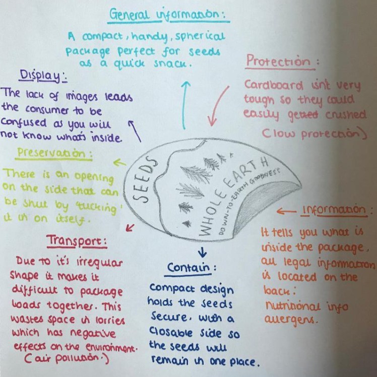
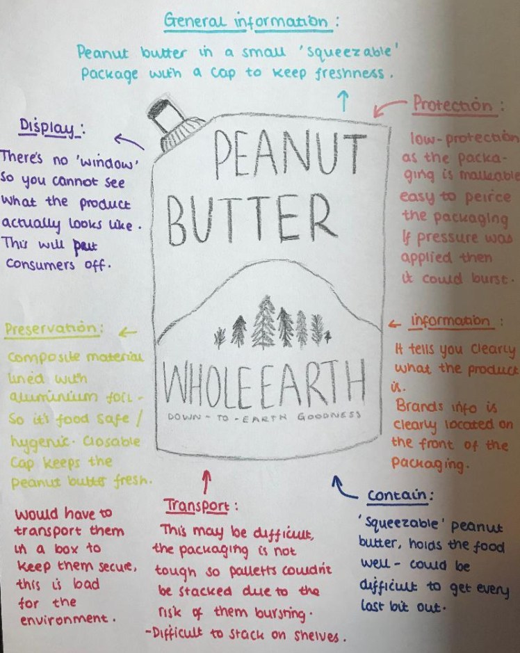
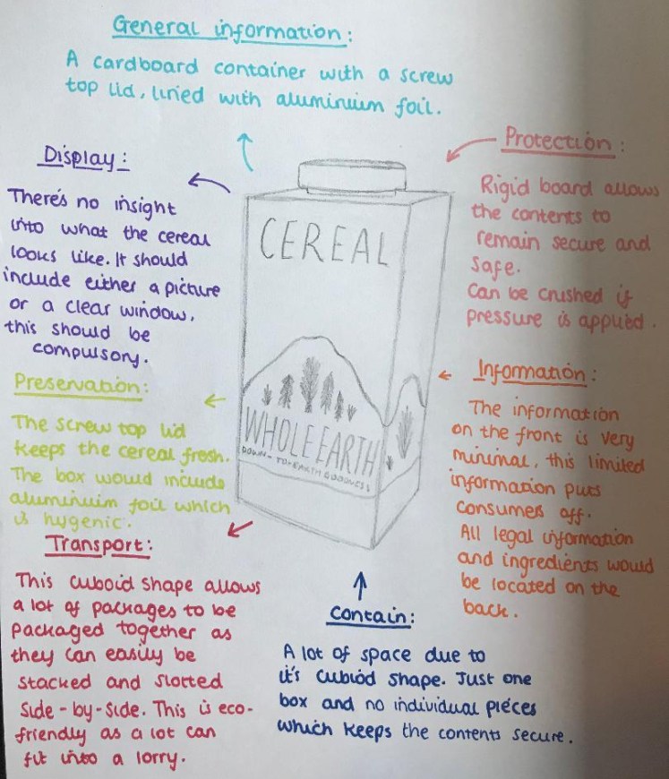
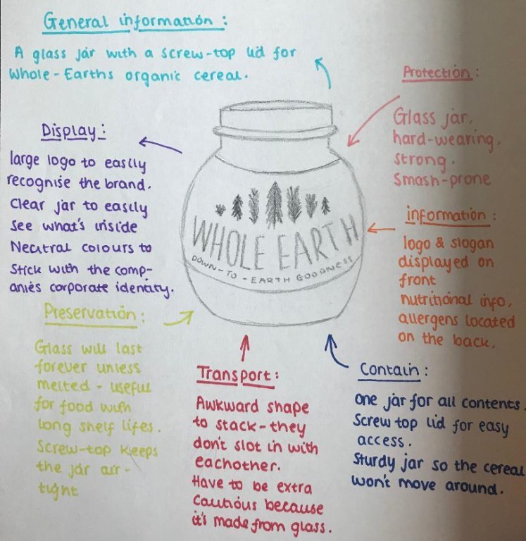
Functions of Packaging:
Packaging has come a long way. As times have changed, consumers have become more and more demanding for what they want packaging to portray. Designers have created a ‘pictpd’ acronym in order to organise the main functions of packaging.
Firstly is ‘Protect’. The packaging of a product must protect the contents, if the packaging does not protect what is inside then it hasn’t been designed well at all. Protection can come from different materials used within the package, for example, polystyrene is commonly used in packaging due to its properties of being tough and impact resistant, yet it’s also very lightweight making it an appropriate material.
Secondly is ‘Inform’. Packaging must contain specific information in order for it to be sold. The packaging must inform the customer of what is inside the package, how to use the product, any safety hazards, nutritional information, ingredients, allergens etc.. This is so the consumer can buy the product with confidence, so they know what they’re getting. It’s also very beneficial to have an image of the contents on the packaging or a clear ‘window’ so you can see what is inside. This is so there’s no false selling on the product.
Then it’s ‘Contain’. Packaging must contain the product, you cannot sell a board game with all the pieces separately- it just wouldn’t work. So a very important value of packaging is for it to contain and hold all pieces of the product. For example, small plastic bags and small cardboard boxes are used within flat packed furniture in order to keep all the screws etc.. in place.
The ‘t’ is for ‘Transport’. When designing packaging you must consider how the product is going to be transported from place to place. The product should be easy to stack to save room in storage and on the shelves, the material also needs to be tough to withstand this stacking. If your product is a sphere then it’s going to be harder to transport, you will also be able to fit less circular packages than cube packages on a pallet, so the design of your packaging will affect how many times it would take a lorry to transport your package, the less you can fit in a space the less environmentally friendly it is as the lorries would cause more air pollution. So consider how the item will be transported.
The second ‘p’ is for ‘Preservation’, especially with food. It’s very important that the food is kept in a sanitary condition, the food has to be bacteria free and in a safe, clean environment. In packaging there are many materials that are food-safe such as aluminium foil. The food also needs to be kept from deterioration from oxygen, so many food packages are airtight, such as jars and tin cans, this allows the food to stay fresh. For food packaging many composite materials are used (such as foil and card), again as means of keeping the food fresh.
Lastly, ‘d’ for ‘Display’. Display, along with all the others, is very important within packaging. The packaging needs to entice customers, it needs to draw people in. When on the shelves it needs to be visually appealing and recognisable from a-far. Many companies also pay shops extra to be in the ‘eye point of view’ on the shelf, meaning that their products will be at the eye-line of most customers who shop at that store, this means that the products are more likely going to sell compared to if they were on the bottom shelf.
So ‘pictpd’ involves all the important values that make packaging efficient. I researched pictpd because when creating my packaging I want to ensure that I hold all of these attributes in order to make my packaging as consumer-ready as it can be.
Labelling:
It is very important to put specific information on your packaging. You need to specify everything that the customer may want to know. So I’m going to research what symbols and information needs to be on a package so then I can apply this to my own design.
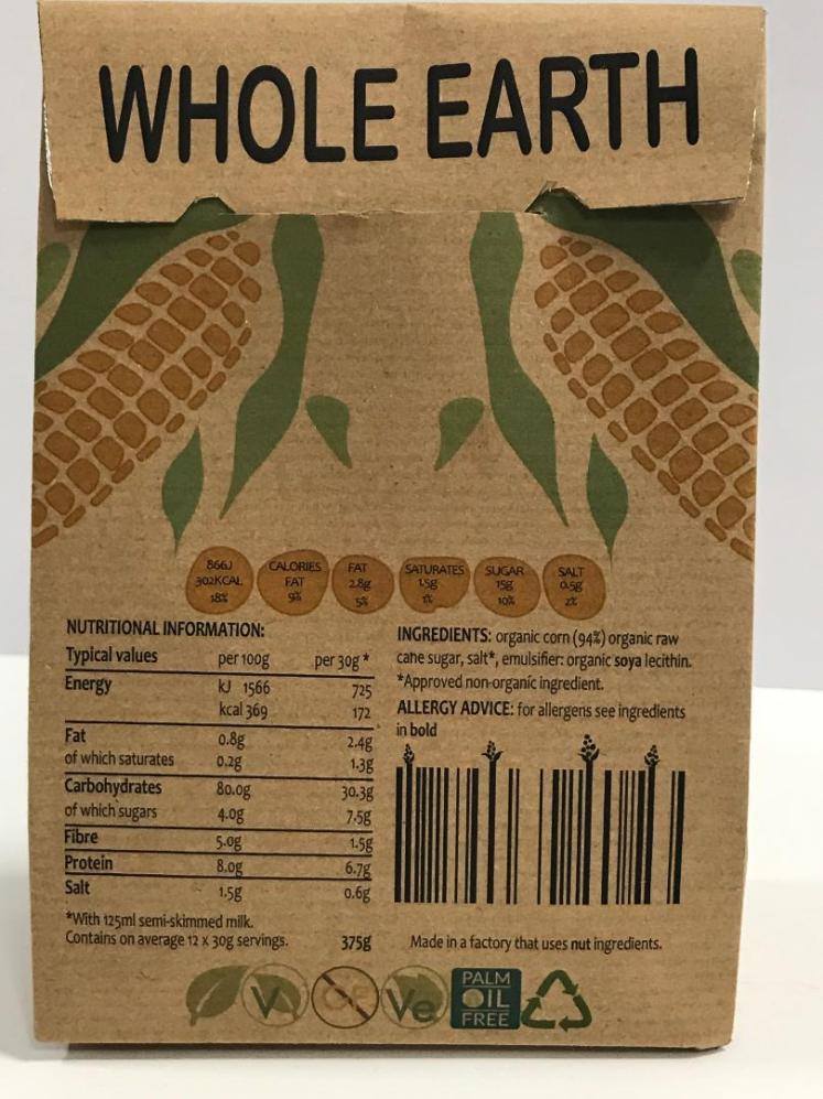
Whole Earth Symbols:
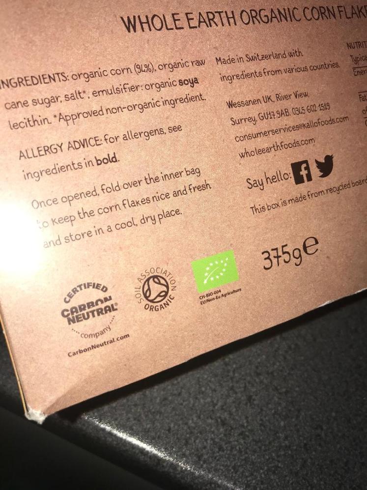
On the back of existing Whole Earth Packages are these symbols:
Carbon Neutral Company- 
This company helps other brands to become more environmentally friendly by working with them so they can lower their carbon emissions, in a way to help reduce global warming. They only partner up with companies who already strive for a better lifestyle for the community and those who help the environment in the process.
Soil Association-

They’re a charity who partner up with brands in order to spread awareness of their message, that message being that we need to protect our natural world and help the animals live a healthy and happy life. Whole Earth also wants to portray this message, hence their partnership.
Non EU Agriculture-
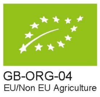
This logo proves that the contents has come from an organic farm, and none of the produce have any additives or harsh chemicals. This is especially good for Whole Earth as they promote organic, healthy, nutritious food.
On packaging it is also vital that you display the ingredients, nutritional information and most importantly, allergy advice. This is to inform the consumer on what the product contains, which is very important as different people may have different reactions to different foods. In order to get this information I bought some of Whole Earths cereal, so I could really study the information on it.

Companies like Whole Earth:
1)
2)
3)
4)
5)
6)
7)
8)
I decided to go to a local store ( TK Maxx ) and take some photos of different types of packaging; I thought I should get some inspiration for different ways an item can be packaged. I decided to take photos of the most ‘natural’ packaging ideas I could find, this was so it was relevant to the client that I chose.
From my primary research I found out that the natural products mainly consisted of packaging involving colours such as green or brown. Some of the packaging, however, didn’t include and colour, it was just an unbleached/unworked box, I believe this is very effective as it highlights that they’re trying to be beneficial for the environment, which I believe is a very important factor of a good packaging design.
My Opinion on this Packaging:
1) I like this packaging because of the simple design, the flowers give the product a sense of familiarity as we can relate flowers to something very delicate and it allows us to infer that the product inside is going to be gentle and beautifully scented. Furthermore I like the contrast between the brown packaging and the black flowers, this highlights the flowers, it makes them stand out. As a consumer my eyes would be drawn to the product, making me want to buy it as I get heavily influenced by the connotations of flowers. In addition, I like the fact that there are little ‘windows’ in the packaging, this allows me to know, as a customer, what is inside the package, and to know what I am buying.
3) In my opinion, the yellow colour of the packaging is extremely effective, I relate the colour yellow to images of the sun, health and warmth, by making a package yellow it intrigues me as it uplifts my mood. As a consumer I would want to buy this product as I feel as if the yellow box is a representation of the ‘healthy’ snack inside, it makes me feel better about buying the product and eating the product as I believe it is a healthy option, all from the colour yellow. I also like the simplicity of the box, there’s nothing confusing about it as the design is very straight forward. Even though the box is an abstract shape, it is still simplistic- this is a good design as the box is intriguing for the consumer but it’s also not off putting as it’s similar to what we’ve seen before.
6) Similar to number 3, the green packaging is really effective, green is a major colour you associate with nature, green grass, green leaves etc… so when packaging is green you instantly associated it with nature. The product inside involves a variety of beans and seeds, so the packaging reflects the product inside. I also like the fact that there are cutouts within the packaging, again this is similar to number 1 with the windows.
I feel as if there are reoccurring features within all the photos of the packaging I have taken, they mainly all involves bold writing in a easy-to-read font, cut outs/windows so you can see what is inside the package, natural/bright colours that reflect nature and abstract yet simplistic box ‘shapes’. So by conducting some primary research of taking photos of different products, it has allowed me to see what motifs occur throughout natural packaging designs and what I should involve when thinking of ideas for my innovative packaging. I used this form of primary research because I believe that it’s easier to get an understanding of packaging when you actually see it in real life, you can then see specific dimensions and styles, when viewing images of packaging online I don’t believe you can get the best possible understanding of that design as you’re just seeing a 2D image. To further my knowledge on packaging I should dismantle packages to see them in their 2D form (nets).
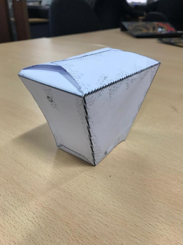
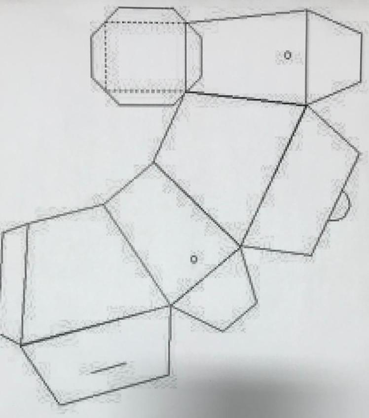
I decided to print out a net of a food box, I done this so I could see the size of the packaging and how the nets come together to create a piece. I printed it out on an A3 sheet of paper, and the box came out really small. I now know that when I design my packaging, I should spread it over multiple A3’s or on an A2 sheet.
Artist Research:
I’ve decided to research this minimalist artist because I feel like it will help me when I come to design new packaging for Whole Earth. I want to keep the packaging simple and easy to use but I also what it to be interesting and enduring. I chose to research minimalism because the pieces created are simple but they’re also interesting, just like how I want my packaging to be. In a previous unit I’ve researched all about minimalism, so I have some background knowledge on the subject including the theories behind it.
Sol Lewitt:
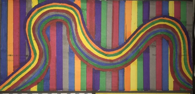
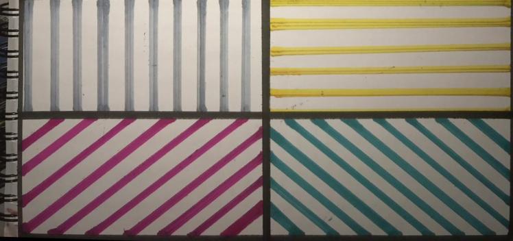
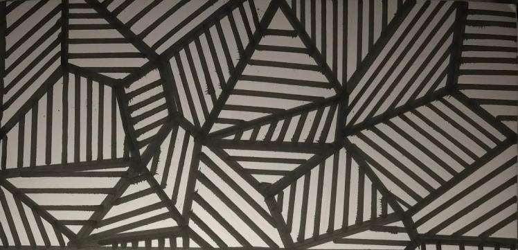
Sol Lewitt was born in 1928 and died in 2007. His artwork challenged the norm and his work involved: drawings, paintings, photography and structures. His artwork often involved lines and geometric shapes, these lines often creating illusions. Some famous pieces include ‘the location of a square’, and ‘straight lines’. I chose to recreate some of Lewitt’s work because I feel like it will aid my understanding of minimalism, and it will inspire me to perhaps portray minimalism within my packaging.
Initial Ideas:


Once I annotated each of my initial designs I conducted some primary research and asked my classmates which design was their favourite. I asked my peers because they could be potential clients. I then chose to develop the two designs that were the most popular.
Two Most Popular Designs:
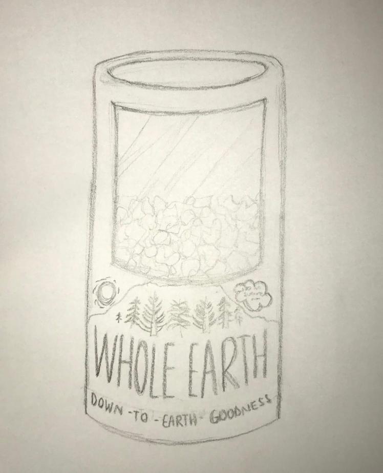
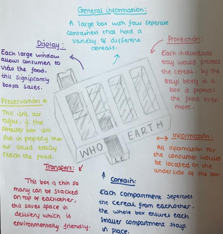
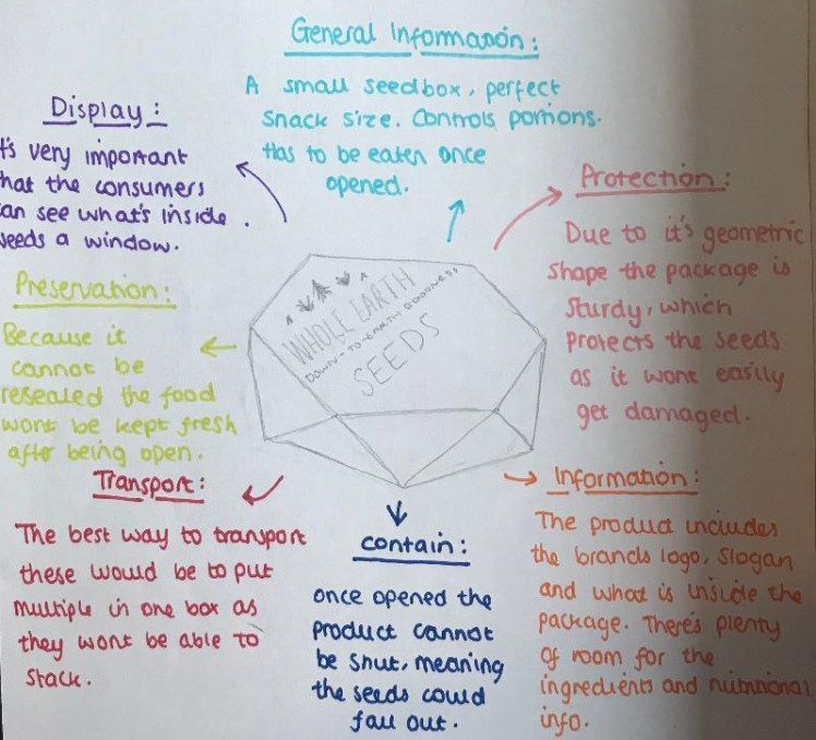
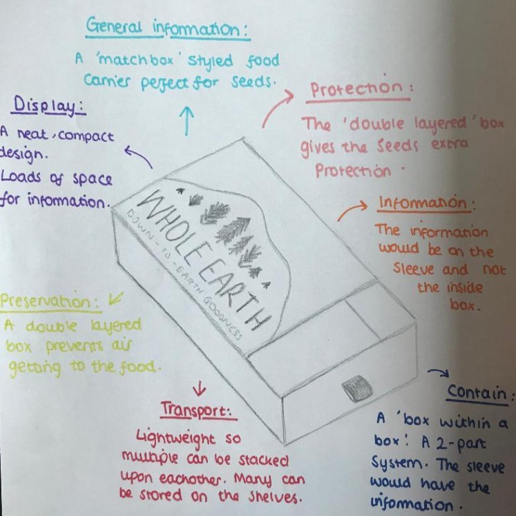
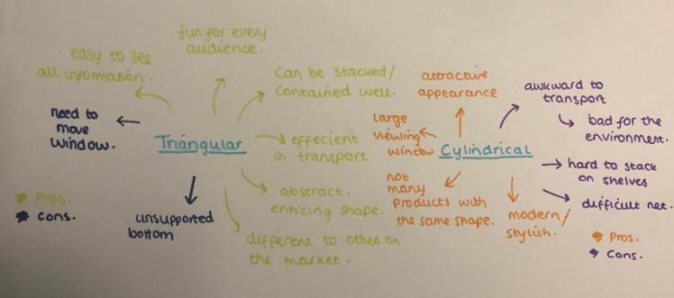
I decided to chose this design as one of my developed designs because it was one of the favourites. There’s also a lot I like about this design. Firstly, the cylindrical shape is different to any cereal packages out there, meaning there is a gap in the market for this design. Furthermore the cylindrical shape gives the package character, it conveys to the consumers that the brand is something different, this implies that the cereal is also different to those already on the market; which is true because Whole Earth cereal is gluten free and organic.
I also like the fact that the package includes a large ‘viewing window’, I feel like this is really important in a packaging design because it allows the customer to see whats inside, enticing them to buy the product when they can see how delicious the cereal looks. It’s also vital that there’s a way the consumer can see/know what’s inside. Some of my initial packaging designs didn’t have any images or ‘windows’ included, so I like this design because of the window attribute.
On this design there is enough space for the logo and slogan to easily be displayed, and for the text to be large enough to be read from a far. I chose this design over others because on some of the designs the writing would of have to been squashed which wouldn’t make it legible or appropriate for all audiences.
However there are some downfalls to this design. This includes, when many of the packages need to be transported from one location to another, when stacked in a pallet there will be small gaps between each package. These small gaps means that less would be able to fit in one space compared to a regular box which wouldn’t create any gaps, this would then lead to more lorries being used to transport more products which would produce more carbon emissions which are harmful for the environment. Another negative feature about this design is that they would be hard to stack due to its small surface area, this means it is harder for shops to display the items, so certain shops may be put off by this and they may not want to sell the item.
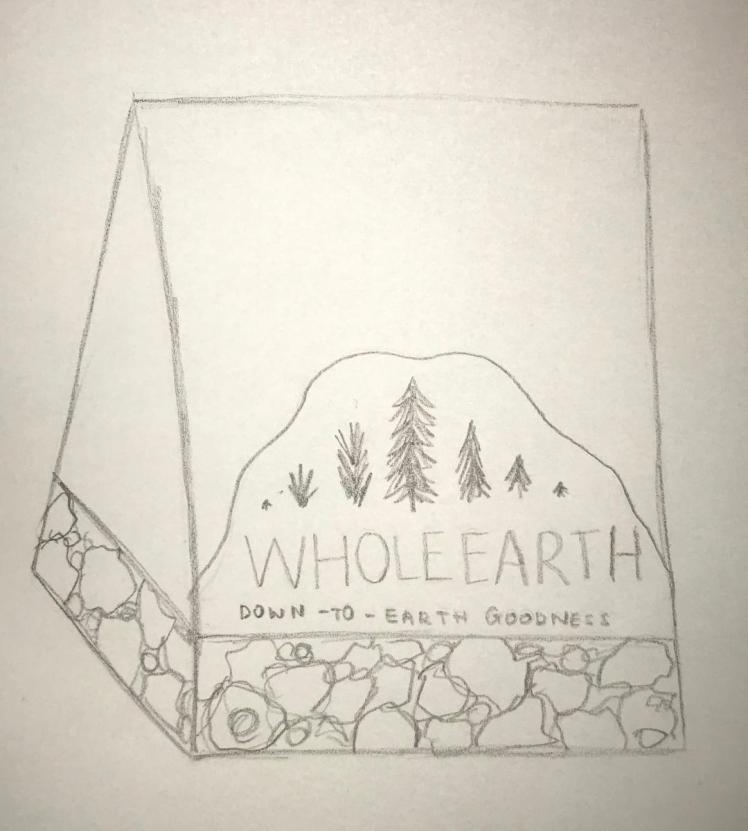
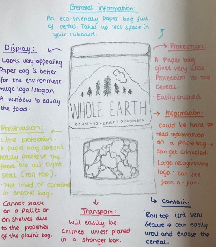
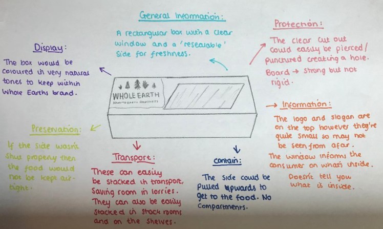
This design is another one of my peers favourites. I decided to develop this design because I felt it included attributes of good packaging. This includes a section where you can actually see the cereal, which, like I previously stated, is very important for the customers. Additionally, I really like the aesthetic of the triangular shape. I believe it looks really appealing, especially for cereal because it isn’t your regular rectangular box. This would also intrigue customers as it pushes the boundaries of what food can be. Conveying Whole Earths message as they’re always trying to find new ways to change the norm.
This design allows easy transportation as the packages can be interlocked with each-other by turning the second one upside down and stacking them alternately. This is beneficial for the environment as lorries would need to do less runs to transport the packages from place to place because there would be no gaps between each product in the pallet. There is also a large front area where you could fit all the required information on and the companies logo and slogan.
The only issue would be that if I were to have the clear acetate window around the whole bottom side of the package this would lead to it being unstable and not very strong. Packaging needs to be durable and tough and this design doesn’t include either of those properties. When I go to develop this design further I need to rethink where I am going to position the window so it doesn’t affect the overall strength of the package.
Now I have chosen my two designs I am going to develop them further and then chose one of the two to create into a final piece.
Developed Designs:
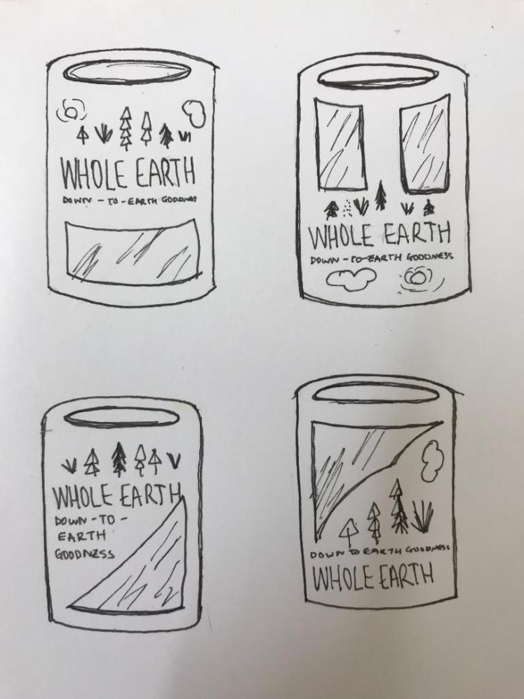

For the cylindrical shape design I drew out different options of where the window could go, this was just to see which would look the best. I also experimented by colouring each design in a slightly different brown to see which shade was the most appropriate.

Firstly I wanted to experiment with different designs and how I could use different illustrations to change how the product looks. I experimented with different cloud designs and ‘wheat’ designs. Until I realised that the main ingredient in cornflakes was corn and not wheat, so I disregarded all these designs and I carried on developing them.


To get a better understanding on Whole Earth I decided to conduct some primary research and find Whole Earth products in supermarkets, I took photos of existing products so I could see motifs throughout the products. I saw a trend of natural colours being used so I will ensure to keep these trends throughout my product.
I then weighed out the pros and cons of each design to help me come up with a decision. I decided to go forward with the triangular design as there were more pros.
I then produced some nets of my developed design.
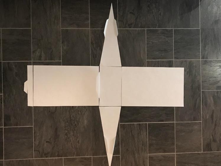
I then came to terms that this shape isn’t going to work as you wouldn’t be able to open the top of the package, however I still wanted to keep this design, so I carried on thinking and I thought about corrugating the sides.

I then realised that this design, again, isn’t going to work, so then I decided to have inverted sides. That way you will be able to open the top of the package and it still has my ‘triangle’ design.
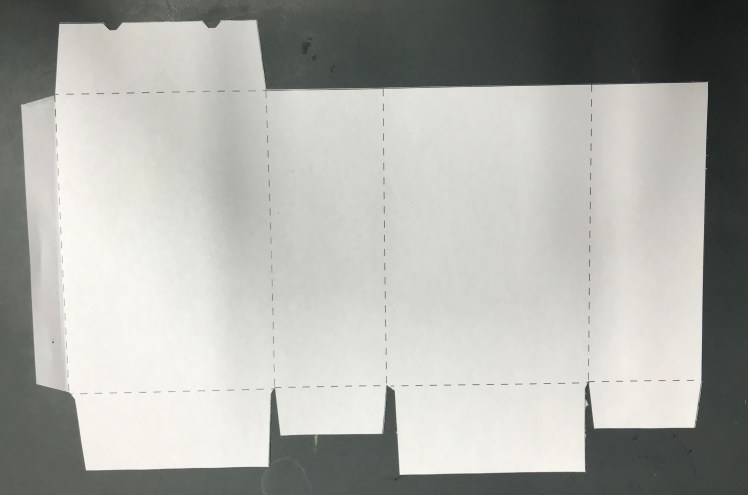


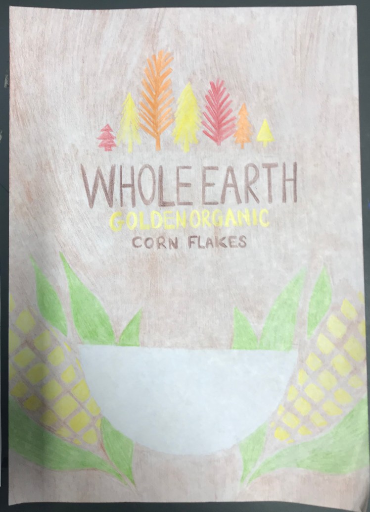
I then produced my final ‘front cover’ of my design:
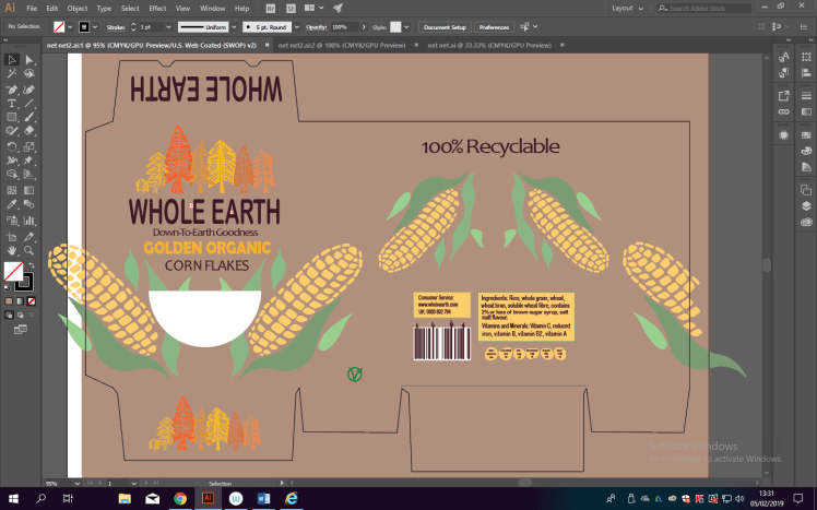
I then played around with this design on illustrator:
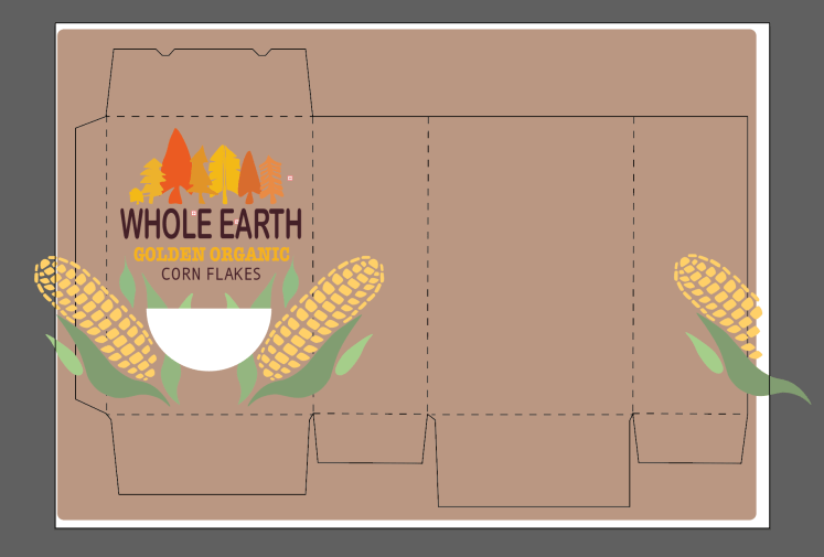
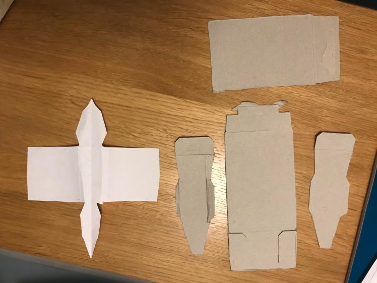
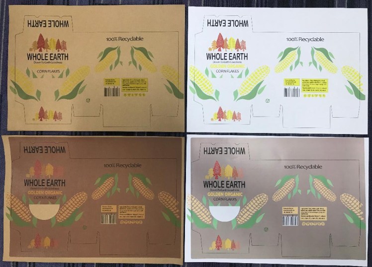
I printed off multiple different nets to see which one looked the best when assembled.


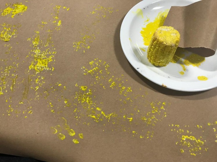
I also wanted to see what different effects I could get so I printed on various different pieces of paper, including card, printing paper, recycled paper. I also tried a different printing method of rolling a piece of corn on paper, however, despite my efforts, this attempt didn’t work and I had to disregard it.
Final Piece:

Evaluation:
Throughout this whole unit I have used a mixture of primary and secondary research sources. Firstly, I involved primary research when going to different shops like ASDA and TkMaxx and taking photos of their stock, this was to get inspiration from different, yet similar packaging designs. I thought that if I were to see different ways food can be packaged in the real world then it would give me a better understanding on how I need to appropriately package mine. Which I did, I learnt all about how a product is stacked on shelves, and how the design of a package can majorly influence how many people would take a second look and actually buy that product.
Another way I used primary research was by asking my classmates, after drawing out all my initial designs, which design was their favourite. I asked several people in order to be as least bias as possible. In one of my previous units (unit 2), I learnt about how being bias whilst making a decision can negatively impact the market as it’s what you would find easiest to produce rather than what would be best for the customers. As I’ve also learnt in a previous unit, you need to always do what would be best for the customers; you put them first.
So I believe my choice of conducting primary research helped this unit as it allowed me to learn what would be best for the market, I learnt this because of the questionnaire I conducted. The only downfall with my questionnaire is that people could’ve randomly of chosen a favourite without actually putting thought into their answer, this would then give me inaccurate results as the one they chose wouldn’t of necessarily of been appropriate. To improve upon my primary research, I could ask people of different ages what their favourite design was, this would then allow me to see if there are any trends between the packaging designs and ages.
For secondary research, I used a mixture of the internet and books. For most of my research I used the internet as a source of information. This is due to it being easy and straightforward to use, so it is very time efficient, and it’s reliability. I ensured to use trusted websites, like companies actual pages rather than a Wikipedia page, as this would give me the most honest and reliable facts, as it’s coming straight from that company themselves. When conducting secondary research on the internet I always ensured that the website was up-to-date with correct facts and figures, rather than an out-dated website. That’s an advantage of using the internet, because websites get regularly updated, rather than books that can become out-dated fast.
Despite the fact that books can become outdated- I also gathered some information from a product design book I had. From the book, it allowed me to understand the properties of different materials and which materials would be best used for packaging. The book was published recently so I know that the information I was collecting was accurate. The book was also produced by a well known company (CGP) so it is a reliable source as CGP are a trusted company.
I think I used a good balance between primary and secondary research sources. Questionnaires, photos, the internet and books all helped me and inspired me to create the package that I did. So I am happy with my choice of research sources. However next time I may use YouTube as a way of watching videos about the subject, just another way I will efficiently be able to collect information.
I believe that only some of my initial designs were suitable to be manufactured. When creating my initial deigns I believe I focused more on the aesthetic and appearance of the product, rather than it’s performance. Many of my designs didn’t include an image or a window on the design. These then wouldn’t be able to become a real product as it is essential the consumer has a way of seeing inside the package. Not only that, but some designs would’ve had to of be packaged again, in a separate box, in order to ensure the product would be kept safe during transport, this is harmful for the environment as most materials would be used on packaging which would eventually be left in landfill.
However, I do think that my designs were all drawn well, I made them 3D and I drew them in an angled way so you could see how the product would actually look. In my opinion, I produced a significant amount of initial designs, all of which were heavily annotated. These annotations were a crucial step as they allowed me to really dig deep into each design so I could weigh out the pros and cons for each. I didn’t colour my initial designs, in the future I could just colour a section of each design so then other people would be able to see the designs full potential, and it will allow them to understand the design more.
I did take quite a lot of time producing my initial designs, in the future I could be less precise with each design, and just quickly produce several small sketches to brainstorm and to get the ideas out of my head. Compared to my previous design work in different units, I believe my drawings have improved as I learnt how to draw from different perspectives, which gives the designs a more attractive appearance.
For this unit, we only had to repackage a product, rather than change the brands corporate identity. So in this case I kept all of the typefaces the same as the existing product. By keeping the typefaces the same it allows people to still be able to recognise the product, if you were to change the packaging as well as the fonts then people will think that it’s just a new brand completely, which isn’t a good thing.
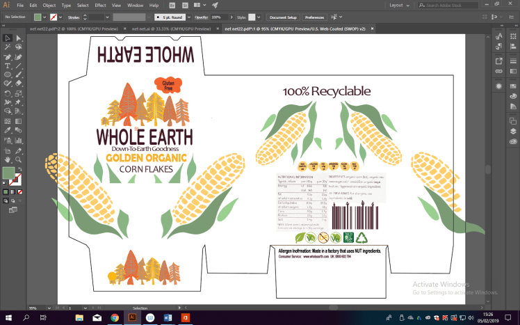
For all of the nutritional information and ingredients on the back I used the same typeface. I made the subtitles one size larger than the rest of the writing, this was so it was easier to see what was what at a glance. I also put the allergens in bold so they are easily view-able for the consumers. I did print out one design on card before realising I had made a spelling mistake. So, unfortunately, I had to disregard that piece and alter my work so it was correct.
To begin with all the information on the back wasn’t aligned and was slightly off centered, the leading changed throughout the writing and overall it wasn’t visually appealing. I was advised to perfectly align the writing to make it more pleasurable for the consumers. To do this I used grids on illustrator to ensure that all the lines matched and that the writing was positioned equally from either side of the back. After this was done it changed the overall product and made it look very professional.
On my blog each photo I imported is very large, especially my design work, this is so it’s easy to see and so my annotations are legible. I feel as if the presentation of my blog is professional as you can see how my designs have changed and adapted throughout my blog, everything’s done in chronological order. I feel like presentation is very important as it reflects how you are as a person, it also would make people want to come back to your website again, as they had such a pleasant experience the first time.
I do believe my final piece is suitable for my target audience. My target audience was initially middle aged people who wanted to become healthier. However as time went on my product changed and now I feel as if it’s suitable for a wide range of audiences. Due to the shape of my product, children will find this fun which could encourage them to eat the cereal, this would get more parents buying the cereal as they think their children would enjoy it. Furthermore, the style and colours used within my packaging would also entice the older generation who care about the environment and who want to make a difference to the world to buy my product.
I am confident that I met the criteria for this unit, I followed the brief but I also expanded out by conducting primary research. Throughout this unit I have tried to explain aspects like ‘ACCESSFM’ and ‘Pictpd’ in simple terminology, I want people of all ages and intellectual levels to be able to understand my blog and what I talk about. I do attempt to keep my language professional and I try to use technical terms when I can, however I do steer away from using unnecessarily large technical words so people who do not study graphic design will still be able to understand.
Throughout this unit I have taken care in ensuring that I do not offend anyone. This is by taking into consideration all ages, races, religions and genders. I do not want to limit my product to just one group of people. I feel as if Whole Earth as a brand are already very inclusive. As I’ve learnt from a previous unit, it is very important that you try to be as inclusive as possible to reach out to as much of the population as you can. So I stuck with very natural colours so no one would get offended by my choice of colours.
Throughout this unit I have used many different types of media, the main two being illustrator and sketching. However I also dabbled across different printing methods, I just wanted to experience different ways in which something could be produced. After realising the ‘corn’ printing method wasn’t going to work, I resorted back to illustrator.
I decided to initially draw my designs on paper because I feel like it’s an easy way of expressing my thoughts, it also allows me to change ideas and develop them, however this can be quite time consuming because I would need to draw out the whole design again. Another time consuming process was drawing and using colouring pencils to colour in my final ‘front cover’ design, the outcome also wasn’t what I was expecting as you could see the strokes of the pencil.
I enjoy using illustrator as a type of media because it’s very quick and simple to change between different colours and sizes of images. You do not need to re-draw the whole design to just change one small thing. It is very time efficient which is beneficial when you have a large unit to complete. I also feel as if illustrator gives you the most professional outcome, which is what I want for my designs.
To expand my horizons I could’ve used different medias like paint and photoshop. I didn’t use these because I thought paint would be extremely difficult to use as the work I was producing was small and intricate and I am also not very confident when it comes to photoshop. To improve I need to practice using photoshop. This would also give my designs more variety and I could produce final outcomes in each media.
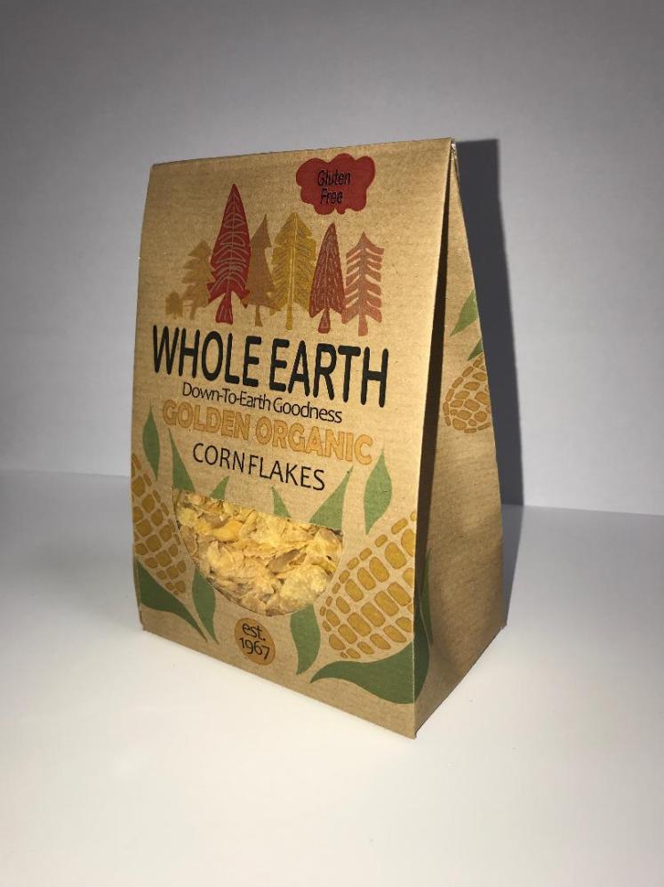
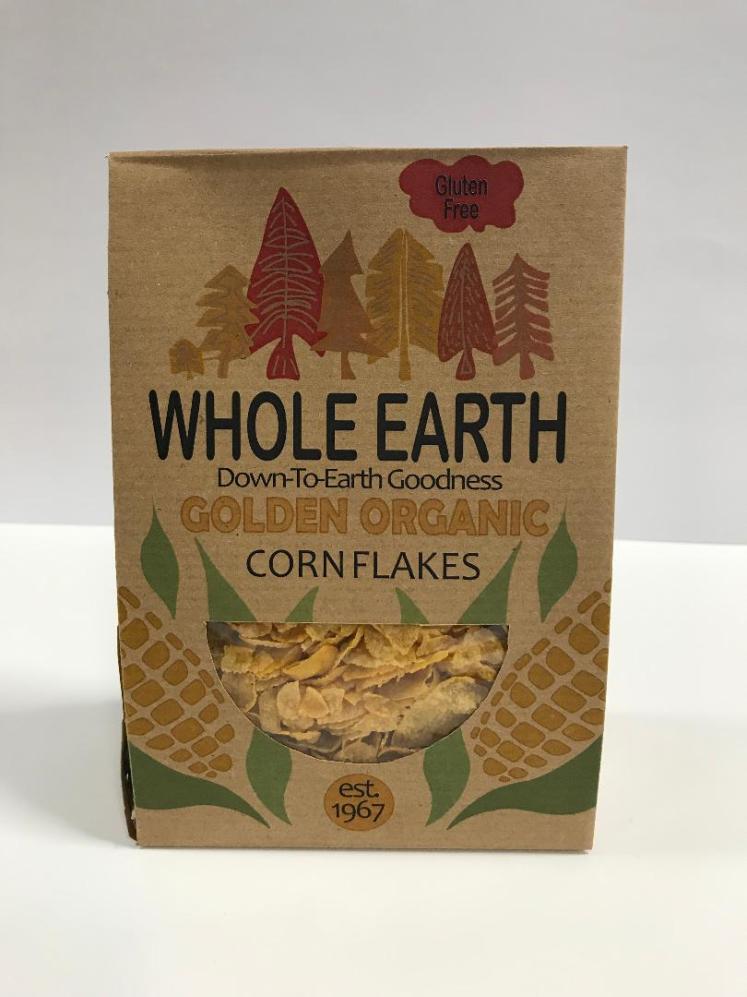
Overall I am happy with my final piece. In the end I decided to use brown recycled paper as a way of highlighting that Whole Earth is all about being environmentally friendly. I want to portray that we as a company are living up to our words rather than just saying we want to help the environment without actually following up with it. Another way I conveyed this through my packaging was by the fact that I didn’t use a plastic bag to contain the cereal. Instead I lined the package with foil to keep the cereal fresh.
I like the shape of my packaging design. Although there were hurdles I faced I over came them by creating the design with the ‘pinched’ corners. This allows the cereal package to still function as it opens up so you can pour the cereal out. Another aspect of the final design I like is the fact that the window is in the shape of a cereal bowl, this gives the design a novelty effect and a sense of character whilst still performing an important role. The colours on the design was hard to get right as printing on brown paper washes the colours out, so I had to change the shades of yellows and greens multiple times to try to get the best, bright outcome. In the end I think the colours came out well and they’re as vibrant as they can be with the technology and sources we have at my college.
So overall I am happy and proud of my final piece. Next time I am going to use different types of medias to product more outcomes, I am also going to spend less time trying to perfect my initial designs, this way I can spend more time on my developed drawings. I do think my drawing skills have slightly improved since my last unit as I drew from multiple different perspectives. I feel as if I have also improved with illustrator as I learnt how to use rulers and grids to align specific things on my design. So, to summarise, I am happy with my outcome and the new skills I have learnt regarding sketching and using illustrator. With each unit I feel like my understanding of what graphic design is and what it is about heightens and grows, preparing me for my final major project, which I am excited for.
References:
bigfish. (2018). /. Available: https://www.bigfish.co.uk/. Last accessed 8th Jan 2019.
bloom-london. (2019). /. Available: https://bloom-london.com/. Last accessed 15th Jan 2019.
carbonneutral. (2018). /certification/how. Available: https://www.carbonneutral.com/certification/how. Last accessed 4th Feb 2019.
cgp (2017). gcse d&t product design aqa specification. Newcastle: Richard Parson. 5-17.
earthnaturalfoods. (2019). /sodermalm-house/. Available: https://www.earthnaturalfoods.co.uk/sodermalm-house/. Last accessed 16th Jan 2019.
europa. (2019). /info/food-farming-fisheries/farming/organic-farming_en. Available: https://ec.europa.eu/info/food-farming-fisheries/farming/organic-farming_en. Last accessed 4th Feb 2019.
heathfieldcc. (2019). /wp/wp-content/uploads/2015/10/Supporting-Learning-in-DT.pdf. Available: http://www.heathfieldcc.co.uk/wp/wp-content/uploads/2015/10/Supporting-Learning-in-DT.pdf. Last accessed 29th Jan 2019
medium. (2018). /digital-packaging-experiences/the-evolution-of-packaging-57259054792d. Available: https://medium.com/digital-packaging-experiences/the-evolution-of-packaging-57259054792d. Last accessed 17th Jan 2019.
morriston. (2019). /mod/page/view.php?id=2952. Available: http://moodle.morriston.swansea.sch.uk/mod/page/view.php?id=2952. Last accessed 28th Jan 2019.
pentagram. (2019). /about. Available: https://www.pentagram.com/about. Last accessed 16th Jan 2019.
quizlet. (2018). /17578898/gcse-dt-packaging-flash-cards/. Available: https://quizlet.com/17578898/gcse-dt-packaging-flash-cards/. Last accessed 29th Jan 2019
sciencestruck. (2018). /polystyrene-properties. Available: https://sciencestruck.com/polystyrene-properties. Last accessed 29th Jan 2019.
soilassociation. (2019). /. Available: https://www.soilassociation.org/. Last accessed 4th Feb 2019.
tes. (2016). /teaching-resource/access-fm-question-sheet-11610019.Available: https://www.tes.com/teaching-resource/access-fm-question-sheet-11610019. Last accessed 29th Jan 2019.
wholeearthfoods. (2019). /our-story/. Available: https://www.wholeearthfoods.com/our-story/. Last accessed 15th Jan 2019.
