Project Brief:
My Final Major Project is for me to use all the skills that I have developed over the year to produce an individual response that demonstrates my learning effectively. It is my own motivation, enthusiasm and determination that I put in that will produce work in which I can be proud of. All of my work pieces must be completed for assessment including my final pieces.
Within this brief I will explore the theme. Using a mind map on the theme, I will identify areas to research. I will produce a project folder of idea development and a final piece. I will also describe and evaluate the effectiveness of my work throughout the project. I must demonstrate independent thought processes and working methods and have a degree of self-direction and motivation in planning, reviewing and organising my own work.
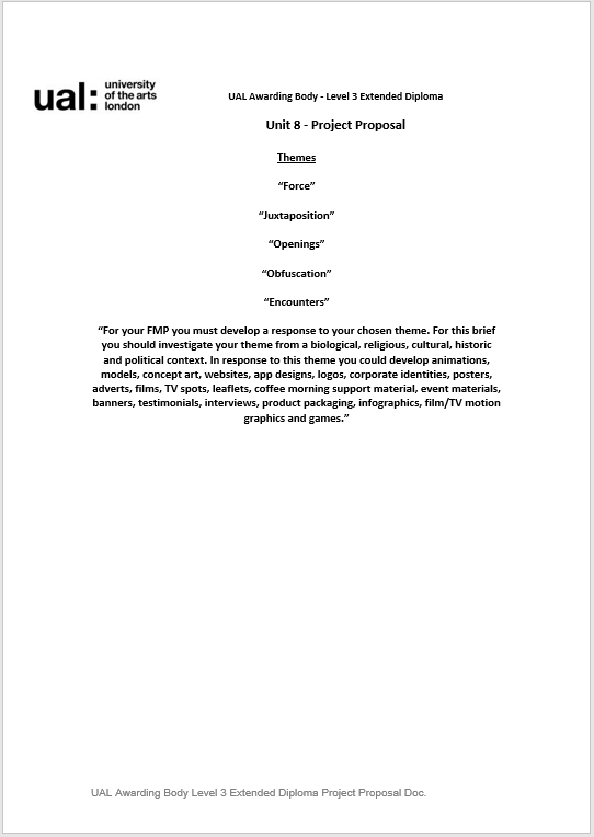
For my FMP I must develop a response to my chosen theme. For this brief I should investigate my theme from a biological, religious, cultural, historic and political context. In response to this theme I could develop animations, models, concept art, websites, app designs, logos, corporate identities, posters, adverts, films, TV spots, leaflets, coffee morning support material, event materials, banners, testimonials, interviews, product packaging, infographics, film / TV motion graphics and games.
My Initial Reaction to FMP:
So to begin, I understand that out FMP is our most important unit of the year, I understand that the previous units we have completed were all to help aid this project, this is the longest project we have, spanning over 12 weeks in total (including holidays), I do plan to work within our holidays, this is so I can complete a significant amount of research and so I can really look in depth into this project and really analyse what it’s about in order to produce a very relevant final piece. Initially, I am quite excited to start my FMP, this is because I know that I am going to learn many new skills along the way, and I am also excited that I will be able to further develop my existing skills to really produce a good final outcome. I am glad that we are given a wide range of themes to choose from, I feel like I will really be able to choose something that I find interesting and that I am passionate about, this way FMP will be enjoyable.
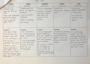
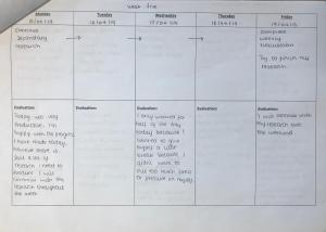
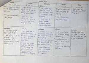
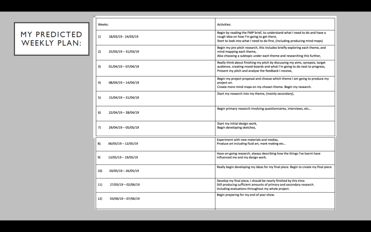
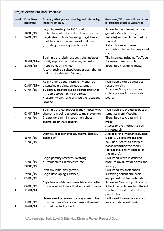
Week One Evaluation (18/03/19-24/03/19):
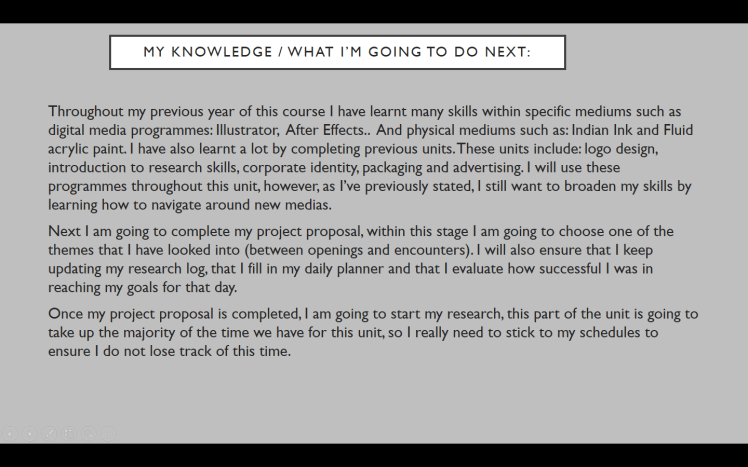
I didn’t use my time as effectively as I could’ve at the beginning of the first week of FMP, I believe this is due to the fact of finishing my other units at the start of this week, so there was quite a lot on my mind as there were many deadlines I had to reach. However, that was just at the start of the week, half way through the week I changed this around and I feel as if I have learnt quite a lot. I know what FMP consists of, and what I need to explore in order to get there. Although my ideas are still vague, I know which themes I need to look into and explore. To explore these themes I created mind-maps on each of them. I have also started to do my ‘pre-pitch research’, this includes looking into a sub-topic under each theme and analsying it further. I understand that there is a lot that needs to be done for this unit, so in order to ensure I do not crack under any pressure, I have created a ‘predicted weekly plan’ for my FMP, not only this but I have also printed off a ‘FMP Action Plan’ this is where I set myself daily goals and evaluate how successful I was for that day.
I followed my predicted plan for this week, and I also feel as if I was successful as I filled out my action plan consistently and effectively. I evaluated myself after each day I worked. So overall, this week didn’t have a great start, but I pulled through and still learnt a lot/produced a sufficient amount of work. Next week I need to finish my pre-pitch research and I also need to begin my pitch.
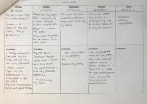
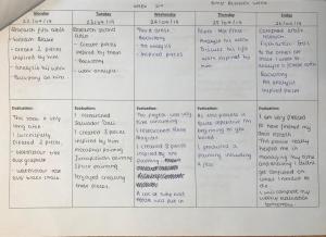
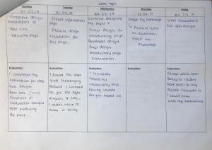
Week Two Evaluation (25/03/19-31/03/19):
So it’s now week 2 of FMP. Within the first two days of this week I had finished my pre-pitch research regarding the sub-topics, and I then began to make a start on my pitch. I imported my pre-pitch research into my pitch power point and I made a start on my aims and synopsis. This was my aim for this week so I had completed the goal that I had set myself. I feel like so far my work is going well, this is because I’ve spoke to my college teachers and my classmates about the project in order to understand the project more, this way I know I am going to create my optimum project as I’m gaining as much knowledge as possible. Furthermore by listening to other peoples ideas upon the FMP I can understand their thought process and I can see if any of their ideas can influence and inspire my ideas in any way. As of yet, they haven’t influenced my choices but I will have on-going conversations about FMP to see if they have any ideas that could possible help and inspire me.
I am still up-to-date with my predicted weekly plan, in fact I am ahead of schedule as I have already made a start on my pitch including my aims, synopsis and mind-maps. I still filled out my daily action plan, and I evaluated myself after each day. I do not think I was as productive this week as I was as last week, this is because I found it quite confusing on how to start my pitch and what I need to include within my pitch. Next week I need to really familiarise myself with the reasoning behind creating pitches, and ensure I know what to include within my pitch. I will also need to finish and present my pitch.
Pitch Research:
The reason behind producing a pitch is to really familiarise ourselves with the themes within this unit, it allows us to go into detail about each theme, which in turn will help us choose the most suited one for ourselves. It helps our understanding of what we will need to eventually produce (a response to one of the themes) as we can really break down what this unit entails. Not only does it help us analyse the themes, but it also produces a good introduction to this unit, it allows us to comprehend what we need to achieve, and creating the pitch gives us freedom by permitting us to create mind maps and mood boards on the themes.
However, producing a pitch doesn’t just help us, but it also informs other people on our initial ideas and reactions to the themes. By presenting these views to others, in the form of a pitch, it can be really beneficial as they might have ideas they could give to you that can really affect your thinking, they can give you feedback and help you analyse the themes. Creating a pitch opens you up to different perspectives as you can get other peoples views and opinions on your thoughts.
So to start my pitch I created a mind map on each of the themes we were given. I created mind-maps because I feel as if it’s a great way of getting out your initial ideas, you can be very creative as there are no restrictions or limitations to what you could write. So I produced these 5 mind-maps. To start my pitch I began by looking at previous pitches, as I’ve never created a pitch before I wanted to see the format and layout of one, looking at pitches from previous years really helped me to understand the purpose and reasoning behind why we create these pitches, it also allowed me to recognise what we should and shouldn’t include within a pitch. So my pitch should include my aims, discussing my aims, any work I’ve done (mind-maps), discussing the mind-maps, talking about my potential target audience, anything that’s influenced or inspired me, my plans, health and safety issues, my previous knowledge and what I’m going to do next.
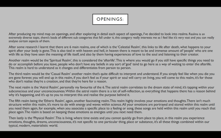
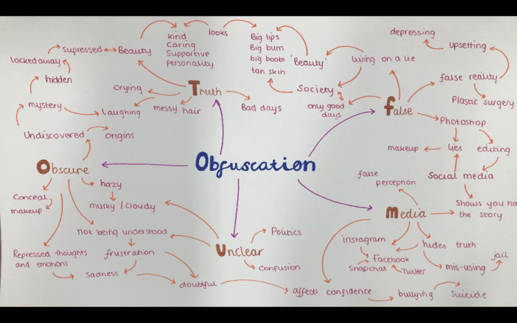
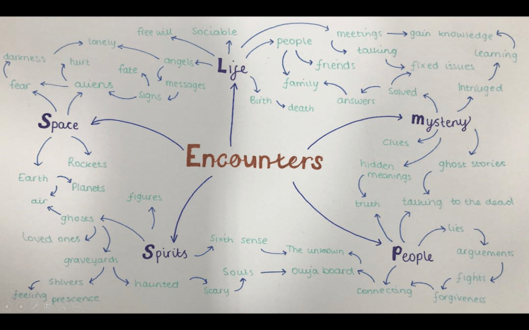
So after I analysed what should be in my pitch and after creating my mind-maps, I decided to choose one ‘sub-topic’ under each of the themes, I decide to chose a subtopic rather than discussing the theme in general as I feel as if it lets me be more creative as I can really go into a high amount of detail in one specific area. This will also allow me to see if I have interest within that area, and if I should research that topic further, or if I should steer away from it. So that’s what I done, my sub-topics for each theme include: Pressure, Emphasis, Realms, Media and Mysteries/Life.
Once I analysed the sub-topics it gave me a clearer image on what I do and what I do not want to do (I discussed this further within my pitch on the slide titled ‘What I might do (Research, Investigations)’).
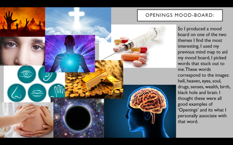
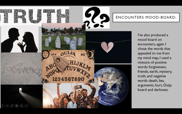
I then went on to producing mood-boards on two of the themes (I described how I narrowed it down to two themes within my pitch). I feel as if mood-boards, similar to mind-maps, are a great way of expressing your thoughts upon the subject, mood-boards are a great way of getting inspired as you just find images that you personally correlate with that theme, whilst looking for specific images you come across other images that you may not of associated with that theme but now it’s influenced you and adapted your way of thinking. So, to summarise, mood-boards broaden your way of thinking as they open you up to ideas you may not of been able to come up with completely by yourself.
Once I produced these mood boards I then began to think who my target audience is going to be. I’m still unsure on this as I do not know what I am producing yet. So I only slightly looked into this area. I then went on to discussing my knowledge and explaining what I am planning on doing next, (this information is on my pitch which I have imported below).
My Pitch:
Powerpoint:
Video:
My pitch is uploaded onto YouTube, I’ve imported this onto my blog which is the video below: I’ve evaluated how my pitch went in my ‘week three evaluation’.
Pitch Feedback:
Whilst presenting, my peers were evaluating my presentation by filling out a questionnaire. These are found below. I evaluated how I think my pitch went in my week 3 evaluation which can be found below.


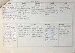
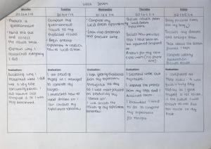
Week Three Evaluation (01/04/19-07/04/19):
This week was very productive. On the first and second day I watched other peoples pitches and read upon pitches in order to learn the reasoning behind why we produce them, and so I also knew what to include within my pitch. This was the goal that I set myself last week for this week. I then finished and presented my pitch and I gathered feedback from the people who watched my pitch. Not only that, but I’ve also fully discussed my pitch and imported my pitch onto my blog. In my opinion my pitch could’ve gone better, this is because I was quite nervous to present my pitch, this led me to speeding up my words, rushing and missing out key concepts (like describing why I created/chose some of the images that I did). If I presented my pitch again, I would slow down a lot, and make sure that I describe the concepts that may be quite confusing to others. Overall it went okay, my peers watched my presentation and they filled out a questionnaire (photos imported), analysis on this can be found below.
I feel as If this week has been the most productive one so far. This is because I am now fully engaged within FMP, I know what it’s all about and I am getting excited for whats to come. My FMP action plan is really helping me to manage my time, by setting myself smaller goals for each day I feel as if I am more likely going to complete them to a high standard, as it breaks the work down and it doesn’t look as frightening. Also by evaluating myself after each day I can understand what my strengths are and I can also see what I need to carry on over to the next day.
I am still on track along-side my predicted weekly plan. To stay on track, next week I need to analyse my feedback, choose the theme I am going to focus on, create my project proposal and begin my research.
Feedback Analysis:
On my feedback there isn’t too many comments that can really help me to improve for the future. The comments are mainly just statements on how I performed rather than evaluative or constructive feedback. However, along side the comments that said I presented my pitch well or that my slides had a lot of detail there are a few comments that will help me to improve.
These include, if I was to slow down whilst presenting so I can actually explain a bit more in depth, there were a few comments stating that my synopsis wasn’t fully explained in the future I will ensure to take more time to explain my synopsis. Lastly, there was a comment that suggested I explain some of the pictures that were in my pitch.
Getting feedback from my peers helps me to improve my work and push me in the right direction as they are a potential audience, so they can tell me whats working and what I should steer away from. So now I have analysed the feedback I received, I will ensure to take these comments on board for when I next present some work.
My Chosen Theme:
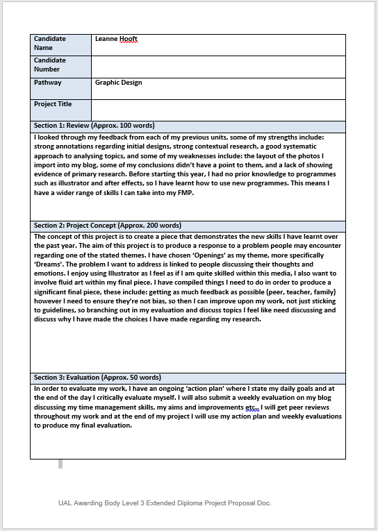
As you know I narrowed the themes down to Encounters and Openings.; choosing between these two themes was difficult. I really want to create my FMP on something I feel passionately about and which I am interested in, this is because I feel as if it will give me the best possible outcome, so I thought long and hard about what I’m strongly interested in- I then came up with the idea of choosing dreams. Dreams have always interested me, so going forward with this idea I decided that dreams fall more under ‘Openings’ than ‘Encounters’- as I see dreams as an ‘opening’ into the mind and subconscious. So now I have my chosen theme I will create my project proposal.
Project Proposal:
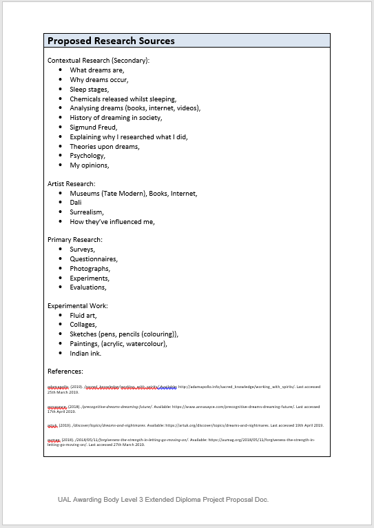
References From Project Proposal:
(I’ve also printed these out, they can be found within my sketchbook).
Dream Research (Secondary):
Why I chose dreams:
To begin with, I want to elaborate more on why I’ve chosen my theme to be dreams..
For as long as I can remember I have always been so fascinated with dreams, I’ve always been curious on the whole reasoning behind dreams, I’ve also been so intrigued as to how dreams tell us so much about ourselves. I feel as if you can really learn a lot about who you are as a person if you tap into your dreams and analyse what they mean.
To help me study dreams I created a mind-map; this is really just to help me write down my initial thoughts on areas I would like to study within dreams. As I’ve previously stated, I believe mind-maps are a great way to explore a given topic as they allow you to branch out and analyse the topic in detail.
Mind-map:
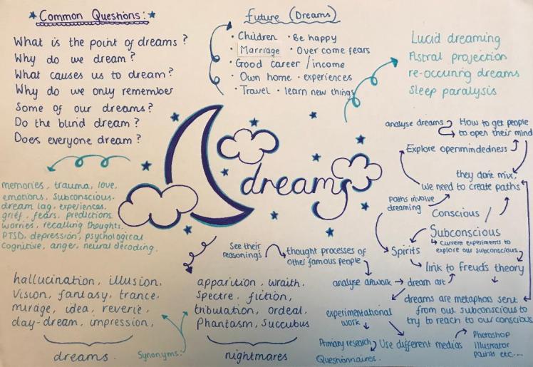
As you can see I wrote out some questions that really jump out to me and intrigue me, I would like to possibly find the answers to some of these questions as it will really help me to expand my knowledge within this subject, which will aid my final piece as I will have more of an understanding on my theme.
Within this mind-map I discussed dreams as in dreams in life rather than dreams we experience when we’re asleep. I spoke about some future plans that I hope come true like a good career, children etc… I thought I would include these as it still links to dreams, and I wanted to explore as many options as possible.
I also wrote out what first comes to mind when I think about dreams, what feelings and events I link the word and my first thoughts upon the subject. In addition, I wrote out synonyms of ‘dreams’ and ‘nightmares’ just so other people will be able to get an idea on what they are as they can link it to other familiar words.
Mood-board:
I’ve also created a mood-board upon dreams because they really help inspire me as they suggest connotations to dreams that I may not of thought of myself.
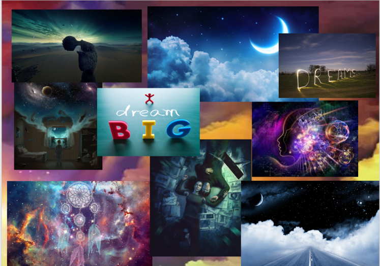
This mood-board has influenced me as it’s shown me that not everything in an image always needs to make sense, for example, the left middle picture in reality doesn’t make much sense at all, but as this image is an example of dream art, it’s allowed to not make sense.
Now I have created my mind-map and mood-board I will begin my research into dreams.
What is a Dream?
Dreams are classed as ‘subconscious imaginings’, it’s where thoughts, memories, emotions, feelings, colours, sounds etc… all compile together to create a new image, this new image then gets played throughout our mind as we sleep, allowing us to live or relive scenarios that may never be able to exist in reality. Dreams are a calling from our subconscious, they allow us to express our repressed thoughts, they give us a way to relax and really be one with our feelings. Dreams allow our bodies to escape for a while, where our mind is in complete control and our bodies get temporarily paralysed, our muscles get paralysed so we don’t act out any actions that would be occurring in our dreams, which could lead to potential danger.
Many people believe if we were to interpret our dreams it will give us an insight into our mind and our subconscious, interpreting them will allow us to learn more about ourselves as dreaming releases thoughts we may not have had in reality. These thoughts include our secrets, our passions, our desires, our mistakes, our fears and worries, many things that we may not want to think about when being fully conscious.
In my opinion, dreams are a gateway into the subconscious and spiritual realm. I believe that dreaming is a way of connecting our bodies to our soul, it’s an alternate reality, as we’re asleep for roughly a third of our lives, dreaming is a huge part within our life. I strongly believe that the things we dream about all have a meaning, it’s our subconscious trying to influence our conscious. Our spirit and soul are trying to communicate with our body, and the only time they are active is when our body is paralysed and we’re dreaming. The battle we face with dreaming is trying to allow our minds to accept these thoughts from our spirit, we need to try to ‘be one’ with our soul, hence why I believe it is very important to listen to what your dreams are trying to tell you, as they open pathways to parts of yourself you may not even of known existed.
As our brains are very much awake and alert whilst we dream- even more alert than when we’re actually awake, there are loads of chemicals and neurotransmitters that are flowing through our brain as we sleep, these chemicals that flow through our minds is what gives us such vivid and strange dreams. Acetylcholine is a very important neurotransmitter (a neurotransmitter is a chemical messenger that transmits signals across your brain) that we experience whilst dreaming. Acetylcholine is actually a chemical responsible for memory and learning whilst in your woke state, so by it being active whilst you’re dreaming shows how memories can be formed in dreams and how dreaming allows you to learn new things.
Another chemical that gets released whilst we sleep is called melatonin. Melatonin is an extremely important hormone in our body, the main purpose melatonin serves is allowing our bodies to feel tired when it’s dark and to feel awake when it’s light. More melatonin gets released when it’s dark, hence making us sleepy. Your body produces the most amount of this hormone when you’re in the REM stage of your sleep cycle, if your body was to produce more of this hormone that is when you would experience lucid dreaming and nightmares. People who do not produce a sufficient amount of this hormone often experience insomnia.
When do Dreams Occur?
There are 3 main stages of our sleep cycle: the light sleep stage, the deep sleep stage and the REM stage. Dreams most commonly occur in the ‘REM’ (rapid eye movement) stage of our sleep, this is when your brain activity is high and your heart rate increases. Dreams within the REM stage are the most vivid, most memorable ones. In order to remember your dreams, you will have to wake up before the dream ends, otherwise it will be lost from your memory, when waking up the dream can fade within seconds, as it’s not a real memory. Some dreams can occur in other stages, but these tend to be extremely short and you will most likely never remember them.
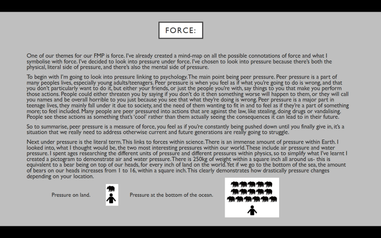
I created a 2 pie charts to demonstrate what our sleep consists of (of the average person). One of which quite complex, and one of which a lot simpler so everyone can understand:
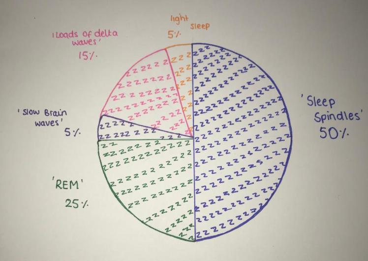
Loads of delta waves is enhances the depth of your sleep, it is literally the waves of signals your brain gives to your body when we are in this deep, dreamless sleep state. In this stage, although we’re giving out loads of delta waves, we are actually at our most unconscious state, our brain is at it’s least amount of activity.
The slow brain waves is when we just begin to fall asleep, it prepares our body for sleep as we begin to lie still and our heart rate decreases.
Sleep spindles are sudden bursts of energy our brains give out whilst we are asleep. These spindles are what keep us in the calm state that we are in when we sleep, which then allows us to process what happened in that day.
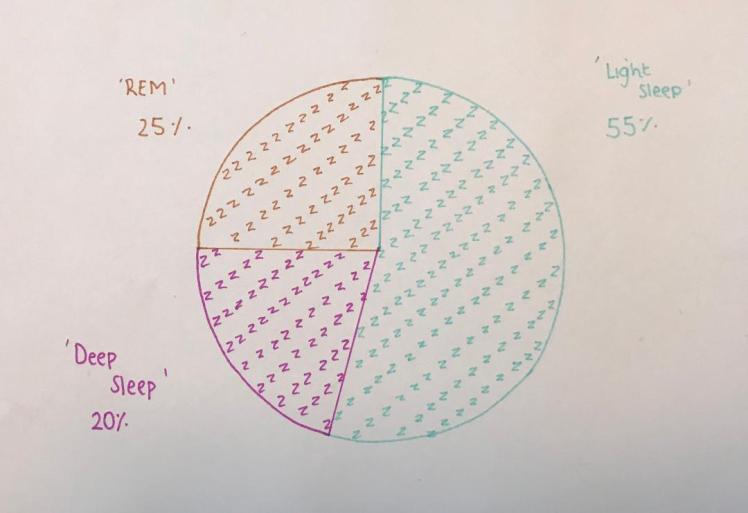
This pie chart is pretty straight forward, it shows you what the three main stages of our sleep are and on average what percentage of the night we spend in each stage.
Why do we Dream?
Dreams are essential for our well-being, this is because it allows us to experience different feelings and emotions, and it allows us to express our thoughts. Scientists produced a study, (this study I collected from webmd.com) where they had a group of people, the scientists were analysing the peoples sleeping patterns, and as soon as the patients started going into the REM stage of their sleep, they were woken, this continued for a few nights. The scientists then analysed the results and they found that those who were not allowed any sleep within the REM stage had an increased feeling of anxiety, difficulty concentrating, lack of coordination etc… The effects of not dreaming were very negative and impacted the people quite significantly.
We also dream to process all the events that happened during the day, they allow us to relax and put the events into our long term memory. Another useful reasoning to dreaming is that they can actually help us solve problems in our lives, if there’s something troubling you, dreams can actually fix that issue by giving yourself time to process and think about the situation, hence the term ‘sleep on it’. Dreams also allow you to prepare for upcoming tasks or events, say you’re anxious about something in the near future, elements of this even may be incorporated within your dream and you may be able to think of ways to overcome this feeling of anxiety by experiencing it in your dream.
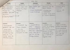
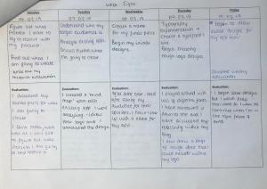
Week Four Evaluation (08/04/19-14/04/19):
This week has been productive, because this week is in our Easter holidays it gave me a lot of time to work on this aspect of my project. On the first day of this week I analysed the feedback I got from my pitch, (I’ve also discussed why I done this above). On my weekly action plan I discussed how I wanted to start my project proposal and choose my theme on the same day that I analysed the feedback, however I had to move these tasks onto the next day because I didn’t want to rush my work which would bring down it’s quality/ In the future I will ensure to not give myself too many tasks to complete on one given day as this can be quite stressful.
So by Tuesday of this week I had decided upon the theme on which I was going to produce my project on. I was glad when I had finally decided upon a theme because it then allowed me to move onto my next target which was creating my project proposal, I was happy when this task was completed because it then meant I was on track against my predicted weekly planner and that I was managing my time effectively and correctly. I’ve discussed the reasoning behind my project proposal above.
So from Wednesday I had started my research into my theme. In my predicted weekly planner I talked about wanting to create more mind-maps this week, so I done this and I’ve imported the photos onto my blog and they can be found above. I then began to dabble into the dream research by creating mood-boards and pie-charts. I feel like these are both excellent ways of displaying important information as it’s very easy going on the eye, so it’s east to evaluate and understand. I just wanted to experiment with new ways of presenting my information, this is so it keeps it interesting for the reader of my blog, and for myself.
I’ve also conducted an experiment this week to see how sleeping at different parts of the day can affect how much you dream (this experiment can be found under my ‘Dream Research (Primary)’ below.) The idea of conducting experiments to further my knowledge on this subject really interests me, so in the future I will conduct more of these experiments, for my own curiosity and for aiding this project. The experiments will aid this project as I will be able to see how analysing dreams helps me in the real world, I can link them to a real person and analyse if interpreting my dreams helps me in any way.
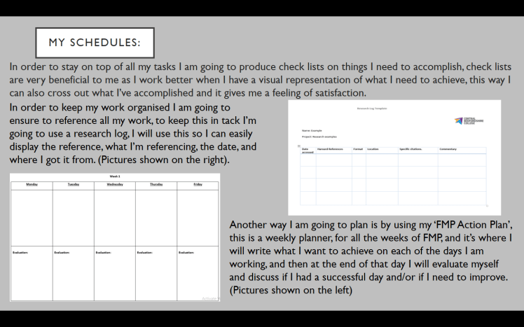
So next week I will carry on researching dreams, this will mainly be secondary research from sources such as: books, videos and the internet. To stay on track I will also be referring back to my predicted weekly planner, I will continue filling out my research log and my action plan.
Inventions Created Whilst Dreaming:
Although it doesn’t sound believable- many great inventions were actually created whist people were dreaming:
The Periodic Table- Dmitri Mendeleev tried for so long to figure out a way to lay out the elements in the periodic table, where the elements followed an order and they were organised. He couldn’t figure out a way to organise them, however, when he fell asleep one night he claimed that he saw a ‘table’ in his dream where the elements all fit perfectly. When he awoke he wrote out this table to see that it was in fact correct and that it worked.
Google- Larry Page was a 23 year old student and he needed to create something for his phd at uni, after multiple ideas he realised that none of them were going to work. So he turned to his dreams for inspiration, and that is when the idea of ‘Google’ reached him. Once he woke he developed and researched this idea further until he realised that it was actually possible, so he turned this dream into reality and Google was born.
Many story-lines for famous books where created whilst dreaming, these include:
Jekyll and Hyde- Robert Louis Stevenson knew briefly what he wanted to create his book upon, he just didn’t know how to compose the idea into a real story, this was until he fell asleep that night and the scenes for the book came to him in his dream. Once he woke he wrote down this story, and it became an extremely famous novel.
Frankenstein- Mary Shelley was extremely bored one day, and whilst she was with her husband and other fellow writers, she proposed a competition where they all have to write horror stories in order to frighten one another, after Mary was struggling to compose a story she went to sleep that night and that is when she had a horrible, vivid nightmare. In that nightmare is when she saw Frankenstein, after waking she wrote this story which became a very famous book.
Many very famous film ideas also came from dreams:
The Terminator- James Cameron is responsible for the idea of this famed movie, after fighting a fever he slept and had a nightmare of a metal cyborg chasing him, which evoked the idea of the terminator.
Avatar- Again, James Cameron came up with this idea for a movie after seeing it in his dream.
How can I Remember my Dreams?
Firstly, there are many theories as to why we don’t remember our dreams, one of these theories is that if we remembered every single dream we had, they would get mixed up with real memories, and we then wouldn’t be able to distinguish between these real memories and memories of dreams. Although your brain is active whilst dreaming, the parts of your brain you’re using is different to the parts you use when you’re conscious, this means that your brain may shut off pathways of creating memories, hence why not all of our dreams can be remembered. Also, as I’ve previously stated, dreams can only be remembered if we wake up during them, that’s why we mainly remember the last dream we had of that night, because alarms tend to wake you up whilst dreaming.
Another theory is that all dreams do make it into our memory, it’s just we may not know how to access these specific memories. That explains why we sometimes remember our dreams later on in the week, or when we specifically see something it can often trigger a memory of a dream, proving that these memories were there all along.
I’ve also researched specific things that we can do in order to help us remember our dreams, these include:
- Writing them down as soon as you wake up,
- Saying them aloud when you wake up,
- Thinking about them as soon as you wake up,
- Remind yourself before you sleep to remember your dream when you wake,
- Purposely wake yourself up in the middle of the night: (by setting an alarm for example) and hope you were dreaming when you wake,
- Stay lying still when you wake up and try to recall the dream,
- Keep your eyes closed if when you wake,
There’s also another theory about dreaming, this theory I personally do not agree with, but I still wanted to include it because there are some people who do believe within this theory, and it still influences people within today’s modern world. This theory is that the main reason as to why we dream is just to fill the time up of whilst we’re asleep- that there’s no specific meaning to our dreams; that they’re pointless. That there’s no real reasoning behind the images that occur within our dream, they’re all just random images that have compiled together to create a ‘story’. I do not like this theory because I feel like you’re completely shutting of your thoughts from your subconscious, your unconscious mind is trying it’s best to communicate with your conscious self but you are completely ignoring it by believing that there’s no meaning behind dreams.
Facts About Dreams:
I‘ve decided to gather the most interesting facts about dreams I can find, just to expand my knowledge upon the subject:
- Within 5 minutes of waking up we forget 50% of our dream, then after 10 minutes we forget 90%,
- We experience more negative emotions in dreams than positive ones, the most popular is anxiety,
- Every person we see in a dream, we have seen in real life- you just probably won’t of remembered seeing them, our mind cannot invent faces,
- On average you have 3-7 dreams per night, some of these could be only minutes long though,
- Everybody dreams, it’s just people don’t often remember which leads them to believe that they never dreamt in the first place,
- You cannot dream and snore at the same time,
- Around 12% of people dream in black and white, the majority of these people being over 55.
Dream Lag:
Dream lag is a very interesting concept. In simple words, it’s the process of images, people that you saw, or events that happened at a certain time, being portrayed in your dreams about a week later than when they occurred. So if there’s someone in your dream that you don’t recognise, chances are you probably just saw them around about a week earlier. The reason as to why we have dream lag is because it takes some short term memories longer to form into a long term memory, and a way to help these memories transfer is by them appearing in your dreams. Dream lag explains why some of the events that occur in your dream have some correlation as to what you were doing the previous week, it’s just your brain trying to process the new information. This is another reason why dreaming is extremely important for us, it gives our memories time to consolidate within our minds.
Dream lag may also repeat itself. This is where you could have a dream and around a week later, you have the same dream again, this is quite a rare phenomenon, it usually happens after an emotional or traumatic event. It can be quite a scary event for the dreamer, especially if the repeated dream is a nightmare.
To summarise, dream lag is just a delay we experience on events that occurred in our lives and we see them in our dreams as a way of transferring these events from our short term to our long term memory.
Precognitive Dreams:
A precognitive dream is when you dream about something then it occurs in the near future. However there is more depth to it, for example: if you dream that it is raining, and you wake up and it is in fact raining, this is not a precognitive dream. The event needs to be quite specific in order to be able to class it as a precognitive dream.
Many people believe precognitive dreams are a way of predicting the future, and in some cases this is true. A famous example of a precognitive dream is:
Abraham Lincolns assassination. Abraham apparently had a dream that he witnessed a funeral in the White House, he apparently asked a nearby soldier who the person in the casket was and the soldier replied: ‘the president of the United States’. Abraham told his wife about this incident, only to find that two weeks after he had the dream he was shot dead, with his funeral being held at the White House.
So precognitive dreams allow us to see a glimpse into the future, for those who believe they are real, however, there are many mathematical theories that lead people to believe that these dreams are just pure coincidence. Many people have claimed to see the Titanic sinking or the 911 plane crash in their dreams before they occurred, is this pure coincidence or did they have a sixth sense which allowed them to see the future. The mathematical theory is that because everybody in the world dreams, and we have more than a couple dreams per night, the likelihood of dreaming of an event and then it coming true isn’t as rare as it seems, especially if it is a common thing to dream about, like a plane crash.
If you believe that precognitive dreams exist, and you have one, you will probably want to know why we have these types of dreams. So, precognitive dreams do serve different purposes, they can actually act as a warning, for example, if you see an unpleasant incident in your dream and you can link this to real life, it may be wise to re-evaluate your choices and see if you can make any changes to possibly prevent these incidents from occurring. They give us that push in the direction that we needed, they can influence change and they can allow us to better ourselves in reality.
Precognitive dreams can also sometimes give you a weird feeling of de ja vu, say you’ve experienced an event in your dream, and you remember where you were and who you were with and what these people said, then one day you find yourself in this exact scenario- exactly the same as your dream, you will most likely experience a feeling of de ja vu. However, this is a positive sign, it means your’e on the right track of life, you are in the right place and that is where you should be.
So overall precognitive dreams are really helpful as they can steer us away from possible dangerous situations, and they can also be a reminder that we’re living our lives correctly and that we are in a good place.
What are Nightmares?
Similar to dreams, nightmares occur in the REM stage of your sleep cycle, when brain activity is at it’s peak. Nightmares put simply are frightening dreams. We can easily sleep through a dream, however when having a nightmare the likelihood of sleeping through it is very low, you will normally always wake whilst having a nightmare; this is purely because of the emotions nightmares evoke, these include: fear, sadness, grief, dismay etc… These emotions are pretty hard to allow pass without thinking of them. Nightmares can often symbolise some of our deepest fears that we’re too scared to face in reality. Nightmares are a sign, they show us that it may be time to tackle some of our fears by facing them head on in the real world, especially if you have a recurring nightmare, then you should really try to analyse this and see what’s causing the nightmare. A recurring nightmare is when the same nightmare repeats itself several times in a given period like a week or month. There are some ways to reduce the likelihood of recurring nightmares/nightmares, these include:
- Going to bed at a reasonable time (having a proper sleep schedule),
- Keeping electronics away from your bed, not using electronics at-least 30 minutes before you’re about to sleep,
- Not eating preferably for 2 hours before you’re going to sleep (eating before bed increases the amount of energy your brain has which can lead to more vivid nightmares),
- Try to keep the room dark, this way the amount of melatonin released will be sufficient,
- Ensure you’re lying in a comfortable position, sleeping in awkward positions can actually increase the likelihood of having a nightmare,
Nightmares affect children more than they affect adults, (only around 50% of adults experience a nightmare often and 2-8% of adults experience them frequently) this is mainly because children tend to have a more vivid imagination than adults, so their minds tend to create weirder and more frightening dreams. Nightmares also affect girls more than boys.
Although nightmares can be an extremely frightening experience, there are some positives. A positive of having a nightmare is actually the release of emotions you get after it, they can release the feelings of stress and anxiety by these emotions being used within your nightmare. The things that worry us in real life, tend to be the things we see in our dreams, as we’re constantly thinking about them, so our concerns then get turned into stories (nightmares), these nightmares then become memories as we wake up and remember what we dreamt about. So these nightmares can actually help our mental health, this is because it’s a lot easier for our brain to process fears in memories because we have dealt with them before and they are now in the past, but if we never had that nightmare then our concerns would still be playing on our minds today.
So in summary nightmares allow us to process emotions such as fear and anxiety by turning them into something that we can understand and comprehend (nightmares), which then allows us to move forward from the situation so these feelings and emotions are no longer burdening us.
In addition, nightmares can also physically benefit our bodies, this is by the increase of blood flow to our brain, which helps our brain to restore and recover from the day. The increase of blood flow in our body also helps us to repair our muscles and they allow us to release stress.
Freud:
Backstory:
Sigmund Freud plays a very important role in the analysis of the interpretations of dreams and many theories involving dreams. Freud was born on the 6th May 1856 in Moravia, but he later moved to Vienna where Freud received his education. Freud began to study medicine at the University of Vienna in 1873, where he later graduated to then work in a hospital. Several years later in 1885 he became a student at the neurologist Jean Charcot, one year later Freud then began to develop practices involving brain and nervous system disorders. 1897 is when Freud began to really deeply analyse himself, he done this for the next three years which led him to publish his book in 1900; ‘the interpretation of dreams’. After many people read his book, he had many people behind him, which is when he started to develop the psychoanalytic theory, this led to the “International Psychoanalytical Association” being founded in 1910 (with help from Jung, described as one of his ‘close associates’, however as time went on Freud and Jung developed separate ideas and went their separate ways). Freud has published a lot of books, but one of his more famous ones, along with ‘The Interpretation of Dreams’, is ‘The Ego and The Id’, which was one of his theories that he developed which talked about the ‘model of the mind’. (I’m not going to analyse this book as I don’t believe there is much relevance to dreams so I feel as if it’s not going to indefinitely influence my choices for my final piece). Freud then sadly passed due to cancer in 1939.
The Interpretation of Dreams:
This book came about when Freud started to analyse his patients and himself, as he was working with patients who had psychosis: (a disorder where people cannot distinguish between reality and not reality), he thought if he could analyse their thinking then he will be able to report upon their mental health; to analyse their thinking he thought of interpreting their dreams. This worked as he was able to tap into his patients thinking to see if there’s any way he could help them.
As Freud had vivid dreams he used these within his analysis, after much studying he concluded that all dreams are a representation of a suppressed feeling or emotion, he believed that all dreams had a meaning behind them, and that we needed to interpret them in order to become more familiar with ourselves and our own thinking. This topic heavily interested Freud which led him to spending two years writing this ever so famous book. In this book he discussed his theories behind the conscious and unconscious mind which later influenced his discovery of the psychoanalytic theory. This book played a major part in history, despite there being not a lot of scientific evidence to back his theories it still reached so many people and changed so many peoples beliefs at that time. People studying psychology today still relay back to Freud’s theories as his thought process was just revolutionary at that time. My favourite quote from Freud being: “dreams are the royal road to the unconscious”
From writing this book Freud came to conclusions on what dreams are and why we have them:
- Freud believed that all dreams are a wish we want to come true, this wish could be extremely small, or a large wish that we’ve had since childhood,
- He believed all dreams are about ourselves, our wishes, our thoughts,
- Wishes can be feelings, emotions, events we want to occur, people we want to see etc..
- Dreams can become confusing as many ‘wishes’ may compile into one story- so it’s up to us to break this story down and analyse it,
- Dreams are metaphors of our wishes,
- These wishes are disguised in weird imagery- this is because our consciousness isn’t aware of these wishes- only our unconscious is. So in order for these wishes to reach our conscious they need to be disguised, otherwise we are going to block this out as we don’t want to listen to these repressed wishes,
- Freud believed that our conscious and unconscious were not connected and in order to connect them we need to analyse and interpret our dreams (which are just messages from our subconscious),
- Our conscious doesn’t want to bring these emotions into reality- they are meant to be repressed for a reason, hence why we forget most of our dreams,
- he believed that even when other people are in our dream, they’re representing something about us.
Psychoanalytic Theory Vs The Neuroscientific Theory:
As I’ve spoken about Freud, I’ve briefly mentioned what the psychoanalytic theory is, I’ve now decided to analyse this concept further.
Psychoanalytic Theory:
Psychoanalysis is a theory mainly based on the subconscious and the conscious. It involves your mind, your personality and your behaviour. It’s a very broad concept with loads of research and theories behind it. The main purpose behind psychoanalytic processes is to free your mind from repressed feelings, emotions, desires, fears and memories. Some examples of psychoanalytic processes include deeply : analysing someones past to see how it affects their current behaviours, talking to people about their feelings (such as depression) to bring them a sense of relief and analysing dreams in order to free their trapped thoughts, all these processes allow individuals to feel content within themselves as they are able to tap into their unconsciousness this means in order to reach catharsis you need to bring your subconscious thoughts into the real world (this is through those processes).
Neuro-scientific Theory:
Neuroscientists really believe that the sole purpose of sleep is to learn and help process memories- not so we can dream and then interpret these dreams as a way of trying to find out what our subconscious is trying to tell us. Similar to dream lag, where I spoke about how dreaming is vitally important in the process of consolidating memories, neuroscience focuses on the parts of the brain that process these memories, and what paths dreams need to take in order to become memories. Neuroscientists mainly focus on the structure of the brain and how different aspects of the brain affect the way we sleep and dream furthermore, neuroscience links to the study of the stages of sleep and REM itself, and how the amount of sleep we get in the REM stage affects our ability to learn new things.
The difference between the psychoanalytic theory and the neuro-scientific theory is that the neuroscientific theory is mainly based on facts, statistics and science, although they still rely heavily upon opinions, they have evidence to back them up. Neuroscientists do not go into depth about the meaning behind dreams or interpreting them where-as the sole purpose behind the psychoanalytic theory is to analyse these dreams to see what our subconscious is trying to tell us.
Lucid Dreaming:
So in my opinion, lucid dreaming is a really interesting event. Lucid dreaming is when you realise you’re dreaming, whilst you’re still dreaming, this means you can manipulate your dream by changing events and making conscious choices. It’s a very fascinating phenomenon which occurs when you see something within your dream which you know cannot be real, for example: walls bending or being able to run at 100mph etc.. and once you have come to terms that you are in fact in a dream you can then make decisions and choose what you want to do, and since you’re dreaming, there really is no limit. You can begin to fly, or breathe underwater- the options are endless.
Facts about lucid dreaming:
- Lucid dreaming can only occur when we are in the REM stage of our sleep,
- Over half of the worlds population will have a lucid dream in their lifetime,
- 20% of those who lucid dream will have one per month,
- It is possible to have lucid nightmares, which can be a very frightening experience as you feel as if you cannot escape,
- It is possible to learn how to lucid dream, however this is quite tricky and it takes a lot of practice,
- Those who can purposefully lucid dream use it as a way of living out future scenarios so they have more confidence in real life,
Sleep Paralysis:
Sleep paralysis can be a very scary experience, with it affecting people mainly between the ages of 10 and 25, yet it can happen to anyone. Sleep paralysis is quite rare with it only affecting people once or twice in their lifetimes, however there are some cases where people experience this a few times a month or week. Sleep paralysis is when your body is still temporarily paralysed (from being in the REM stage), but your mind has woke without giving time for your body to catch up, leading you to being conscious but still paralysed. In this time you cannot move or speak, you are frozen for a while, although sleep paralysis tends to only last for up to 15 seconds, its still a very frightening experience, and there have been reports of it lasting for anywhere up to a few minutes. Not only that but when you encounter sleep paralysis you hallucinate, this leads you to seeing very disturbing images (of people, creatures, monster or things) in your room, you cannot do anything about this as you are paralysed. So you just have to face these scary ‘beings’. There have been cases where people have experienced pain whilst in sleep paralysis as they feel like these ‘entities’ are physically touching them and put pressure on them. Sleep paralysis can lead to a sense of paranoia, as some find it difficult to breathe, panic attacks, a rush of fear and anxiety and loads of other negative emotions.
Although sleep paralysis can be induced, it normally occurs to people on accident and for no real reason. It’s just one of those un-explainable events. Sleep paralysis however will be more common in people who experience insomnia, sleep deprivation (from work, young children, jet lag etc..), frequent panic attacks, those who sleep on their back and people with PTSD, etc.. Only around 8% of the general population experience sleep paralysis frequently, compared to around 32% of those with mental health issues such as depression.
Even though sleep paralysis can be very scary, it’s important to remember that the event will subside, and that’s it’s technically not real. Furthermore, sleep paralysis isn’t always so bad, with reports of people seeing passed loved ones, or famous characters/people.
Most Common Dreams (analysed):
For this part of my research I am going to research the most common dreams. I will then create three paragraphs for each common dream, for each paragraph I will use a different source of research for the interpretation of the dream: (paragraph 1 will be research I gathered from websites like Google, the second paragraph will be research from videos I will watch from Youtube and the third paragraph will be analysis I gathered from a dream interpretation book I have). I want to conduct my research this way so I can see if there’s trends between each source of research, or to see if I get different interpretations on the dream depending on which source of analysis I choose.
Common Dream: Falling:
Google Interpretation: Falling in you dream implies that you may feel overwhelmed about a situation you cannot control. You may feel a sense of failure in your life, regarding to work or school.
Youtube Interpretation: Falling in your dream links to your anxieties of letting go, and the feeling of losing control/helplessness. If you have dreams about falling, it’s wise to analyse your emotions in the real world and see if there are any ways you can reduce the feeling of fear and anxiety in reality.
Book Interpretation: When you dream about falling it’s normally in your hypnogogic or hypnopompic state (the state right before you fall asleep and the state where you’re just about to wake up). Falling in your dream represents the need for you to be grounded, and that you do not feel as if you’re in control of your life.
After analysing the meaning behind falling in your dream from three different perspectives, the motif I can pick out is the feeling of having a lack of control. I can see that there is a running theme throughout the different medias I used, which therefore allowed me to get the best, most accurate results of what falling in a dream means.
Common Dream: Teeth Falling out:
Google Interpretation: That you have a fear of growing old and you are frightened to have your power stripped away from you, a fear that you will no longer be able to live and active and beautiful life.
Youtube Interpretation: Losing your teeth in a dream reflects your anxieties about your appearance, you may feel as if you are not living up to the standards of those around you.
Book Interpretation: Dreaming of you teeth falling out means that you are going through a transition in life, for example from a teenager to an adult or from an adult to old age. It may also mean that you are anxious of this transition, and that you may not want it to happen.
Now I’ve analysed teeth dreams in depth I can see that there’s different interpretations depending on what source you use as your means of research. Although each interpretation is mainly based on having an anxiety of losing your beauty through age, there’s still different meanings like life transitions and societies standards. As I analysed teeth dreams from 3 different ways I was able to come up with the most suitable definition of what the dream means.
Common Dream: Being Chased:
Google Interpretation: Being chased suggests that you’re trying to avoid or person or situation that may evoke feelings of pain or annoyance; this dream is trying to tell you to confront the issue in your waking life.
Youtube Interpretation: If we dream about being chased it means that our unconscious is trying to tell us to stop avoiding an issue or a person, we will often experience feelings of pain and/or anxiety throughout this dream.
Book Interpretation: To dream about being chased in a dream represents that you’re trying to escape responsibility or that you’re tying to run from a fear or from the sense of failure.
After analysing this dream I can see that all three interpretations are extremely similar, compared to other interpretations of different dreams. Each source I used basically said the same thing, so from conducting this research I can see that different dreams may have more than one meaning. So in the future I will be able to apply this knowledge as I may begin to search for multiple interpretations for a dream yet there may only be one, therefore I am not going to make this mistake. Furthermore I also learnt that some dreams are very specific and do only have one meaning to them.
Common Dream: Flying:
Google Interpretation: Dreaming about flying may mean that we are trying to escape the pressures of the real world. If you fly in a dream it can also mean that you are feeling restricted in the real world, this could be due to work or school.
Youtube Interpretation: Flying in your dream can be a very pleasant and joyful experience, so this suggests that you’re on top of all situations in your life and that you’re really in control.
Book Interpretation: To fly in a dream suggests that you may lack freedom and inhibition. It means spiritually that you’re trying to connect yourself and your subconscious together in order to feel peace and harmony.
This dream was very interesting to analyse, this was because there were different interpretations depending on which source I used, this fascinated me as I was able to see multiple interpretations of the same dream. So all in all I was glad I used multiple variations of research because it allowed me to see how the same dream can be viewed in multiple ways, not only that but I also learnt that it’s extremely important to research something from multiple perspectives in order to get more information.
Common Dream: Being Late to something Important:
Google Interpretation: If you are running late to something important in your dream this could signify that you are putting too much pressure on yourself, and that you cannot deal with these pressures. Being late in a dream is signifying that you need to take time to figure out what’s really important in your life.
Youtube Interpretation: This suggests that we are taking too much upon ourselves in our waking life, and that we’re becoming frustrated as we cannot deal with all the pressure. Another interpretation is that we are having difficulty making important decisions related to work or life in general.
Book Interpretation: If we are late in a dream it’s said to mean that we are looking for perfection, and that we may be letting people down. In order to over come this you need to try to take control of different situations in your waking life.
From analysing this dream I can see that the interpretation from Google and Youtube are both very similar, yet the book interpretation was slightly different. This, however could just be due to the time the video or analysis on Google was produced. Interpretations can change over time as psychologists and dreamologists learn new meanings and develop existing ones further.
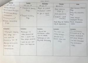
Week Five Evaluation (15/04/19-21/04/19):
This week I continued with my secondary research upon dreams. All of the research I’ve produced is really important for this project, it allows me to learn about the theme I am creating my project upon. After producing my research I know that I am interested in areas such as lucid dreaming and learning how to remember your dreams. Although I have produced loads of research I am still not any closer to knowing what I am going to produce for my final piece, I’m still not certain upon what aspects of dreaming I want to look into more, so I will need to do more research in order to come closer to a conclusion. So far I have not encountered any problems, this is mainly because I’m working in a systematic way by following my predicted weekly planner and by setting myself targets for each day so I know what to focus on. Furthermore I feel as if my project is going well, I’m nearly half way through and I am happy with the progress I have made.
To continue I will have conversations with my college peers to see if they have any ideas that I may not of thought of that could potentially influence my final piece. In addition, I will also be producing some primary research, this involves questionnaires and surveys, which is what I’m going to start my secondary research is complete. I will still however produce on-going research as I think it’s important to continue learning new things as this project goes on. I need to complete my artist research and produce work inspired by them.
Artist research:
So in order to aid my project, I am going to research several different artists, where I feel like their work represents those of dreams. I will research them as a person, including their life, their inspiration and their work, this includes analysing their work (visual analysis). In a previous unit I created mind-maps on how to analyse art, I decided to incorporate these mind-maps into this unit as I feel like it’s important to bring previous knowledge into my current unit, this is because I’ve had experience upon analysing art already so I can use this knowledge in order to aid and enhance this project.


Artist 1 – William Blake:
Blake was born on the 28th November 1757, he lived in London with his 5 siblings. Blake skipped a lot of schooling which allowed him to have a very peaceful childhood. William had always been quite interested in drawing and writing, as he had quite an artistic flare within him. His parents kept pushing him to fulfill these artistic routes by enrolling him into a drawing school (Pars’ Drawing School) when he was just 10 years old. After 4 years of studying art, his parents wanted to then change schools and enroll William into an engraving apprenticeship. William tried a few engravers until he found one he liked, Basire was his name, William liked Basire as Basire allowed William to complete drawings for some of his works- William really enjoyed producing these drawings as it allowed him to be creative which is what he wanted. Several years later, when Blake turned 21 he then began studying at a Royal Academy, he then earned his living through engraving illustrations for popular books.Riots then broke out in London, and William witnessed all of these riots, which really inspired some of his books that he produced.He married in 1782 to a lady called Catharine, they had a happy and long lasting marriage.
Blake was very well known for his mystical creativity, as many of his paintings represented philosophical views, at the time his artistic style was put under the romantic movement, romanticism linked to the development of yourself as an individual and it heavily looked into emotions; It’s really about finding out about yourself and bettering yourself. Blake then passed in 1827 at a healthy age of 70.
So in order to learn more about William Blake I am going to analyse some of his artwork, more specifically, his art that represents imagery of dreams. I am going to use my previous mind-maps to help me analyse his work.
Milton’s Mysterious Dream (1820):
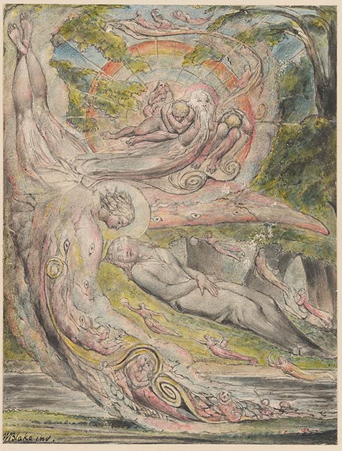
Blake produced this painting in 1820. In this painting Milton (the main focus of this painting, the man) is laying asleep in the center of the page, his head tilted towards us, his eyes closed. Milton seems to be buried as he is covered with grass and he is in a dark ditch (symbolising a grave). Although the painting is quite morbid, as he lays in his grave, the picture is still full of colour, with their being blue skies and a rainbow. There are six angels within Milton’s grave, these could be in his dream, these emanations are carrying what seems to be a musical instrument, connoting how dreams bring music to a sleeper, his dream is being provided to him from a larger more dominant angel. Of which this angel has the ‘seven eyes of god’- the seven eyes of god is what Blake believed an angel needs in order to stay protected, he also believed that these eyes are essential for the development of the soul as each eye represents a different stage of development. All this imagery is very dream like, as it heavily involves spirits and the soul, which is what I learnt about when researching Freud.
Blake uses a lot of emphasis throughout his painting this is by Milton being in the centre of the page as it straight away pulls our attention to him. Blake positioned Milton here so we instantly see him, all of our attention is meant to be on him. This is symbolising how when we dream all of our attention is focused on yourself and how the world seems to evolve around us. Blake orientated Milton towards us to show us how powerful he is and how he isn’t hiding any aspect of himself.
In order to create harmony within this painting Blake positioned the main angel pointing downwards from the sky, not only for contextual reasons but also to create unity between Milton and the angel. This unity allows the painting to be harmonised, which creates beauty as it lifts any tension between the characters and it creates peace among the angels. Harmony within a painting is very important as it evokes calmness for the viewer as the painting flows. Blake uses irony as the painting portrays how Milton seems to be in control as the picture is in harmony, however this differs from the truth as you cannot be in control of your dreams (unless you learn to lucid dream but I’m speaking generally), this irony gives the painting complexity, which mirrors the characteristics of a dream. In addition, this harmony throughout the painting connotes a good relationship between Milton, the dreamer, and the angels themselves, this technique of highlighting their relationship depicts how when we dream we really engage with our subconscious and our soul.
Another technique used throughout this painting is leading lines, again the angel is pointing downwards towards Milton, so our attention is further brought to him. Blake’s attention to detail is also very high, this painting has a lot of detail, from the expressions on the characters face, to the depth of the colour in the bushes. This detail portrays to the viewer how much time Blake has dedicated to this painting, and how much thought has been put behind it. This is shown, again, from the depth of the bushes- this depth foreshadows how deep and complex dreams can e, as there’s always more to it than what meets the eye. As the painting is very detailed, this can confuse many viewers as the message the painting is trying to convey can be obstructed by all the things going on within the painting. however, everything is still controlled, despite there being a lot, each thing has it’s own place in the picture and a reason for being there.
Throughout this painting Blake has involved multiple perspectives, these include underground, by being able to see within the grave, up above as you can see the angels, and from a birds-eye-view as you can see the top of the trees. By Blake involving different perspectives throughout this painting it alludes to how dreams can be viewed from multiple ways, each person has their own views and opinions upon the subject, they have their own perspective. So by Blake involving multiple it suggests how he wanted to combine all these different views in hope that he will create a painting that brings people together. In my opinion, he was successful in creating such a picture as the painting did reach out to and inspire many people of that era and in today’s modern world.
Although the painting is mainly bright and clear, Blake did still include contrasting features within this painting, this is by involving the use of shadow and highlights. Shadows within paintings often forebodes scary events as we’ve learnt that ‘monsters’ normally lurk in the darkness. So by Blake involving shadows and highlights within his painting it conveys how there’s always more than one side to a s troy, and what may seem bright and enticing, can actually have danger right around the corner. Again, you can link this to dreams as dreams can easily take a dark turn and become a nightmare.
Blake used water-colour paint over graphite to produce this painting. Instead of trying to recreate this painting, I just explored the same medias that he used: (water-colour and graphite) as I want to see if this media is easy to work in, or if you need a high level of skill. So below is a piece of art I created which is inspired by William Blake:


So to begin with I drew a tree using a piece of graphite. I had some issues with this medium. It was quite difficult to work with because the graphite kept on snapping, which led me to using smaller an smaller pieces. It is very easy to smudge so I had to keep paper on top of the paper I was drawing on to ensure my hand didn’t smudge the work I was producing. So the painting did not turn out how I was anticipating. As soon as the colour and the water hit the graphite it ran and smudged instantly, the black combined with the blue creating a dim, murky, bluey colour, which then got dragged along the page. So by producing this painting it gives me more respect for Blake as I can see just how difficult it is. Although Blake would have better quality pieces, I can still see the beauty within producing something of good quality in this medium.
The Goblin (1820):
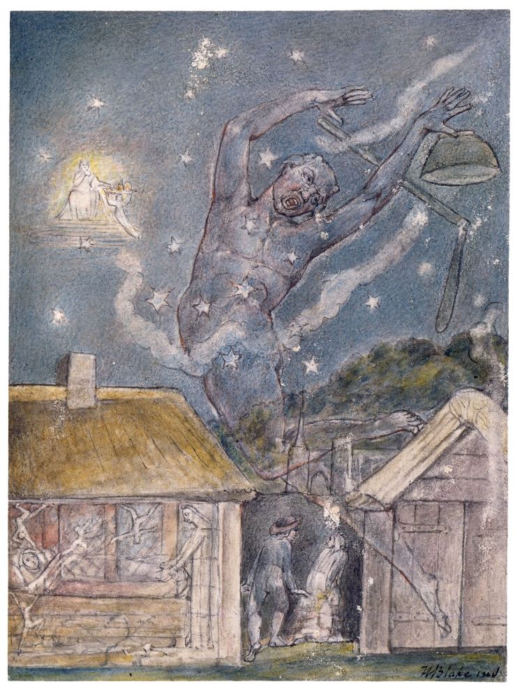
In this painting there is a woman sleeping in a small house, with a lady at the bottom of her bed and four smaller people who seem to have been thrown around as they’re struggling in the air. The lady at the bed seems to be an angel, who could be looking over and guarding the woman from any potential danger. The people around the woman could be different variations of her self as she could be dreaming and these are just the versions that appear in her dream. The house seems to be a safe place, I can infer this from Blake’s use of colour and light within the painting; the house involves light shades of pinks, purples and creams, these colours connote femininity, calmness and peace. This evokes tranquility for the viewer as we can relax as we know that the woman isn’t in any form of immediate danger. Furthermore, Blake chose this house to be the most colourful place of the painting to depict that you are safe when you are asleep, this is because you’re shut off from the brutal realities of the real world, and that you can really focus deeply on yourself and you don’t need to worry about any darkness in your life.
Although the house is very bright, Blake also uses light in the stars and the angel in front of the sun in the sky. By Blake breaking up the darkness with these bright stars he’s conveying that there is still a glimmer of hope in the world and that our future is still bright. This can be ironic as the angel in the sky is bright but this angel is symbolising the opening to heaven, and the only way to get to heaven is if you pass away, so Blake is showing both sides of the story. Another way Blake is showing two parts of a story is by having a ‘goblin’ amongst the angels in the painting, however, the goblin is a lot larger than any of the angels, Blake chose to do this to put emphasis on the goblin to covey that the goblin is the main focus of this painting, Blake orientated him away from the angel in the sky to show how they’re composing emanations, however by them being in the same painting it shows that anything can happen in your dreams. In my opinion, the goblin in this painting represents fears, this is just how I’ve interpreted the painting, this could be different to your views on the piece. I believe they represent fears because throughout history goblins have always been perceived as devilish greedy creatures, fears can also have devilish tendencies as they’re there to scare you, so that’s how I linked the two together.
Blake, however, used contrast within his painting as he involves darker colours and shadows. Similar to Milton’s Mysterious Dream, the shadows forebodes that the goblin may bring danger. However, Blake decided to colour the goblin with a translucent effect, this depicts that the goblin isn’t real, it’s not as frightening or as strong as he may appear to be- this symbolises that our fears (represented by the goblin) can be over-come and they’re actually just false imaginings there to make us stronger. Traditionally a Goblin is dwarf-like with very distinctive features, this is contradicted to the goblin in the painting, which is very large and tall, with quite human-like features. Blake adapted the ‘modern’ goblin to represent that we can all interpret things differently, and what may scare you could not frighten anyone else. This means that we all have our own ‘goblins’ (fears) to face, and there are ways to overcome them.
There are two people within close proximity to the goblin, Blake used this low amount of space between all the characters to demonstrate how your fears are never far behind you, but with people they should be easier to overcome. By interpreting the space between people you can view their whole relationship, so Blake purposely placed these people near each-other, everything within this painting is there for a reason and is done deliberately by Blake. By analysing the painting it allows you to delve in and see his reasoning behind including these elements.
In this painting Blake uses water-colour paint over black chalk. This is what gives the painting that distinctive texture, texture plays a huge role in a picture as it involves another one of your senses, touch. I thought in order to explore texture, I will create some paintings using black chalk and water colour paint, by doing this I will hopefully be able to recreate the texture of the goblin painting, this is just to explore his work further.


This painting didn’t turn out how I thought it was going to. I assumed the black chalk would’ve gave the painting a rough texture, but this painting was completely smooth. The chalk was extremely hard to work with, it was quite a thick piece so it was difficult to get thin lines with it, which meant the rose couldn’t have as much intricate detail as I was hoping it was going to. Nevertheless, I still like how the piece turned out, similar to the piece before, the chalk smudged with the paint, but this is what gives the painting that cool, abstract effect.
How William Blake Inspired Me:
Overall, Blake has inspired me. If I didn’t research Blake then I never would’ve experimented with a graphite stick and black chalk. I would’ve never of thought to incorporate such contrasting mediums together in order to get a new outcome. So I’m glad that I was able to create such beautiful pieces by mixing different sources together. So Blake has taught me to be not be frightened to explore methods of combining existing medias together. He also taught me that even if something didn’t turn out how you were anticipating it to, it doesn’t mean that it’s not good, if anything, it could be better than what you were hoping for. So stick with it and try new things.
Artist 2 – Salvador Dali:
Salvador Dali was born on the 11th May 1904. As a teenager he was an art student in Barcelona and Madrid, Dali fully understood loads of different art movements, he explored many movements which led him to be the great artist that he was. All the art he produced was extremely creative and portrayed a high level of skill. In Dali’s twenties he started to develop his own sense of artistic style, heavily influenced by Sigmund Freud’s theories. As he researched Freud he learnt about the subconscious ad he wanted to see if he could portray this through images. So that led him to develop within surrealism.
In order to further develop his art style, he came up with a way to induce a paranoiac state which allowed him to fully express himself through art by being able to dabble into his subconsciousness, then painting the images he saw when in this state. He called this method of inducing paranoia: ‘paranoiac critical’. Dali believed that when in a paranoid state, you’re the main focus of yourself, so the things you see or imagine are an accurate representation of you as an individual, so this allows you to put yourself at the forefront of your paintings, which therefore makes them personal. Dali suspected that when in that induced state, you’re not thinking as clearly as you could, which allows you to think of ideas that you wouldn’t otherwise be able to think of. Therefore opening you to be able to produce bizarre and unthinkable paintings. So, after he created this method his paintings became unimaginably creative, which led him to become the best surrealist artist ever. Dali’s paintings mainly thrived between 1929-1937, when he painted weird hallucinations he saw, dreams he had or any messages that came from his subconscious.
Dreams highly influenced Dali’s work because, similar to paranoiac critical, dreams allowed Dali to delve into his subconscious. Therefore when he woke, he was able to paint the events that occurred within his dreams, and still get the same effect of inducing paranoia. As all dreams have hidden meanings, proposed by Freud, by painting your dreams it can be another way of interpreting them, so you will then be able to learn more about yourself. Furthermore, it will give the painting a meaning that you wouldn’t be able to create whilst in your woke state, when your consciousness is at the forefront of your thinking. So as Dali involved this within his paintings, it’s what led him to become such a well-known artist.
After exploring this aspect of surreal art for several years, from 1938 his style adapted, this was caused by the change of time and society. His style morphed into being more focused on academics and politics. Dali then passed on the 23rd January 1989. I’m going to analyse some of Dali’s work that I feel like most represents dreams:
The Dream (1931):
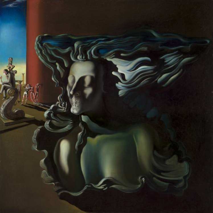
As the woman in the foregrounds eyes are shut we can infer that she is asleep, and therefore dreaming. Her senses are stripped from her as she cannot see, nor talk, as her mouth is covered with ants. In the modern world ants symbolise strength and accomplishment, suggesting that although they’re minute, they have a lot of power behind them, so this image would be perceived as a positive one. However, this interpretation of ants differs from what Dali perceived them as. Dali believed that ants where a symbol of ‘death and decay’, so by him including them within this picture could suggest that her dreaming is a bad sign. An interpretation of this could be that when you’re asleep you cannot see what’s going on in the real world, leading you to miss opportunities by not being able to make conscious decisions.
The woman’s hair seems to be flowing as if the wind is on her, this adds to the dream like effect of the painting as it brings motion and movement into the image, although the woman would be in a state of paralysis, because she’s dreaming, the movement connotes that her mind is very much awake, and she can still feel elements on her.
One of the men in the background appears to be holding a key. Dali made this key golden to convey it’s worth and importance, as gold is a very royal colour as it has connotations of wealth and success. Dali also made the key the only gold object throughout this painting, further emphasising it’s importance. The key could represent the key to the subconscious, and in order for you to unlock this aspect of your brain you need to be dreaming.
However, the people in the background almost seem to be fighting for this key, suggesting that it’s extremely important as it’s worth fighting over. Fighting in a dream can be perceived as frightening, which would make this dream more of a nightmare. Nightmarish traits are also shown throughout this painting as the woman’s eyes are almost bulging, this implies that she could be having a nightmare, as shes trying to open her eyes and wake herself but the paralysis is too strong.
Overall, the painting is quite dark, this could be because surrealism as a whole is quite a dark and mysterious art movement, as it mainly involves delving into your subconscious. In my opinion, the painting is very interesting. This is from Dali’s use of block colours: red, blue and brown. His use of basic colours tells me that Dali is trying to convey that the state of dreaming isn’t as complicated as it seems, it’s quite straight forward- like block colours. In addition, all these colours are very natural, for example brown soil, blue sky and red blood. These natural colours further depict how dreaming is a natural occurrence, and we should listen to what our dreams are trying to tell us as they can influence our everyday lives, much like how Dali’s dream influenced this painting.
Persistence Of Memory (1931):

Going back to Dali’s concept of ‘paranoiac critical’, this was one of his pieces created whilst in this induced state. When analysing the painting you can see how the visions that occurred to him in his reveries are reflected within this picture. Dreams represented through art are very personal, so this painting can actually be perceived as a self portrait as these images occurred to Dali in his paranoiac position.
The main message represented within this famous painting is the ‘unconscious fear of death’. This is depicted through the ‘melting clocks’. The clocks are deformed, this is symbolising that whilst in the unconscious dream state, time doesn’t exist. In reality, time is just a man-made concept that human-kind follows in order to live properly within society, it restrains us from living freely by putting deadlines to actions as everything we do somehow correlates to time. So seeing a painting where time doesn’t exist is invigorating and freeing. Furthermore, the clocks are gold and silver, as I’ve previously stated, these colours connote wealth, so by them decaying suggests that the normal rules of society: (working in order to gain money) doesn’t occur in the dream state as, similar to time, money is man-made and we don’t need to abide by these rules in our unconscious state.
Freud implied that the only way dreams can influence us is if we analyse them. However, as our conscious and our subconscious do not like working together, the only way we in which we are able to influence our conscious is to interpret the dreams we have. This can be difficult because our conscious tries to block out these thoughts from our subconscious as these thoughts are meant to be repressed and kept secret. Therefore, our repressed thoughts are often disguised as metaphors in a way of tricking our conscious in order for our dreams to actually be remembered. So, Dali knew this as he studied Freud, and that is the reasoning as to why Dali involves metaphors within his paintings. This and to give the piece more depth and meaning, making it interesting for it’s viewers so hopefully they will get inspired by his art.
Along with metaphors, another technique Dali enjoyed using within his paintings was juxtaposition. There is no right or wrong answer when it comes to art, so juxtaposition is an interesting way of conveying ideas throughout a painting. By putting objects amongst eachother which would usually have no correlation further emphasises the dream-like appearance as you wouldn’t find this in reality. Juxtaposition also demonstrates how opposing things are able to be beside eachother in perfect harmony, without negatively effecting anyone; so juxtaposition can create harmony. Dali wanted to create harmony within this picture as it evokes a sense of relief and satisfaction for the viewer as they can see that the objects have their own place and meaning to being there.
Another way Dali illustrated harmony is through the landscape. The landscape appears to be a coastline, somewhere most likely in Spain as that’s where Dali is from. The coastline presents harmony as the colours of the sea and the sky merge into one, this highlights unity between the elements as the blended look gives the image a soft facade. Dali presented this painting with soft lines to give the image a gentle appearance, especially as the softness has been used with the water, which is earths strongest element, it demonstrates that the things that might appear frightening, in this case water, have softer sides to them which once shown will allow us to overcome these fears. This can be linked back to the message of the painting ‘unconscious fear of death’ as it demonstrates that maybe we do not need to be scared of death, if we allow ourselves to see the softer side to it, and accept the fact that that’s life, we may be able to bring peace over our mind, which, in turn, would lead us to be able to live a happier and healthier life.
There appears to be loads of ‘free’ space within this picture. However, I see that the space is actually full of sand, which can be linked to the sand in a sand timer, further linking the painting to time. There is an immense amount of sand, which could be symbolising that although it seems like we have a lot of time, the amount of time we have is restricted to the amount of space we have. If you were to think about lives, then not a lot of time can fit into a life, which is why we need to enjoy every moment we have. I believe that Dali wanted to promote this message within his painting, but he didn’t want to state the obvious, so by including, what would initially be viewed as empty space, actually allows the viewer to dig deeper into Dali’s reasoning behind why he didn’t add further images into the painting to fill this ‘space’, which then allows us to receive this message.
In order to explore Salvador Dali further, I will produce paintings that involve his key themes of metaphors, juxtaposition and space. This way it will allow me to experiment with new techniques, and this in turn may inspire my final piece.
Metaphor:
In order to explore metaphors within art I decided to research some of the most common metaphors. I decided to paint, ‘money is time’. By painting this metaphor it allowed me to experience how different paintings have hidden meanings, sometimes you really need to analyse the piece in order to find out what it’s symbolising. So from producing this metaphor piece I learnt how easy it is to incorporate messages into your paintings, and how it gives the painting depth and emotion. Overall I like the idea of using metaphors within pieces.
Juxtaposition:
I explored juxtaposition in paintings; I decided to paint a flamingo in a desert. I used acrylic paint, to try to create texture within this piece I made the gold paint at the bottom of the page very thick, this way it sort of represents sand and it gives the painting a 3D effect. I’m quite pleased with how the piece turned out, I thought these were very contrasting ideas so I thought it was a good way of representing juxtaposition.
Space:
It was quite difficult for me to come up with an idea on how to represent space in a picture, I was talking to my family about it when they suggested that I draw an optical illusion which makes it look like there is a lot more space on the page than there is. So I looked into these illusions and I saw one which made it look like there was a hole in the page, which then adds space to the picture. This was difficult to draw as I had to get the right perspective to make it look like a hole. I like how it turned out and I feel as if I portrayed space in a picture well.
How Salvador Dali Inspired Me:
Researching Dali really inspired me as I learnt a lot about the surrealism movement. I learnt how tapping into your subconscious can lead you to creating explainable pieces, and how by listening to your dreams you can learn a lot about yourself, especially if you then paint these imaginings as you will then be able to analyse them.
I learnt how some people are very dedicated to delving into their subconscious, this is by Dali’s technique of ‘paranoiac critical’, although I am not going to attempt to get into this state, he still inspired me as maybe I will be able to think of new ways to connect with our subconscious, and I could then represent this technique through art.
Lastly, by creating pieces in the themes that Dali used (metaphors, juxtaposition, space) it helped me to understand that paintings do not always need to make sense, it’s okay to let your mind take over and express your thoughts. So going into the future I will not put too much pressure onto myself to create a piece that everyone is able to understand, I will just let my mind flow.
Artist 3 – Rene Magritte:
Rene was born on the 21st November 1898, when he was just 14 his mum committed suicide, she was found drowned in a nearby River. Between the age of 18 and 20, Rene studied at an art academy (Academie des Beaux-Art), he was only there for two years as he felt as if it was a waste of time. In 1922 Rene married, he then got a small job, and in his free time he would create lots of art. He then became very focused on producing this art work and he became a dedicated artist. Although he explored different art movements such as Cubism, his favourite art style was definitely Surrealsism.
Several years later he had his own show at an art museum, Rene was very quick at producing his art, so there was a lot of pieces to display at the exhibition. However, the art show didn’t really work out for Rene, his work was heavily criticised, ashamed, he decided to move to Paris. He still continued to paint. One of Rene’s major influences was Sigmund Freud, his dreamology heavily inspired Rene’s art style, as he explored surrealism further.
Rene enjoyed creating surreal art as he was able to express his views and opinions without being restricted to any rules, as surreal art doesn’t have any right or wrong answers. In addition, Rene was also interested within the subconscious, and how our subconscious attempts to influence our conscious through dreams. Hence why many of his paintings involve dream-like imagery. Rene enjoyed confusing his audience, throughout his paintings he wanted to create a sense of mystery, as this is essentially what a dream is. However, Rene stated that his paintings mean nothing, he didn’t think they always needed a meaning behind them, this contrasts Freud’s beliefs as Freud believed everything had a meaning. This juxtaposition further conveys a sense of mystery, as it confuses the viewer even more by provoking mixed views.
Rene wanted people to look at his artwork and question, I quote, ‘What does that mean?’. He wanted his paintings to be thought provoking, as we begin to attempt to analyse the painting and the symbolic objects throughout his art. Some of Rene’s work that allude mystery include:
The False Mirror (1928):

The painting is a lash-less eye, with the sky filling the iris. To begin with, eye’s are often seen as the ‘window into the soul’, the window connotes how our eyes are an opening into our body, they let us see the world, they let us see colour, people, etc.. By creating this opening between reality and our ‘soul’ it gives us that connection between our conscious and our subconscious. It gives us a way of feeding information to our spirit by taking in the views we see in the real world, and turning them into memories, stored in our mind. Then, when we use our eyes to see specific things these memories can be triggered and activated, which would then release them back into the real world.
Our eyes also convey and evoke different emotions, they can tell us so much about a person, without them actually verbally communicating anything. We can sense someones emotions, whether they’re delighted or miserable. Furthermore, if you were to look into someone you care about eyes, and they were conveying sadness, this would often trigger a domino effect which may lead you to feeling upset or disheartened, as their emotions can absorb into you. You can also, if you’re a good judge of character, tell when someone is lying by looking into their eyes, eyes always connote the truth, there’s ways of telling if someone is lying by looking into their eyes. Eye’s display the truth because they are an opening to your soul, as you subconscious doesn’t have a reason to lie.
So, moving back onto the painting, Rene decided to created this painting of an eye to demonstrate how he’s trying to get people to delve into their subconscious. However, he didn’t paint just a normal eye, he removed the normal iris and replaced it with a some-what cloudy sky. When we look out of windows the first thing we would initially see is the sky, so Rene created this iris to symbolise a physical, literal window, along-side the theoretically window into the soul. This image therefore denotes mystery as we wonder why Rene has changed these elements of the eye. This painting can appear very confusing as we are looking out of the window and seeing the sky, we are also looking into the window which is the soul, whilst the eye is looking back at us, so we are in their window. Rene purposefully did this to evoke confusion as he enjoyed painting mysteries.
The reason as to why Rene painted a cloudy sky could be to add more depth to the image, as it gives the sky movement as the clouds would be floating by. Or the clouds could be symbolic of emotions, as clouds hold water and tears are water, so he could’ve included the clouds to demonstrate this person’s emotions, portraying that they’re sorrowful. Another reason could be that if he didn’t involve any clouds, the plain blue sky could’ve easily been mistaken for a normal blue iris, it therefore wouldn’t of gave off the same confusing effect as it does now. However, we do not actually know the real reason behind why Rene included these clouds, and Rene might not even know himself, that’s what adds to the mystery of the painting.
Below are some pieces I created which are inspired by this painting:
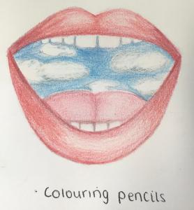
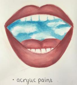
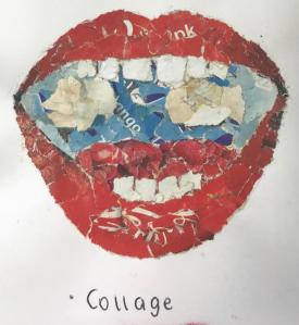
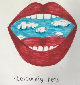
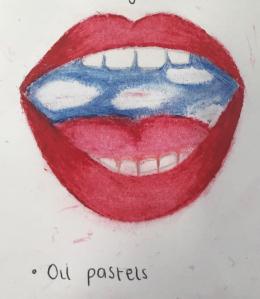
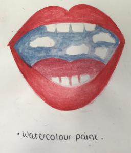
I decided to focus on another main facial feature, I wanted to stay along the same lines as Rene, so I chose lips rather than eyes. This was just so there was a bit of difference between the paintings, and also so I could put my own spin on his work.
I firstly experimented with colouring pencils, I chose this media first as I would say I’m the most confident with pencils as I find them simple to use and I’ve probably had the most amount of experience within this medium. I then created the same drawing but using acrylic paint, a collage, colouring pens, oil pastels, water-colour paints, and Illustrator.
I wanted to experiment with all these different mediums just so I can see which one would produce the best outcome. In my opinion, the acrylic paint painting is the best. Although it was very time consuming and difficult to produce as the paints were quick drying which made it difficult to create the ombre effect, I am happy with the outcome of it. I like how the colours blend and that their are not any harsh lines, I also feel as if the clouds look the most realistic out of all the different pieces.
The Son of Man (1964):

This painting is a self portrait of Rene, his face is partially hidden by a large green apple. The juxtaposition of Rene and the apple creates mystery as the apple has no correlation or reason for being there. The only reason its there is to cover his face. Rene had a weird obsession with objects covering objects, he believed that everyone was always fighting with themselves to try to see hidden yet visible things. In more detail, everything we view in life, objects more specifically, are always going to cover something else, so we will never be fully satisfied with what we see in the foreground. So we all have this urge and desire to see behind what would initially meet the eye, this, again, can be linked to dreams as we need to really go in depth to interpret a dream, we cannot just briefly analyse it and expect to find out what our restrained thoughts and desire are.
Rene’s surrealistic style is portrayed within this image in multiple ways, one of which is that his left arm is the wrong way round as his elbow is facing us, this is quite a minute detail that you may not initially see. You would only see this if you analyse the image. This links to his obsession, as you begin to see more than what initially meets the eye, if you actually take a second to look at the painting.
When viewing this image, I question, why an apple? I’ve decided to research what an apple actually symbolises. I thought back to the Book of Genesis, and the story of Adam and Eve. Adam and Eve were instructed by god to not eat the forbidden fruit (the apple), if they ate the fruit they would have to leave the Garden of Eden, however, Satan visited them and told them to eat the forbidden fruit, going against god they did eat the fruit, they would then know good and evil. So by Adam and Eve eating the apple, it changed the way they perceived life as they had to start over again somewhere new. So linking back to the painting, the apple in-front of Rene’s face could symbolise this forbidden fruit, so Rene is trying to demonstrate how this apple can change your perception on life so dramatically. Additionally, I thought about more ‘famous’ apples, and I thought about how the apple that fell on Isaac Newton’s head allowed him to discover gravity, which changed history and influenced many people, scientists perception and how that apple influenced science in general. So by Rene using an apple to cover his face, it could symbolise this important events that made history.
Despite the fact that some of Rene’s paintings (like this one for example) have religious connotations, Rene himself was not religious, in-fact he was agnostic. However, many people believed that Rene did have a religion but he just hid it from the world. No one really knows for sure.
The gloomy sky also adds mystery to the painting as it creates an eerie atmosphere. Rene created this glum ambience from the use of colour and shadow. Although there seems to be bright skys up yonder, the dark clouds bring this sense of dismay and despair, which could signify Rene’s relationship with himself so the sky symbolises Rene’s thoughts, especially because this painting is a self portrait, everything within this painting will represent him in some way, so you can infer that Rene doesn’t have positive views about himself, yet the touch of brightness could foreshadow that his opinions about himself may change.
How Rene Magritte Inspired Me:
From producing the ‘lips’ piece, I learnt that although it’s the same picture, using different mediums heavily influences the final outcome, and the amount of time it takes to produce. He inspired me to try out multiple different techniques and to not just stick to what I know. So in the future I will explore a wide range of mediums instead of just choosing the medium that I’m the most confident within.
Artist 4 – Max Ernst:
Max Ernst was born on the 2nd April 1891, he was born in Germany and he had several siblings. His father was interested in painting yet he only ever took it as a hobby. This in turn then heavily influenced Max as he was always around painting from such a young age. At 18 Max joined a university where he studied may subjects, art literature being one of them. In this year Max became fascinated with mentally ill patients as he visited many asylums, he was very interested with their minds. This is also the same year that Max took up painting. 2 years later in 1911 is when he decided he wanted to be an artist.
Max was inspired by famous artists such as Van Gogh and Picasso. The first major pieces Max produced were his collages, which is what Max is most famous for today. In 1923 Ernst was inspired by Freud, as he took many of these theories on board and these theories influenced his artwork. Ernst like to experiment with his artwork, hence why he was influenced by Freud’s beliefs, he wanted to push the boundaries of what art could be at that time. Which led him to create a new technique used within at called Frottage.
Frottage is a style that many people use within art, this technique is also used throughout many schools as it’s relatively easy. As mentioned before, Ernst wanted to experiment with ways of producing art, this also involved experimenting with different textures. Which led to the invention of frottage. Frottage is the act of laying paper over a material that has a slightly rough texture such as bark or wood, then using a medium such as a pencil to ‘scratch’ over the surface so the imprint of the material goes onto the paper. Ernst liked this technique as he believed that the artist didn’t have much control within the final outcome of the piece, he’s letting the mediums take control of the art- which is the beauty of it. Ernst stated that he: “came to assist as spectator at the birth of all [his] works”, which perfectly describes how the art was producing itself.
After the development of frottage, 2 years went by until Ernst developed a similar method called grattage. Grattage is when you paint a canvas with several layers of paint, you put objects underneath the canvas, (objects like wood, glass etc..) then using a sharp utensil like a scalpel, you will scratch away at the layers of paint, to reveal the pattern from the objects underneath the canvas. This was just another way Ernst could experiment with the rules of art.
So throughout Ernst’s life he created many new techniques that inspired multiple artists, and arts of that time period. Many of Ernst work was inspired by and followed the rules of surrealism, especially after the development of Freud’s theories. Although most of Ernst’s work would be categorised to the ‘abstsract expressionism’ due to his experimental work. Ernst then sadly passed on the 1st April 1976.
I decided to explore Ernst’s techniques of frottage:
Frottage:
This was a very simple piece to create, despite it’s simplicity, the overall piece is very cool. the piece almost looks embossed, which gives it depth and dimension. This also conveys the texture of the leaves, which makes the creation seem realistic. I may use this technique in my final piece as I enjoyed producing the piece and I like the aesthetic of it.
I’ve also decided to analyse some of Max’s work:
Paris Dream (1925):
Initially when I look at this painting the feelings I get are mixed, for example I feel confusion and intrigue. This painting is very abstract and of the surrealist movement, which allows me to interpret the painting which best suits me. I’m not overly sure on what is being portrayed within the picture so I’m going to focus more on the techniques Ernst used throughout the paint.
To begin with, the colours are quite juxtaposing, this is because there are warmer toned colours towards the bottom like reds and oranges, and colder tones towards the top like blues. The connotations of the warm colours give us a sense of serenity as we begin to feel comfortable in the place we are at at the moment. However, by this contrasting the colder tones it evokes a feeling of unease as the cold tones connote the ocean, which is quite frightening as it is so huge. Ernst involved juxtaposition using these tones because it gives the painting the ability to control it’s viewers thoughts as it elicits these feelings of uncertainty, which is what Ernst wanted as he wanted to leave a mark on people’s thoughts in attempt to try to change societies mind-set.
Another way this painting makes me feel slightly on edge is through the lack of unity within this image. The three shapes/things at the bottom are very irregular, none of the three are the same, this shows that there may be a slight conflict between the three. This adds to the sense of unease as the lack of unity depicts madness. Furthermore, there is no overall pattern to the shapes, they’re all intertwined and merged together, so this doesn’t let us focus on one specific thing, it makes our minds wonder and start to overthink the meaning behind the painting. This overthinking then leads to a feeling of apprehension which I believe is the main feeling trying to be stimulated in this painting.
Despite the irregularity of the shapes at the bottom, there is a somewhat regular shape in the middle of the painting. This is what leads to the sense of confusion as I am unsure on what Ernst was trying to demonstrate throughout this painting. Yet that is the beauty of surrealism. By Ernst being a surrealist it allowed him to create paintings inspired by his dreams; which is what this painting is an accurate depiction of. Ernst is telling us, similar to what Rene Magritte stated, that not all paintings need to have one specific meaning behind them (much like dreams), that sometimes he just lets his hands free. This circular shape in the centre almost represents a sunset, or a different universe, a UFO, crop circle, waves- there’s really no limitations as dreams are infinite.
Forest and Dove (1927):
This painting is very personal to Ernst, there are many elements incorporated within this piece that give the painting sentimental value to him. To begin with, this painting was inspired by the woods that were located near his childhood home. So this gives the painting life as he can relate it to himself, furthermore it also gives the painting emotion. This is because when he was a child he was often scared of the woods, as it was very large and he felt as if he could easily get lost in it. Hence why the painting is very dark, there’s not a lot of colour to the painting, this further highlights how it’s easy to get lost in the woods because you can fall into the shadows. Ernst’s technique of using dark colours allows the audience to almost get lost in the painting themselves, as the shadows lure them in.
Another technique Ernst used in this painting to evoke fear would be the lack of detail. The trees are very plain with not much life to them at all. His choice of using dead trees opposed to live trees highlights how the woods have been scaring people for years, and it drains the trees of all their beauty and brightness. The lack of detail further implies how when it the woods you have no clues to how to get out, you literally only have what you can see, and your surroundings are not able to give you any information about where you are. Ernst wanted to almost scare the viewer, so he can show them a glimpse of his life, as he had to live with this consist fear for years.
Another way this painting is personal is because he used his own technique of grattage. By involving his own creation it portrays that despite the fact that he was frightened of the woods, he still carried on with his own life, and he stayed true to himself by producing new ideas. In addition, by using this technique he was able to use real bark under the canvas to created the texture of the trees. This technique gives the painting depth as the texture allows the viewer to use another one of their senses, it makes the painting feel more real. This is another way of Ernst attempting to create that fear in the viewer.
In the painting there is a dove trapped in a cage. The dove appears to be really small, but it’s actually an accurate size, it’s just the woods is so vast it makes the dove appear smaller. In this painting, the dove is symbolising Max himself, again making the painting personal, this alludes how Max felt as if he was trapped. In addition at the time this painting was produced surrealists believed that the woods were a, ‘metaphor for the imagination’. So by Max being trapped in the cage in the woods he’s actually being forbidden from his imagination; which can be a scary event as you feel as if there’s no way of escaping.
So it conclusion, this paintings main goal was to evoke fear in the viewer, not to completely scare them, but just so they could have an insight into Max’s mind. In order for myself to try to get an insight into his mind I decided to create a painting which involved one of my fears, to try to connote this fear to my audience:
Fear of Fire:
I decided to paint the inside of a fire, as Ernst was an abstract painter, this fire I produced is quite abstract, it’s not your typical flames. Fire is quite frightening as it is uncontrollable and deadly, so I was hoping to portray this fear throughout this painting. By painting a fear it allowed me to break it down and understand it more. So I can see Max’s fascination with including fears within his work.
How Max Ernst Inspired Me:
Overall, from researching Max I have gained a lot of knowledge. This is because I learnt multiple new techniques including frottage and grattage. Max has influenced my work because, as previously stated, I may use frottage in my final piece, if I didn’t research him then I never would of experimented with these techniques. So he has heavily inspired me and I enjoyed researching him as an artist.
Artist 5- Frida Kahlo:
Frida was born on the 6th July 1907 in Mexico, she has 3 other sisters. Throughout her childhood she had quite bad luck, she suffered from polio when she was very young, this led her to being bed-bound for 9 months. A couple years later she was in a horrific bus accident, this led her to having several broken bones, fractures etc.. Frida then had to be in a full body cast for 3 months. When she was in this cast, in order to keep sane she had to think of something to keep her entertained. So this is when she took up painting. Her parents were very supportive of her painting hobby, and they enjoyed the beauty of the art she created.
When Frida was older she married an artist who encouraged her with her paintings. She then moved around a lot due to her husbands (Diego Rivera) work. Frida then continued to paint, creating many paintings, focusing on self portraits. Frida enjoyed painting self portraits or surrealistic self portraits as she felt as if it was a subject she knew a lot about,(she spent a lot of time alone so she learnt a lot about herself). Frida had a rough adulthood with multiple issues with her marriage and problems with being able to have children. These incidents influenced many of her paintings.
Painting really allowed Frida to express herself, as it allowed her to express her thoughts, free her mind from worries, and to distract her from the problems of reality. Her issues in life carried on, whith the tragic loss her of father who she was close with, and a divorce and a remarriage. Another disease led her to get part of her leg amputated, again she was bed-bound for months and months which caused her to get depressed, so bad that she contemplated suicide. Not long after, it was her 47th birthday, and a few days passed after that when Frida was found dead at her house. Some people thought it was due to her condition, others believed it was possible suicide. Her work became very popular after her death, as she inspired many people, especially female artists.
The Dream (The Bed) (1940):
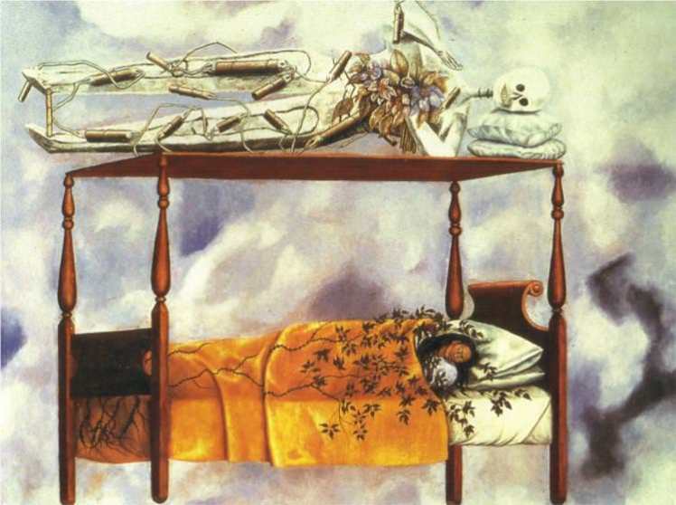
The message of this self portrait is to depict that death is never far away from you. That no matter how peaceful you may seem you never know what the near future may have in store. I believe there are two very contrasting interpretations to this painting. One positive and one negative:
Frida displayed this eerie, enduring message through the dark, murky fog in the background of the painting. Fog is seen as a negative event as fog is used to hide and obstruct your clear vision, which can be a frightening experience. Furthermore fog can also be depicted as being ghost like, this imagery denotes negativity as ghosts are seen as oppressive emanations. Fog also gives the impression of feeling left behind or unwanted, which adds to the eerie effect of the painting.
Another way the painting connotes negativity is through the skeletons, the skeleton laying on top of the bed is strapped with dynamite, this demonstrates how death can literally happen at any time, it can be an instant scenario that you may not of been anticipating, much like bombs going off. The explosives also emphasise the danger of death, and how you do not get any second chances with it.
However, on a more positive note, the painting doesn’t have to be as bad or as scary as it may seem. In Mexico, where Frida lived, death is not seen as something that’s bad or negative. They accept it as have been taught that life and death come hand in hand and that’s just the way it is. There are more positive feelings linked to death in Mexico than negative ones. The event can be seen that that persons journey of life has come to an end. In Mexico they hold a festival called ‘Day of the Dead’ to celebrate this inescapable scenario in life.
So Frida has portrayed these positives in her painting. This is by her laying peacefully in a bed along side a skeleton. Beds are perceived as somewhere to grow as an individual and to evoke emotions of calmness and tranquility, so by these two laying in harmony with each-other demonstrate how death isn’t anything to be scared of, instead we should live in the moment and understand that we should accept it.
Another way Frida conveys the positives is through the flowers within the painting. Firstly, there are vines growing up her duvet, this is representing life and the eagerness to grow. This is then along side death which further signifies how they come and in hand with eachother. The skeleton on top of her bed is also holding a bouquet, this is ironic as death is holding life. Irony allows the painting to hold emotions of happiness as we are able to express serious opinions but through a light-hearted way.
On a more positive note, the fog or dark clouds could just be demonstrating the realm between lie and death, and in that stage they can be amongst each-other in a calming environment. So by Frida including both the negative and positive side of death in this painting allows the viewer to understand that life is what we choose it to be, we can either run and hide form the fact we are going to die one day, or embrace it and ensure to make each day count.
Girl With Death Mask (She Plays Alone) (1938):

This painting has a lot of symbolic meanings. Firstly, it is a self portrait as the girl in the photo is herself, so it is a very personal painting. As Frida was a very ill child, she was very often alone, which explain the subtitle of this painting. The mask that she is wearing in the painting is a skull, as if to state that she feels and looks ‘dead’. Being ill really makes her feel like someone completely different as she is losing sight of herself. The emotionless skull depicts how she felt as a child, with no one to talk to, no one to ply with, just the voices in her mind to keep her occupied.
By her wearing the mask, and having a second mask on the floor connotes how she often has to switch personalities, she cannot let herself stay with one part of her mind for too long as she might begin to lose control and lose herself for good. So the second mask allows her to express some internal repressed feelings that she may have as the mask is protection from her true self, it can be seen as a layer to stop herself from getting hurt further.
Another way Frida conveys loneliness in this painting is through the landscape of the painting. In the background it appears to be a desert or a mountain range, both being very empty, broad places where not a lot of people live due to the frightening weather conditions. By Frida placing herself in these landscapes is her way of presenting how lonely she truely feels. She is trying to allow the viewer to see that there is no one around to help her, she living in these harsh conditions and she’s fighting these battles all by herself. By her using both a mountain range and a desert conveys how she’s feels like she’s getting the worst parts of all the world all in one go, these juxtaposing places shouldn’t exist together, but in her mind they do, representing how her mind is a confusing, messed up place.
However there is still hope within this painting as she is holding the yellow flower, yellow symbolises health and beauty as it is a very bright warm colour, and, again, flowers are a symbol of life.
I wanted to create a piece that merges these two paintings together, so I thought about involving skulls and flowers to represent the first painting, just so I can experiment with new combinations and then I wanted to attempt to create some sort of facade or mask with these flowers.
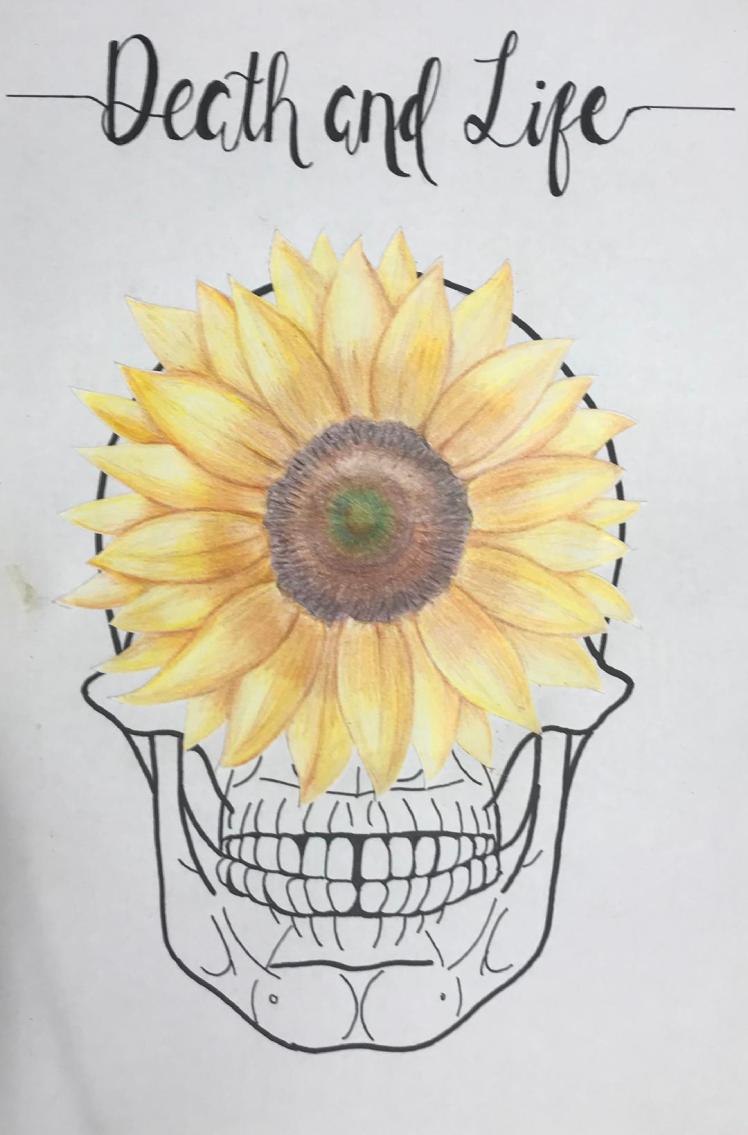
I feel as if the picture turned out well because I believe I successfully created a piece that symbolised both of the paintings I analysed. I drew a sunflower as I thought this flower was probably the flower that represented life the most, as it’s very bright and warm. It is also the flower the girl is holding in the second painting. I then put this flower on-top of the skulls eyes, to try to connote that death sees life, but life cannot see death. Suggesting that death is an unexpected event that we cannot foretell. Furthermore, the sunflower hides most of the skulls face, so it is acting as a mask which was inspired by the second painting I analysed.
How Frida Kahlo Inspired Me:
Overall, Frida is a very inspiring woman, she had a rough life yet she was still able to influence society by creating her interesting paintings. Her ‘The Dream The Bed’ painting has inspired me as I have learnt to try to make each day positive because you never know when your last day is going to be. Furthermore, in her paintings she always tried to put a positive spin on a sinister thought, further highlighting how she really just wanted to make others happy by showing them that even bad things have a positive side.
Week Six Evaluation (22/04/19-28/04/19):
This week I really focused on producing and completing my artist research. I wanted to research five artists in total, so to stay on track for each day I dedicated it to one artist. I firstly researched their life, their backstory etc.. I then decided to research 2 pieces of their artwork, I chose to analyse two because I thought I would be able to learn more about them as an artist if I was to look at more than just one piece of work they created. I then fully analysed this artwork. I then produced artwork inspired by them. I created this artwork because I thought it would help me learn new skills and techniques which may in turn influence my final piece. I’ve previously discussed how I thought each piece of art I produced went and how they inspired me in general.
As I’ve included research into different artists, I did not take this into account within my predicted weekly plan. So this led me to fall a week behind. For my seventh week I was meant to start my initial designs for my final piece, however I still haven’t produced enough primary research, so I will have to start my design work on the eighth week rather than the seventh as I am going to dedicate this upcoming week to primary research.
I am still writing in my FMP action plan, for this week for each day I wrote out which artist I was going to research and what art work I was going to produce, this really helped me to not put too much pressure upon my self to research loads of artists all in one go, by breaking it out over the week it allowed me to get the most out of my research as I really took it on board, it also gave me enough time to put loads of effort into the artwork that I produced.
I was quite disheartened that I fell a week behind, but I had to keep reminding myself that it was just a predicted plan that I produced at the very start of my FMP, so it wasn’t always going to be 100% accurate. I am still happy though as the majority of my research is now complete. I thoroughly enjoyed researching dreams, I have found it very interesting and I have learnt so much that I wont only use to complete this project, but I will also take this knowledge and apply it to my future
For this upcoming week I will explain why I researched everything I did and I will complete primary research, and my experiments.
Why I Researched Everything I did:
What is a dream?- Firstly, this was probably the most important thing I could’ve researched. If I am basing my whole project upon dreams then I think it’s extremely important to actually understand what a dream is. Whilst researching what a dream is I gained a lot of knowledge like: the chemicals that get released during dreaming, the stages of sleep and dreaming, how to interpret your dreams etc.. I also discussed my opinion on what I think a dream is and what dreams mean to me. The reason as to why I wrote about my opinion is so it gives the readers an insight into my mind and my thought processes, therefore they can see how my views and opinions change throughout the project. I do believe that it’s important I show my thinking about the subjects I research, also by doing this I can always refer back to my thoughts when I first began this project and I can compare my current knowledge with the amount of knowledge I had back then. This allows me to show how the things I learn influence my final choices.
When do dreams occur?- Again, the reason as to why I researched this subtopic is pretty self explanatory, I just wanted to further my knowledge upon dreaming as a whole. I was also quite curious to this question myself, I’ve always wanted to know the answer as dreams have always been something I’ve been quite interested in, so I thought I would include this within my research as it will not only aid my project but it will also give answers to a questions I’ve always wanted to know.
Why do we dream?- Similar to the question before, I really was just curious upon this question. Although I didn’t fully get the answer to this question I was still satisfied in the amount of knowledge I gained when trying to find the answer. However, there isn’t a straight forward answer, scientists and psychologists have been trying to find out the real reason as to why we dream for hundreds of years, so I knew I wasn’t going to get a straight forward answer but I still enjoyed researching this question as it allowed me to further understand the concept of dreaming. I also researched a study that a scientist conducted, I included this within my project because I feel like taking some information from different sources allows you to learn things that you wouldn’t of necessarily of learnt if you didn’t.
Inventions created whilst dreaming: The reason as to why I researched inventions was because I wanted to see how dreams have majorly impacted the wider world. If these people didn’t have those specific dreams the way we know the world now would be very different, the periodic table might not of been the same, we wouldn’t have Google, famous stories like Frankenstein wouldn’t exist. So from researching these inventions I have learnt that acting upon and listening to your dreams can influence potentially hundreds of thousands of peoples thoughts, so that’s just another reason why we should listen to what our subconscious is trying to tell us.
How can I remember my dreams?- I researched how to remember your dreams because I feel like it may help me when I come to create my final piece, I am not sure
on what I am going to produce yet for my final piece, but if I answer the most common questions asked when thinking about dreams, I could then include these answers in my final creation and I will then be able to reach out to more people as I’ve answered (or attempted to answer) some of the most thought about questions.
Facts about dreams:- Again, I thought it was important to include some facts and statistics throughout my project, as this just provides me with evidence and the reliability that I need. Facts also interest people more than opinions as they can trust them and believe them, rather than basing their thoughts of different theories. I mainly got these facts off of the internet however I also used videos and books as a means of research. I decided to research facts because I feel as if the more knowledge I gain upon dreams the more it will enhance my final piece as I know that I can somehow incorporate these facts into my creation.
Dream Lag: I researched dream lag as it talks about a scientific side to dreaming. I learnt facts and statistics upon the subject and I thought this was beneficial because facts allow people to trust my views as I have evidence to back it up. Furthermore, because dream lag is quite a common phenomenon I wanted to include it as many people may be able to find some relation to it, which may allow them to feel calm as they can see that it is normal and it happens to quite a few of us.
Precognitive Dreams: When researching precognitive dreams I looked into famous examples in history, as I didn’t have any experience with precognitive dreams myself, I turned to secondary sources for help. By including these famous events it will allow viewers to relate as they will be able to understand the concept of these dreams more as examples really help them in understanding. I found this fascinating a it was quite eerie because you could almost relate it to witchcraft as you can somewhat tell the future. I may not talk about this in my final piece because I feel like there will be many mixed views upon the subject as people have strong beliefs when it comes to witchcraft and fortune-tellers.
What are nightmares?: I researched nightmares because I wanted to talk about the scary, negative side to dreams, rather than just the positives, as I think it is important to show both sides to a subject even if it may be quite frightening. Dreams and nightmares also often come hand-in-hand so I couldn’t of missed this subject off.
Freud: Sigmund Freud is possibly the most important man relating to dreams. I couldn’t research dreams without researching this man, as he was such an influence on how dreams are perceived. I researched Freud because it would be hard for me to research other aspects of dreaming, and artists who were inspired by him as I wouldn’t of understood any of the concepts.
Psychoanalytic Theory Vs Neuroscientific Theory: I really enjoyed looking into these theories, I felt like it changed my perception on dreams as I was able to view these concepts from two completely opposing sides. As I enjoyed the psychoanalytic theory I feel as if I will be able to take key these key notions and implement them into my final piece. This is because I found them very inspiring as I learnt that you can begin to feel better in yourself if you follow the rules within this theory.
Lucid Dreaming: I believe the more I research into different aspects of dreaming, the more I will learn which will then be able to enhance my final piece. To further my understanding of this topic I will conduct an experiment upon lucid dreaming to see if I can grow my knowledge.
Sleep Paralysis: Although I enjoyed researching this I don’t believe there is much I can take away from this as it may frighten some people as it is quite a scary topic. I do not want to include negative sides within my final piece as I want my project to be as uplifting and as beneficial to the user as possible.
Most common dreams (analysed): For my final product I know I want to include some sort of way to be able to analyse dreams, so I thought it would be a good idea to gain some experience within this region and actually interpret some dreams. As I didn’t have the knowledge upon what every dream actually means, I turned to different medias to find this information. I’m glad I included this within my research as I believe it is going to enhance my final piece as I will be able to use the experience I gained.
Artist Research: I have previously discussed how the artists have inspired me, and how their work influenced me. I researched artists and art movements, again just to expand my knowledge and experience as I was able to create pieces using different/new mediums. I may be able to use these new techniques in my final piece.
Dream Research (Primary):
My Questionnaire:
So I’ve produced a questionnaire about dreams, I will hand out this questionnaire to around 10 different people of varying ages. Once I’ve got the results back, I will then analyse and compare them.
All of the questions that I have involved within this questionnaire are to hopefully help me further understand dreams, I picked them out in order to get closer to seeing if your age and gender affect the way you dream and remember dreams.
My Predicted Results:
I feel like my younger audiences of 10-21 will more likely be able to remember more of their dreams than the older audiences of 50+, however I feel like more of the older generation would’ve had a lucid dream and experienced more of the ‘most common’ dreams. I will then compare my prediction to my actual results.
My Results:
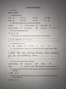
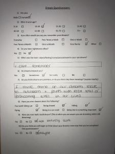
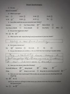
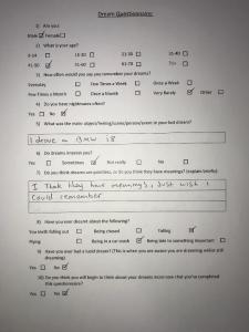
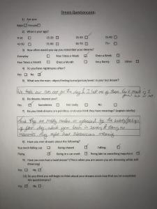
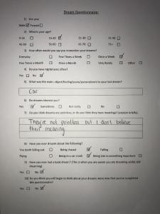
So after collecting results from my questionnaire I can see that my prediction was mainly right. I can gather that the older generation have experienced more of the ‘most common’ dreams than my younger audiences. I can also infer that people between the ages of 21 and 30 are the most interested in dreams. So from producing this questionnaire it has helped me understand who is and who isn’t really interested in dreams. I can then use this information to influence my final piece as I can focus on the most suitable audience.
My Experiments:
I really want to see how much I can change how my dreams work. In order to do this I am going to complete a set of experiments that I made up, to see if it affects my dreams.
Experiment 1:
This experiment requires me to not go to sleep for the night and instead go to sleep in the morning, I will then compare my results of my dreaming pattern to those of a regular night to see if I have more or less dreams.
Firstly, to give you a background story, I have a watch called a FitBit HR, this watch has a heart rate sensor on the back, so my heart rate is forever being recorded. There is also a matching app that you can download on your phone, the watch then transfers all this data to the app. As the watch tracks my heart rate, it also detects movement, therefore it also tracks my sleeping patterns.
So for this night (10th April), I didn’t sleep all night, I kept myself occupied by walking and going out. By the time I went to sleep it was 8:15 am and I woke up at 3:20 pm. Here is the photo of my sleep for that day.
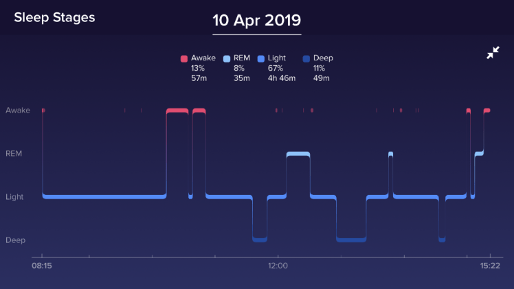
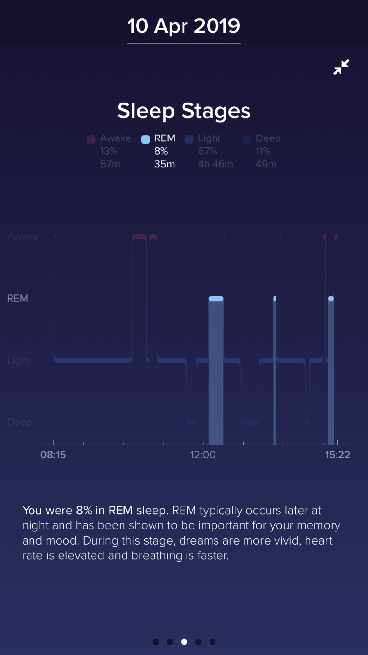

As you can see by the percentages at the top, I was dreaming for 8% of the time I was asleep, this is about 35 minutes of dreaming.
Now here is a photo of a night (6th April) where I went to sleep and woke up at a reasonable time.
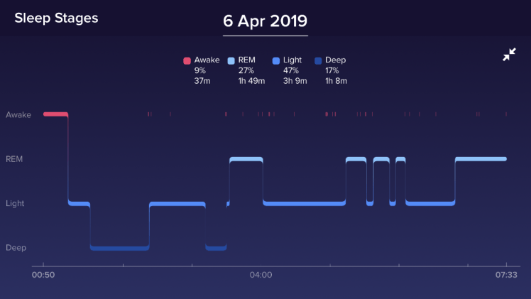
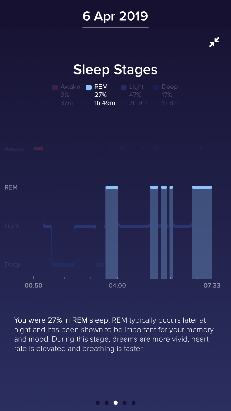

Looking at the percentages again, I was dreaming for 27% of this night, which accumulates to nearly 2 hours of dreaming.
In order to make this a fair test, I compared my results to the night of the 6th because for this night and the night of the 10th I slept for the same amount of time (6 hours 10 minutes). By choosing nights where I slept for the same amount of time you will really be able to see the difference in percentages of my sleeping pattern. If I was to compare it to a night where I got more or less sleep, then the percentages will be different because the time was different. So my results are reliable because of fairness of this test.
So to compare, the percentages of the time I was dreaming between the two nights has a difference of 19%. From this you can infer that sleeping at night has a huge impact on the amount of time you dream for and because dreaming has so many health benefits it’s important that you sleep for a reasonable amount of time and at a reasonable time (It’s recommended you get about 7/8 hours of a sleep a night to have a healthy lifestyle). I conducted this experiment mainly out of curiosity, I just wanted to see if sleeping during the day does affect how much you dream. From producing this experiment my question has been answered and the answer is yes, sleeping in the day compared to the night does impact your dreaming pattern which will over time negatively impact your lifestyle.
This experiment influenced me as I was able to gain more of an understanding into dreams, which will help me to produce a better outcome for this project as I will be able to apply more knowledge into my final piece.
Experiment 2:
I thought it would be a fun idea to see if I am able to manipulate my dreams. I have previously talked about what lucid dreaming is, facts about lucid dreaming and the reasons to why it occurs, but I have yet to discuss how you could possibly force the event to occur. People do train themselves to be able to lucid dream on call, but this does take time. However, people manage to induce this state on random nights so I want to see if I can replicate this.
In order to potentially lucid dream I need to:
Firstly I need to ensure that my bedroom is dark and quiet, this is just so I will not be disturbed when I enter the REM stage of sleep. In order to realise that I am dreaming whilst dreaming I need to look out for signs, so when I’m dreaming I need to consciously think if what I am seeing is normal, or if it is false, this way when I see something that is false I should be able to recognise I am dreaming. Another way to learn how to lucid dream is if throughout the day I make an effort to ‘check’ if I am dreaming or not. These checks are very simple, for example: if I go to check the time on a clock, I will check it twice as you cannot tell the time in your dreams, so if the time drastically changes between the two looks then I know it cannot be real. Another ‘check’ would be for every time I walk through a door I will ask, ‘am I dreaming?’ this is to train my brain to hopefully ask that question when I walk through a door in my dream.
Another way to try to induce lucid dreaming is if I repeat the phrase ‘I will lucid dream tonight’ as I’m falling asleep, to hopefully bring this conscious thought into my unconscious. The last thing I can try would be if I was to wake in the night, I need to lay completely still and keep my eyes closed and try to focus on the dream I was just having, this way you can then sometimes ‘carry on’ the dream, but this time you will be aware that you are dreaming.
So now I have researched this I will conduct this experiment tomorrow (01/05/19). Throughout tomorrow I will keep asking myself if I’m dreaming, every time I walk through a door I will question myself if I am dreaming and I will repeat the phrase as I’m falling asleep and I will make sure my room is quiet and dark.
My results:
Throughout yesterday I tried to remember to ask myself if I am dreaming and to question myself when I walk through doors but it was quite difficult to remember to do this. I definitely forgot about it around half way through the day and I only dismembered I was conducting the experiment when I checked the time in the afternoon. At night I did repeat the phrase ‘I will lucid dream tonight’, over and over again but I do not recall bringing this thought into my dream. I did not lucid dream and I cannot even remember what I did dream about, so this experiment failed as I do not have positive results. My results are the way they are because I didn’t follow the rules exactly (I kept forgetting), so they’re inconclusive, I may try this experiment again in the future to see if my results change. However it was still fun to try and it has furthered my knowledge upon this subject
Experiment 3:
For this experiment it will involve me not using my phone whilst in bed and before I sleep. As a teenager I am always with my phone, I do like to always have my phone on me and I do think I am on it quite a lot. I think with my age any people are always using their phone, especially when it comes to night time and you are just chilling in your room. Phones are quite bad for your sleeping schedule as they are a huge distraction from you actually being able to fall asleep. They have a very bright blue light which disrupts the amount of melatonin your brain will secrete, making it more difficult for you to feel tired. Lastly if you repeatedly sleep too close to your phone there will be some radiation from your phone which long term will affect your brain.
So I want to see if I stay off my phone for at-least 2 hours before I sleep if it will affect how I sleep an if it impacts my dreams. I hope that I will wake up feeling really refreshed and feel like I had a really good sleep, and I want to be able to vividly remember what I dreamt bout.
My Results:
So for this experiment I turned my phone of 2 hours before I knew that I as going to be going to bed. For that time I tried to distract myself by listening to music and watching a bit of TV. When I got into bed I automatically started looking for my phone until I remembered that I was conducting this experiment. So instead I tried to sleep straight away, when I have my phone I would normally stay up for at-least another hour, so it was quite difficult for me to actually fall asleep. When I woke up I would normally reach for my phone right away, but instead I laid there and really tried to think about what I was dreaming about. If I’m being completely honest I couldn’t actually remember my dream.
I feel like to get more accurate, clearer results I would have to try this experiment out continuously over a period of time to see if it impacts me more long term. However, I did have a really good nights sleep. From conducting this experiment it hasn’t really affected my outlook on dreams as the results where not exactly how I anticipated them to be. Nonetheless, it was still fun to try and I may try this again in the future.
Trips:
For research, as a class we went on some trips to art museums and other places in order to get inspiration. This inspiration could be from art work, artists, scenery, people, locations etc…
The Design Museum:
We went to ‘The Design Museum’, which was located in London. From this trip I took multiple photos of work that I thought looked really interesting or that I found inspiring:


How the Design Museum Inspired Me:
I’ve always wanted to visit art museums as I find it fascinating to see which pieces are popular, and how they’re presented. I like the vibe that museums give as they really showcase the pieces so it allows you to really appreciate the work. So I was pleased when I heard that we were going to visit the Design Museum as I knew that it was going to be a fun, inspiring day out.
I knew that I would be able to include this day in my FMP so I took lots of photos which I knew I could use to perhaps influence my final piece for this project. Throughout the whole museum it was very bright and uplifting, even if the art being displayed was dark, the museum brought out the best in it. So from visiting the Design Museum I have learnt to involve colour in my project as it really helps people to feel positive.
Tower Hamlets/Gardens:


Me and my friend decided to go to Canary Wharf and see the Tower Hamlets Gardens. I had a really enjoyable day out and I thought it was really inspiring. It was a very surreal experience as the scenery was beautiful. I thought I would include this within my research because I felt amazed by the views, it didn’t feel real so I thought that this was similar to dreaming. I only managed to take a couple photos because I was so mesmerized I did not want to go on my phone. As you can see there was no roof over some parts of the place, so when I looked up I was able to see the stars, which made the experience even better because it really did feel like I was dreaming. The lights casted shadows upon the plants which made the pathways really intriguing and interesting to walk down.
How The Gardens Have Inspired Me:
I feel inspired by the geometric shapes on the ceiling, I feel like it adds a really cool effect and it enhances the feeling of being in a dream. I want to be able to make the viewers of my final piece be able to feel what I was feeling when I was in the Gardens. So hopefully if I include similar shapes and styles then I will be able to achieve these emotions.
Dream Art:
Dream art is really art which has been inspired by and influenced by dreams. Artists create paintings and pictures by using the imagery they see within their dreams, it’s very fascinating as it’s something that cannot be created without these dreams. After Freud expressed his views on dream psychology, many artists were highly influenced, this inspired the way they painted and it changed how art was perceived in the world. I decided to create some dream art as I wanted to explore this concept and because I wanted to experiment with different mediums:
Fluid Art Pieces:


I decided to experiment with fluid art because I feel like it is good for representing dreams as you never know how the outcome is going to turn out, much like how you cannot predict the outcome of what you are going to dream. This consisted of me pouring multiple different coloured ‘free-flow’ acrylic paints into a cup, and then tipping the cup upside down onto the canvas, and just letting the paint flow and spread over the space. I also mixed in a bit of washing up liquid to try to break the paints apart in order to get a cool, surrealistic effect.
My Dreams:
Throughout 2018 I used to write my dreams down as I found it fascinating to analyse them and interpret their meanings to see how I can correlate it to my waking life. I still have this book of my dreams, so I thought it would be interesting to pick out recurring themes throughout my dreams and interpret them just so then I can involve some personal topics throughout my work. Furthermore I can practice my new skills of interpreting dreams.
Beach: To dream about a beach has several connotations, a few that I can relate to myself at that period of my life would be that I was going on holiday soon, so the beach is my dream could’ve resembled that. Beaches can also mean new beginnings, and at that time I was about to start college and I was on my way to getting my job. I had multiple dreams about beaches which can be found throughout my journal, it was definitely a recurring theme.
Rolla-coaster: Dreaming of rolla-coasters signifies your need to try to handle stress. I remember that I kept having dreams about rolla-coasters an I never truly knew why, looking back on that period now, it was when I was taking my GCSE’s which was a stressful period. That explains why I kept having these sort of dreams.
Arcades: Dreaming of an arcade could signify childhood memories, I believe this is very accurate because when I was growing up every year we would travel to the coast in the summertime and spend hours playing on the arcade machines.
By just analysing a few on my recurring dreams you can see that they really do correspond to your waking life, and your emotions in reality cause a huge impact upon the types of dreams we have. I enjoyed analysing my dreams as it allowed me to see how I can relate my dreams to myself which means I can learn more about my subconscious which interests me.
Pictures?
Week Seven Evaluation (29/04/19-05/05/19):
So this week I really wanted to focus on collecting primary research. At the beginning of the week I collect the results from my questionnaire, I then compared these results to my predicted results. I then carried on with conducting my experiments, on Tuesday I attempted to lucid dream and I then documented my results on the Wednesday.
My experiments really helped me grow my knowledge upon dreaming as I was able to experience different events in person rather than just reading upon the subject. I also enjoyed conducting them, it was quite fun learning and experimenting. In the future I may try some of the failed experiments again to see if I can get different results.
Learning about dream art was also enjoyable as I was able to experiment with different mediums that I normally wouldn’t use. I’ve previously discussed how I thought creating the art went and this can be found above. I spoke about how my trips inspired me, and I then discussed my dreams as I thought it was important to bring some personal events into my research (primary research).
I am very pleased with my progress, as all my research is completed. Although, compared to my predicted weekly plan, I am a week behind as this week I was meant to start my initial design work, which is now going to be my main priority for this upcoming week. However I didn’t want to rush my research, I thought it was very important for me to take my time so I do not miss out any important information. I also got a little carried away as I found the research aspect quite enjoyable so I did produce a lot. As previously stated, this upcoming week is when I will begin to look into researching and designing my final piece. I will also produce my final evaluation for my research as it is now complete.
Research Evaluation:
So to begin with my research evaluation I want to look back throughout the whole year and read over all of the reviews I’ve had, therefore I will be able to detect my stronger and weaker areas. Within these reviews, I set myself targets for my FMP, I would like to see if I have reached my targets and to see if I have improved upon any of my weaker areas. I am not going to evaluate my stronger areas because I don’t think this would benefit me in any way, I prefer to focus on improving my weaker areas therefore I can develop as a graphic designer
Unit 1- Logo design,
My weaknesses from this unit include:
- I could’ve expanded a bit more on my research within that company by deeply evaluating their reasoning’s behind their choices,
- I need to ensure that the images I import onto my blog are large enough to view so it’s legible,
- I should make sure that I do not miss out key parts of a companies message.
Throughout this whole project I kept referring back to my feedback forms from my previous units, as I think it’s vital to overcome these weaker areas. So within this project I assured to overcome my weaknesses from my unit 1 by making sure that I deeply evaluate each company I come across, I done this by using multiple different sources to gather all my information, this is because different websites I went onto had a different facts and opinions upon the subject, so I thought it would be beneficial to me to explore all these websites. This allowed me to fully look into all their messages so I do not miss out any key information. I also took care in ensuring that all the photos I imported into my blog are large enough to view, this way the viewers will not have any difficultly seeing what I have produced. I am glad that I was able to overcome my weaknesses from unit one as I believe I am on my way into becoming a better graphic designer.
Unit 2- Introduction to Research Skills:
My weaknesses from this unit include:
- When finding the meanings behind specific terms, I should investigate the term in depth, rather than taking the first meaning I see that comes up on the internet,
- I need to ensure that my visual analysis is consistent throughout my whole project,
- Make sure my conclusions are detailed, that they do not just state I have learnt something, I should discuss what I have learnt specifically,
- Always have evidence of my primary research, do not just state that I have completed it.
As the units went on they became more and more difficult, so my areas of weakness increased. However as I was looking over my weaknesses whilst creating this project I kept trying to tick off these weaknesses by not making the same mistake twice. Therefore throughout my FMP I believe I have been very consistent with my visual analysis, this is because I kept referring back to the mind-maps I had created upon visual analysis when researching artists, this was mainly to explore the artist further, and to improve upon these weak areas of mine. In addition, as I produced multiple conclusions throughout this project of how a specific thing influenced me or inspired me, I ensured to add detail within these conclusions, and to be very specific with how they inspired me. Furthermore when producing my primary research I included screenshots and photo evidence on all my work, this way there is proof of my findings. I believe throughout my FMP I have ‘ticked off’ my weaknesses from my second unit, I can now move forward and continue bettering myself.
Unit 5- 2D Project:
My weaknesses for this unit include:
- Try to include more analysis within my primary research to try to reach my secondary research standards,
- Make sure I use the best suited colours for the specific piece that I’m creating.
This unit, overall was quite positive, due to my skills rapidly increasing within the mediums/medias I use. However, I still had areas to improve upon, I really tried to improve upon these weak areas. I believe I was successful because in my FMP I have increased the amount of primary research I normally conduct. Although the amount of primary research I did produce was no where near the amount of secondary research, I still produced way more compared to all my other units. For primary research I conducted my own experiments, questionnaires, verbal surveys, art and more. So this, in turn, led to me producing more analysis for my primary research which I think checks off this improvement. To improve upon my colour choices I will dedicate an area of my research just to colour, therefore I am really analysing the best, most suitable colours to choose. Now I have completed these requirements for this unit, in order to improve I continued to look at my improvements from my previous units.
Unit 6- 3D Project:
My weaknesses from this unit include:
- When analysing pictures, make sure my analysis is next to the image I am analysing. This way it is clear to see what goes with what,
- When including peer feedback, make sure it is very clear and easy to view.
These areas of difficulty were quite easy for me to overcome. When I produced my artist research, I placed all my analysis underneath that specific photo, I also gave subtitles to my analysis I done this so it was extremely easy to see which analysis goes with what. In addition, going back to my pitch, when getting the feedback from my peers I produced paragraphs explaining how I will use this analysis to better my work (by taking their constructive criticism on board), I also clearly laid out their feedback forms, so I believe I was successful in overcoming these weaknesses.
Unit 7- Time Based Project:
My weaknesses from this unit include:
- Try to refer back to previous units to show how the knowledge I gain from each unit it influencing me,
- Discuss the reasoning behind why I researched what I did,
- Include more peer feedback,
- Make my evaluations broader, don’t just stick to the given guidelines.
I wasn’t overly happy with what I produced for this unit, however I discussed that in my evaluation for that unit which can be found on my blog. So there was quite a lot of areas I could’ve improved upon to of got a higher grade for this unit. However I didn’t want to run into the time I have for FMP to make an outstanding unit 7 as FMP is more important. So looking at these improvements, again, I believe I have overcome these. Throughout my FMP I have tried hard to link back to previous units, by referring to previous mind-maps, or just regarding knowledge upon art movements I have already learnt. In my FMP I made a very conscious effort to discuss the reasoning as to why I researched what I did, this was to overcome this weakness so I can better myself and better my work. When I go onto my designing stage of this project I will include peer feedback to further overcome this weakness. Lastly, as I am evaluating my weaknesses from my previous units I have already stepped out of the guidelines for an evaluation so I believe I have overcame that weakness of mine too.
I do not want to be overly confident and over praise myself as that then wouldn’t be an accurate and honest evaluation of my work, however, I do believe I have overcome these weaknesses from my previous units due to the reasons I have discussed. I will now look back at the targets I previously set myself to see if I have met them, this way I will be able to analyse and evaluate my growth.
My target made in September 2018 was:
‘By the end of the year I hope to achieve a distinction. I can do this by meeting all the deadlines and doing all the coursework to the best of my ability. I can address this by increasing the volume of critical research and analysis I complete including synthesis into my design work.’
I feel like the amount of research I produce has steadily increased over the course of all my units, with my first unit only being around 2000 words whereas this unit is over 15 times that. I produce a lot of research mainly because I get so engrossed into the subject and I enjoy learning about it. Especially with FMP as I was able to choose a topic I am already interested in. I have handed in all previous units to the given deadline, in order to complete FMP I think I will need to work to the deadline that is after our half-term just so I am able to get more research and design work complete for this unit.
My target made in December 2018 was:
‘Become more confident in Photoshop, start practicing simple tasks 1. Start by changing colours (Editing photos) 2. Deleting backgrounds’
I definitely put this target off for a very long time. Although I have briefly touched upon Photoshop in one of my previous units I still needed help and I didn’t use that media for long. I find learning new medias quite intimidating, although I am always looking to learn new things, when under a time limit and with deadlines to meet I sometimes find it easier to stick to using medias that I am comfortable using. However, for FMP I understand that I need to explore new options and broaden my horizons in order to work to the best of my ability. So for FMP I am very determined to meet this target, I will use Photoshop to help me produce my final piece. I will discuss how I found using Photoshop in my design evaluation.
My target made in February 2019 was:
‘By the time FMP starts I will start focusing on helping my peers improve their work to raise the collective level of skill to be closer to my own. I can start taking a little bit more responsibility in class to help others which will broaden my leadership skills and help me gain a deeper understanding of my own value and skill.’
In all honesty, I do not think I have fully lived up to this target. I have always been quite an independent worker as I feel like I work better as an individual rather than in a group. So this target, although it shouldn’t be, is quite difficult for me. I feel like there was probably times where I could’ve suggested ways in which some of my peers could improve their work, it’s just I prefer to stick to myself. So looking forward I think I need to take more time and be more attentive towards my peers. However, I have still completed questionnaires for my peers and given a brief opinion on some of their work, but in the future I will really try to help others more in order to better myself as an individual.
My target made in March 2019 was:
‘Task 1 for unit 8 : Start FMP by the end of term, the pitch and FMP proposal will be completed. In order to aim for a Distinction, work needs to show thorough discussion, critical judgement and professional planning for this part of the brief.’
I am definitely a planner, so I am confident I have met that part of my target as I believe I used professional planning techniques throughout my FMP (I will discuss these planning techniques later). My weekly evaluations is where I discuss my project and my views and opinions upon how I think it is going, this includes critically picking at my work and involving improvements I could make for each week so I can get better and better, by involving these weekly evaluations I conclude that I have included thorough discussions throughout the entirety of this project. So in summary I think I have met this target with evidence shown throughout my blog.
My target made in April 2019 was:
‘By the end of the year I plan to complete my FMP to the highest standard. I would like to use both physical and digital techniques to expand my range of skills and impress at FMP.’
So far on this unit I have used both digital and physical mediums., mainly physical such as paints and pencils, but I have still produced some work using illustrator. As I continue with this project I will begin to use more digital medias such as Photoshop and Adobe After Effects, this way I can definitely meet this target. it’s hard to evaluate this target as I still have more work to complete.
By looking back at the targets that I had previously set myself it allowed me to realise what’s important when creating my FMP. It has also reminded me what I need to do in order to achieve my goals for this unit. I want there to be long lasting effects of growth and development in my knowledge, I’m not just producing this project for the sake of it. I wanted this to be an enjoyable experience so I will really strive to achieve all my goals to get that sense of accomplishment. Now I have reviewed all my previous weaknesses throughout my units, and discussing my targets, I will move onto evaluating my research.
I think I have produced an immense amount of research. Like I previously touched upon, this is due to me being genuinely interested within this subject, I waned to learn more about dreams, which led me to writing the amount I did. I think it’s a sufficient amount, it’s led me to having quite a lot of knowledge upon this topic. Which is very beneficial as it will lead me to be able to create a very relevant and appropriate final piece. Compared to my other units I have without doubt wrote a lot more for this one, which is good as it is a very important unit, it also shows my development as a student as the quality of my work increases.
For my secondary research I used a wide variety of sources. I knew that in order to get the most efficient amount of research I will need to explore multiple different medias. So this led me to consult to books, the internet, videos, and people as a means of gathering information. I mainly enjoyed using the internet for my research, this was because it is extremely easy to use compared to the other medias. The internet is very fast, compared to using books as it took me ages to find specific ones that related well to the subject. The internet also gives more of a direct, factual answer compared to books which are quite bias as they mainly evolve around the authors opinions. On the internet it is easy to find the history of a subject as all the searching for research has been already done (hence the term secondary research), this way when looking at multiple different websites you can begin to create a wider image upon what you’re researching. You could say I was quite bias when researching on the internet due to its simplicity to use, but I think as we are under pressure with time I do not have enough of it to fully find out everything for myself.
In addition, the internet is very reliable, new websites are constantly being made with updated facts and statistics, by choosing the websites that are newer then you information will be the most accurate and up-to-date of what it can be. However, I am guilty of using some websites that are multiple years old. If doing my research again I would only use websites that were from the past 2 years to ensure that the information I’m presenting is reliable and trustworthy.
I also enjoyed using YouTube as a main source of my research (especially when analysing the most popular dreams), this is because, again, it was quite simple to use as I just had to watch and listen to a video. The context of the project allowed me to experiment with using videos as research because my topic is obviously quite well known, so there are many people, like me, who are very interested in this subject which is why there was so many videos to choose from. Compared to previous units, I haven’t used videos in any of them, so I liked exploring this new means of research.
In all honesty I wasn’t too keen on using books. This was because it was very time consuming and challenging compared to the internet were the answers are right in-front of me. I mainly used books when discussing, again, the most popular dreams because this way I could compare my answers. In the future I will probably still use books within my research because I think it’s very beneficial in aiding the quality of my research, however it will not be my go-to option.
In order to show viewers of my blog how my research influenced and inspired me I kept writing little justifications throughout my blog summarising what I learnt and how I am going to apply this to my work in the future. I especially liked creating the art inspired by different artists, I felt like this was a very good way to actually learn more about that artist as I was able to some-what experience there way of producing this art. It also helped me as I could learn new techniques, such as frottage. Some of the artist also taught me life lessons, like William Blake who taught me not to give up on something when it isn’t going your way. So from researching the artists it has actually helped me to become a better person in general and not just within graphic design.
Moving onto my time management skills throughout my project thus far. I knew from the very first week of this project that there was going to be a lot to do, so from the beginning I printed off an ‘Action Plan’, I’ve spoke a lot about this throughout my blog, my action plan has really helped me to stay on-top of all the tasks I needed to do, it gave me a clear visual representation of each task, this way it was easy for me to see what I needed to complete. I then briefly wrote if I had a good successful day or if I was quite unproductive and needed to improve my mindset. Although I filled out an evaluation everyday, I really only evaluated myself throughout my weekly evaluations. To elaborate, my weekly evaluations is where I summarised what I accomplished that week and what my plans for the following week are. These didn’t really help me with my time management skills but they still helped me keep on track because then I knew what I needed to do for the upcoming weeks.
In addition, at the start of this unit I created a predicted weekly planner. This weekly planner gave me a brief idea on what I was going to do for each week of the following 12 weeks. At the beginning it was quite helpful as I was able to refer to this to give me a structure on what I needed to do, but as the weeks went on I began to steer away from this plan as it was only ever a rough guide to begin with. At first when I realised I wasn’t sticking to this plan I was quite hard on myself because I thought I had to stick to it in order to be on track. Luckily I then came to terms that it’s my project an I can do my own thing, I do not need to stick to limitations that I made 8 weeks ago. I was glad when I got this mindset because it allowed me to progress with my work, and actually produce more work than I would’ve if I were to of stuck to that plan.
Throughout my research I have tried to not over complicate things when there is no need to, for example, when discussing terms like lucid dreaming and the psychoanalytic theory I didn’t want to use lots of specific technical terms as viewers reading my blog would find this difficult to understand; which would therefore lead me to reach out to less people. So I do think that my research is very clear and thorough for my audience as you can clearly see my thought process throughout my blog, it’s easy to see where my thoughts and opinions change (these are found in my weekly evaluations, and from my summaries of how I’ve been inspired), so that leads me to be confident all my work is legible for my target audience. I’ve also stated how I wanted to be inclusive with my work.
Compared to my peers I feel like I have produced quite a lot of research, this is mainly due to the fact that I can get carried away sometimes and I was very engrossed within this subject. I have had conversations with my peers throughout this process because I think it’s good to get second opinions upon subjects, this way they can help benefit you and your work. So in conclusion I think my research has gone very well and I’m very happy with what I have produced, the research aspect oft this project was similar to what I was anticipating. However, I did not anticipate to produce so many experiments so I have surprised myself in that way as I do not normally produce so much primary research. Everyday I push my boundaries and accomplish more than what I thought I was capable of. I am pleased that I keep pushing myself as I am becoming a better, more determined individual because of it.
Problem I Will Help Resolve:
As the brief states, my product needs to help resolve a problem of the modern world. I need to attempt to help a community of people. In my project proposal I stated, ‘my problem will be linked to people discussing their thoughts and emotions’. So to develop, my product will help resolve the issue of people not being able to express their emotions and thoughts.
‘People who struggle to express their emotions and thoughts will be able to look up their dreams and it well help others be able to understand what they’re thinking’.
What I’m Going to Create (Part One):
I’ve decided to create an app. I think an app is a good way to try to reach people as so many people of this day and age have a smartphone, and are actively looking for new and exiting apps to download that will benefit them in some way. An app is also a good way in which I can demonstrate all the skills I have learnt throughout the year, as I will be able to include both digital and physical mediums. I will be able to explore logo design, layouts, corporate identity, advertising which is what I learnt from my previous units as well as including different artistic techniques I learnt throughout this unit and previous units. Obviously my app will be based on dreams and it will be a means to which you can analyse dreams and keep them safe. I know the base of what I’m going to create but in order to get a more developed understanding of my app I will analyse ones that are already on the market.
Audience Analysis:
For my final piece I need to come up with an audience, this is a group of people that I will mainly be targeting when creating my piece, this allows me to better suit and adapt my project to their needs, and in turn it will hopefully benefit them more.
In my pitch I briefly touched upon who my target audience was going to be, I stated that my audience will not be for anyone below the age of 13. I am still sticking to this statement as I still believe that anyone below that age will not understand the concept of dreams. My product is going to be free for users to download, so that broadens my horizons as more people will be wanting to download the app. The problem I want to help resolve (stated above) will only really be a problem to people over the age of 16, as I believe that older teenagers and adults have a harder time expressing their emotions than younger people.
My audience will need to have some understanding of dreams otherwise they will not have much enjoyment from the app as they will not understand the reasoning behind why I created my app, so they may not find it very beneficial. So, from my questionnaire, I gathered that people above the age of 50 began to lose interest when talking about dreams, so I will not target my app for above 50 year olds.
The demographics of my audience is quite vast. I want my app to be quite inclusive, so I would like to make my app unisex, so no gender would feel like they were not allowed to use my app. It will not matter what job you have or what your income is for you to download and use this app, which, again, makes my product more inclusive. Your religion will not affect whether or not you will be able to use my app.
My app may not be suitable for users with disabilities, if they have a sight impairment then they may find it more difficult to use my app as the writing will be quite small on a phone where my app is available. In order to overcome this I can have an option on screen that you will be able to click to make the writing appear bigger so it makes it easier to read. However I could then limit my target audience to people under the age of 35 where people’s eyesight tends to be stronger, furthermore younger people, stereo-typically, have more experience with phones, so they will find it easier to use my app as the slightly older generation may have difficulty using smart-phones.
So from my research upon target audiences I have decided to target people between the ages of 18 and 30. I know it’s quite a large gap, but for what my app is, I feel like this group of people will be the most suited. So now I have my target audience I will begin to look into existing apps in order to get some inspiration for my product.
Existing Apps:
For existing dream apps I decided to draw their app logo, and then the name of their company underneath. I annotated each design and I spoke about what I liked and what I disliked. I decided to analyse existing ones because I think it’s important for me to see what is on the market currently, so then I can adapt my design accordingly.
iDream:
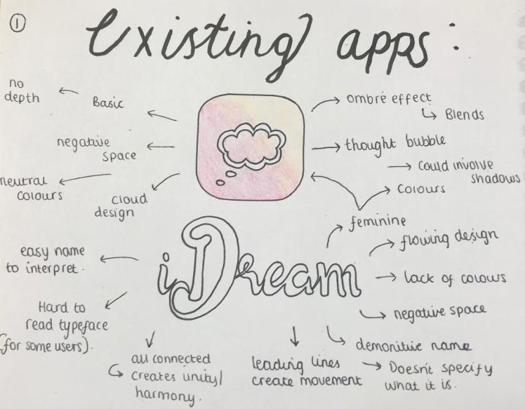


Dream Journal Ultimate:
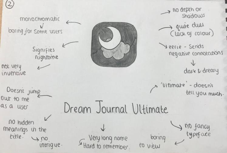


Capture:
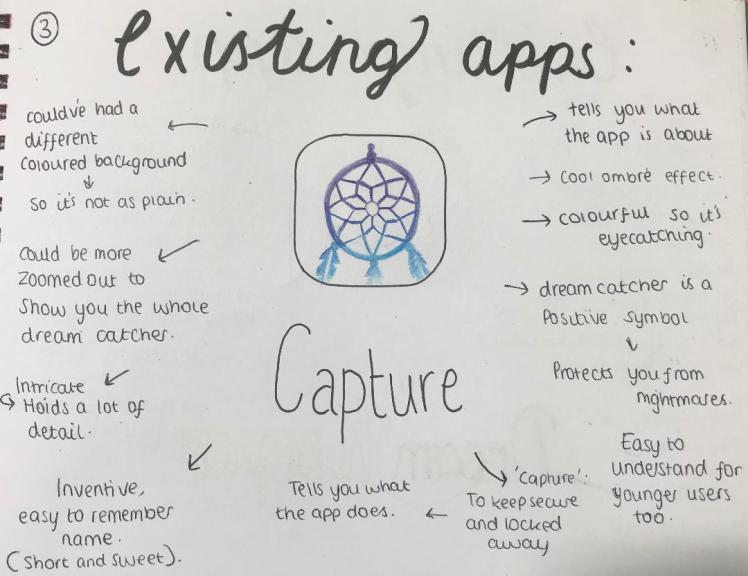


dream moods:
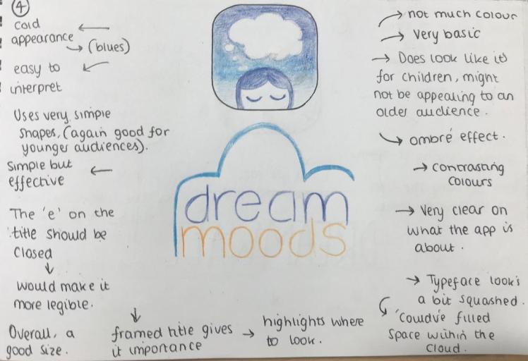


Dream Keeper:
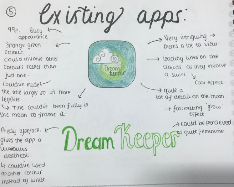
DREAMWALL:
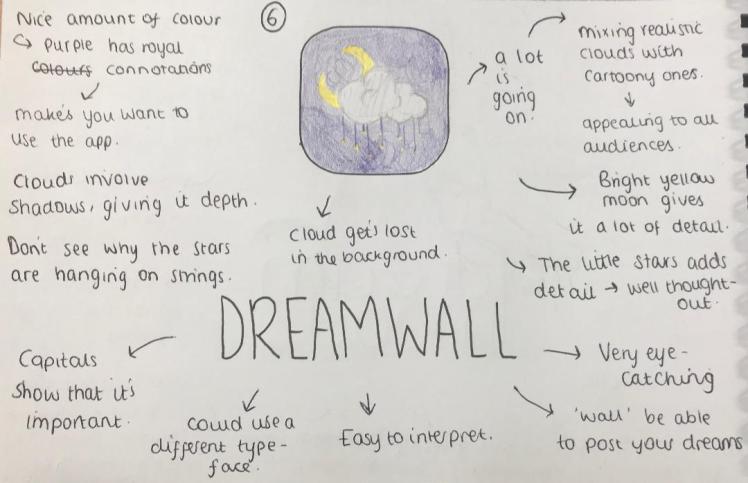


What I’m Going to Create (Part Two):
I have spent a lot of time thinking about how I could make my app different to other apps on the market, as I believe it is important to stick out to competitors. So after much thought I will include voice recognition in my app. So when you wake up all you need to do is say ‘hey…’ then say your dream. this way it allows you to get as much detail saved as possible as it is a lot quicker to say words than to type them. Once you have finished saying your dream the dream will automatically save with the time and the date. The app will then pick out key words from your dream that you said. It will then analyse all these key words as it will give you the interpretation of your dream very quickly, so there will also be no waiting around to see what the meaning of your dream is. By saving the time and the date means that you will be able to look back and previous dreams. The app will also be able to begin to learn patterns of key words throughout your dreams so you can see recurring themes. this way you can learn more abut yourself as you can begin to see what your subconscious is trying to tell you.
By interpreting your dreams you will be able to tap into these repressed emotions. Furthermore, in order to help solve the problem of struggling to express emotions, the app will be able to tell you what the overall emotion of your dream is so you can then begin to understand what your feeling. In addition, you can sync this app with friends and family who also have the app, this way you can share your dreams with eachother (if you wanted to) and this way they will be able to see how you’re feeling just from the overall emotion of your dream/ So this app will be very helpful for people who find it difficult to tel others how they’re feeling, either because they don’t know themselves. or they don’t feel comfortable telling someone face to face.
To reiterate whats in my app:
- Voice Recognition for Quick Use,
- Auto-Save Dreams,
- Dates and Times Saved,
- Fast Key Word Analysis,
- Interprets Dreams,
- Get Overall Emotions of your Dreams,
- Share Dreams with Friends and Family,
What my app needs:
- Company Name,
- Suitable Typeface,
- Company Colours,
- Logo,
- App Icon,
- Welcome Page,
- Information Page,
- Introductory Page,
- Homepage,
- Space to Record Dreams,
- Page to Connect to Family and Friends,
- Your Dream History,
- Page Demonstrating The main Emotions Occurring in Your Dreams,
- Page Where it Displays Your Most Common Dreams,
- Easy View Calendar,
Name Of My Company:
I am currently trying to come up with a name for my app. This part is what I find quite difficult could it could either make or break the app. Analysing existing apps allowed me to get a rough idea upon names that are on the market. I know that my name cannot be too long otherwise people will struggle to remember the name, it needs to be short and snappy so it’s memorable. I also do not want it to be too basic, like ‘Dream App’, otherwise this will bore my audience and they will not be intrigued for what my app is about. My company name should be:
- Short,
- Snappy,
- Memorable,
- Portrays Enthusiasm,
- Functional,
- There May be a Story Behind it (so the name is not irrelevant),
- I May Make up a New Word.
From my mind-map you can see how I explored synonyms for ‘diary’ and ‘dreams’. I also explored the word ‘dreams’ in other languages but I don’t think I will include these as my app is for the British public and if the title is in a different language then I don’t think they will be able to understand what my app is about. I also wrote down all the words I would initially correlate to dreams, and dream imagery. I then tried to combine some of these words to produce a title but they were all too long.
I have compiled a list of my 5 favourite names for my company, below is how I got those names.
I decided to look into star constellations, I thought that the stars are only visible at night time, and this could be related to sleeping where you’re dreaming. So I thought it would be interesting to include a star constellation. So I decided to research different star constellations and I chose the name of one of my favourites: Ara. I then chose one that linked to dreams, rather than just choosing one because I liked the name. So I got Pyxis, which links to the compass. I thought this correlated to dreams because when you’re dreaming there is no concept of time.
I then looked into Greek mythology. I decided to look at the God Of Dreams: Morpheus, however I didn’t really like this name for my company. I looked into the names of his children but again I didn’t think these were suitable. That is when I saw the name of the Greek Goddess of ‘Night’, Nyx. So I decided to include this in my list of my 5 favourites.
I then looked into issues with sleeping. A very common issue is insomnia, so I wanted to see if I could put an ironic spin onto this and name my company insomniac. It is ironic because if you had insomnia it would actually be difficult to dream, so it is strange to give this name to a dreaming app. However, there may be controversy with this name as people with insomnia may get offended.
When dreaming all your senses are heightened, so I thought how I would be able to include your senses within the name of my company. That is when I thought of the name ‘senseless’. Senseless also links to your subconscious, again this correlates to dreaming.
So I then showed these names to my classmates and I got them to choose their favourite out of the five. The favourite was Nyx. As the people I asked are within my audience, I believe that I should take this on board and choose this as the name of my app.
Typeface:
Now I have my name, I need to begin to look into different fonts to use for my brand. In order to do this I will experiment with different fonts in order to see which one has the best appearance and which one will be the most suitable for my brand.
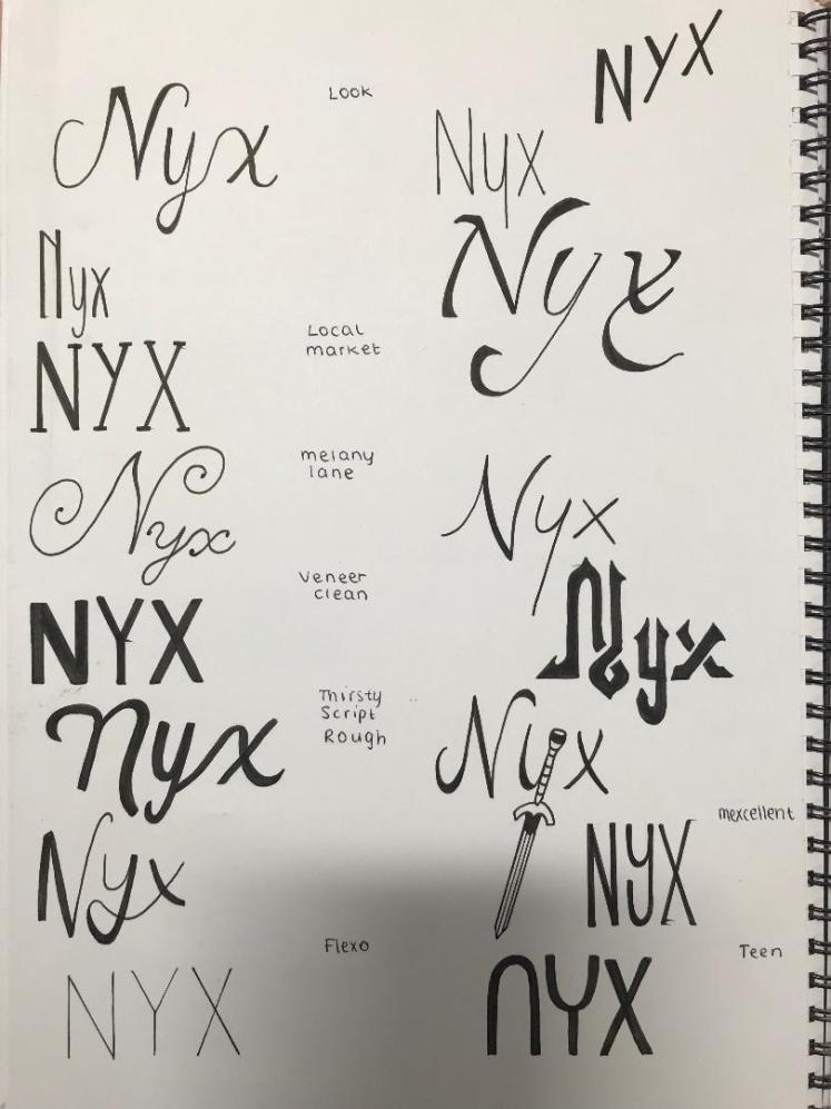
I’ve experimented with different typefaces. I looked into cursive and serif fonts, at first I thought that this would mimic the feel of dreams as they’re very flowy and continuous, much like how dreams flow and are smooth. However, as I progressed I realised that these where quite difficult to read as the letters begin to merge into one another and as ‘Nyx’ is quite hard to read I need to write it in a very legible typeface. I also wrote Nyx in the style of Greek writing, I thought this would be a tribute to Nyx herself. Although the typefaces do look interesting, I still don’t thin these are suitable enough for my app as they are quite hard to interpret.
I then spoke to some people within my target audience and I asked them which Typeface they thought looked the best. The two that got the most votes were the following:
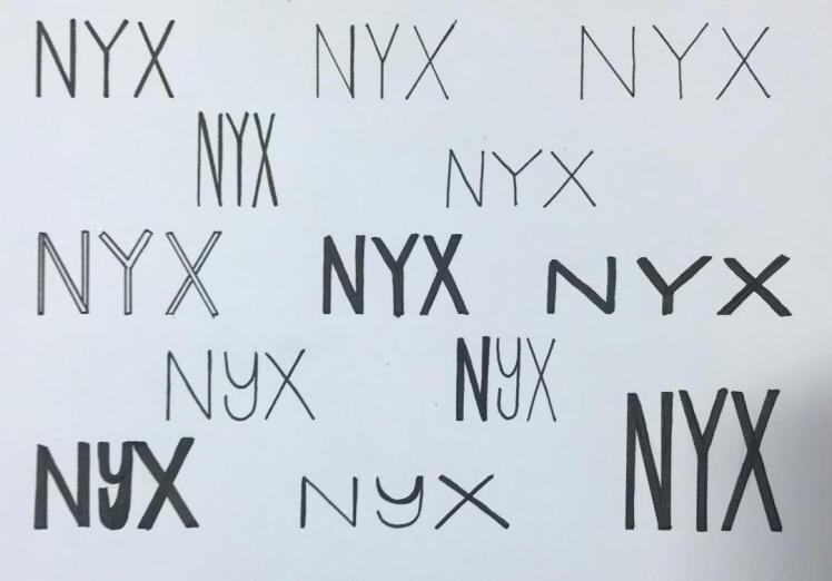
I like the look of this typeface as it is very legible and it’s easy on the eyes as all the letters are the same height and length. I like the fact that the letters seem to be in a ‘box’, again this adds to the tidiness of the typeface which makes it look more professional. I played around with different thicknesses of the letters.
I also referred back to my previous units where I learnt about typefaces and the rules within typography. I remembered how kerning and spacing can affect the overall look of the word. So, again, I experimented with different amounts of space between the letters and the proxemics of the letters. I am not so keen on the ‘bold’ typefaces, I think it makes the word harder to read as it’s very ‘in your face’ (quoted from someone of my target audience), so I think I will discard the ones with a large stroke.
So after the process of elimination and asking my target audience for their views, I have decided upon this typeface for my final design:
Initial Designs:
Colour:
In order to make a successful brand I need to have a colour scheme, this way people will be able to recognise my brand even if they just see the colours. So I experimented with different colours to see which combinations work (photo displayed below). In order to come up with a scheme I looked into the main theme of my project, which is dreams. When I think of dreams I normally associate them with deep purples, pinks and blues, almost mimicking a surreal starry night sky. Furthermore, I also looked into Nyx herself and I can see that she does involve a lot of purple within her clothing, so I get the same colours portrayed from her too. So I have decided to go with a pink, purple, blue colour scheme as I think this represents my project the most appropriately.
Logo:
I need to create a logo for my company, as I have learnt from previous units, a logo is crucial in creating a successful brand, you need something that consumers with instantly recognise. From analysing existing apps I have learnt what I do and do not want to include within my logo. I want my logo to involve colour as I believe this is vital in attracting your audiences attention. Furthermore, colour will bring positive emotions to my piece as if it was monochromatic it would appear quite dull and dreary.
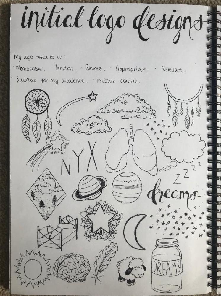
After drawing some rough Ideas I have decided to steer away from having an image within my logo. This is because I feel like it may get too complicated if I have a name, a logo and a separate app icon. Instead I am just going to make my company name in it’s chosen typeface my logo. This way it’s kept short, snappy, it will be memorable because it’s just the name.
My Final Logo:

Although my logo looks very basic, there’s a lot of reasoning as to why that is. I thought if I produce my logo in a very modern, simple typeface, then apply this to an app about dreams, hopefully it will connote that dreams are not actually that complicated. It will also allude to the fact that this app is a very easy app to use. Throughout my blog I have spoke about how I did not want to include black within my final piece. Hence why my logo is a deep bluey-purple shade #000b60, this way it also ties into my colour scheme for my project:
My Influences:
Above are just some photos that I found inspiring, Including pictures of the sky and fluid art. I tried to take photos of dream imagery, this way it could possibly influence my final designs.
App Icon:
I drew a wide range of potential app icons, I had quite a lot of ideas so I wanted to draw them all to ensure I explored every potential icon. In my opinion, some worked and some didn’t. I annotated them so it’s clear to see my views upon each one; I also discussed visual elements upon each of them.
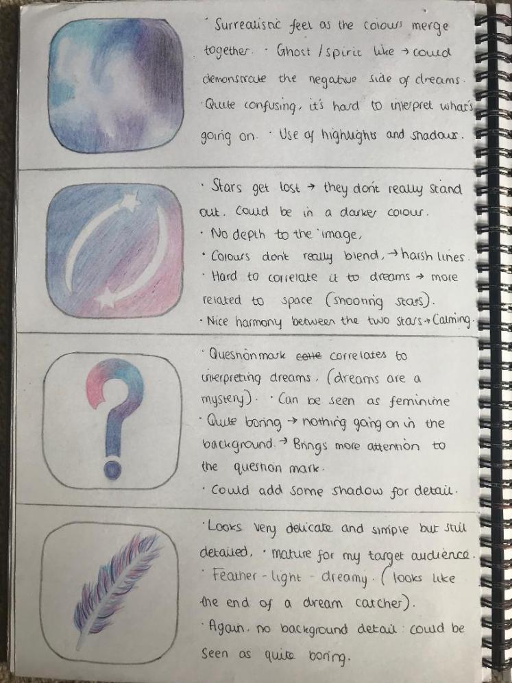
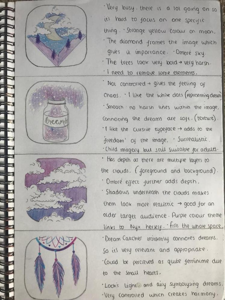
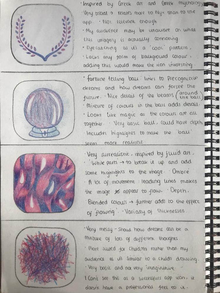
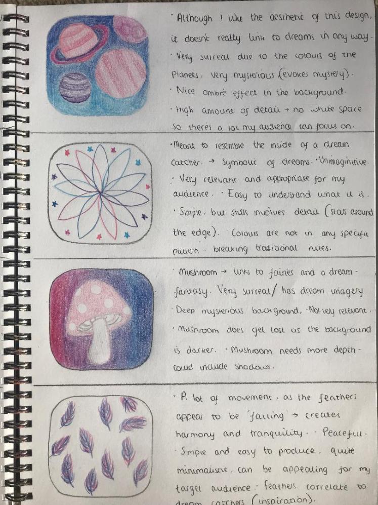
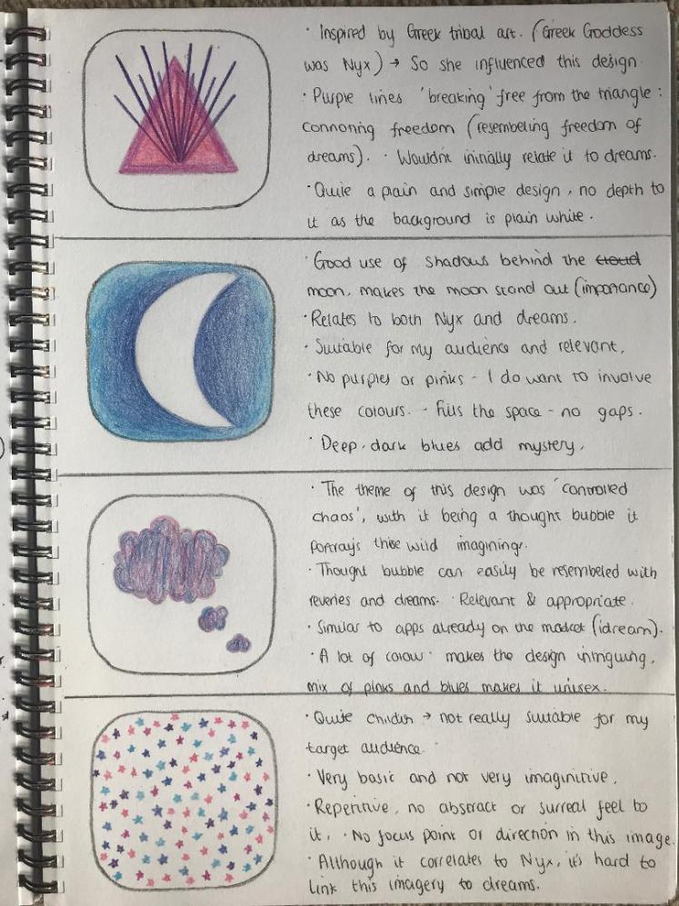
Week Eight Evaluation (06/05/19-12/05/19):
So in my predicted weekly plan I was going to conduct my experimental work this week. I am quite on track regarding this as I produced my experimental work mainly last week when I was conducting my artist research. I also produced dream art last week. So for this week I started my initial design work. I discussed what my plans were for my final piece, discussing what I am going to create. So to start I created a mind-map to splurge my ideas about for the name of my company. It did take my a while to come up with a name because it was such an important step of this whole project. However, I am happy with my choice of name.
I did analyse multiple existing apps. I think if you look at your competition then you can see what their companies may be missing, you could then add these missing details into your company so you fill that gap in the market. Analysing apps also allows me to see what does and doesn’t work, as I am a customer of them, I can see that I am more attracted to a colourful app than a dark and dreary one. So this has influenced me as I have learnt to try to steer away from blacks in my final piece.
I then produced my typography research, I researched this because I needed to find the most suitable typeface possible, and I thought the best way to go about this would be to write my company name in different fonts. I then ensured to get my target audiences opinions upon what I was producing to make sure that it was appropriate. I believe in order to make a successful company you need to constantly get feedback from your potential consumers, this way you can adapt and create the most suitable product for them.
It took me a while to draw out all my initial designs for logos and app ‘fronts’ as I used colour throughout the majority of them. Now I have my initial designs, next week I will focus on developing these designs and choosing my final one. This upcoming week will be dedicated to developing my ideas, then when comparing this to my predicted weekly plan, it will put me a week ahead which is good as I can then give myself more time on perfecting my final piece.
Developed Ideas:
I then chose 3 of my favourite designs which I believe are the most suitable, I think these three designs would all be suitable for what I am creating, and I believe they’re appropriate for my target audience. Once I had my three developed designs I asked my clientele which design they were most attracted to. I then chose this as my final design.
1.
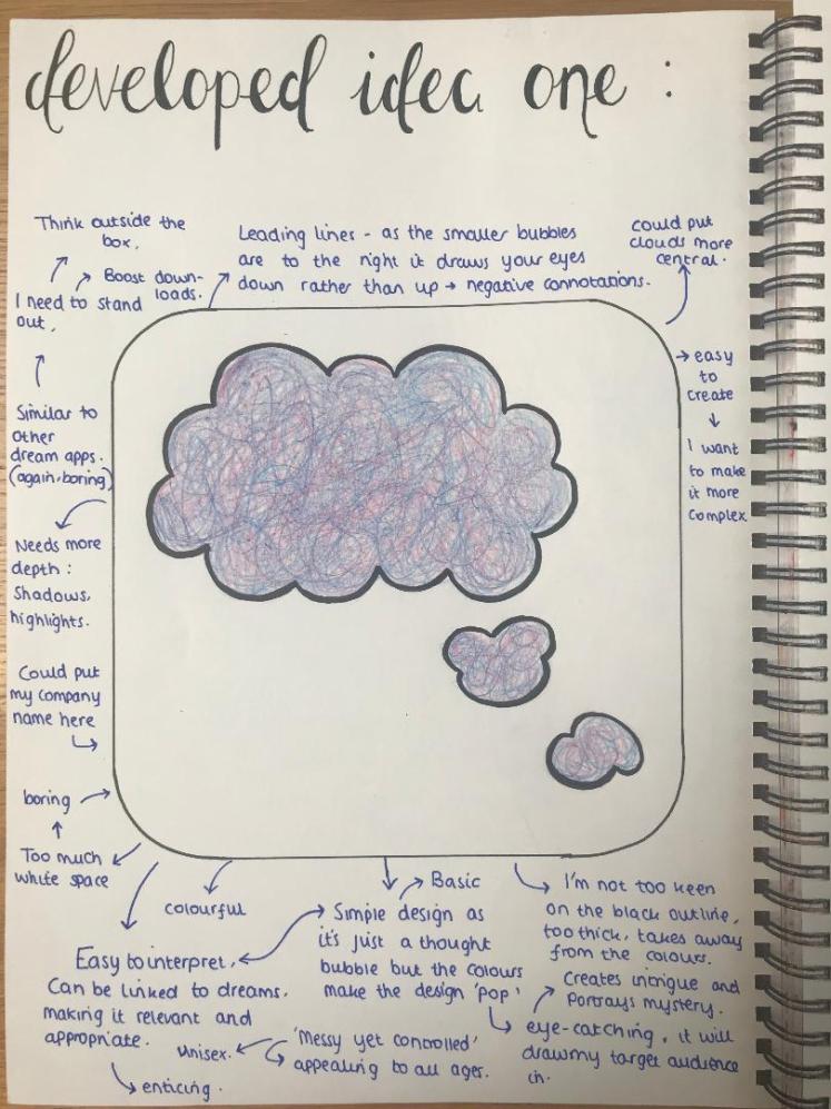
2.
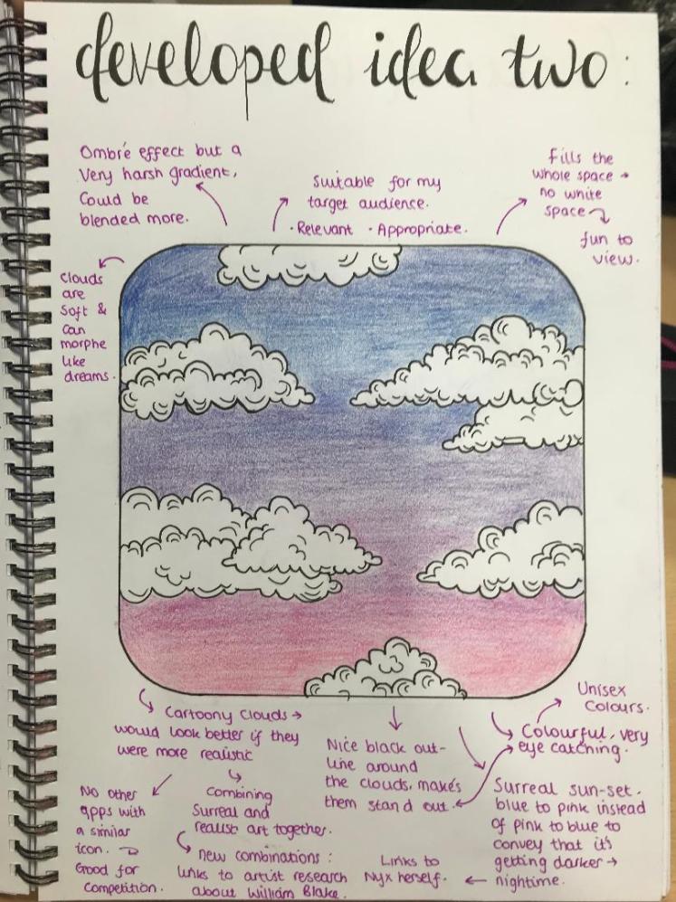
3.
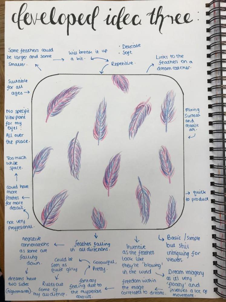
Final Idea Developed:
Once my audience chose their favourite design, I began to create this on Photoshop, I played around with different gradients and it took me a while to create a piece that I was happy with. I had multiple attempts as I wasn’t happy with what I was producing at the start. I stuck with it and kept building up the clouds, and it then started to take shape. As I learnt from William Blake, it’s important to carry on your work even when it’s not looking it’s best because it will look good in the end.
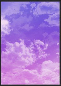
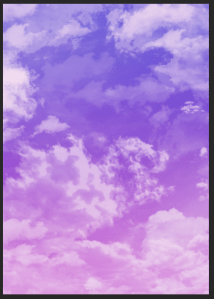
Final App Icon:


Design Evaluation Part 1- App Icon:
So this was my first proper time using Photoshop. Overall I feel like once I get the hang of it it will be quite straight forward, much like how illustrator was. Prior to starting this course I had no knowledge upon any digital media programmes. I do think I am quite a fast learner so, although I have been avoiding it for some time now, I do think I will comes to terms with this programme quite quickly. Which is beneficial because I like how Photoshop allows me to create these realistic to surrealistic designs, because of the tools upon this programme I am able to make my visions become a reality.
So to evaluate my final app icon, in general I am pleased with it. As I previously discussed, it took me a while to come up with the arrangement of clouds which I was happy with but it was worth the time it took because I am proud of the outcome. In order to make it looks realistic I ensured to build the clouds up in layers using different opacity’s so some of the clouds appear to be further in the distance. I wanted to have this realsitic effect because of my target audience, my audience is of the maturer age group so I didn’t want to have ‘cartoony’ clouds which were like my initial drawings. This way I feel like my app will look more appealing to that age group.
I decided to not have text upon my app icon because I waned people to be able to recognise the colours and clouds and to associate this with my company straight away rather than relying upon my logo and name to know what my icon is showing. In addition, by limiting the factor of text it ensures that there is no illegibility throughout my app icon which helps me as a company as I do not need to worry about cutting off some of my audience. I have talked about why I chose these colours already in my blog. Just to reiterate, I feel like these colours is what gives the app icon such depth, as the gradient is quite strong which, looking at it as if I was a user, definitely draws me in.
I then decided to go onto illustrator and create a mock-up of my app icon on a phone. I thought it was important to actually demonstrate what my app would look like if it was going to be in the real world. There isn’t as much detail as a real phone but I just wanted to show briefly what it would look like. To improve I could’ve used a pre-made mock-up and just import my design onto it rather than create the phone myself as this would’ve saved me a lot of time and I then could’ve put this time towards something else.
A problem I faced was when I was importing my design from Photoshop into Illustrator. This was because I didn’t realise that the colours were going to change so significantly depending on which media I was using, so when on Illustrator I had to play around with different effects (contrast, brightness, sharpness, black point etc…) in order to try to match the colours that were on Photoshop. Next time I will bare this in mind an make sure I either work in CMYK or RGB, not mix between the two.
I hope that my skills within digitial media programmes will improve as I create more and more designs, this is with Photoshop and Illustrator. In order to improve I will take on the problems I encountered, and I will keep practicing in these mediums. My next task is to create the ‘Welcome Page’ for my app.
Welcome Page:
Initial Designs:
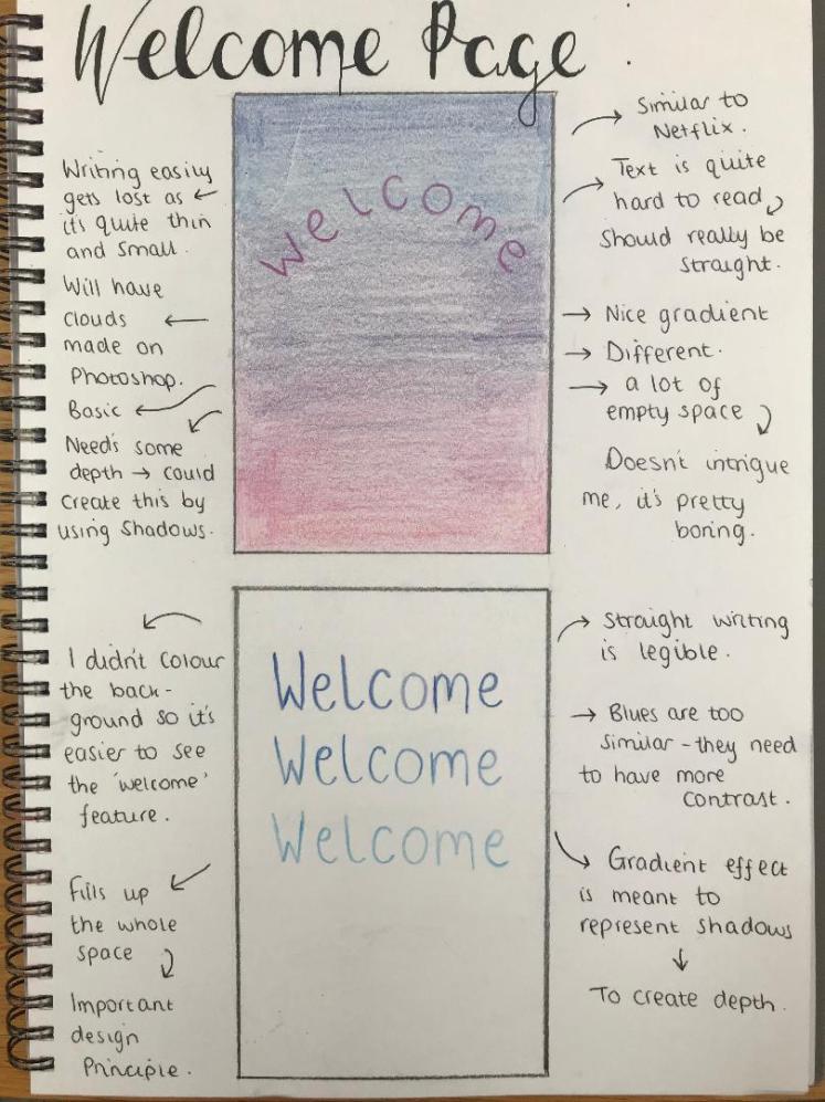
When I was analysing existing dream apps, when I first went onto the app, there was a ‘welcome’ page on some of them. I thought this was a really nice touch and it makes you instantly connect with and want to use the app. So this inspired me to create my own ‘welcome page’. As this is the first page the user will see after the app icon, it needs to be intriguing but not over complicated. In order to do this I will keep the same layout from my app icon, this way it begins to build my theme. I looked back at my development for my app icon, and I thought I could just use this for my first page:
Developed Designs:
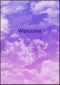

Firstly, I knew I wanted to incorporate the word, ‘Welcome’ into this page, so I played around with it’s position, I also included ‘Let’s Begin…’ on one of them but I then disregarded this as I didn’t like it. I also wanted to try to include my company name/logo within this page, however I wasn’t keen on how it looked when it was above the ‘Welcome’, so I then put my logo at the bottom right of the page.


I then experimented with shadows and the opacity of the word. I wanted to explore different options so I know what I like and what I don’t like. I did like how the 3 ‘Welcomes’ looked, I feel like it gives a sort of dreamy ambience as the word appears to be fading away into nothing. I therefore went through with this idea as my final piece.
Final Welcome Page:

Design Evaluation Part 2- Welcome Page:
I am pleased with this design, I like the fact that this page carries on from my app icon, so straight away when opening this app you have that familiarity of the design. By a user seeing something that they recognise (they would recognise it from the app icon), means that they will begin to associate specific feelings with this app as it will build as a memory in there mind. Much like what dreams are themselves. I want to create this emotional bond between me as a company and them as a user, this bond will develop over time which will make them use the app again and again, and this bond is purely from continuing the design from the icon onto the first page.
Contradicting my app icon, this page does involve words. So I had to be careful when ensuring that my work was legible. I’ve already spoke about the reasoning to why I chose the typeface I did (regarding legibility and aesthetics). My skills within Photoshop haven’t improved much since designing my app icon, this is because I used the same design, there was no need for me to create a new one, so I couldn’t really practice within this medium. I did however learn how to create and use text within Photoshop, so I am learning.
I included my company name at the bottom right hand corner, I done this because I feel like the more times you see something or read it, the more likely you are going to remember it, even if you don’t consciously see it. So the name NYX will keep coming up in their mind which will promote me as a company as they’re more likely going to talk about it to other people. I kept all of this in mind when designing this page. To heighten the fluidity of my work I need to ensure to put my company name in the bottom right of every page, this, again, builds the familiarity of my app.
For this page I think it was beneficial to me that I created a lot of developed designs, I feel like this really helped me create a final piece I was happy with. I liked exploring how by changing the text slightly it can affect the overall aesthetic of the design. I believe this final piece is suitable and appropriate for this project and my audience because of it’s relevance to the theme of dreams. Not only this, but the use of just one word keeps it simple and easy for my audience to interpret, as I stated when doing my ‘audience analysis’ I do not want to over-complicate things in fear I may put some people off.
When thinking about the rule of thirds, the writing fits perfect as the start of the word and the end of the word meet the points. Rule of thirds is crucial when trying to draw a customers attention, this is because their eyes automatically go to the points where the lines cross, so by writing starting at these points it means that they will have an easier and more pleasurable experience reading it. It also makes the overall appearance of an image more appealing as using the rule of thirds creates harmony throughout the image.
For my upcoming pages I want to continue to use this theme, however I will start to switch up the clouds because I do not want to use the same background design again and again as this is when it will start to get repetitive and boring. Additionally, by creating new background designs it will give me that needed practice throughout Photoshop.
Information Page:
Initial Designs:
I wanted people to understand the reasoning behind my app, initially I wasn’t going to include this page as I felt like it would contain too much information and people just wouldn’t want to read it, that it would bore them. However I think this is a vital page as it has information about the app which I really want to include. By including this information it informs the user what my apps main purposes are, and how by downloading it they can become a better person. I tried to make the writing entertaining by using colloquial language, I feel like this would engage my target audience more than by it being extremely formal.
Developed Ideas:

Again, I played around with how the writing has been laid out, I experimented with it involving a ‘flowing’ motion to make it appear ‘dreamy’ however, I thought this made it illegible so I decided against this idea.
Final Information Page:
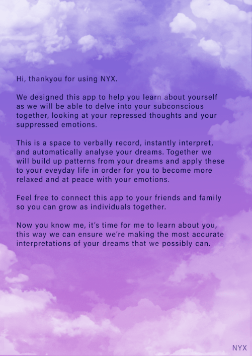
Design Evaluation Part 3- Information Page:
I previously stated that I want to switch up the backgrounds to keep my app entertaining, I thought I could apply this to this page. I am going to, however, keep the same colour scheme and gradient idea throughout my app (to give that fluidity and motif running). By changing the clouds it gives the app an authentic feel, that a lot of time and passion has gone into the making. Which is what I want to evoke to my audience.
Having a strong background is very important, in some of my initial designs I annotated that there was a lack of background colour or lack of any images in the background; so I did not want to have that same issues within this design. A good background is important because it is what you will first see when viewing an image, if it involves bright colours then that is where your attention is going to be brought to first. I did not want to cut my background short because then this would leave a white boarder around my image and in my opinion this brings down the smoothness and it takes away that professional look. So I ensured that the colour completely filled the whole page.
So my experience with rearranging the clouds overall was good. I feel like I am improving within Photoshop as I am learning new skills everyday (for example: how to blur layers together to create that smooth look, or how to individually change a brushes size). I am only going to grow if I keep practicing on this medium so I am excited for whats to come. I am always thinking about my audience and how what I create is going to impact them, so I keep in mind the appearance of my pages because I think a nice aesthetic will be calming for the user.
To ensure this page was legible I consciously kept the clouds away from the writing. I didn’t want to put any clouds behind the writing because I felt like this easily obstructed your view. Furthermore, by having the clouds almost circling the writing it gives the writing a sense of authority, like it is really important and as a viewer this would make me want to read the text. The technique I used was framing. Framing is important especially in posters or pages like these because it directs the eyes where to look. It gives us a viewpoint to focus on and from there we get to appreciate the whole image.
I didn’t create any initial designs for this page because I feel like I have more freedom when creating different designs on digital softwares. Advantages of digital mediums is that I can very quickly and efficiently swap out certain words or images, whereas when sketching these initial designs it takes a lot of time to draw out multiple ideas. For this project I am under a time limit so I think it is wise of me to not always have physical initial ideas, instead I will just use digital softwares because of it’s efficiency. I will continue creating my pages.
Week Nine Evaluation (13/05/19-19/05/19):
So this week was when I really started designing my final pieces. To begin with, at the start of the week, I drew my initial designs for my ‘app icon’. As stated within my action plan, I was happy with what I produced that day as I was able to explore multiple options because I had so many initial designs. Then throughout the week is when I developed some of these ideas, and it’s where I asked for feedback from my target audience, this way I can make the most suited piece for my audience.
I initially thought this week was going to be difficult as I knew it was going to be a lot of work to produce all my initial sketches along side beginning my design work. However, despite my worries, by setting myself little goals for each day using my action planner it really helped me to stay on-top of all my work, and now that this week is complete I can see that I really didn’t have to worry about anything. This week is also when I first used Photoshop on my own to develop my ideas. However, I will discuss how I thought this went in my final evaluation, that way I can go into more depth upon the subject.
Compared to my predicted weekly plan I am a week ahead of schedule, as it’s stating I should’ve started producing my design work next week. However, as I’ve previously stated in my ‘Research Evaluation’, there are flaws within this predicted plan, so I am not too worried about not being on my target for each week regarding this predicted plan.
I am pleased with the progress I’m making, I do not feel frightened that I will not be able to meet the deadline, in fact, at this given time, I’m quite confident within myself and my work as I believe I’m currently in a good place regarding FMP, as I’m not letting myself feel any stress or pressure, if I encounter any problems I am a firm believer that there’s always ways to tackle them. So next I will continue with the development of my app.
Introductory Page:
The purpose of this page is to find out more about the user, this way my app becomes personalised and tailored to them as an individual. This way I will hopefully be able to make some connections between them and my app; these connections is what stems loyalty. If I have loyal users it means that they will continue to use and talk about my app. This is similar to what I learnt in Unit 2 with brand loyalty. I want them to talk about my app as as a way of publicising and advertising my app.
Initial Ideas:
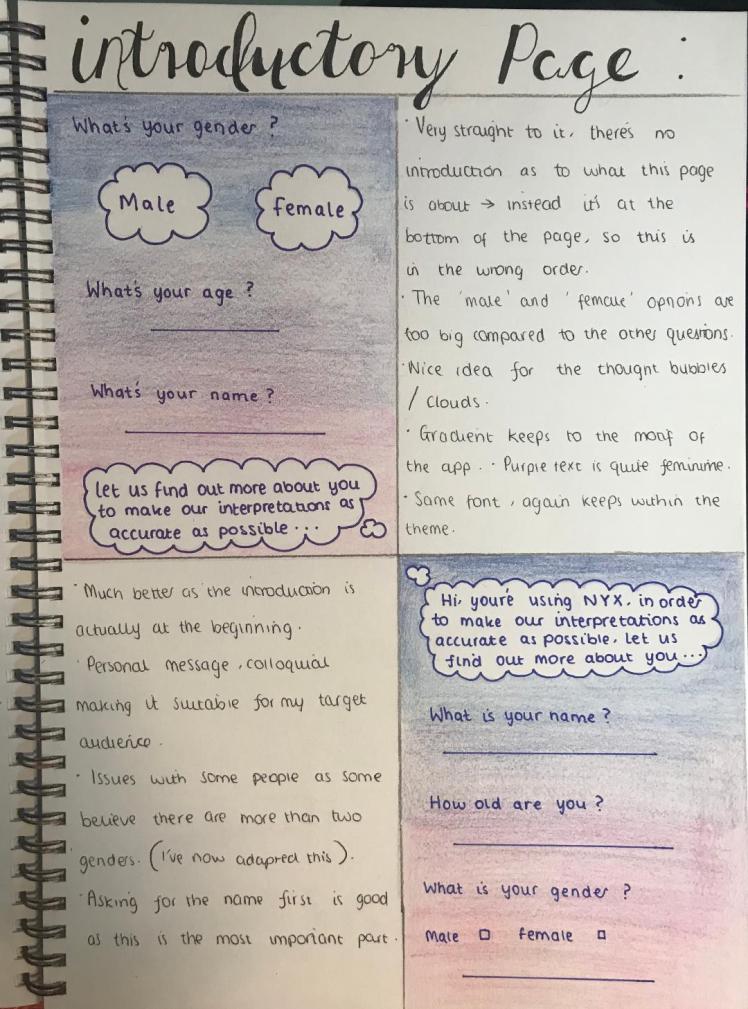
Developed Ideas:
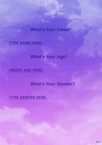
Final Introductory Page:
Design Evaluation Part 4- Introductory Page:
For my developed ideas for this page I experimented with different placements of the text, I was unsure if I should place the text in the middle of the page or not because I thought if it was in the middle of the page then it would draw the users attention straight to that, which would’ve been a good thing. However, I decided to go against this because I wanted to stick to the original placement of the writing, which is where it’s positioned on the left hand side. I thought that it’s probably best to stick to traditional ways so people will not be afraid of viewing a new format.
For my developed pages I should’ve screen-shotted throughout the ‘cloud making’ process, this way people viewing my blog could easily of seen how I got to the final outcome, it also would’ve been interesting to see how I build these clouds up. So in the future I will take screen shots of the whole development stage rather than just the final stages. This way it better demonstrates my working.
Thinking of the size of the writing in regards to the whole picture, I tried to fill up the entire space, however I did want to leave some space at the top and the bottom for the clouds because it’s important I keep my theme running throughout the entire app. When designing a page I think it’s vital to ensure to use the whole space, I do not think it is visually appealing if something is squashed up in one corner. I bared this in mind when creating this page by taking into consideration leading (the space between the horizontal lines) and ensuring there was enough space so the writing is well presented.
I also aligned all the writing so the whole page appears smooth. This smooth appearance is an important factor in keeping my audience interested because if the writing was scattered around the page then people will not want to read what is written. I aligned the writing on Photoshop using a ruler tool to assure there was accuracy within the text. I believe this crisp sharp look also makes the page appear more professional and i want to create this persona for my app due to my target audience being of a mature age.
Overall I am pleased of how this page turned out. I like the fact that I used the same colours of the text from the previous pages and this makes all the different pages look more unified and I believe unity evokes calmness and pleasure when using an app. Again, I continued to put my logo at the bottom right hand side of the page (as previously mentioned this allows me to keep reminding the user what app they’re using). Similar to my ‘information page’ I tried to keep the clouds away from the writing for legibility reasons but I still wanted to create a natural ambience within the design of the page. Instead of giving the option of choosing if the person is a male or a female I left a space where the user can write our their gender as I wanted to be inclusive and be able to include members of the public who may want to distinguish themselves as a different gender. I will now continue to create my pages.
Homepage:
I believe that all well known, successful apps have a homepage. This is where you can go to navigate your way around the whole app as it easily presents to you all of the choices you could make in regards to what page you will see next. I want to make a very clear homepage where it simply presents to you different buttons you could click in order to get yourself from one page to another. As my app has 6 main pages (not including the welcome, information or introductory page) this leads me to having 6 different icons, one for each page.
Initial Designs:
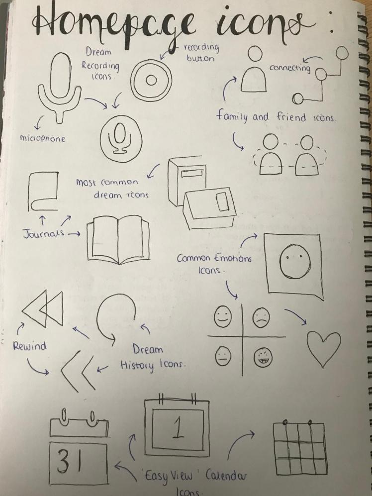
Developed Designs:
![]()
- Microphone Icon- Page where you can record your dreams,
- 3 people Icon- Page where you can connect to friends and family,
- Book Icon- Your dream journal where it demonstrates your most common dreams,
- Calendar Icon- The easy view calendar where you can quickly switch between different days to see the main interpretation of your dreams,
- ‘Clock’ Icon- Dream history page where you can look back at all your previous dreams,
- Smiley Face Icon- A page demonstrating the most recurring/common emotions portrayed throughout your dreams.


Final Homepage:

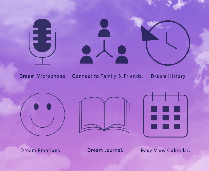
Design Evaluation Part 5- Homepage:
Out of all my pages so far this page is my least favourite. In my opinion this page looks quite amateurish due to the simplicity and ‘cartoony’ appearance of the different icons. This did take a very long time to produce as I made each icon on illustrator first (as shown in my developed ideas) and I then imported these onto Photoshop. Some of the icons like the microphone I think look good and I am happy with, but others like the smiley face I think bring down the overall quality of this page. although I did want to keep my app simple to use I think I this looks too basic and I should’ve designed this is a more professional way by finding more suitable icons.
Moreover, I do like the concept and idea behind this page, I have discussed the idea behind this page already, so just briefly I enjoy the way I have presented it. This is because everything you need for this page is in one compact area, it is easy to view as the icons are large and in the centre of the page. When designing it’s crucial that images you import are large enough to be easily seen by the user otherwise you take the risk that viewers may skim over very important concepts within your design.
When thinking about the principles of design I really wanted to amplify balance within this page. When developing this idea I did draw out designs where the icons were ‘dotted’ around the page, however I didn’t follow up with this idea to due the principle of balance. Balance within an image gives it order, it allows each individual thing to have a place where it belongs, overall impacting the design as every icon has a purpose of being there. So, I tried to keep all the icons within a rectangle outline, just so nothing seems out of place which would, again, bring down the quality of this page.
I did have some difficulty creating this balance because the icons are obviously all different shapes, so I had to make them slightly different sizes so they could ‘slot in’ with one another. I thought this was challenging because I am working with irregular shapes rather than regular shapes which is what I am used to. With patience and perseverance I overcame this issue and I managed to create a balanced design. Another issue within this design is that some of the clouds do fall behind the icons, I did want to try to stay clear of this but when producing the backgrounds it is quite difficult to not have some cloud fall in with the icons. However I do not think this affects the overall image drastically as the icons are not totally obstructed.
In addition to balance I kept in mind another rule, which is alignment. Similar to balance, alignment gives the overall image structure as it gives bonds between the individual elements. I want these bonds because I believe that these bonds will connote to my audience that this app just wants to evoke harmony, it wants the user to feel like they will be able to make bonds to try to help resolve the ultimate issue (I have previously discussed this issue within my blog). In the future I will try to ensure that the imagery I use within my designs are suitable for the project and are appropriate for my target audience.
Week Ten Evaluation (20/05/19-26/05/19):
I found this week to be quite challenging, this is due to all the work that I needed to produce was going to be on Photoshop. However, this week has proven to me that I am quickly able to learn new skills as I feel a lot more confident using this digital medium now. I think I was able to learn how to navigate around Photoshop quickly because I was very keen to learn, I wanted to teach myself how to use this as I know it was going to come in very handy for this project. In addition, as I’m wanting to aim high I thought it was vital for me to try to use as many different mediums as I possibly could- including learning new ones.
So this week was just a continuum of the previous week, where I mainly focused on designing my pages. Looking at the whole project now, I do wish I started the actual design process a week sooner than what I did. This is because I underestimated how long this part was going to take. I do not want to rush this stage so to ensure that my work is still up to a high quality I will just have to stay longer after my lessons, come in on days where I don’t have lessons, and continue my work at home. The only negative with that is I do not have access to digital programmes at home, so I can only use these when I’m at college which again doesn’t help me time wise.
I also set my targets quite high as there are 10 pages that I wanted to produce in total, which is a lot. I would say I’m roughly just under halfway through designing all my pages. I also need to leave time for printing, I haven’t really thought about this part yet because I wanted to design my pages first. Printing is a very crucial part to this project so I will set myself the goal for next week that I need to know what and when I’m printing. Next week I will also continue developing and creating my pages.
Despite wanting to of started this part a week earlier, I am still on track with my predicted weekly planner. Although I do not like referring to this (reasons explained in my research evaluation), it still gives me a piece of mind knowing that I am not way out of time for my tasks. When I made this plan I did not think that I was going to have so many ‘final pieces’ (pages), to complete, so I am started to get slightly worried for time. So I’m very determined to try to get these completed next week.
Dream Recording Page:
This is the dream recording page, a very important page within my app. To make my app different from others instead of actually physically typing your dream, you will just say into into this microphone, the dream will then document itself on a separate page (the dream history page). This recorder page will begin to pick out key words which will then get interpreted, you will then get this interpretation instantly back once you have completed saying your dream. The interpretation will initially be shown on this page, but then the key words along with a summary of the dream will be stored again on another page (most common dreams page). By storing the interpretations on a different page it keeps the whole app organised, so you can then access all the different parts easily.
Initial Designs:
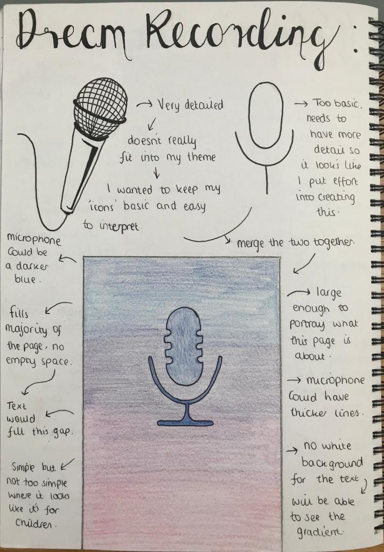
Developed Designs:


Final Dream Recording Page:
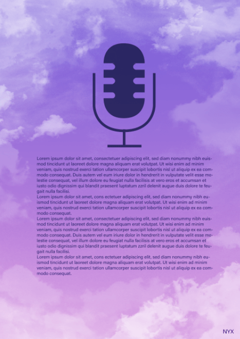
Design Evaluation Part 6- Dream Recording Page:
This is what would appear if you were to click the microphone icon from the homepage. Overall I like the presentation of this page. I decided to use lorem ipsum (the writing) to represent the interpretation of the dream. I thought it was important to demonstrate what it would look like as if the user was actually using this page so the viewer can get a better view of my app.
I made the microphone very large on this page because I wanted to try to make it very clear on what this page is for. In addition, I positioned it in the middle because I wanted to try to make it symmetrical. I’ve learnt from my previous units that symmetry can really help with the overall beauty of an image. The more symmetrical something is the more visually appealing it is because symmetry tricks the brain and evokes tranquility as the elements appear to be in harmony with each-other.
Thinking about hierarchy within design, the larger the object is the higher it would be in the list of hierarchy, justifying why the microphone is larger, to show it’s importance. As the microphone is in the middle another way I’m trying to divert attention to this is through the use of leading lines. These lines tell our eyes where to focus, they show us the direction in which we should look. So they’re important when designing pages as it gives the user a sense of peace as they can have ease whilst using the app.
Although the writing seems close to the microphone, I didn’t want to have the writing too close to the bottom as I was afraid that this wouldn’t leave enough space for the clouds which in turn would disrupt my theme. So I spaced the writing closer to the microphone. I also tried to balance out the clouds, by ensuring that there were some on both the right and left hand side, as previously mentioned, balance is helpful in creating that harmonised appearance.
In conclusion I like the aesthetic of this page, compared to my homepage I do prefer this as I think it looks more professional. In addition, I think my skills within Photoshop are improving as I was able to import things from Illustrator into Photoshop, furthermore, it’s taking me less and less time to create the backgrounds for these pages as I am becoming more confident in using brushes on Photoshop aiding this project as I am able to spend more time on other aspects of this project (for example, my evaluations).
Family and Friends Page:
The issue I’m trying to fix is about people who struggle to express their emotions, they will be able to use this app to communicate to others how they feel. So in order for me to come up with a solution to this issue I think I initially need a space where people can use this app as a means of sharing their thoughts and emotions with people they trust. Hence why I’ve involved this ‘Family and Friends page’. So in order to connect with these people the app will ask for your phone number, it will also ask for the numbers of the people you want to connect with. Once you have put these details in their profile will come up on this page which is then when you will be able to either send them your; dreams/main interpretation/key words and /or main emotion.
Initial Designs:
Developed Designs:
I created these on Illustrator so I could then import them onto Photoshop.

I imported them with both a white background and a clear background. I prefer the clear background because I think it looks more professional as you can still see the gradient.
I then played around with the sizes of the bars. Due to legibility reasons I am going to choose the larger ‘bars’.
I included a send icon to show that that’s what you click to send dreams/emotions/interpretations… So from the homepage when you click the ‘family and friends’ icon, the following page is what’s going to be displayed.

Final Family and Friends Page:
Design Evaluation Part 7- Family and Friends Page:
This is one of my favourite pages, I like how the order of the clouds came out and the overall appearance, mainly because there’s a large space so I practically made a ‘feature wall’ where I could really play around with the clouds. When using Photoshop for this page I learnt a new aspect of the programme. As the clouds were behind the writing I needed to remove them so you could still very easily read the writing. So I learnt how to use the mixer brush tool, this way I was able to ‘blend’ away the clouds so you could just see the gradient.
As time goes on I’m definitely feeling a lot more confident with this media as I am balancing equally between Photoshop and Illustrator rather than just sticking to Illustrator. For this page I had to try to figure out how to create those ‘bar’ shapes but without having a colour in the background, after some time I was able to figure out how to do this. I do sometimes learn best by just trying to figure out how to do it by myself using trial and error. However this may not be the most beneficial method for this project as this takes up a lot more time than just asking someone who does know or /reading tutorials. So going forward I will try to ask people for help if I do encounter a problem so I can over come the issue quicker than I would just by myself.
I positioned the bars to be the top layer, this was just so if there were clouds on the writing then at-least the writing still appears to have the most importance in the situation. I also lowered the opacity of the bars to 75%. I found 100% opacity to be too harsh, and because I want to stay related to my theme of dreams I thought it was best to lower it’s intensity just to give the overall image a much softer appearance; to signify a ‘dreamy’ ambience.
To develop I could’ve possibly used titles throughout my pages just so people are reminded what page they’re on. Additionally for a first time user this page may not be so clear, to help with this issue I could’ve also included a small description at the bottom of the page just re-stating what this page is about and how they can use it to it’s full potential. However, due to time restrictions, there is not enough of it to go back and edit this page, despite it’s lack of information I am still pleased with it.
I am pleased with the progress I am making regards to my skills in Photoshop. I’m excited to learn more within this media as time goes on because I will continue to use Photoshop for the rest of my pages; this just ensures that the quality of each page is the same and that they will all have a similar aesthetic.
Dream History Page:
The purpose of this page is to look back at all the previous dreams you’ve had. I thought that the user would most likely prefer to be able to see their previous dreams, rather than the dream completely disappearing after you had got the interpretation. So this is the ‘journal’ part of the app, where it displays all your dreams in files so you can easily look back upon and read them again.
Initial Designs:
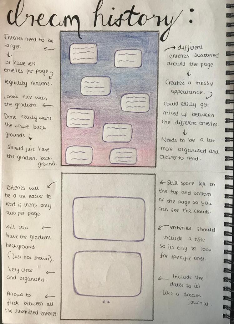
Developed Designs:


Final Dream History Page:
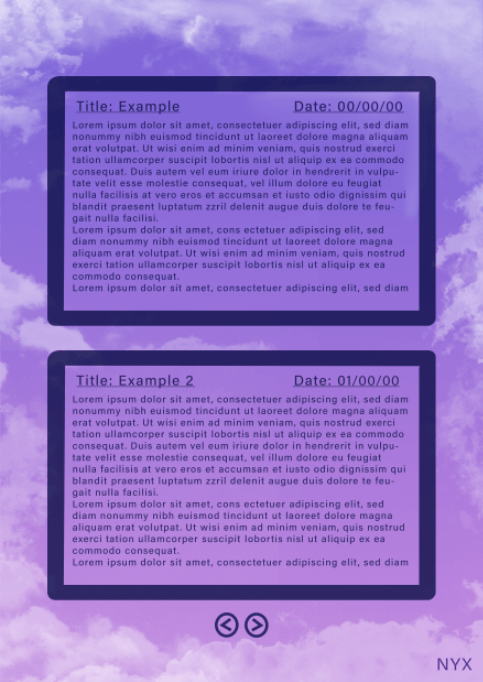
Design Evaluation Part 8- Dream History Page:
For this design I experimented with different opacity’s. Similar to my previous pages, I first created the design on Illustrator as I find it simpler to import the design rather than attempt to create it on Photoshop. Aesthetic wise, this page is along the same lines as my previous pages, which is good because I need to keep that motif running throughout this whole unit. (The motif being dreams).
I believe the boxes are accurately in proportion compared to the page, this is because there’s still enough space on-top of and below for the clouds. I decided to have 2 dreams displayed on this page and then arrows at the bottom so you could flick between pages. However, reflecting on my work now, I think it would be best to include more dreams per page, maybe around 4. This way you can easily see more of the dreams and you will not need to spend as much time flicking through all the pages.
So to improve for the future I will create more rough designs before my final piece ensuring that I explore multiple options. Additionally, being very constructive, I think the outline for the box is too thick. I find it quite distracting as I think it overpowers the writing, the writing needed to be the main viewpoint for this page and it’s not at the moment so if I was to re-do it I would definitely reduce the thickness of the outline of the boxes.
I included the feature of being able to give your dream a title. This is so if my audience wanted to look for that dream in the future they’re going to have an easier time looking for it as they will most likely remember the title that they gave it. I always try to keep my target audience in mind because they’re the most important aspect of this whole project, without them there would be no need to create this app. I linked this feature to my own thoughts because I thought of how every story and movie has a title, it’s how you easily recognise them, so it would make sense for your dreams to have titles too; that was my inspiration for this feature.
Next I’m going to continue creating my pages. This process is beginning to get quite repetitive now, and I’m afraid it’s going to start getting boring. In the future I don’t think I should create so much work for myself because it puts me under more pressure and it is also extremely time consuming.
Main Emotions Page:
After you have gotten the interpretation from your dream you will also get a a note saying what the main emotions portrayed in that dream was. These emotions then get placed onto this page where you will be able to go onto it to view the emotions that come up in your dreams most regularly. You can then look back at these emotions and see how you’ve changed and developed as a person.
Peer Discussion:
I found it difficult to come up with ideas for this page, because I’ve already created so many pages I began to run out of new and exciting thoughts. So I had a discussion with my college peers and teachers to see if they had any ideas on what I could involve within this page to make it interesting.
Some of the ideas they suggested were:
- Pictograms,
- Pie-Charts,
- Bar Graphs,
- Different Size of Faces,
- Word Cloud.
I decided to go forward and use the idea of a word cloud. This is where the most used word is the largest and the less used words are smaller. It’s just a very easy way of interpreting data as it is very clear to view. This discussion was extremely helpful and I’m glad it happened otherwise this idea never would’ve come across my mind.
Initial Designs:
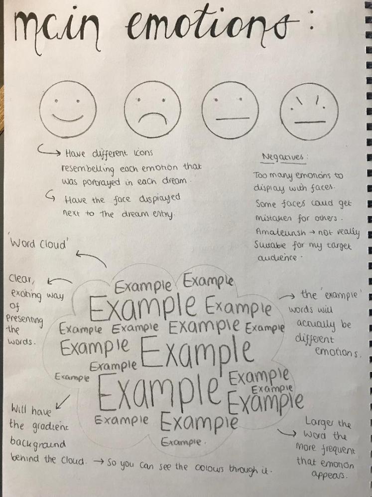
Developed Designs:
Analysis of these developed designs can be found in my ‘Part 9’ evaluation.


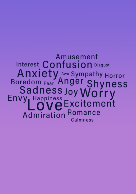
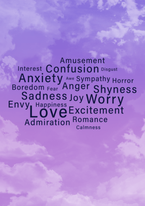
Final Main Emotions Page:
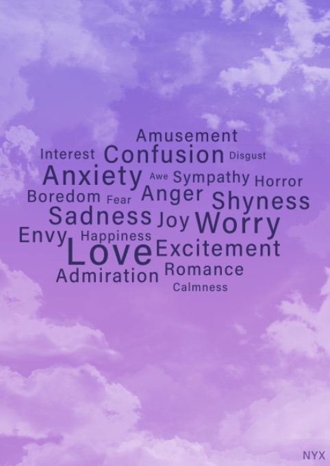
Design Evaluation Part 9- Main Emotions Page:
Beginning with my developed ideas, I thought I would include pictures showing the process I took to blur out the harsh lines created from the clouds. I thought it would be fascinating for any readers of my blog to see the process that I took. I used, again, the mixer brush tool to eye-drop the surrounding colours so I could then go over these harsh lines to add softness to the image.
This page was inspired by a word cloud, as previously discussed within my peer discussion. To create this I used the type tool on Photoshop and I changed the size of the type to create this mixture of different sized words. I involved real emotions because I wanted to accurately demonstrate what this page would look like to my audience; this way they can get a full understanding of this pages’ potential.
As time goes on when you use this app obviously the ‘cloud’ will keep changing and adapting to suit the new emotions occurring in your dreams, I could’ve demonstrated this by creating another final page where the emotions are larger or more spaced out- this way my audience would’ve been able to see exactly what this change would’ve looked like. Despite the fact that I only created one final page, this is still suitable as all of my other pages only have one final page, so by this page not having two final pages I don’t think it brings down the overall quality of my work.
I’m pleased with how the appearance of this page turned out. I was afraid that the ‘word cloud’ was going to look strange amongst the clouds in the background but it doesn’t because the clouds in the background are realistic compared to this surreal word cloud. I also think I used the space well, as the words are still large enough to view, even the smaller words are still legible for a regular user. Furthermore the words are not all cramped together, although they’re very close to each-other, they’re not so close that you can barely distinguish between them. To ensure I demonstrated this properly I always kept space and proximity between the words in mind.
I enjoyed creating this page because, although still similar to my other pages, I was able to try something new, which kept it entertaining for me because I wasn’t just repeating myself. As I am becoming more familiar with Photoshop I am becoming faster with producing these pages, which is a positive because I can then give more time to my evaluations. Next I will start to draw initial designs for my ‘Most Common Dreams’ page.
Most Common Dreams Page:
As your dream gets interpreted you will get key words from these interpretations. These key words being places, people, events, object etc…, these key words will then be stored, similar to the emotions page, on a page where it will demonstrate the most recurring key words. This way, again, you can see how the things that happen in your dreams change over time and you can then compare this to the emotions and see how they link to each-other.
Initial Designs:
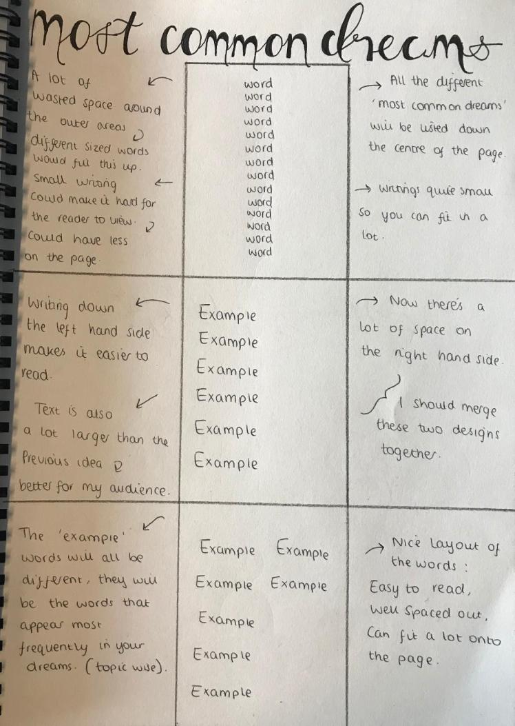
Developed Designs:
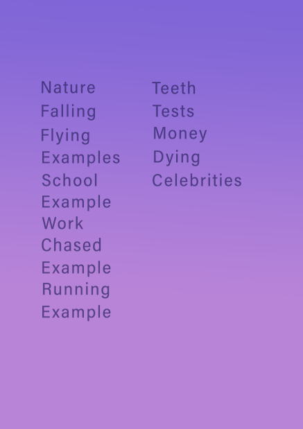
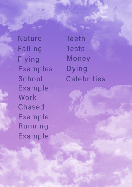
Final Most Common Dreams Page:
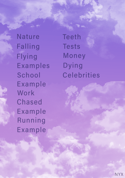
Design Evaluation Part 10- Most Common Dreams Page:
For this design I definitely could’ve involved more developed designs. However I was so engrossed in producing this page I actually kept forgetting to take snapshots of my work throughout the designing process. I know I have previously discussed that I need to take more development photos and I understand that I haven’t met this goal, but I will still try to implement this goal for my next page.
Compared to my ‘Main Emotions’ page where I used real emotions in the text, for this page I kept using the word ‘example’. This is because I wanted to demonstrate to my audience what the page would look like as more key words develop. However, looking back at this page now I realise that I should’ve used ‘real’ key words rather than ‘example’ because this would’ve made my work look more professional and more realistic.
I really kept in mind the principle of alignment throughout this page, I wanted all the text to be in a perfect straight line down both side, this is because it’s then easier for the viewer to read as it’s easy on the eye. To ensure they were aligned I created a rectangle and put this on the side so I could then start all of the words form the edge of the rectangle. As I evaluate now I should’ve used the ruler tool opposed to a rectangle because this would’ve given me more accuracy.
As I was unsure if I fully liked how this page turned out I decided to ask my peers and family their thoughts and opinions upon this page. From discussing it with them the main feedback I got is that the writing is too boring. This page is quite standard with the words laid out as if it was a book, when comparing it to my ‘Main Emotions’ page, the text for that page is a lot more exciting to read, so if I was to redesign this page again I would present the words differently. Either by creating a shape with the words, or scattering them around the page etc..
Additionally, although I didn’t want the clouds to go behind the writing, I feel like there is still a lot of space where it is just the background gradient where I could’ve involved some clouds, even if they were to be a low opacity. This would’ve just filled up the space and overall it would’ve made the page more interesting to view. So to conclude, due to the reasons I have discussed, this page is definitely not my favourite.
Easy View Calendar Page:
Finally, on this page it’s simply just going to present a key word and a key emotion from that dream on that day, so when looking at this page from a glance you can easily see what happened and how you felt by just looking rather than going into the dream journal part and re-reading the dream to see what emotions were depicted.
Initial Designs:
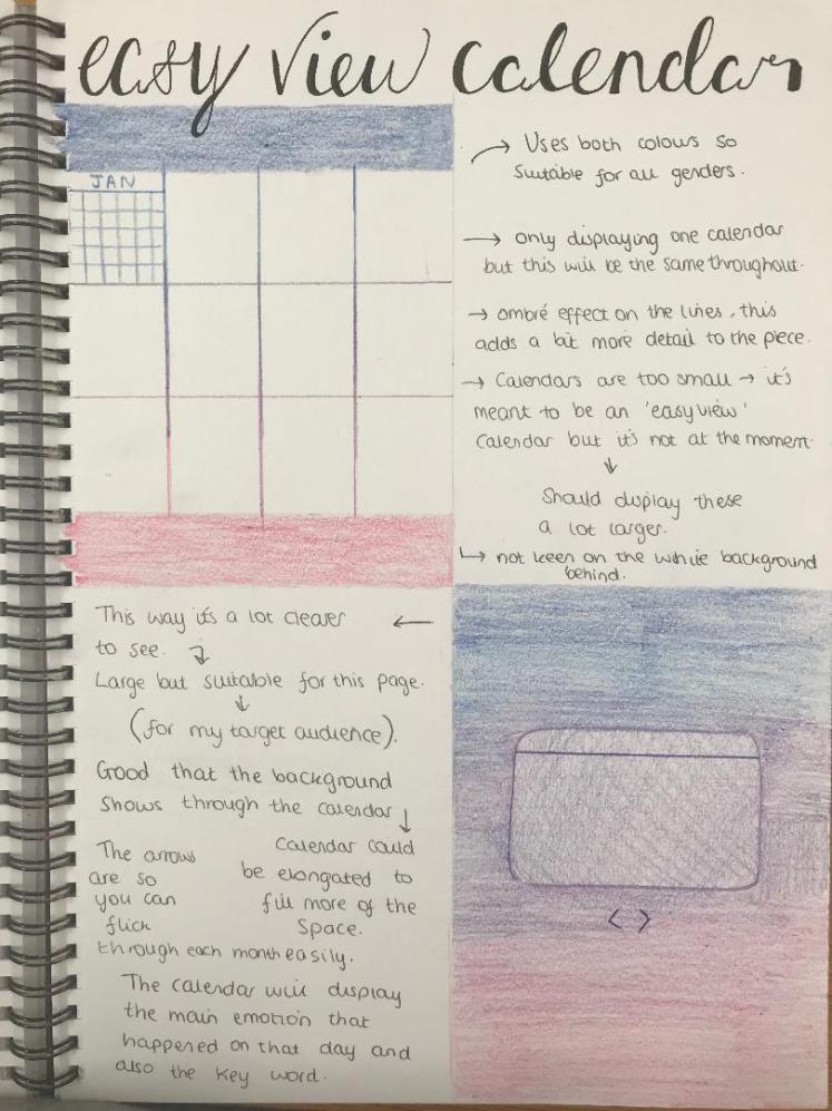
Developed Designs:
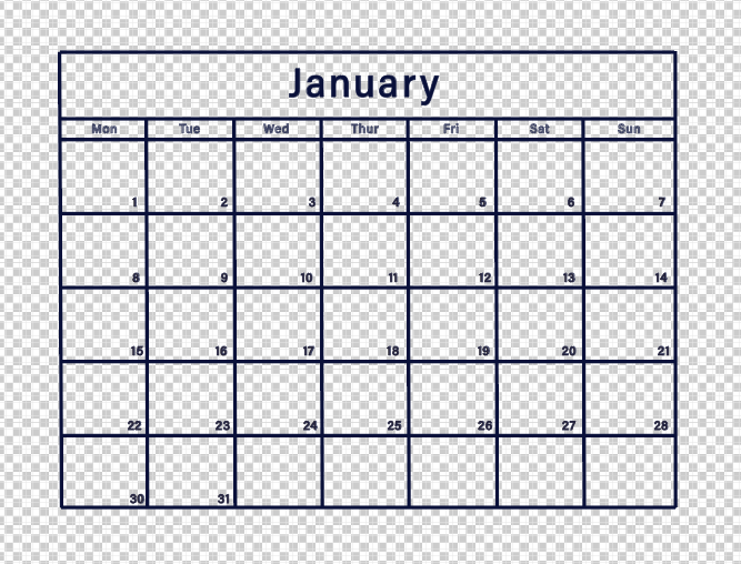
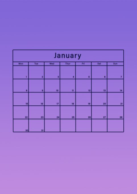
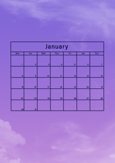
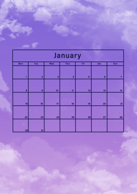
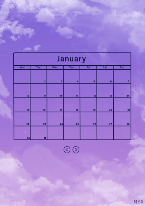
Final Easy View Calendar Page:
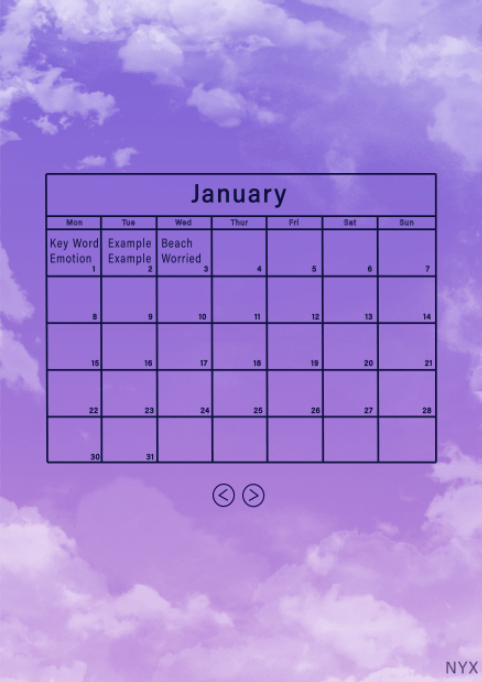
Design Evaluation Part 11- Easy View Calendar Page:
Initial designs really helped me to make this page successful as I could see from my first drawing that having all the months displayed on one page was not going to work as the writing would’ve been too small. Initial designs really help me plan and understand what would and wouldn’t work in the wider world.
In my part 10 evaluation I discussed that I wanted to involve more developed designs. I consciously tried to keep reminding myself to take snap shots of the process. I do think my developed designs are sufficient because it depicts the process I took to get to the final outcome, however there still could’ve been more displaying the calendar at different positions on the page. This way it would’ve portrayed that I experimented with multiple outcomes of the page before choosing my final page instead of just creating the final design straight away.
For this page I, again, demonstrated examples within the calendar just so my audience can see how this page will begin to look as they use the app more and more. This is my final page. Being completely honest I’m relieved that there are not any more pages that I need to produce because the whole process was definitely beginning to get repetitive. As a whole I have found designing these pages fun and beneficial as I have broadened my skills throughout different medias/mediums which I can bring with me into the future. Furthermore these are skills that help me as a graphic designer as a whole.
As I look back upon all of my designs I do see flaws along the way. I have noticed that my logo in the bottom right hand corner is not always in the same place, the same size or the same opacity. Although trying my best throughout the whole process to try to keep them all the same. I didn’t fully achieve this. So although it doesn’t majorly affect this project, going into the future I need to take more care in positioning this in the same place each time. I could accomplish this by writing down the amount of space between the right hand side and the bottom of the page so I can then use the same measurement for each page.
Overall, for this page, I am proud of the layout. I believe the calendar is a suitable and appropriate size for my target audience, additionally the arrows allow you to easily move between different months. To save myself some time and to keep the theme the same throughout my pages I decided to use the same arrows that can be found on my ‘Dream History ‘ page, I just slightly adapted it to have a lower stroke to fit the aesthetic of this page. I included this feature opposed to having all the months displayed on one page so my audience will have a more enjoyable experience when using this page because they can see everything with ease.
Animation:
To display the pages within my app I really want to create an animated video. I like the idea of having a short clip of all my Photoshop pages because I feel like it will be able to somewhat portray how my app would be in the real world. This is definitely going to be a challenge because I know I want to produce the video on Adobe After Effects, however by working with this media in the past I know it is not a straight forward application to use.
I’ve only considered creating an animation because I have previously created an animated advert for my Unit 7. I did find it difficult to try to get a grip with all the features and I know this is not going to be easy. However I think it is good to challenge yourself, especially with FMP because I want to explore as many different mediums as possible. Even if I do not have enough time to make the video up to a professional high quality standard, I still want to attempt it because I want to push my boundaries.
So to begin this part of my project I am going to create a storyboard for the video. It is good to plan what is going to happen before I dive straight into it and start creating this animation. This way I have a rough idea on what I’m going to create and I can then go through it step by step.
My Story-Board:
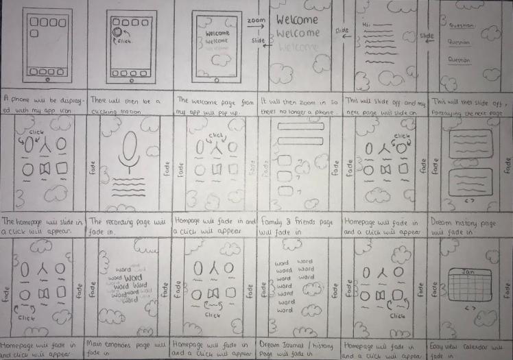
Now I have completed my story board I am going to begin to create each scene on Adobe After Effects.
I soon remembered how to navigate myself around the app. I found this part very enjoyable, I do like working within this media. As time went on I became more and more familiar with how to animate my video including the use of slides and animated ‘clicks’. I also imported different sound effects to make my video more enjoyable to watch.
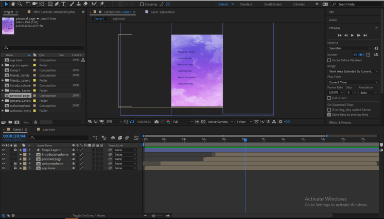
I thought the process of creating this video was going really well and I was happy with the outcomes I was producing. However, this is when things started to get difficult as my video was running over the time limit. This led me to spending hours which I didn’t really have, moving each stage of the video along. It would’ve been a quicker process if I didn’t encounter multiple different problems along the way.

I kept facing the same errors over and over again and I wasn’t sure on why this was. However I kept persevering and after some time I managed to resolve the solution by deleting certain aspects of the animation and re-doing them.
From the very beginning of my FMP I stated how I need to keep backups of my work (pictures imported below) just in-case anything was to crash or go wrong. So luckily I had multiple saved files of my work, I’m very pleased I done this otherwise I would’ve had to of started from scratch again, and then I really wouldn’t of had enough time to complete the video.


So I thought I had things back on track and again I was happy with the progress I was making with the video. That was until I went to render and finalise my video. The rendering process failed twice, and due to my lack of understanding of this application as it was only my second time using it, I was unsure on why it was not rendering. (I need to render my project to save it as a video which I can then upload onto YouTube and my blog).
So this added a lot more time onto this project and I was beginning to get mentally drained from trying and trying to complete this video. However, I was still very determined to finish as I had invested so much time and effort into it already and I did not want it all to go to waste.
So that is when I thought to try a different application and try to import my video into that and attempt to render it there. This was a tough decision as I was basically going into this blind as I had never used a different application before, but I knew I had to try it. So I did, I sent my video on Adobe Media Encoder, where I was able to successful render my video. Additionally, this application was able to upload my video straight to YouTube, so this part did actually save me some time.
Final Animation:
Design Evaluation Part 12- Animation:
Taking into consideration all of the errors and problems I faced throughout creating this, I’m pleased to a certain extent with the outcome. I’m glad the video is complete as I found it very challenging to produce, especially as I haven’t had as much experience using this media as I have compared to Photoshop and Illustrator. So the level of skills I have for this media isn’t as high as it could be with an immense amount of practice, but due to time restrictions I can not do lots of practicing. There are aspects I do and do not like about this piece, these include:
Firstly, there are a few improvements I could make to make this animation more professional. In the first 3 seconds there is a slight gap between the edge of the light grey and dark grey background, this was due to me not importing the slides from Photoshop large enough. I should’ve increased the size so it fully fits the frame so it doesn’t have any awkward gaps.
Another issue is when the slides are sliding (between seconds 3 and 6), this is because again there is a gap between the backgrounds on the right hand side. To improve I need to ensure that the slides start slightly on the page, and not off the page, this way it will reduce the gap between each page.
Another improvement I could make, and quite a large one, would be choosing the most suitable background to begin with. The medium that I was working within was landscape whereas all the pieces I wanted to import were vertical, this has led me to have the large black border around my video which I initially didn’t realise existed when editing my video of After Effects. This border is an issue as it makes the actual video a lot smaller and therefore it’s hard to read the text on the pages. Additionally it just brings down the quality of this piece as it doesn’t look very professional.
All of these issues were encountered due to my lack of experience and skills within this medium. I will be able to create better, stronger projects in the future as I can learn from all of these mistakes that I made.
Despite all of the flaws within this video, I’m still satisfied with the final outcome. Some positive attributes of this animation include the mini animation of the ‘click’ feature. I feel like this aspect heightens the quality of this piece as I have the ability to be able to direct the viewers eyes. It also helps them to understand what is actually going on which is beneficial because I always want to try to make my work as easy to understand for my viewers as it can be.
I’m pleased with how I timed everything. The whole animation fits into the 30 second time frame, although this did take me a while to achieve because, as previously mentioned, I had to keep making the slides closer together in time. Additionally, I tried really hard to match up the imported sound effects with the given action, to accomplish this I kept zooming into the different key frames so the noise is right up to the millisecond of where it should be. If my sound effects where off time then there would be no point of actually having them as it would just throw off the whole project.
Furthermore, by my video being a sufficient length of time it makes it worth while watching as it is long enough to actually engage and intrigue you. In my opinion, it would be unfair to make my target audience go through the effort of watching a clip which is only actually 5 seconds long. I do believe this video is suitable for my target audience because it has professional and sleek attributes (the ‘fade’ ins and the slides), these features will get appreciated because my audience will be able to understand the effort that has gone into creating this video.
Factoring in all the limitations and errors of software throughout this aspect, I am still overjoyed with the outcome. In conclusion, for the stage where I’m at with graphic design now, I believe the video is up to an amateur level, which is promising and it gives me space to develop and grow. Even though this was difficult and sometimes frustrating to produce, I’m pleased I stuck to it and completed this. I did show my peers this video and as they have played around with Adobe After Effects before they could understand the obstacles that I faced. So their opinions on my video were all very positive, with most praise going to my ‘fade-ins’.
Week Eleven Evaluation (27/05/19-02/06/19):
This week was the week where I mainly focused on producing my final pages. Out of all the weeks this week was not one of my favourites because the whole process did begin to get really repetitive after a while. Also, creating my initial designs was very time consuming because I had to hand write and colour everything.
Nonetheless, this week was probably the most important week as I produced my final pieces. It’s also where I created my animation -which I found to be quite difficult (full evaluation on my animation can be found above). So this week was definitely week of facing challenges and figuring out ways to overcome them and as I did overcome them all I am very proud of myself. My action plan helped me significantly this week because it would’ve been easy to get mixed up with each page as it was the same process for the each of them, so I was glad to have that planner.
Next week is my final week where everything needs to be handed in. So I have several things I need to accomplish by then, including my final evaluation, and the whole printing process. I’m excited to see how my final pieces are going to look when they’ve been printed.
Final pieces:
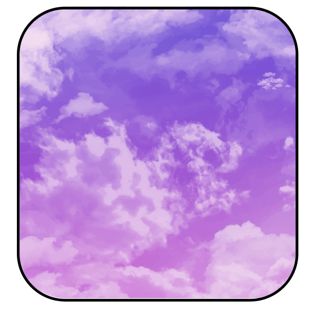


Printing:
I didn’t really fully take into consideration printing when I was creating my work. As I was working on Photoshop I didn’t actually realise that I was working in RGB opposed to CMYK, RGB is perfect for web displays as the colours appear very vibrant, but then you cannot print with RGB colours. So when converting my work from RGB to CMYK the colours changed and they then appeared very dull. The colours had no vibrancy like they did in RGB. Additionally, I didn’t work with bleeds within Photoshop, so if I was to print straight from there then there’s a high possibility that some of my work would be cropped out. To avoid this risk I imported my designs onto Illustrator, where I could then create a bleed. To overcome the colour issues I had to edit them on Illustrator, playing around with the saturation etc..Although the colours are not as bright as they were on Photoshop, I still think they are suitable to be printed.
Although I knew I am not going to be printing my pieces at college, I still tested it to see how it would come out:

As you can see the colours are lifeless and overall it just doesn’t look good with the white border and the ‘NYX’ at the bottom right corner being slightly cut off. So I emailed a printing company that was located near my college to ask them a few questions:
I asked them these questions to ensure that they were going to be the right company for me. As I have so many final pieces I needed to narrow it down to just 4 pieces which will be displayed at my end of year show. I simply chose my 4 favourite pieces as I was the most proud of these:
- Welcome Page,
- Information Page,
- Main Emotions Page,
- Dream History Page.
However, after realising this company would be too expensive, I decided to go to a more affordable place and then just mount the prints to foam-board myself.
My Final Printed Pieces:
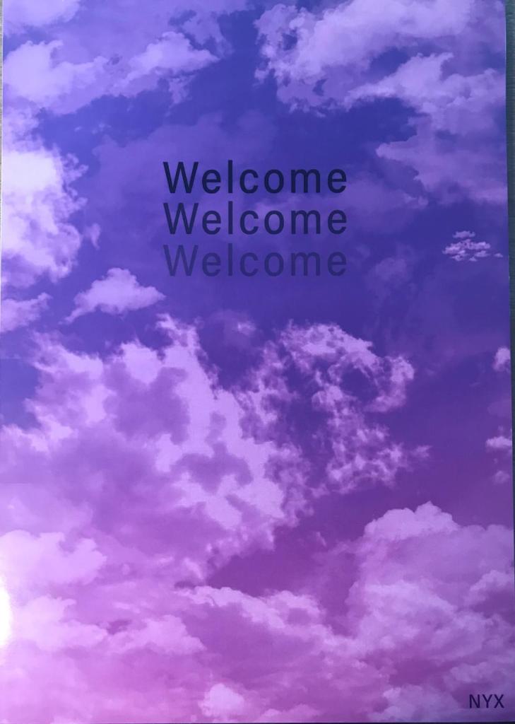
Complete Design Evaluation:
Although I’ve included design evaluations throughout this entire unit (12 parts), I still want to fully evaluate the design portion upon my whole blog. I decided to evaluate myself after each page or piece I produced because I wanted it to be easier for my viewers to read and understand. It’s easier to read because it’s very clear what piece I’m talking about, this way you can compare what I’m saying to your thoughts as you can see the images right in-front of you. Additionally, by including evaluations throughout it makes it simple to see how my thought process and mentality towards my work changes. This way I can also talk about the issues I faced and improvements I could make, and I can take action on these improvements for the next piece I created rather than just saying I improve in the future.
In regards to my blog, I think I have presented it very professionally. In my research evaluation I linked back to my goals and one was ensuring that images I imported were large enough to easily view. I do believe I have stuck to and achieved this goal because all of the images and screenshots I implemented into my blog are large. Another reason as to why I think my blog is professional is due to the amount of explanations I include about what I’m doing. I think as you type it’s easy to get carried away and go off on tangents, but you need to keep in mind that the reader may not have as much knowledge upon the subject as you do so it’s important to take the time and really break down what you’re doing. This way it feels like you are taking the readier/viewer on that journey with you.
Another reason I believe my blog is professional is due to the language I’ve used throughout. As briefly touched upon in my research evaluation, I do try to articulate my blog in an executive way so it is pleasurable to read. Especially because my target audience is a different generation to me, I didn’t want to use colloquial language that they wouldn’t be able to understand. Additionally throughout my blog I have tried my best to have correct spellings, I have noticed that sometimes I type too fast and this will lead me to making spelling mistake, but I have tried my best to ensure this hasn’t happened. Furthermore once this log entry is complete I will read over it all so I am confident it all makes sense.
Throughout this unit I have experimented with multiple different types of mediums including: acrylic paint, colouring pencils, sketching pencils, charcoal, chalk, ink, water-colour paint, collage, oil pastels, Photoshop, Illustrator, After Effect, Media Encoder. Everytime I used a medium I discussed how I thought it went and my opinions upon that media. So I’m not going to evaluate each again as these evaluations can be found throughout my blog and I do not want to repeat myself. However, I will say that my favourite medium to work within was Photoshop. If you asked me at the beginning of this unit I would’ve said Illustrator because that was the media which I felt the most comfortable using. Nevertheless, my opinions have now changed. Photoshop has grown to be my favourite because you get a lot of freedom with what you can create, it’s also quite a simple application to use when you understand the basics. Although frightened of this media at first, with a lot of practice it has led me to want to use this medium again in the future.
An aspect of the designing process which I didn’t really enjoy was creating the initial designs for my pages. At first I didn’t mind doing this, but as time went on I was just becoming more and more eager to create the pages on Photoshop without having initial designs because I was just excited to get on with it. Additionally, hand-drawing designs is a lengthy process, also because I annotated each design this definitely took up a lot of the time I had. However, I did still create initial designs for my pages because it is important to have a rough idea on what you’re going to produce before you do make a start.
When looking at my final pieces, I’m delighted. I did work extremely hard over this unit, going above and beyond by doing some work nearly everyday for 11 weeks straight. So I’m pleased that all this hard work paid off as it led me to create pieces which I’m proud of. When comparing these final pieces to previous units, there are some improvements. For example, this animation compared to my unit 7 animation is up to a much higher quality. However, when comparing my design work to my previous units I would say I’m at the same level in regards to paintings, drawings and initial designs. The only thing I would say makes this unit different compared to my previous ones is the amount of work I have produced. Normally for a unit there will be a maximum of 5 final pieces. Or back to my unit 7, I just needed to produce the video with no further final pieces. So for this unit having 12 final pieces (all my pages and video), not even including my logo and corporate identity, there was definitely a lot more work that needed to be produced.
I feel like I have successfully met the brief as I have included everything I learnt from previous units to produce my final pieces. I believe I’ve included a lot of different elements including: logo design (unit 1), research skills (unit 2), materials (unit 3), justification (unit 4), corporate identity (unit 5), advertising (unit 7). The only unit that I couldn’t really implement into my FMP was unit 6 which was our packaging unit. Nonetheless I’m still proud that I was able to use all my previous knowledge to create these final pieces. Our brief also stated that we needed to come up with a solution to an existing problem, the problem I chose being (copied from the ‘Problem I Will Help Resolve’ section on my blog):
“My product will help resolve the issue of people not being able to express their emotions and thoughts.
‘People who struggle to express their emotions and thoughts will be able to look up their dreams and it well help others be able to understand what they’re thinking’.”
I do believe I was successful in not completely solving this world-wide issue, but at-least helping some people out and directing others in the right direction for a more positive life. When creating my pages I always tried to keep this issue in mind so I could create the pages to try resolve it. I think I helped with this because my pages are dedicated to giving the user those main emotions and main interpretations, which they can easily share with others. So from this their close ones can use the interpretations to understand how that person is feeling.
I do believe all of my designs and final pieces are adequate for my target audience because they’re good quality, well thought out pieces, involving complex and realistic imagery that they will be able to appreciate and enjoy (this dream imagery being the colour scheme and cloud motif). I think if I was doing this project again, I would most likely choose a target audience which is my age, this way I would be able to implement more of my thoughts and opinions as I would know more upon the subject because I could just relate it to myself. Nonetheless, I was still able to make my content relatable for my target audience because I had discussions with people within that age range, so getting views from some members of my audience did help me in creating more sufficient final pieces. I do think my designs are suitable for all genders, but there may be controversy with this view as the colours of pink, and the clouds, could be perceived as quite feminine, regardless, I’m still confident males will use and like this app. Furthermore, I do not have any worries regarding people of different religions or races using my app as it’s an inclusive, universal app, and I took the time to ensure I didn’t use anything that could be discerned as offensive by always using appropriate language.
As the designing process started I was slightly frightened by the time we had, I did think that 4 weeks was a long time but looking back on it now it isn’t a lot. For the future I will always ensure I have got enough time to be comfortable in regards to how much work I need to do. I can do this by just starting the designing portion sooner. This whole unit was 12 weeks long, including holidays we had, that does sound a very long time but in reality it’s not. The time has gone very quickly but I pulled through and produced all of my work without rushing or cutting corners, which I did not want to do as I was afraid that this was going to bring down the quality of my work which it would’ve.
Throughout this project I wouldn’t say there were many safety concerns. Thinking about my own safety regarding health, I tried really hard to not put any pressure or stress upon myself because in order for me to work sufficiently I need to be relaxed. However when discussing general safety, I followed rules by not having any liquids near electrical equipment, being careful when using scalpels or scissors and overall being sensible when in college. I never saw concerns within safety as a main issue because I knew I wasn’t going to be taking on massive tasks that could potential harm me in any way.
At the beginning of this unit I was adamant that I was only going to learn new things regarding graphic design, which is still really good, but I believed this unit wasn’t actually going to further inspire me as a person in any way. However, now that this unit is complete, I can say that this unit has slightly changed me. I have become more patient as a person as some of these pages did take a very long time to produce. I’ve grown more confident in my capabilities of under-going and overcoming challenges that are thrown at me as there were many hurdles I had to prevail over. I’ve also thoroughly enjoyed this unit, I’m grateful that I was able to have access to all of the different medias that I used as it led me to creating a project that I can say I’m proud of. Moreover, I’m also quite pleased that this unit is coming to an end as it has definitely been a length journey, but it’s been worthwhile as it has been a huge learning curve and it’s been a great opportunity for me to become a better person.
Research Log:
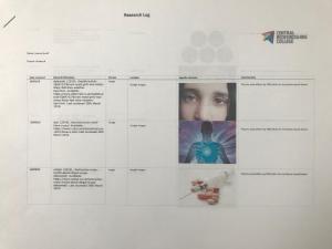

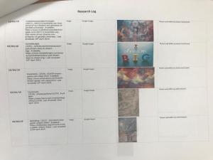
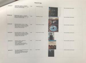
Criteria Exploration Page:
Brief – Use the Internet or a dictionary to discover the meaning behind these criteria terms that you will be assessed on:
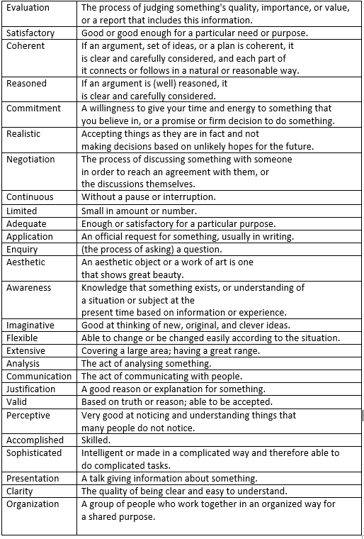
Action Plan: