Project Brief:
I am working for Bloomsbury. They offer me the chance to work on publishing a new concept for a children’s book. I need to choose an age range of 0 – 5, 5 – 7, 7 – 9 or 9 – 11. I will then create a story, illustrate it and produce a small printed proof of concept book.
Bloomsbury:
Homepage:
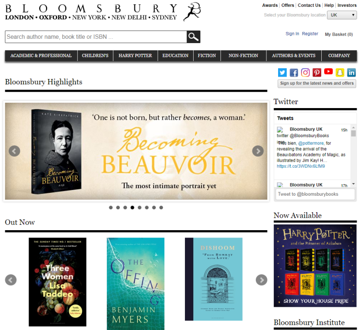
About Bloomsbury:
Bloomsbury were established in 1986, they are a famous publishing company with establishments all over the world including: London, Oxford, New York, Sydney and New Delhi. The agency is all about the publication of different books, which has led them to get nominated for multiple publishing awards, including: the ‘Publishing Group Award’, the ‘British Book Awards’, and the ‘Children’s Publisher of the Year 2018 Award’.
Along side the nominations, Bloomsbury are also famous due to the authors they work with, some well-known Authors include: J.K Rowling and Sarah J. Mass. Furthermore, Bloomsbury have also worked with award winning (including the Nobel and Bookers Prizes’) authors, and they were also the original publishing agency for The Harry Potter series. So they are definitely a well known, trusted company.
The company publish over 1400 books a year which means, over the years, they have accounted for thousands of publications, which allow them to develop further as a company because they are able to get their name out there and present to more people. Which benefits them as it’s only going to make them grow as they cover more of the world.

As you can see by the screenshot above, the company have a section on their website which tells their audience all about them, which is where I gathered all the previous information. In order to be a successful company I feel as if this is a really important factor within your website, therefore you can begin to create a bond between your company and your audience. The trust which is created is essential as it’s what builds up your company, without any interactions with your audience there is no way you will be able to create products that people will use and enjoy. So seeing this factor on their websites educates me on who they are and what they do meaning I can gather information to see if this company would be suitable for me to use myself.
‘Further Information’ Section:

Another feature that I like about their website is the fact that if you want to find out more about the company and go into more depth about who they are and what they do then you can. This is due to the fact that they have a, ‘further information’ section (picture displayed above), where you will find their neighbouring websites which hold details about different factors that make up the company as a whole. The fact that you can find out more about them suggests that they genuinely care for their audience, as Bloomsbury are willing to give away every detail of themselves.
Going back to our project brief I know that I need to create a children’s book, so I decided to look into their ‘children’s’ region:
Children’s Region:

As you can see in the image above, Bloomsbury dedicates a section of their website to their children’s books. This section speaks about some of the book series that they have published, including the ‘Witch Wars’. This section also speaks about some of the authors that they have worked with, (list of authors can be read in the screen-shotted section imported onto this page). Another feature that enhances the company is the fact that they have separate ‘sub-sections’ for different age ranges (found on the left hand side). This is beneficial to their websites users as it narrows down our searches so we can easily find what we were looking for.
Additionally, Bloomsbury also have pictures of some of the books that they have published, this visual confirmation of recognisable books also helps us, as users, trust the company because we are able to see evidence which backs up the information that we were previously reading. Allowing us to believe their views and speeches.
I decided to look further into this company by choosing one of their ‘sub-sections’:
Specific Age Group:

I wanted to look into this age range (7-9) so I could begin to gather some knowledge as to what these ages like and the best-selling and most popular books, as this will help me when I go to design my book. In this section of Bloomsbury there are many videos of different authors and illustrators, this shows me a background to how Bloomsbury partnered with these companies and it allows me to create connections between faces of authors and their books. I found this educational as I learnt what I need to look into when researching existing children’s books including: book covers, what illustrations to use, colours I should think about and storylines. I gathered this all from just looking at the latest releases and seeing what initially jumps out to me as things I should look into further.
Conclusion:
As an audience member I feel like I am able to trust this company because I was able to learn so much about them and what their morals are all due to their simple yet effective layout of their website. Now I have looked in-depth into Bloomsbury I think I am ready to progress onto the next section and begin to decide who my audience should be.
My Audience:
I believe it’s important to find out who my audience should be before I start analysing existing books because I want to analyse relevant books; this will enhance my knowledge as I will learn more about that specific age range. So in order to find out which age range I should decide upon I am briefly going to discuss some factors which differ between the groups.
In my opinion, mind-maps are a great way to easily display information and views as it’s layout is visually appealing and easy-to-read. It also allows me to further express my thoughts as I am able to delve deeper into each range as my mind flows whilst creating these mind-maps:
Audience Mind-map:

Producing this mind-map allowed me to explore the ranges in more depth. It also allowed me to understand which groups that I want to steer away from, including: 0-5 years and 9-11 years.
I’ve decided that I’m not produce a book for the 0-5 year old range because I feel as if it is too vast, there are many things that a 4 year old will understand compared to what a 1 year old will understand, so it will be difficult to find a book that balances between the 5 years. Furthermore, this age range doesn’t fully understand a story, they don’t grasp onto the fact that there should be a beginning, middle and end, with characters and a point. In order to benefit myself, I wanted to create a book with a full functioning story as I believe this will help me as a graphic designer as I can enhance my knowledge by learning another area within this media. Hence why this age range is just not suitable for what I want to create.
Additionally, this mind-map led me to understand that I do not want to focus on the age range of 9-11 years. My reasoning being that these years are too advanced for what I want to create, similar to what I previously stated, I want to enhance my graphic designing abilities, so I want to produce a story which also has illustrations. Although there could still be pictures in a book for this range, I feel like I could be more creative with the illustrations for a younger audience as they will have a wider imagination, allowing me to be very free with my illustrations. Also due to timing limitations, I feel like I will be able to create a shorter book for younger audiences as 9-11 year olds will want more of a book to read and I do not think I have enough time to complete a substantial book for that age range.
So now I need to decide between the two remaining age groups: 5-7 years and 7-9 years. In order to help me make a decision between these two groups I am going to look into each of them further by researching more about the ages:
5-7 Year Old’s:
At 5 years old children will begin to have an understanding upon shapes, colour, reading, writing, numbers etc.. Meaning they’re all still very new to basic education. However when comparing this to a 7 year old, who can fully count, read, write, distinguish colours there is a massive jump. Designing and creating a book for 5-7 year olds will be quite complex as there is a vast difference between what a 5 year old and a 7 year old will be able to understand. So getting that mixture between the two and creating a book which all the ages will be able to understand and enjoy may be difficult.
With 7 year olds they are able to understand emotions and grasp onto social situations, this allows them to understand more developed and intellectual stories. Writing a story that is meaningful is more intriguing and interesting to me than writing a basic ‘number’ or ‘alphabet’ book. So this is steering me more onto the pathway of designing a book for the range of 7-9 year olds.
7-9 Year Old’s:
I believe that a 7 year old is more mentally similar to a 9 year old than a 5 year old. This leads me to think that for me to make a story that will actually entertain and change someone, it will be best to choose this range as I think that 7, 8 and 9 year old will all find the same things fun, funny, cool etc.. So I have no doubt that my book will be interesting for everyone that falls under this range, and I just want as much people to enjoy my book as possible.
My mind-maps and further analysis upon the age groups really aided me in coming to my final decision of my age range being 7-9 year olds. So now that I have come to a conclusion on who my audience is going to be, I will research this age range in a lot more detail, by looking into: that age range’s mannerisms, their education, their hobbies, their aspirations, existing authors for that age range etc… so then I can begin to understand what they’re like so I can then produce a relevant story.
My Age Range Research:

To begin with I decided to find what books are selling well for that particular age range. As I was researching some familiar authors popped up that I remember from when I was that age and when we had to read books at school. These include: Roald Dahl and David Walliams. I remember that the books had very weird and imaginative stories, they didn’t necessarily always make sense but that was okay because it was still entertaining to read. I also remember that there were loads of pictures and the books were full of colour, so I need to ensure that these elements will be reflected within my book.
For 7-9 year olds it’s very beneficial for there to be bright colour used within the book, the bright colours grab the readers attention and it allows them to connect with either the character or whatever is taking place within the story. This connection is essential for the child as it will provoke emotions of empathy, which means that the story is actually going to make them think and it will satisfy them in some way. The colour is also visually stimulating, which gets their minds working as they need to process the information.
The majority of stories for this age range are cartoon, this is because it’s easier for children to relate to these characters as they look more friendly and intriguing. Furthermore by the book being cartoon it allows the writer to be a lot more creative as you can play with shapes, sizes, colours etc.. Additionally, a cartoon story will entice children way more than a realistic book, as a realistic story may be quite boring for the child.
Children of this range will experience many new emotions including curiosity, as they will want to explore new things. So I want to create a story that will benefit the child either by clearing up curiosity of something they may have or by teaching them something new. Although there may be slight differences between what a 7 year old and what a 9 year old will be curious about, I need to try to find that balance and create a story that helps them both. To find this balance I am going to look into existing books for that range so I can see what the morals in those stories are; this may inspire me and gives me ideas for my own story.
Primary and Secondary Audience:
So my primary audience will obviously be 7-9 year olds, these will be first in mind when I’m creating and designing my book, however, my secondary audience is equally as important. I’m still designing my books for parents to buy, I want my cover to look appealing and enticing for the parent too as they’re going to be the ones buying the book for their child. So I need to keep this secondary audience in mind too.
I feel like to reach out to my secondary audience I will need to create a book that is going to make their child feel good in some sort of way. So then by their child reading the book it will be beneficial to the parent too as it will help their children develop and grow as a person.
Not only will I be designing my book for my primary and secondary audience, my book also may reach out to niche, which is an audience that I wouldn’t necessarily be designing my book for, but it may still appeal to them. For example: children’s book collectors. This doesn’t really impact me in a major way though as my priority is just my primary (children) and secondary (parents) audience.
To expand on my secondary audience, I will mainly be reaching out to the working/ middle class sector as, stereo-typically, they would read stories to their children. So I need to keep my book affordable so it can reach out to a wider audience as more people will purchase it; I can ensure this by using appropriate materials when constructing my book.
Another factor that I need to keep in mind when designing my book is that I use appropriate and relevant imagery throughout my illustrations. I aim for my book to only be available to buy in the UK as we have the same morals and principles throughout the country, opposed to other countries where people may get offended if some of the characters where to wear or say specific things. I feel like this is the safer route to take; especially for an amateur.
Existing Book Analysis:
Book 1:

Straight away this would look appealing to a child because it involves bright colours and funny images. Children are drawn to silly things so by there being animals with funny props within the cover make it stand out and make it enticing for the child. The 3 bullet points help to explain a bit about the book, this would also seem intriguing for the child as ‘muscle-shaking’ sounds fun. Additionally, the title would jump out at the children because it’s an alliteration, this makes it more memorable because children will be able to recall the book to their friends.

I enjoy the fact that the illustrations spread over a double page, I feel like this gives a large focus point for the children, this will, in-turn, make them want to carry on reading and listening to the story as the spreads are enjoyable to look at. It’s a shame that the illustrations aren’t in colour, however I believe this is due to the fact that they’re books to be used within a school, so it would be very expensive to print every book in colour.

This book is aimed for 7-9 year olds, I like the layout of the book- the writing cuts around the image which makes it easier to read. Not only that, but the choice of language used is very appropriate, the words are very relevant for that specific age group. As you can see the illustrations that are used are quite simple and basic, this is again due to the age range, keeping the illustrations simple will make it easier for children to understand. Furthermore, with simple cartoons, children that are reading it would be able to copy the drawings and learn some new skills this way.
Book 2:

Compared to the previous book, the cover on this one isn’t as appealing to me. The colours are too plain, it would be interesting to have some more detail within the background. However, the illustrator designed it this way for a purpose. With a plainer background it gets children to focus more on what is in the foreground, and in this case it’s the main character and the title of the book. Which can be a really beneficial attribute to have as it will allow the child to instantly create empathy towards that character.

This book is more of a story compared to the poem book, so it’s portrayed slightly differently. However, they still both include the same principles of writing and illustrations. Similar to the previous book, this book has double page spreads, which make it very fun for the children to read. Large illustrations also help the children understand the story more as it involves another one of their senses, this way they are able to interact with the book more.

It’s also very common for children’s books to include illustrations on only one of the 2 pages, this way they can verbally and visually engross you into the story. I prefer it when the pages are separated like this as sometimes it can be quite difficult to read the words correctly around the photo. Pictures are very important in a children’s book as it helps them learn because they can begin to visualise the story instead of just imagining it.
Book Research:
In order to create a story that is legible and enjoyable, I need to teach myself how to actually write a good story, and the elements I need to include within my book. I’m going to research steps of story writing, I will also read advice on how to specifically target story writing for children.
When writing my story I need to keep in mind the fact that I am writing for children, this means I need to use simple language techniques and not write my story too advanced otherwise they won’t be able to understand.

Above is a screenshot of a trusted website, it states that my book should have between 1000 and 3000 words (highlighted orange) and there needs to be illustrations on every page. Although this is only a rough guide, I still want to remain close to these boundaries as this is the average criteria for a good children’s book. So I now roughly know how much I should be writing and how many illustrations I should include.
How To Make my Book a Success:
Some important factors that I also need to take into consideration when creating my book is the fact that I need to make it appealing for not only children, but parents and teachers too; as most children’s books are not actually bought by children, so they need to be enticing for the buyer too.
For this age range it’s best to write the book in present tense so then it’s more enjoyable for the young reader as it will feel like they’re in the midst of the action. Children prefer seeing whats going on as it’s happening, opposed to talking about something in past tense. Furthermore, I believe that it’s more difficult to create a story in first person compared to third person. This is because you would really need to put yourself in that characters shoes instead of narrating a story where you don’t need to go into as much detail in regards to the characters feelings and emotions. In addition, it’s easier for a child to watch what’s going on and evaluate the situation that way, instead of reading it as if they’re actually in that current situation.
In order to make a successful book I should create action at the beginning of the story, this way I can grab my readers attention and hook them straight away, so then they need to keep reading in order to find out what’s happened. I should involve likeable, relatable characters of which the child can learn to feel empathy towards, this way the book is actually enjoyable to read as the reader will begin to care for the characters. My story should definitely have a story line which involves a clear beginning, middle and end with suspense and action throughout. Furthermore, due to my audience, I believe that it’s best to finish with a happy ending, as I do not want children to be put off reading any more books in the future.
Layouts of Books:
There are a few different ways of which I could format my book. How the book is laid out will affect the readers overall experience, so it’s important to get it right.

Although there are many different layouts, above is a picture of three variates of formats. Out of these three formats I do like the idea of the horizontal one, as it makes the story flow. However, I am not deciding upon the format of my book just yet, as I do not want to restrict myself of any potential ideas. As I am involving a lot of pictures within my book it’s important that I chose the correct format as I need to leave enough space for both the text and the illustrations.
I now have a slightly better understanding of what I need to create and what I need to involve within my book to make it a success. I will now begin to research artists to see if I can gain any inspiration for my book from them.
Narrative Design:
In order to write a successful book I need to further look into the elements of what should be included within a story and what the building blocks of a story are.
As a class we decided to research these elements together, including: Archetypes, Setting Archetypes, Image Archetypes, Situational Archetypes and different methods of narrative design. Below are some images of the work I completed:


Character Analysis:
In order to fully understand some archetypes, we decided to break them down into two different elements of physical and mental with sub categories of appearance, emotions, needs and wants:

Artist Research:
Liz Pichon:


Liz is a children’s author and illustrator. I’ve decided to research her because I feel as if her work is relevant, so whilst analysing her work I can also gain inspiration that I may be able to put towards my final idea.
The two books shown instantly intrigue me as they’re bright, bold and different. The abstract shapes of the blue and black is very intense as it makes me wonder the reasoning behind why she chose to create these shapes. Overall neither of the covers make sense. There are random animals and monsters dotted around the page, saying random sentences, this leaves me quite confused as I wonder why they’re there, however this is going to appeal to a younger audience as the children will just see the colours, shapes and animals and be in awe of what the book is about.
Liz lives in Brighton and she has 3 children. She studied graphic design at school which led her to become a freelance graphic designer, and not only this, but she also dabbled in the music industry as an art director.
Jacqueline Wilson:


Jacqueline was born in 1945 in Bath, however she moved to Kingston and she continued to live there her whole life. Her father died young and she didn’t have any siblings, so for a long time it was just her and her mother until she had her daughter Emma. In school Jacqueline loved english and art, even from a very young age Jacqueline knew that she wanted to be a writer. She was always intrigued with story telling as she read many books in her early years. As she became older she fell into journalism, this is where she would write articles for a magazine: ‘Jackie Magazine’, she was only a teenager when she was writing for this company.
The Story of Tracey Beaker is what Jacqueline is mainly recognised for. This series really made her take off as the series won and got nominated for several awards including the 2002 Blue Peter People’s Choice Award. This led to her becoming one of the nations favourite children’s author as she has sold over 40 million books.
Most of Jacqueline’s books are all based on fiction, she prefers to create the characters from scratch as she can then design and develop them however she would like. I believe it’s harder to write a story based on facts because then you are some-what restricted into what you can produce, as there’s almost reigns holding you back. So she inspired me to really delve into my imagination and create creative fiction stories as these have no limitations.
Initial Story Ideas:
Mind-Map:
I decided to create a mind-map of initial story ideas that I had, I feel like creating a mind-map helps me to develop brief ideas into concrete ones as different ideas stem from others. From creating this mind-map I think I am going to steer towards the idea of creating a story either using an insect as the main character, or an inanimate object.

Developed Story Ideas:
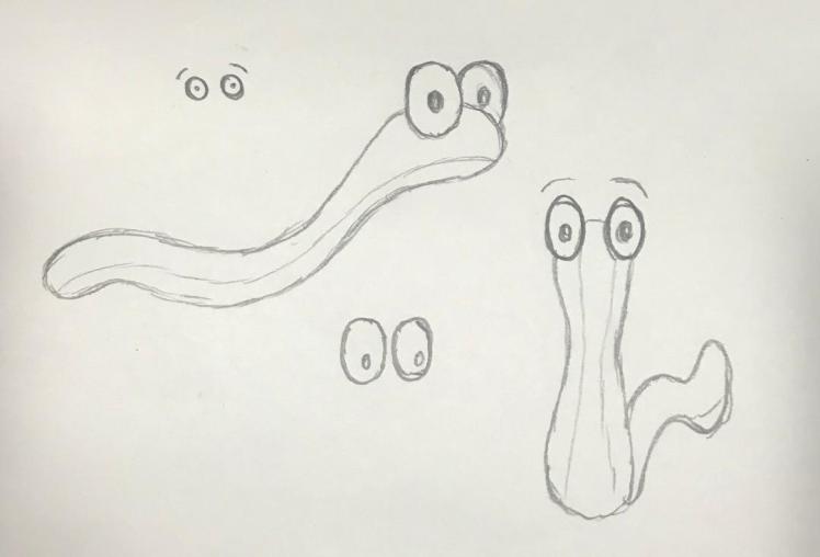
‘Worm Story idea’:
So I had the idea to create a story with a worm being the main character. I chose a worm because I thought that it was an insect that every child would know, therefore the children will be able to relate to the story as they see something familiar. I tried to think of ideas based upon a worm, I had some ideas such as: ‘Worm goes to the City’, or how the worm could turn into a giant monster. However as time went on I began to realise that there isn’t necessarily enough time to create a full story with complete illustrations with an actual story structure; not for me anyway. I like to take my time with work as I want it to be good quality, so I think it’s best for me to steer away from having a full story line.
This is where I carried on brain-storming about what I could produce for my book. Still thinking along the lines of basing it upon a worm, I thought I could create an educational book. So each page there would be the worm performing a different action, for example: there would be a worm in an apple on one page and then on the second page it would say, “did you eat fruit today?”, then the next page there would be a worm with a skipping rope and the following page would say, “did you exercise today?”. So the idea of the book is to encourage children to have a healthy lifestyle through the form of a friendly worm.
Initial Drawings of Worm:
Developed Illustrations of Worm:
I started to produce illustrations upon this idea:
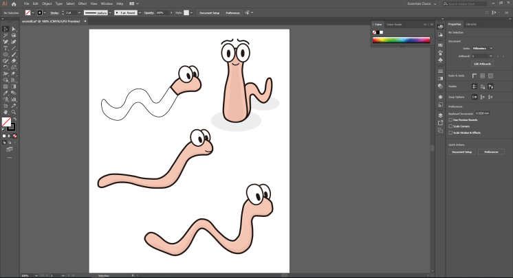
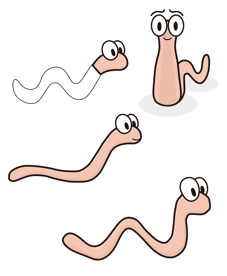
As I began to develop this idea, I was having doubts on whether or not children would even find this book entertaining. Although I liked the concept of this idea I wasn’t completely satisfied with the actual idea itself. I like the idea of writing an educational and informative book opposed to a story book, I feel like they’re beneficial to the child, and they also might be more appealing to my secondary target audience of parents or guardians.
Mind-map of New Ideas:
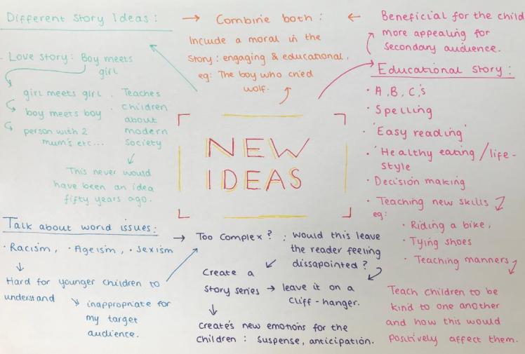
I decided to create a mind-map of new ideas for my book, I thought of all the different things that I could actually educate children upon (listed above in pink). I still like the idea of encouraging a healthy lifestyle, so I definitely think I’m going to sway in this direction.
I also spoke about combining both an educational story and an interactive story to create a story with a moral, however, thinking about my target audience, I think this would be way too complicated for the majority to understand.
So from creating my mind-map I know I am going to create an educational book. As I think this is very appropriate for my target audience.
Healthy Eating Idea:
My favourite idea is probably to encourage children to eat more fruit and vegetables. I feel like now-a-days children are eating more and more processed, unhealthy foods, purely because more is being produced and promoted in stores. So I want to teach children that fruit and vegetables can actually taste nice and show them how beneficial they are. My idea would be that there is a different fruit or vegetable on each page and it would literally just inform children upon what they are.
Or to develop this idea, I could make the story more interactive. So I could introduce unhealthy foods too, like sweets and chocolate, and the there could be a rivalry between the two groups, and in the end fruit and vegetables would win. Portraying that these foods are better and stronger, hopefully subliminally pushing children to choose a healthy option over sweets or chocolate because they’re better for us. By a rivalry I mean something along the lines a tug-of-war, so it’s still playful and so it’s not promoting any form of violence.
New Target Audience:
As I was developing my fruit and vegetable idea I came to the conclusion that my book was going to be quite basic for my original target audience of 7-9 year olds. I feel like that age group needs a developed story with multiple characters and a plot. So I understand that my book wasn’t going to be appropriate for this range. Therefore I am going to change my target audience from 7-9 to 0-5 year olds. Despite my negative comments that I made previously in my blog- in regards to the fact that this age range is too vast- I think that this book will be suitable for all ages between 0 and 5 because although 1 year olds will not be able to read, they can still look at the colours and pictures. I feel happier that I’ve changed my target audience because I believe my book will now be suitable.
I am set on including fruit and vegetables within my book, however my idea may still adapt slightly as I begin to develop this idea further. Next I need to research what pages I should actually include within my book.
Book Necessities (Beginning):
In order to make my book professional, I want to ensure that I include the correct pages. So I chose a book and I took some photos of the first few pages:
Book One:
This allows me to get a rough understanding of what pages I need to include within my book. From this example, I can see that I need:
- A title page,
- An ‘established’ page,
- A contents page,
- A ‘summary’ page,
- An introductory page.
In order to see if these were essential, I looked at the first few pages of another book too, so then I can compare them:
Book Two:
As you can see, there are some similarities. There is still: a title page, an ‘established’ page, a contents page, a ‘summary’ page and an introductory page; so from conducting this research I can see that I definitely need to include these 4 pages within my book.
I conducted some research and I learnt that these first pages of the book is called the ‘front matter’. So my front matter will consist of:
Front Cover:
The front cover is a very important factor when creating a book, it’s what draws in the readers. It’s the first thing of which they will place their judgement upon, so it needs to be enticing. To make it enticing I should involve bright colours and bold text, especially because my target audience is so young, the bold words will catch their attention.
I thought about what I could possibly name my book, I had multiple different ideas:
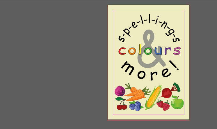
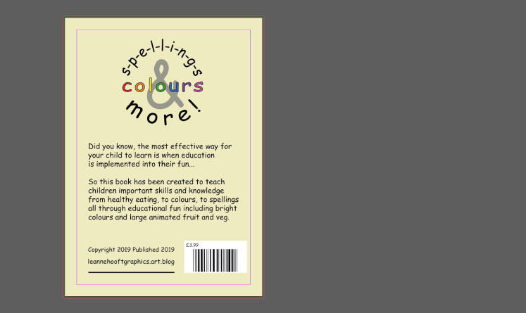
However I decided to go for the idea of ‘Spellings, Colours & More!’, I believe this title involves every aspect of my book, it’s obvious what the book is about and it’s not giving any false ideas to my buyers- this is important because I don’t want to mislead anyone. I then decided to draw some different ways of which I could present my front cover:
Initial Ideas:
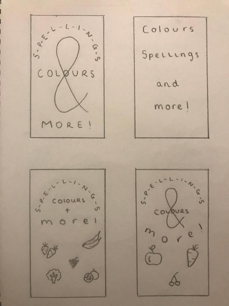
I like the use of ‘&’ instead of ‘and’ because I feel like it softens the overall cover, it doesn’t look as professional which may be appealing for my target audience because they will perceive the book as more fun. I also enjoy the aspect of having the images of fruit and vegetables on the cover because in the title it doesn’t necessarily imply that it involves fruit and veg, so having this imagery will portray to my audience that: ‘& more!’ links to this. The fourth idea is my favourite, I like how the words almost create a circle, I believe this aesthetic is very visually appealing, I feel like, again it will be attractive for my audience because the curves create a soft and playful ambience for the book. So I will now develop this idea further.
Developed Ideas:
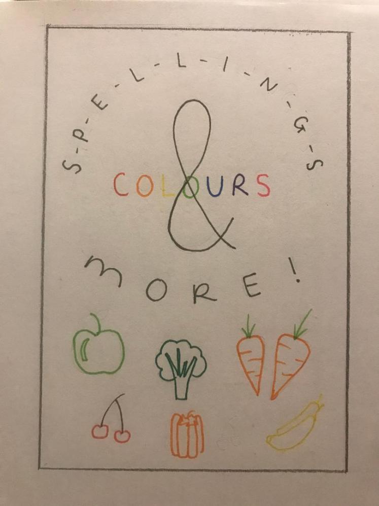
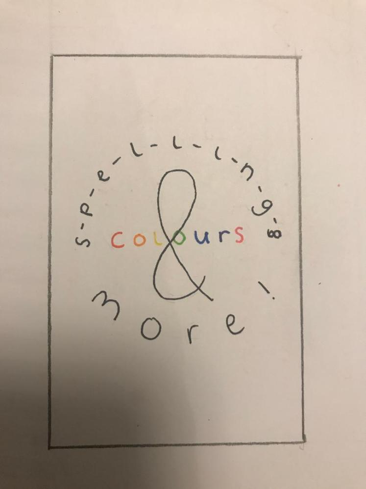
I like the fact that ‘colours’ is in colour, as I previously mentioned, the title needs to be bold, I believe that by having this specific aspect in colour, it allows the cover to be really eye-catching, which will lead to more buyers as they are intrigued by the book. I now need to develop this idea on Illustrator:


I played around with different sizes for the word ‘colours’, after doing this I think I prefer it when the word is larger as I think it is more eye-catching, especially for my young target audience. I think I may need to add a black stroke around the word ‘colours’ if I was to have coloured background, just to make it really pop.
I decided to make the words look more rounded, and to aid me with this I put a circle around the words to get them more uniformed:
I also involved no uppercase letters, I thought this would make it look more delicate and enticing for the younger readers. I am now happy with the placement of my title.


I now need to decide upon a background colour for my book, I need one that will compliment the colours in the word ‘colour’:


I feel like having a pastel colour as the background is a good idea, this is because it’s not going to clash with any of the existing colours, furthermore pastel colours are very soft and inviting, making it perfect for my target audience. Stereotypically, pink is for girls and blue is for boys, I want my book to be unisex so I think I will choose a gender neutral colour; for example beige.
Final Idea:

I am pleased with my front cover, I now need to move on to developing the pages that will exist within my book.
Title Page:
This page is basically the front cover again but with less detail. It’s an important factor within a book, this is because it shows the official beginning of the book, it also reiterates the name of the book for the reader. It’s essential to include a title page, here are some initial designs:
Initial Designs:
Developed Designs:
The title page is really just a less developed version of the front cover, so I decided to just take away the fruit and vegetables and just put the title in the centre of the page.
In order to get the title in the centre I used rectangles to block out the same distance from the top and bottom.


I feel like there still needs to be a background colour to the page, however I feel like this doesn’t need to stand out as much as the other pages because the children wouldn’t read these pages, they would be more for the adults, so I might just use a plain background for these pages.
Final Design:

I like how this page is set out as it is quite basic, which is what it should be, I feel like I am set on this aesthetic for the page.
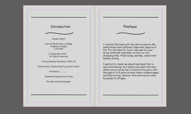
“Established” Page:
After some further research that I conducted, I realised that this page is actually a copyright page. So it needs to include a copyright notice, the copyright owner, the year of publication, disclaimers and acknowledgments. Not all of these are essential, but they should be included.
Initial Designs:
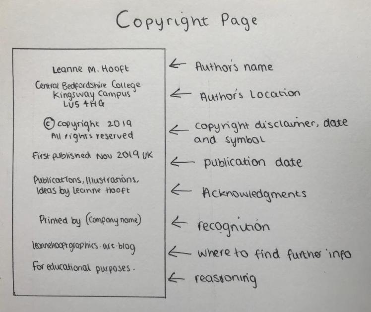
I decided to draw out roughly what I think this page should look like; I used other childrens books for inspiration. I feel like this includes everything it needs to as it includes important information about me and about copyright. I will next start to develop this page on Illustrator.
Developed Designs:
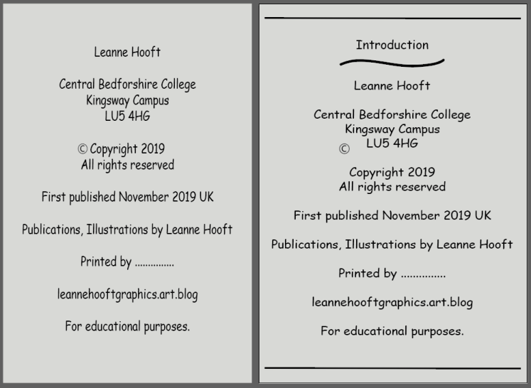
As you can see, I was playing around with different placements of the words on this page. I also wanted to include different decorative pieces (the lines and curved line) to make the page look more professional, as this will intrigue my secondary audience as the book will look familiar to others they’ve used in the past. People like familiarity as it gives them a sense of comfort as they’re in their territory.
I still wanted to give this page a title so I decided to call this page ‘introductory’ as I thought it was better than calling it ‘copyright page’. I now need to finalise this page.
Final Designs:

Contents Page:
Although a contents page for a normal book would be essential, for my book I’m not going to include one. Purely because my book doesn’t have specific chapters, furthermore, my book is going to have around roughly 20 pages, so it’s a very short book which is going to be very easy to navigate around.
‘Summary’ Page:
Again, after more research I have realised that this page is actually called the ‘preface’. This page is written to give the reader some insight into why the book was written, the preface is written by the author.
Initial Designs:

I wrote a list upon what I thought should be included within this page, I gathered this information by looking at existing books and getting inspiration from them. I want to write a short message as to why I wrote this book, just to inform my audience upon this books purpose.
Developed Designs:
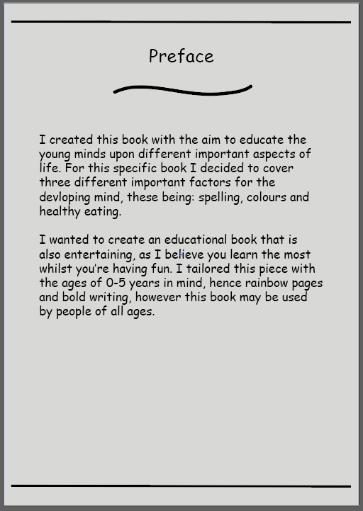
Similar to the copyright page, I played around with adding different curved and straight lines, just to add detail to the pages so they’re more intriguing. Within the message I briefly spoke about my aims for writing this book, and it’s purpose. I didn’t want to include too much detail because I didn’t want to make it really long where I know people would just skim read over it, with a shorter message people are more likely going to read it.
Final Designs:

Introductory Page:
This sets the reader up for the book, it gives them more insight into the book, and maybe some details that the reader needs to be aware of before they start reading. Applying this to my book, I might not need one because my book is going to be quite short. In addition, there isn’t a story to my book, it’s mainly facts. Especially because my target audience is so young, they wouldn’t even be able to understand what the introductory page is for.
Initial Page Ideas:
I decided just to draw some different fruits and vegetables that I knew I wanted to include within my book. These are just rough drawings which I will then develop later with colour and more detail. However, I do not want to add too much detail to the point where the foods will look really realistic, I still want to keep and ‘animated’ theme because of my target audience:
Developed Page Ideas:
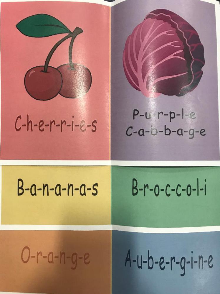
I was struggling to think of how many pages I should have in my book, that’s when I came up with the idea of having a ‘rainbow’ theme to my book. This will also make it more fun and interactive for the child. By this I mean involve the most dominant colours, these include: green, red, yellow, blue, purple, pink and orange. So my idea was to have one fruit and one vegetable for each of those 7 colours; leaving me with 14 ‘main’ pages. I feel like this is a good amount of pages as it’s not too long where the child would then begin to feel bored.
So the order of the colours would be:

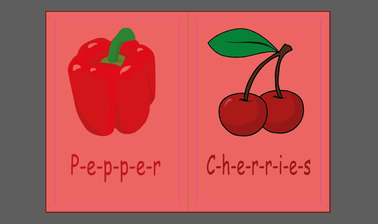
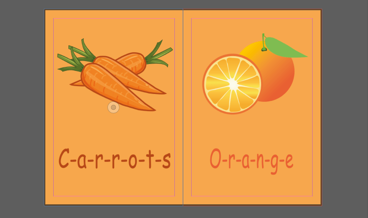
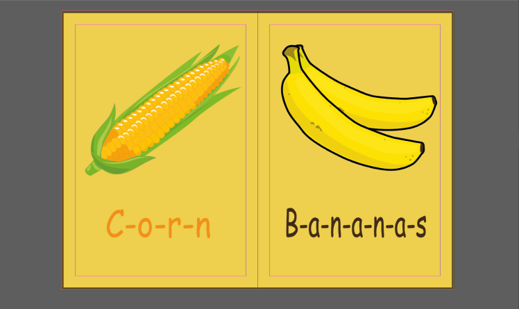
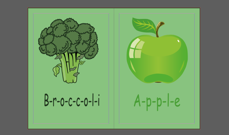
Red, orange, yellow, green, blue, purple, pink.
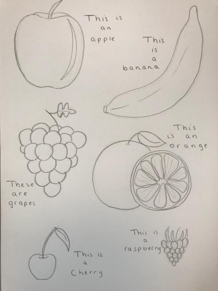
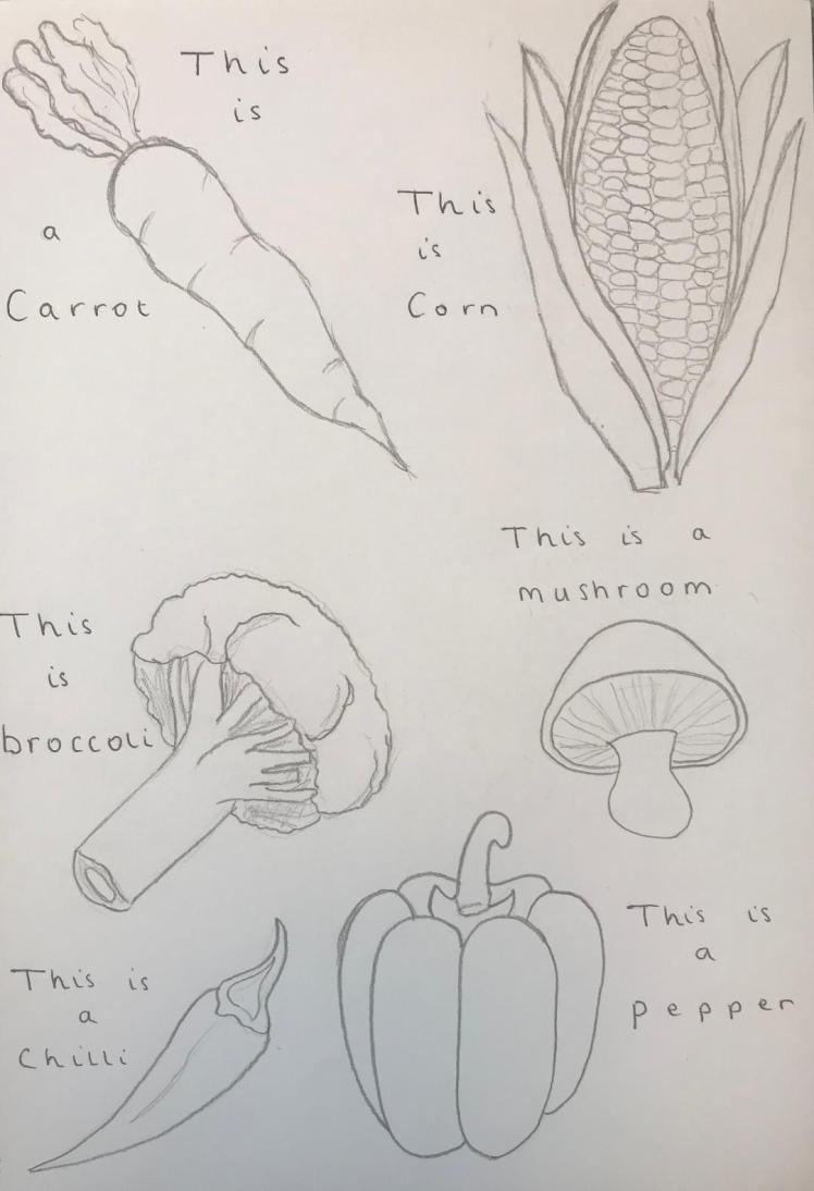
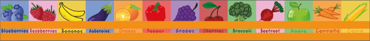
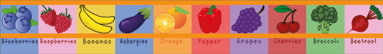
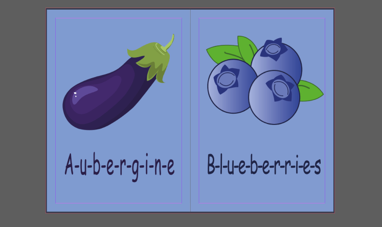
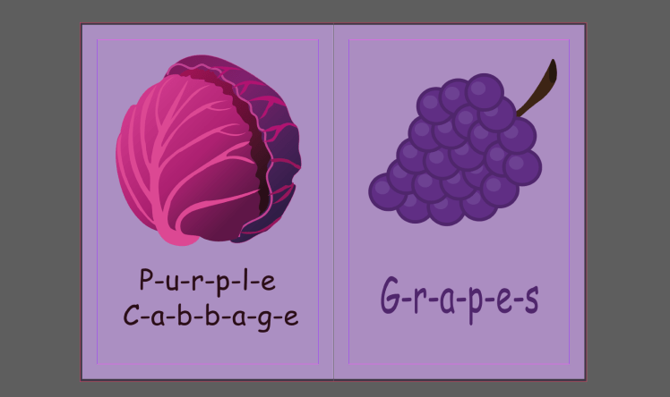
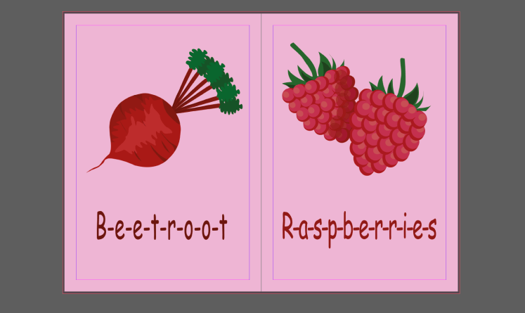
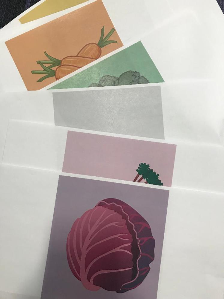
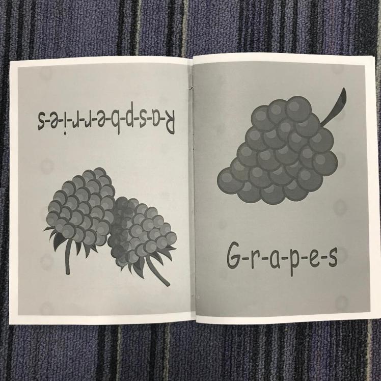
For the vegetables I can have: Pepper, Carrot, Corn, Broccoli, Eggplant, Purple Cabbage, Beetroot.
For the fruit I can have: Cherries, Orange, Bananas, Apple, Blueberries, Grapes, Raspberries.
As I started to create the different foods on Illustrator I wanted to try out different ways that I could present it to the child. By this I mean if I should animate the vegetables to make them look more inviting for the child, or if I should keep them realistic.
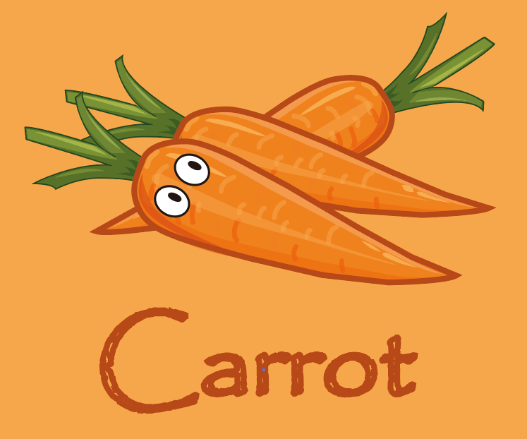

To make it look animated I added some cartoon eyes, as soon as I put them on I decided that I definitely prefer the veg without eyes, especially because the carrot looked quite realistic before, so from here on I am just going to create the foods without any cartoon effects. Next I am going to chose my specific typeface suitable for my target audience.
Typeface:
This is an extremely important factor for any book. If I was writing out a whole story it would be easier to choose as I would probably stick to the standard typeface of Times New Roman. This typeface is very easy to read, especially due to it’s sans serif properties. I’m baring this in mind as I, obviously, want my writing to be easy to read because of my extremely young target audience.
I know I want my typeface to be sans serif, I also want it to have soft curves as I feel like this is more appealing because it’s not as harsh as letters with very pointed or straight edges. It will also give the book a more animated effect because the letters may represent things such as bubbles.
So to look into different typefaces I will just experiment with them within Illustrator:
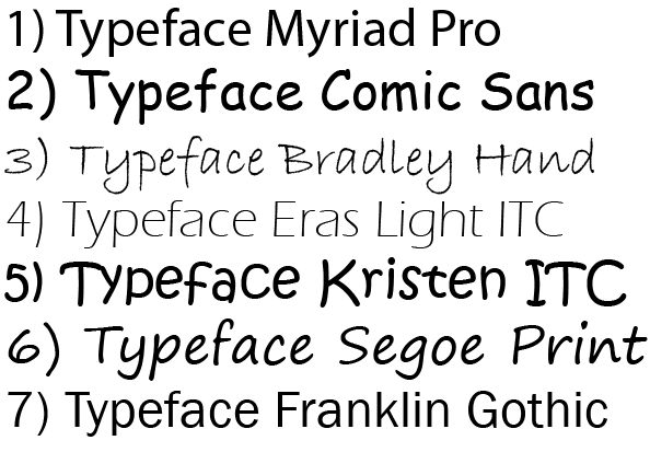
I picked out 7 different types of typefaces that I liked. Looking back at them now I can see that some of the may not be suitable. Although I like the aesthetic of: 3, 5 and 6 I think they represent normal handwriting too much, it also looks quite informal, I want a typeface that looks more professional. Which brings me on to: 1 and 7, I think these are a bit too formal, just because my target audience is so young. Out of 2 and 4 I prefer 2 because 4 may be quite difficult to read for some users as the letters are very thin. So I am going to choose number 2, Comic Sans, as my final typeface.
Developed Page Ideas (continued):
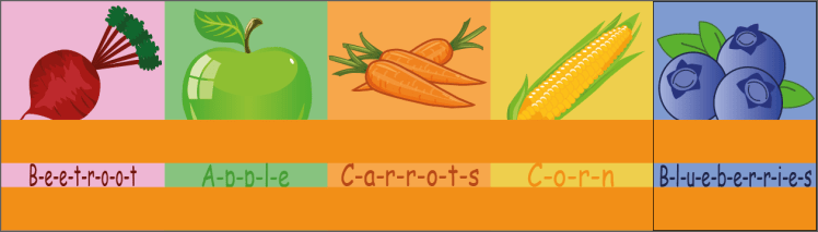
I started to produce my pages on Illustrator, as I was creating them I started to think more in depth about my idea, I looked back at my ‘new ideas’ mind-map, and saw that I wrote down an idea of involving spellings in the book. I thought about this more and realised that I could actually use this idea. As I am including the name of the food anyway, I should write it in such a way where the child would be able to break down the word and sound it out so they could learn how to pronounce and spell it themselves.


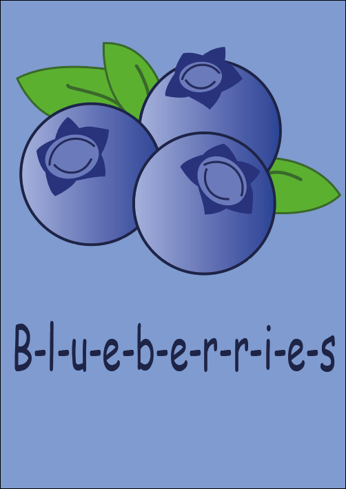
I spoke to my friends and family and I asked them which out of the above 3 they believe would be the most suitable, the majority said the third option, which I agreed with anyway. In my opinion, the third is the best because the hyphen will allow my users to realise that this is a spelling book, and that the hyphens are there to aid them by obviously splitting each letter apart. I will now continue to create my pages.
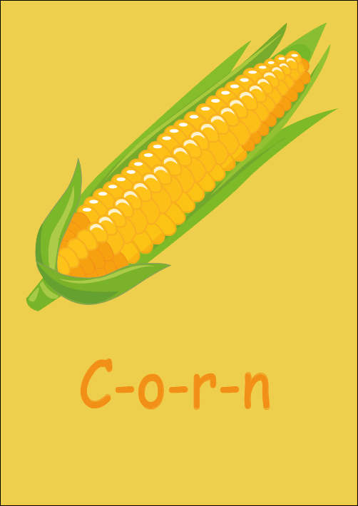
There are a few issues that I have noticed whilst creating my designs. One would be the size of the words. I want the words to fill the page from left to right so then there’s not as much empty space, however, this is quite difficult to do for the shorter words:
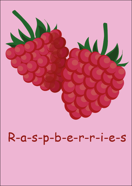
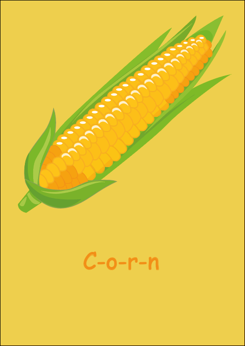
You can see that the word ‘corn’ looks very lost on this page. I set all of the words at size 55pt and height 70pt, which works for the longer words but not the shorter words.
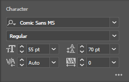
I decided to increase the height and width of the smaller words but still keeping them the same size:
I am now pleased with how the size of the smaller words look. I just need to ensure that the words are the same distance away from the bottom of the page so they’re consistent throughout my book. To do this, I came up with the method of creating a box and putting this box in the same position on every page, so then if I was to put the word on-top of the box, the word would then be in the same place on every page:
Now that I am happy with my word placement, I need to ensure that the foods are in the same place on every page as best I can, (obviously they’re different shapes so it’s going to be averaged). I used the same method:
Now that my pages are coming together, I need to continue to research what other pages I should put into my book.
Book Necessities (End):
Again, I decided to conduct some primary research and look at the end pages of different books. This is so I know what to include within mine:
Book one:
In this book the back pages include:
- Websites where to find more information,
- Copyright information,
- Credits,
- References
- What the book includes,
Book Two:

This book doesn’t have as much information as the previous book, it only really includes acknowledgments and some information regarding copyright. So, to further my understanding regarding the back pages of a book, I am going to research it using secondary sources.
So the last couple pages are actually called the ‘back matter’. In the back matter you would usually find:
- Glossary,
- Reference Bibliography,
- Contributors,
- Index,
- Resources.
I’m only going to further research the pages I know I’m going to include within my book.
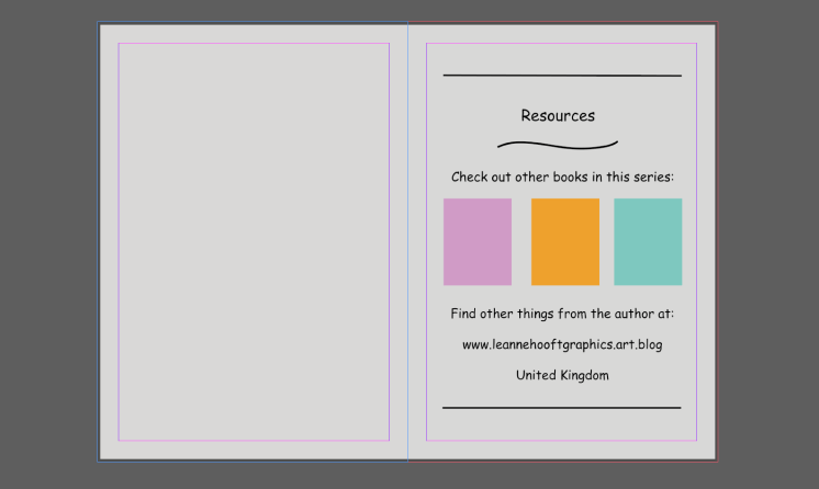
Resources:
This page is where you would include specific details on how to find out more information regarding the author or story etc.. Any information that you think would be of value to either your primary or secondary audience would be included here.
Initial Designs:

I roughly sketched what I thought I wanted this page to look like, I thought I could include pictures of other books within that series, just to promote them to my audience.
I will be able to play around with the layout when I start developing this idea on Illustrator:
Developed Designs:
I don’t think there’s a need to create front covers for each of the books because it’s the concept I’m promoting, I’m just suggesting that if I was genuinely going to create this book to a high standard, I would have these promotions here. However I could always add more colour to keep it exciting:

Final Designs:

Back Cover:
Initial Ideas:
I listed a few things that I knew I wanted to include within my back cover on the design:
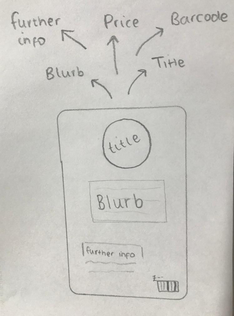
Developed Designs:
A feature I knew my book had to have, just from general knowledge, was a barcode. So I designed this barcode on Illustrator- I will include this on my back cover.

I always think about placement when using illustrator. To help me get certain aspects aligned I use a method of creating boxes, then lining these up with the words to ensure they all start from the same place:


This way I know when I come to print my book all of the text is going to be neatly aligned, making my book look more professional.

I wanted to create a very short blurb that briefly describes my reasoning behind this book, and what my aims were. I wanted to keep it short so it wouldn’t be off-putting to read. I also still wanted to keep the cover quite simple to match the aesthetic of the book.
Final Design:

Final Pages:


InDesign Pages:
Final product:


Evaluation:
To begin, I researched Bloomsbury, it was important for me to understand the company that I was working for, I needed to know what their general products are like so I could create something that’s up to their existing standard. In order to research this company I decided to use secondary sources, this included going onto their official website on Google. It’s important to use official websites because you know their information is accurate and reliable, this way you are not passing on false information to anyone. In this case, secondary research was the best form for me to use, as it is quick to gather. If I was to use primary research for Bloomsbury it would imply that I need to go to one of their offices and actually speak to a member of staff there, and for this unit that would take up too much time. On their websites I ensured to gather information from as many places I could, meaning, instead of me just staying on their homepage, I delved deeper and went into ‘sub-categories’ that they had. I went into their ‘further information’ page and their ‘children’s region’. This way I know I am getting the most out of researching them, and I’ll be able to apply all this new knowledge into my project.
Moving onto my audience analysis, I decided to take this more into my hands, I swayed more to primary research. From previous units over the years I have learnt quite a lot about how to choose an audience and how to make your product as suitable for them as possible. So I did have a lot of previous knowledge upon this subject, compared to Bloomsbury for example. I created a mind-map to get the knowledge that I had down, it’s easier for me to understand concepts when I can visualise it so mind-maps are very beneficial to me. Once I had used my existing knowledge to as far as I could, that’s when I decided to research it further by using websites, I believe you learn the most when you put in that little bit extra; so by combining primary and secondary research sources I believe I am getting the most out of it.
To help me make the most appropriate product I thought it may inspire me to look into different existing books and different artists. To make it beneficial I chose relevant artists and books to what I was researching. For my ‘existing book analysis’ aspect of this project I used primary research, again I had previous knowledge upon how to analyse books as I learnt this in school, so I applied this. The books I analysed I borrowed from a primary school- this way I knew that children of those ages would be able to read them. This was an appropriate means of research as it was very relevant to my audience. However, when researching artists I decided to use secondary research, I read different authors autobiographies and gathered information from there, I also used websites as it’s and efficient way to gather information. I had to use secondary sources as I didn’t have any existing knowledge upon the artists I chose to research.
Lastly, for my research within this unit, as a class we learnt about different narrative designs. Learning as a class is an interesting way to learn new things because you get to see different peoples views and opinions upon the subject and then you can compare these views to yours. Allowing you to deep it more, and really think about what you’re learning. We learnt this information off of a powerpoint, and to be honest, this isn’t my favourite way to learn, but for the context of this it was an appropriate source to use, as you can learn a lot of information quickly.
By researching the different aspects upon books and the company that I did it has allowed me to really learn how to create a successful book- which will help me to succeed in this unit, but also in my future if I was ever to go down the illustration route. In my opinion I used a good balance between primary and secondary research sources, I looked at what I needed to research and chose how I was going to research it upon what it was. So next time I will use the same method as I think I performed well.
Moving onto the designing aspect of this unit, overall I am happy with what I produced, however there are a few places I could’ve improved. I’m happy because all of my designs were suitable, I always ensured to keep my target audience in mind when designing each page- as they are the most important aspect of this project. Additionally, due to me researching existing books and artists it allowed me to make my book professional. From researching books I learnt what pages I need to include (front and back matter), so I could use different books for references so I knew I was creating appropriate pages, therefore I have no doubts that these pages aren’t suitable. Another reason I’m generally pleased with my designs is because I used relevant images and colours, they suit the overall aesthetic of my book that I was trying to portray, (that aesthetic being child-friendly).
However, there’s a part of me that feels like I could’ve done more. I only created a few initial designs for each page- if I expanded this and drew more rough designs I may of created pages that were more advanced and suit to my standard. However I was working to a deadline and I had to keep in mind that if my pages were too detailed it wouldn’t of worked with my target audience. Secondly I feel like I couldn’t advance my skills in Illustrator, as I was creating very basic images, I couldn’t fulfil my desire to create complex and detailed images within illustrator, so compared to my previous design work I feel as if I have degraded. So next time I would like to create more detailed images within illustrator, this way I can advance my skills which will aid me with future units.
When creating my book, typeface was quite a large aspect of it. The typeface you choose could either make or break your product. I chose a fitting typeface because I trialed different fonts, I whittled it down to seven typefaces then I thoroughly analysed each of these to see which would be the most suitable. As always, my audience played a huge part within what typeface I chose, as explained in my research. Looking back now, I still agree that the typeface I chose was suitable, in the end I chose comic sans (again I’ve explained my reasoning already in my research).
Due to the context of this project, writing my book was quite simple, it was easy to see if I made any spelling mistakes, as there aren’t that many words throughout my book anyway. I’m confident that everything is legible, including the long names of fruit because I spaced out each letter so it was easy for the child to read. For this specific project I don’t think that there is many of ways in which I could’ve improved in regards to type, I’m pleased with what I have produced and I’m happy with the choices I have made.
Regarding the layout of my blog, I think it looks professional. Throughout all my units I have taken time and great care in ensuring that the presentation of my blog is formal as I take great pride in this, as it portrays how seriously I take my work. With this project I clearly blocked out my initial, developed and final designs, this way you can see my thought processes as I am taking you on a journey of how I developed my ideas. In addition, I laid out all my final designs at the end of the page, this way it’s really clear to see. One improvement I could implement into future projects, which I’ve also struggled with in the past, is to ensure that the images I import onto my blog are full size so they’re legible, I didn’t do this when importing the work I had done in regards to narrative design, so in the future I will take extra care to stop this mistake.
When evaluating the layout of my actual designs, again, I think they look professional as I used grids and shapes to properly align each aspect within that page. However I did encounter two problems when importing my designs from Illustrator into InDesign. I was just dragging my designs from one source to another, although this did work, it negatively impacted the quality of the designs. I didn’t want to go through all of the work I did for me to then print my book blurry, so I had to export the Illustrator files as a high quality image (tiff), then import these into InDesign so no quality was lost. The other problem I faced was fitting my designs to the new bleed I had created in InDesign. This meant altering the size of my designs, which led to some of the letters or images being cut off the page, so I had to resize each image so they fit- whilst still keeping them in proportion with eachother. This took up quite a lot of time that I didn’t really have, so next time I will create a bleed when designing my pages so I wouldn’t have to do it in the later stages.
As I’ve referred to throughout my research and evaluation, I always have my target audience in my mind. Every decision I make is with them in mind. My brief stated that I needed to chose a target audience then create a book for that range. I feel as if I have successfully completed this task as the book I’ve created is definitely suitable. I thought I was going to struggle a little bit in conveying my ideas and theories for my book to my primary and secondary audience, however I don’t think there was any need for me to worry. I wanted to portray colours, spellings and fruit and veg, I think these three ideas are very obvious in my book due to the ‘broken down’ words, rainbow pages, and largely animated food. Additionally, my title and front cover make it quite simple to see what my book is about- as well as the blurb which gives the audience further information.
Especially in this day and age, where people are becoming more and more aware of societies issues: (racism, sexism, ageism etc..), I wanted to assure that my book wasn’t going to raise any of these issues. So I took special care into making sure that my book was race, religion, sex and age appropriate. The colours I chose weren’t bias to any gender as my concept was the colour of the rainbow, I didn’t chose any particular colours that could’ve been stereotypical to specific genders (pink for girl, blue for boy), hence why my cover is a pastel yellow which is a gender neutral colour (elaborated in my research). Luckily, this book is quite safe for different races as the ideas used within my book are ideas that are implemented all over the world (colours, spellings. fruit and veg), so I didn’t have any worries when creating my book as I knew it was going to be appropriate for all races and religions.
Throughout the most part of my units within this course, I have used Illustrator as my main media. I am very comfortable and confident in Illustrator, hence why I always steer to choosing this media. I know my work will look professional if I use this. Although I still always use drawings throughout my whole blog, but his is quite a standard media that should be used. What makes this unit different is the fact that I worked within a new media that I haven’t used before, this being InDesign. There was never really a need for me to use this platform before in previous units, so I’m glad to of had the opportunity to experiment within it. I feel as if I picked up the skills to use it quite quickly as, in my opinion, the concept behind it is quite similar to Photoshop. Although InDesign wouldn’t be my first choice to use, if the opportunity arises to use it in the future, I wont oppose.
Throughout this unit I admit to only aiming for a pass, I didn’t want to stress myself out over a unit that wouldn’t have too much impact on me overall. I want to conserve my energy and put all of my effort into my final project. However that doesn’t suggest that I didn’t try. I still put a lot of time into researching and designing this book as I did want to produce something that I was proud of.
Which leads me onto actually creating my final piece. There was a lot of confusion as I struggled to get the pages into the correct format for printing. When I was designing my pages I was creating them on A4, even though I wanted to print on A5. Meaning when I came to print it I had to re-scale the sizes of every page, which led the alignment to become wonky. I kept trying to print but the scale was completely off (images of failed attempts can be found below). After many attempts my teacher helped me to print my book correctly. Due to some limitations, for example: not having the best quality printer, I am happy with the outcome. Of course if I was to get my book professionally printed the standard would be a lot better, but again, as I was only aiming for a pass I didn’t think this extra step was necessary. Next time I would ensure that I am creating my pages in the correct size and format to begin with, this way I wouldn’t need to spend time later on changing the sizes of images to then fit.
Our deadline got extended due to circumstances at the college. However, I did manage to meet the second deadline, I didn’t feel rushed throughout the process and I was pretty confident that I was going to meet this new deadline. As previously mentioned, I’m happy that I was allowed to experience using a new media, as I’m always looking to expand my knowledge within graphic design. So to conclude, I would state that I have achieved what I was aiming for, and I’m happy with what I’ve created- I’m excited to see how I will improve over my future units.
Failed Attempts:
Below are my failed attempts at printing, I thought I would include them so you could see the whole journey that I took.
References:
bloomsbury. (2019). /uk/. Available: https://www.bloomsbury.com/uk/. Last accessed 10th September 2019.
bloomsburyfashioncentral. (2019). /products/fairchild-books. Available: https://www.bloomsburyfashioncentral.com/products/fairchild-books. Last accessed 18th September 2019.
diggypod. (2019). /blog/book-title-page/. Available: https://www.diggypod.com/blog/book-title-page/. Last accessed 30th October 2019.
jacquelinewilson. (2019). /. Available: https://www.jacquelinewilson.co.uk/. Last accessed 3rd October 2019.
kindlepreneur. (2017). /how-to-write-a-childrens-book/. Available: https://kindlepreneur.com/how-to-write-a-childrens-book/. Last accessed 19th September 2019.
lizpichon. (2019). /stuff-about-liz/about-me. Available: http://lizpichon.com/stuff-about-liz/about-me. Last accessed 2nd October 2019.
onestringer. (2019). /two-color-fades/. Available: https://onestringer.com/two-color-fades/. Last accessed 31st October 2019.
penguin. (2019). /genres/children/age-ranges/7-9-years.html.Available: https://www.penguin.co.uk/genres/children/age-ranges/7-9-years.html. Last accessed 18th September 2019.
verywellfamily. (2019). /9-year-old-developmental-milestones-620731.Available: https://www.verywellfamily.com/9-year-old-developmental-milestones-620731. Last accessed 19th September 2019.
webmd. (2018). /parenting/4-to-5-year-old-milestones#1. Available: https://www.webmd.com/parenting/4-to-5-year-old-milestones#1. Last accessed 18th September 2019.
