Project Brief:
In this brief I will choose to work on one of the live briefs from YCN, Penguin Books or Secret 7. I will then research the brief and answer it’s design problems, before evaluating my project.
YCN:
YCN are a company that help organisations to achieve their goal; this is through the network of YCN (You Can Now). YCN seek different groups that will be able to provide innovative and suitable solutions to problems that the organisations may face, they set briefs and workshops tailored to the issues that the specific organisations want to overcome, this way different groups of people can help these companies to thrive again.
YCN work with multiple different industries including:

One aspect I really like about YCN is that they’re very tailored to lots of different peoples needs. To elaborate, they have a section on their website specific for students, this way we can get involved in bringing new ideas to these companies, aswell as potentially getting something back from YCN because if your entry gets chosen you have the chance to gain a placement within their company- leading to lots of opportunities.
For their student section they put out ‘live briefs’ each year, the live briefs are from several different brands, all they do is state what they want to improve within their brand and create a ‘brief’ on what to do to accomplish this improvement. Us, students, then follow these briefs.
I looked throughout all the different briefs that they had:


I then decided that I wanted to choose one of the following two:
1) Packaging- Oliver Bonas.

2) Designing – UK Greetings.

These two appealed to me the most because I’ve had experience with packaging and designing within the past, and I wanted to develop my understanding within these areas and improve my skill set. I also know that I would enjoy working to either of these briefs, and I always prefer performing a task if I know I will enjoy it along the way.
After analysing the briefs further I have decided to choose UK Greetings because I feel like this is more open, by that I mean I will be able to express my own creative style throughout this project more-so than the packaging one. This is due to UK Greeting’s brief to be quite vague, they specify within in that you do not have to stick to a specific theme, you have free reign upon what you chose- which I prefer.
UK Greetings:
Who are they?
Just over 100 years ago in 1906 a young man from Cleveland, Ohio, named Jacob Sapirstein had a dream to create a successful brand. The young man would walk the streets selling postcards for just a penny, this was actually very successful for him as he earnt quite a fair bit. Over time this developed into a company which just grew and grew:
In the mid 1900’s many other companies joined him which led to American Greetings being formulated. In around the 1950’s the company spread to becoming a direct to retail greetings card and gift company and over the next 30 years they spread even larger by buying 3 very large UK card companies. Again, they spread even larger as in the late 1980’s they formulated the company Carlton Cards LMT. Then in-between the 1900’s and 2000 more and more UK card brands joined this ever-growing company, which therefore produced UK Greetings.
They are now one of the most popular greetings card company in the world, alongside their partnership of American Greetings. You are bound to find their cards anywhere you go, as they really have designs for everyone. Again, UK Greetings have many brands under their wing, between 2008 to 2018 many brands wanted to join because of UK Greeting’s success. These brands include:
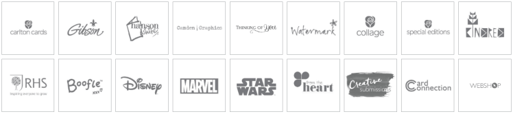
I am going to need to analyse each of their existing clients, choose which one best suits me, then create products resembling that chosen brand. To further analyse I am going to create a mind-map upon each of the brands, I will then refer back to the given brief by UK Greetings and see how I can complete the brief with that specific brand in mind.
Mind-Map:

I decided to create a mind-map of all the different clients that UK Greetings have, this way I can visualise each of the clients attributes and see which one is most tailored to me and my designing techniques. After analysing each client I have decided to choose WaterMark because I feel like I will be able to express more of my creativity through this brand as they’re quite vague with their designs. By that I mean each of their cards do not follow a specific theme, each one varies from eachother allowing me to have more free reign with what I display on the cards.
I will further analyse them as a company later in my blog.
UK Greeting’s Brief in Detail:
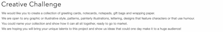
They specify that they are open to any theme and style, which is the main reason I chose this company.
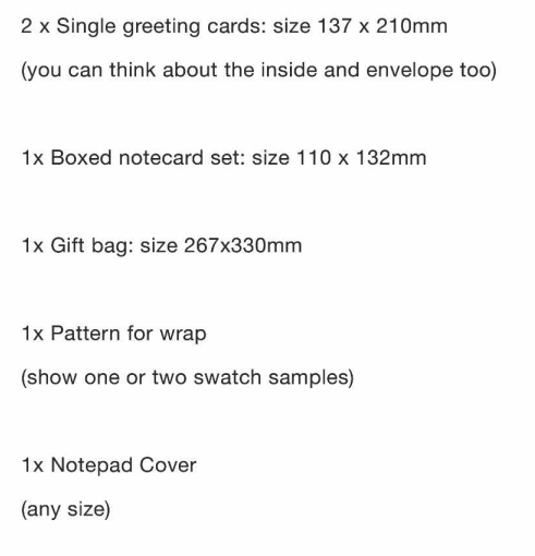
All I need to create for UK Greetings are:
Before I start designing different cards and gift accessories I need to research the brand I chose further.
Chosen Client, WaterMark:
Research:
WaterMark was created to fill a gap in the market for the lack of greeting cards and gift products; created in March 2010. WaterMark has grown to be an extremely popular brand within this industry due to their new and innovative designs. They’re ever-changing to fit new society- which is why they’re so successful. They claim to be one of the, “most respected, professional distribution” of cards in the market at the moment.
Another reason as to why the brand is so successful is because of the quality of their products, with multiple strong designers within their team they’re guaranteed to get the best and most original designs, as well as having a very powerful manufacturing system in place, which aids their production system.
Another attribute that I like about this brand is the fact that they also produce charity cards, meaning some of the profits they receive from selling these cards will go to different charities. This will also boost sales because people will want to buy the cards as they feel like they will be doing their bit for charity, just some of the charities they help out are: “Irish Cancer Society, Children’s Medical Research Foundation and Irish Hospice Foundation”.
WaterMark also pride themselves with good customer service. Along side their excellent team of designers and manufactures, they also have a large team just for customers. As with most successful companies, the customer is the most important part of the brand, you want to do everything you can to ensure that brand loyalty will be grown to you. So in order to create this trust you will need to have people readily there to answer any queries that the customer might have; this way you can create a bond with the customers and this will lead them to buying from you in the future.
Lastly, WaterMark have a very up-to-date technology system, which allows them to further their company as they can reach out to the very large online world. Advances in technology means that many people purchase items online, as WaterMark are ever-changing this means that they have all the newest and most advanced technology so they can stay in touch with their online consumers. Again, this benefits them as a company and boosts their sales.
Now that I have researched them as a company I am going to look into some of their existing products so I can get a feel for their aesthetic.
Existing Products:

Traditional Cards:
I enjoy the aesthetic of their traditional cards, I think they’re quite complex due to their wide range of colours and their high involvement of detail. I like the fact that they have used line as a way of detail, for example in the wedding card the flowers create an arch, this line imagery takes my eyes on a journey around the whole card which gives the card smoothness and direction. Which overall gives the card a sense of importance.
Furthermore, their choice of typography gives the card a formal feel as the writing is very ‘flowy’, which, again, gives the card that smooth feeling which gives us a feel of control-ment as everything is where it should be. This typeface is very suited for this group of card as this typography was used years ago when calligraphy first came out, so it links back to old times, which suits this ‘traditional’ aesthetic.
Another technique used within these traditional cards is the subtle use of colour. Every card has colour in it but none of the colours are extremely bold or ‘in your face’, I enjoy this because it allows the beauty and detail on the card to shine through. Additionally, traditional cards shouldn’t use very vibrant colours as it would take away the simplicity of the pretty designs. So I like how colour has been used to emphasise the delicacy of the cards.
To conclude, all of the cards within this traditional ‘group’ have similar characteristics that I find very pleasant. They are all detailed but delicate and include pretty typography ad designs.

Fun Cards:
This style of card completely juxtaposes the previous style as the elements used within the card are a lot more comical. This style of card would definitely be for a younger generation as it uses funny and entertaining imagery. The funny ‘add-ons’ also give this style of card a ‘jokey’ aesthetic as the googly eyes and the tongues make the pictures funny. There would be a large audience for this style of card because a lot of people prefer cards that use some humour.
These ‘fun’ cards do not follow an aesthetic as much as the traditional cards, by that I mean there isn’t a reoccurring typeface, or use of colour. Each card is different, so if you were designing a card in this aesthetic you would have a lot of choice of what you could produce.
With some of the cards a lot of negative space is used, and with some there is no space, again this shows how diverse this style of card is as there really is no proper structure that’s followed. One thing I have noticed is that the lettering tends to be quite large, so it’s easier for children to understand, it will also jump out to younger people more as the words would be very obvious.
I do not enjoy this aesthetic as much as the traditional one, I find it too vast and ‘all over the place’. This sways me towards creating cards in the traditional style. I now need to start analysing what demographic I will be designing my cards for.
Audience Analysis:
From analysing WaterMarks existing products I have decided to design my work in a traditional style. I believe that this style would mainly attract people of the older generation as it tends to be a lot more formal.
When I say older generation I mean people of age between 55 and 70. From my own understanding, people of this age value and treasure cards more-so than people between 18 and 30. This is just from what I’ve inferred from my day-to-day life. From my own experience my grandma appreciates birthday or Christmas cards more than my dad does. Many people in their teenage years, especially as time goes on, would be buying cards less and less as it is just a lot easier to send a text message opposed to posting a card. However the elderly would struggle more than others to just send texts as they believe sending cards is the traditional way to show someone you care.
This age group of 55 to 70 would understand that there are many cards on offer that can be bought, but I believe they would sway more towards cards that just have short message and nice imagery instead of a funny card with loads of photos or text/graphics on the front. Although this is being stereotypical as there are many elderly out there who would want ‘funny’ cards, I’m just basing my knowledge on the majority of people this age.
Traditional cards should never be too expensive, and especially with some of this audience being the retirement age means that they wouldn’t getting a large income, only state pension. Meaning they are not going to want to spend a lot of money on a simple card. So it would be best to stick to original prices of 50p-£2 for a card.
With the other products like wrapping paper and gift bags, again, with some of this audience being retired, this means they’re going to have a lot of free time on their hands. So they might want to take extra time in ensuring that a gift they bought is perfectly wrapped and looks pretty. In contrast to a middle age mum who works full time- she may not have a lot of free time so gifts may be wrapped to a lower standard. So this means that the elderly would appreciate ‘pretty’ gift accessories as they actually have time to appreciate it. I would prefer to designs these accessories where they would get noticed and recognised for their appearance.
Now that I have my audience (55-70) I will be able to go onto analysing more traditional cards to see the general motifs.
Traditional cards:
I decided to create a collage of lots of different traditional cards so I can pick out the general themes that run through them all:

After creating this mood board I feel like I’ve made the wrong decision, I don’t really think this is my style as I believe it’s quite old fashioned. I prefer designing more modern and light-hearted products opposed to standard ‘basic’ products. It’s very important to me that I enjoy the units I am creating, this way I feel like I learn the best and I can do my best. Therefore I am going to change my target audience and theme. To help me decide upon a new theme I am going to look into previous winners of the brief:
Previous Winner:
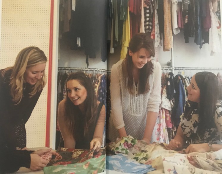
Becky Brice:
Becky won student of the year for her print design for Cath Kidston, she also won an internship with the designer in the process. Becky states that she accidentally fell into the graphic design route, although she always dabbled within the art industry. Becky states that she creates her work in order to create a change, she only works on projects that she truly cares about- this way she can create the best possible outcome. She gathered this inspiration from someone called Shepard Fairy, who had the same beliefs as her. Becky’s love for at stemmed from her middle school teacher, who she said had a strong love for art, and this passion grew into Becky. Becky also got a lot of inspiration from ted talks, these open up your mind and allows you to see different concepts from a new perspective.
Becky started working on this Cath Kidston brief as she felt very connected to the brand, and like previously mentioned, she only works on projects that she cares for. She researched further into the brief to understand what exactly it was that she needed to do, she talked over the idea with her parents- as vocalising these ideas allowed her to make improvements. She then picked the theme of equal rights between the genders- and her designing process stemmed from there.
A picture of Becky’s professional design work, showcasing Cath Kidston Products:
Many opportunities rose from her win with YCN, she was then allowed to work along-side people in the cuttings of Cath Kidstons textiles:
From researching Becky as a previous winner I have learnt that there are different opportunities to progress into a career that you want to be in, you just have to search for them. I was inspired by her dedication to only producing work for a concept that she enjoyed or cared about, I believe this is the best way to create something that you will be proud of. I now need to research into a new theme that I am passionate about so then I can create work I will be proud of.
New Theme:
Despite all of my research into different brands that fall within UK Greetings, I have decided to bring a new idea and not choose any of their existing brands- instead I am just going to create designs that interest me and that I think will do well in the market. It does state in UK Greetings brief that I do not have to follow any specific themes, so I’m taking this as I do not need to choose any of their brands, instead I will bring in my own theme.
Looking back on previous units I especially enjoyed minimalism, I found it so intriguing how something could be so basic yet have so much meaning behind it. So I think I am going to choose this as my final theme idea. In order to make this reality I need to find some more inspiration, so in order to do that I am going to look into some minimalist artists- just so I can remind myself more about this theme.
Artist Research:
For inspiration for my designs I am going to research different artists:
Carl Andre:
Carl is an artist famous for his sculptures and poems. He was born in 1935 in Massachusetts, however it wasn’t until 1957 where he moved to New York when he began creating these famous pieces. His style is very minimalistic, including geometric shapes and his sculptures mainly used perspex and wood. Mainly because he enjoyed experimenting with new materials within art. Carl was close friends with another minimalist artist, Stella, who inspired him very much. Now living in New York permanently, his first sculpture was shown in 1964, then many exhibitions took place after that due to the praise his sculptures gained. Some of his famous pieces include:
Equivalent:
Carl started a series of sculptures in which he would include the same number of bricks (120), therefore each sculpture would have the exact same height, volume and mass. I found this a very interesting concept as I haven’t seen it been done before. I think it’s a very clever idea as it demonstrates how you can create art in many same and different ways, how by just slightly changing one aspect (for example, the layout) it completely transforms the whole image. The title ‘equivalent’ is pretty self-explanatory as it relates to all of the different pieces of art being equal to one another, creating harmony within his artwork. Some pieces from this series:


Carl inspired me because I learnt that you don’t need to have lots of different elements within a sculpture in order for it to be interesting, you can literally strip it right down to basics and only include one attribute and it will still be intriguing. It’s just how you portray that one element opposed to what the element actually is. By that I mean in these sculptures he’s only using fire-blocks, which really aren’t that interesting, but the way he’s created the sculptures makes the blocks fascinating.
Dan Flavin:
Dan was born in NewYork in 1933. Growing up he had no proper introduction to art, he accumulated the love for it himself. He only had 4 art lessons when he was 23, apart from that everything he learnt would’ve been self taught. In his mid twenties he attended university where he studied art history. Then between 1959 and 1961 he was trying to find his style by dabbling in different art movements, mainly producing paintings and drawings in abstract styles. That’s when he stubbled upon the idea of using florescent lights within his artwork. He carried on producing pieces is this style for many years, with his artwork being displayed in many museums and exhibitions, getting a good overall reaction, his was until his death in 1996. Some of his pieces include:
A retrospective:

Architecture of Light:

The two structures steer away from traditional minimalistic art as there is a lot of bright colour used within these pieces. This was a breakthrough at this time as his artwork wasn’t contained within a frame, he let his art fill up the entire space, almost becoming and immersive experience for his audience; which helped him flourish within the art industry. From his exhibitions he learnt that light can not only be a part of his art structure, but it can also become apart of the architecture within a space, then from this he learnt how light itself can change the whole appearance of a room, as different colours either enlarge or close-in room.
Conclusion:
From researching these minimalistic artists I have learnt how you do not need to stick to traditional rules when creating art, if you want to change certain aspects of something even if those characteristics don’t normally fall under that movement (like fluorescent lights in minimalism), then you can. Art should have no barriers- so it’s best to keep an open mind, this will also make your artwork more intriguing for others as you open their eyes up to new experiences and new art forms. Now that I have analysed different artists I Can go onto analysing who my new audience is going to be.
New Audience:
In order to give my products a sense of purpose I feel like I need to add reasoning as to why my cards are minimalistic. Additionally, as I have changed my theme I need to analyse and find a new audience of which I can sell my products too. By analysing different artists I have come to the conclusion that minimalism can really be enjoyed by everyone, but more specifically the younger generation. When I say this is mean between the ages of 18 and 25. Mainly because this age group would’ve been introduced to new and modern designs in society, for example many new builds are becoming very simple and minimal- therefore this age range would be used to this minimalistic appearance as they’re the sort of people to be buying new builds.
This age range might also find minimal detail on gift accessories quite humorous, as, stereotypically, this group can be quite lazy when it comes to presents, so including this ‘laziness’ (which is how some people refer to minimalism) would be quite ironic, which I feel like is a good trait to have in order to make a product popular in the market.
Furthermore, this generation may be more aware of environment issues, so if I could somehow include a solution that would contribute to helping the environment this would boost my sales as people will think by buying my cards they are doing their bit for the environment. Normally if some of the money was going to a second source I would want to increase the prices so I would still make the same amount of profit for a company. However, as my target audience is young I want to help their financial situation as they most likely have a lot of commitments that involve money. So in this case I would keep standard prices for my gift accessories, this way it wouldn’t put any customers off buying from me.
So my new target audience is 18-25 year olds, and my secondary target audience would be those who want to do their bit for the environment. So I’m going to try to ensure that my accessories are eco-friendly. In order to inspire me more I am going to look into minimalism in everyday life so I can see motifs and patterns.
Minimalism in Everyday Life:


All of these images depict how minimalism can be portrayed in everyday life, the motif is simplicity. Some of the main features of minimalism include:
- Repetition of simples shapes: squares, lines, rectangles, etc..
- They’re very simple, within minimalism it’s an attribute to try to use as little detail (for example, shapes) as possible,
- Minimalism tends to be quite monochromatic, however in these designs they have some colour, however these colours are very neutral,
- There wouldn’t be any shading or many visual principles (leading lines, rule of thirds, etc..) that other art movements would follow,
- Detail can be found in the placement and proximity of the pieces, this often shows what is most important in the whole image,
- Leaving the background plain, which will draw more attention to the objects or imagery in the foreground,
Now that I have looked into minimalism in the real world, it’s inspired me as I have gained knowledge upon what makes up minimalistic art; I will be able to apply this new knowledge to my own designs. Next I should look at gift products within current stores.
Primary Research:
In order to aid my knowledge even more, I decided to go to different stores and look at their gift product selection in order to gain some inspiration. I feel like this would help me to understand what is already popular within the market.
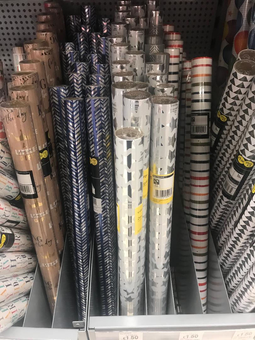
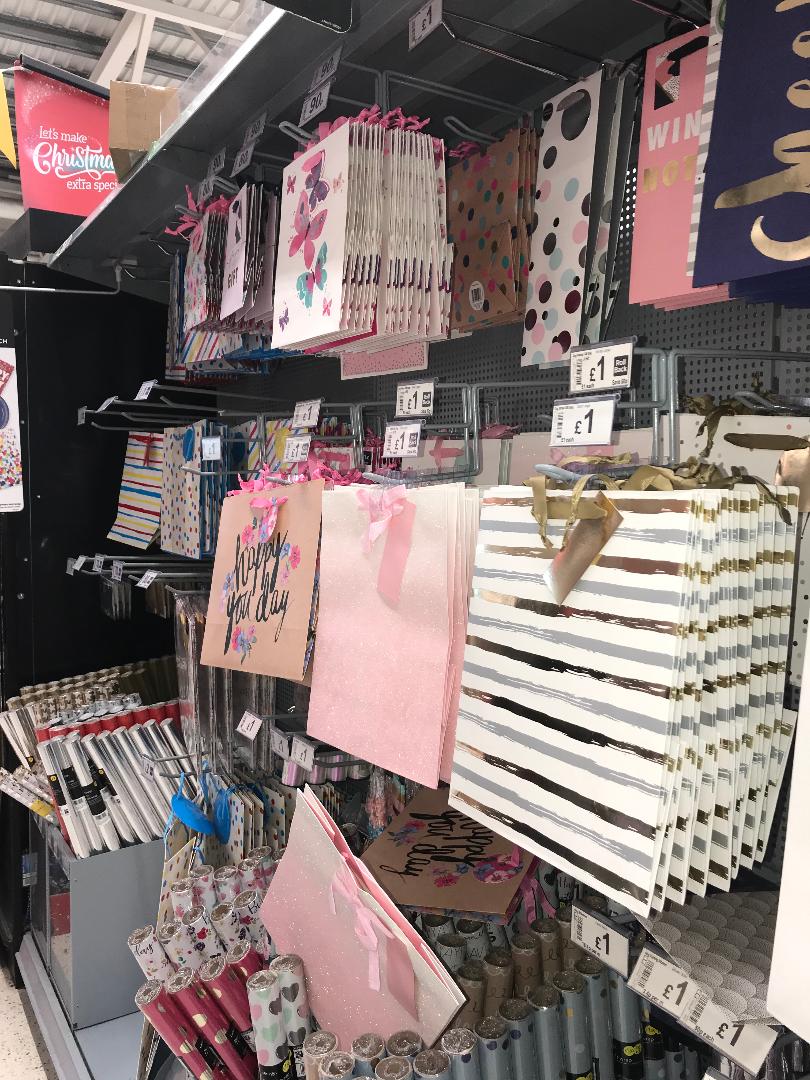
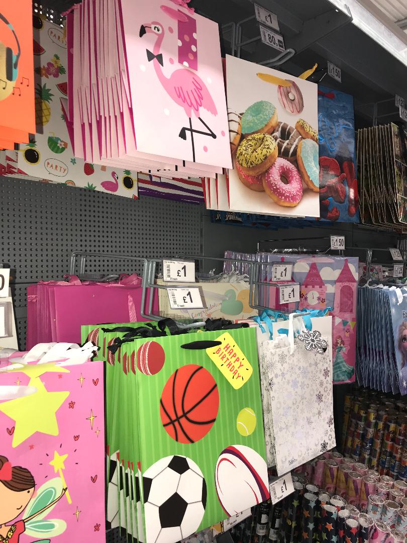
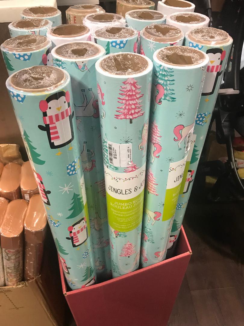
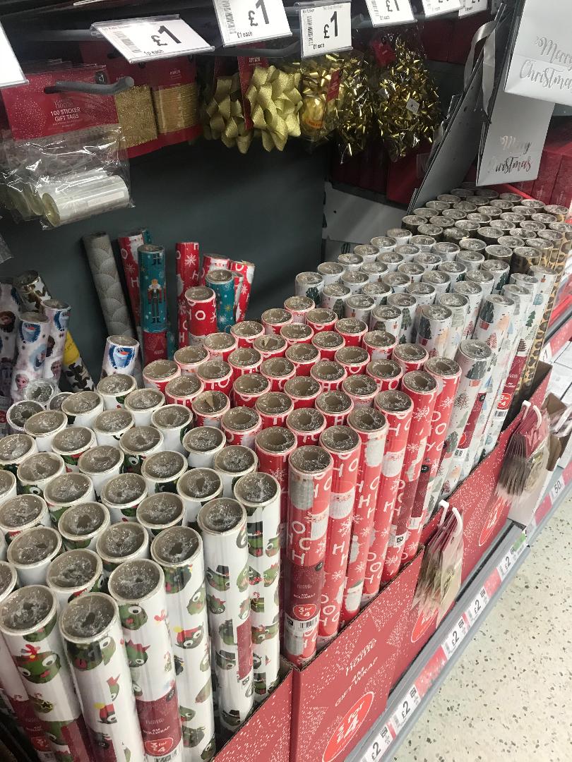
I noticed that the majority of the stock is very busy- all the designs are bright and colourful- there isn’t much variation within the different designs. That’s why I think that my products would thrive in todays society, as there are not much gift products portraying minimalism. I will now start creating initial designs for my products.
Designs:
I decided to choose birthday as my main focus throughout all my different products. This is because I feel like I have more free reign as I wouldn’t be limited to only certain imagery (like Christmas for example.)
Initial Designs: Greeting Cards:
I roughly sketched 9 initial ideas. These are what first came to mind when I combined my thoughts of minimalism and birthdays. I annotated each design discussing certain aspects of each. I know that for this part of this unit I need to design 2 cards, so in this case I am going to develop 3 different ideas and then choose the best 2 from there.
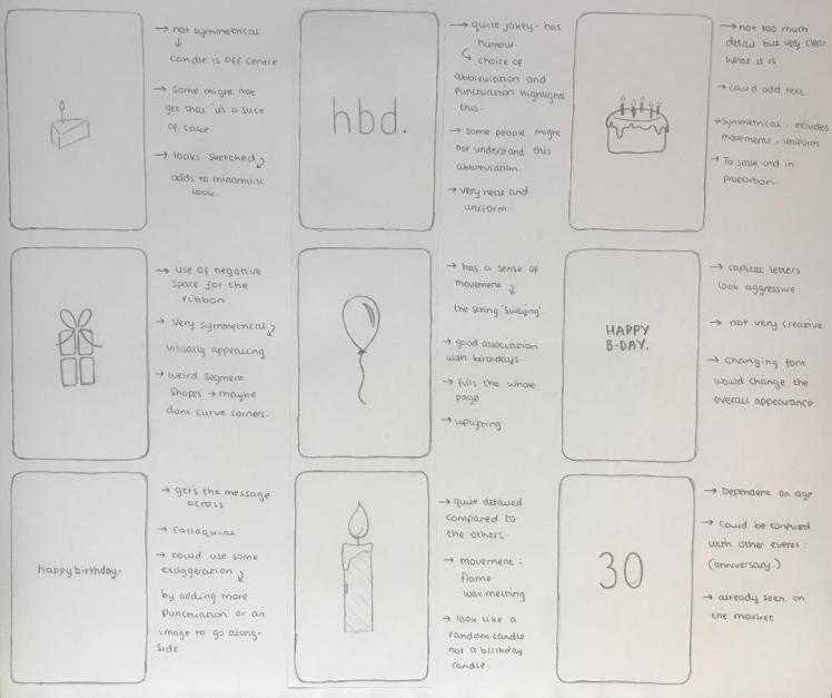
I really like the 3rd design (going across)-the cake, I think there’s a good balance between design principles as it includes: movement, symmetry, unity etc.. Another design I like is the 5th (going across)- the balloon. I like these designs for similar reasons. I like number 5 because it involves different elements like movement and leading lines, I feel like this is quite important as it trails the eyes- shows them where to look, leading this card to be intriguing. Lastly I like the 7th design (going across)- the ‘happy birthday.’ because it get’s straight to the point- which is a key element in minimalism. In order to progress I am going to develop these 3 designs.
Developed Designs: Greeting Cards:
For my first design I need to decide upon which typeface I am going to use. I want one quite colloquial as I want to keep it light hearted:
As you can see I experimented with different fonts. Out of each of these I am going to choose the fourth one down. I like the fact it’s similar to handwriting, which I believe adds to the minimalistic ambience.

The next step was for me to choose what punctuation I wanted for the design. I still wanted to keep it quite humorous, and the words without capital letters or explanation marks make the message sound quite boring- but for this case I want that as it’s ironic, (because happy birthday is usually said with a lot of enthusiasm). Irony adds to humour, and especially as my age range is so young- they will understand the joke. So I have decided to choose the third option. I then played around with the spacing of the letters, just to see which one looked the best:

After I had chosen how I wanted the message to look, I needed to actually place it on the page- in order to ensure accuracy when creating this design, I used equally sized rectangles to mark out the centre of the page:

Which led to my final design being:

I decided to next develop my cake design. My first step was creating the cake on illustrator- I used clipart images from google to help me with the design of the cake:

I was unsure whether or not the cake would look better in colour or in black and white. So I experimented with different colours. However, I still kept in mind the fact that bold colours are not used throughout minimalism- if I’m going to involve colours I need to keep them light.

Out of all these designs I am going to choose the last one- the orange one. Although I really like the second and third design- the blue and pink, I think orange is a better choice as it is a gender neutral colour, especially in todays day and age where gender is changing within society- I think it would be more socially acceptable to go for this unisex colour. However I may still play around with different oranges in order to get the perfect shade.
I still need to decide whether the candles or the flames are going to be coloured- again to see whats best, I will try each design out:


In my opinion, the white candles with the yellow flame look the best. I am going to ask my college peers what their favourite design is..
After discussion, I had one vote for the light blue candles, but majority where with me and chose the white candles with the yellow flames. I will now combine all these elements to get a final design:

Although I do like both of the designs that I’ve created, I feel like they could be better, I had an idea to combine these two cards to improve the overall design:

Again, I used the technique of marking out equal parts with shapes. I am now really happy with this design and I am ready to move onto designing my next card.

So now I am going to develop my second card- my balloon idea. Again, I am going to use clipart images from google to help me design a simplistic balloon:

Now that I have my simple balloon design, I will experiment with colours:

For this specific design I definitely want a colour to be involved, because even though my theme is minimalism- I still don’t want it to come across as boring. Out of all these different options I’m steering towards green, yellow or orange. As I used both orange and yellow within my previous card design I am going to choose green for this card. Green is still a very neutral colour- so it fits with my target audience, it’s also not too bold either- so it fits within my theme too. Now I have the perfect balloon shape and I’ve chosen my colour I will play around with different shades of green.
Now I have the perfect shade I am going to place the balloon centrally and my design will be done:

Although I do like this design, I feel as if it may be better for me to include the: ‘happy birthday’ message for this card too, purely because this could be any celebration card, but I want it to be specifically tailored for birthdays:

I’m now proud of this design- I believe the message adds to the overall appearance as it makes it look more birthday appropriate.
I decided to develop these ideas on illustrator because it makes my designs look more professional and it’s also time efficient- which will lead me to having more time to complete the other parts of this unit. Now that I have got both my birthday card designs complete I can move onto designing my boxed notecard set.
Initial Designs: Boxed Notecard Set:
As I’ve never heard of this term before I decided to research it by looking at images on what a boxed notecard set is. In order to help and inspire me I created a mood-board on this product:

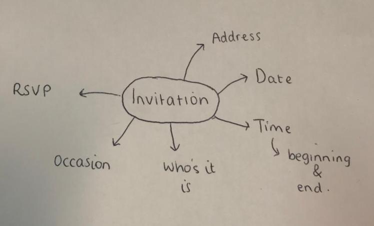
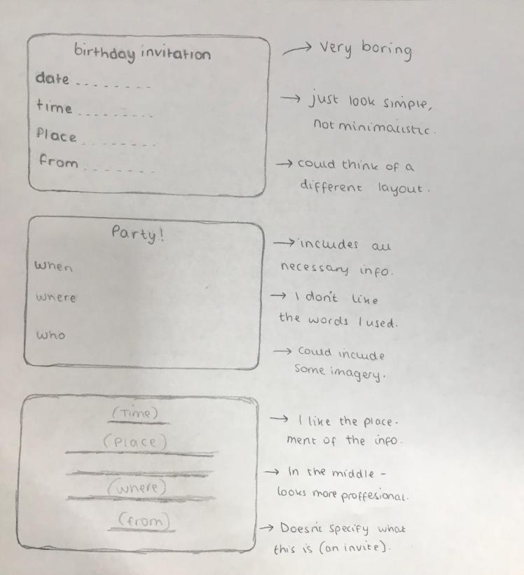
I then realised that this product was quite straightforward, they’re literally notecards in a box. I then thought about it as I tried to understand how I could correlate boxed notecards to my theme of birthdays. So I have decided to create invitation cards instead of creating cards for notes. This way they will match the motif of birthdays, but still meet the brief. I will start by mind mapping what needs to be included within my invitations:
I will now start creating my initial designs:
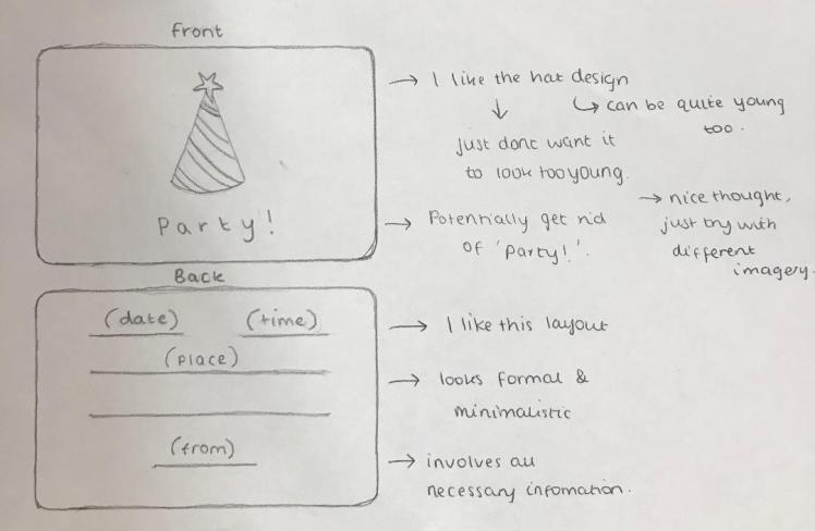
Now that I have a card design I am happy with, I will start to design the box:
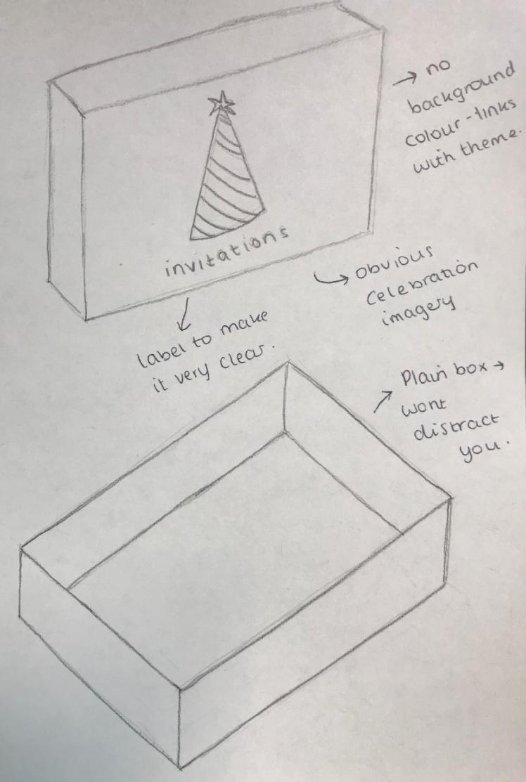
Again, I wanted to keep it minimal but I still wanted to display what was inside the box so there was no confusions. I liked the party hat design from my invitations, but I just didn’t think they were suitable to use for the actual invitations. So I decided to use it on the box instead as I think this clearly demonstrates what these invitations can be used for. I will also write on the box ‘invitations’ just so then it is definitely clear to my audience what is inside. When I come to develop this box, I will play around with the sizing and placement of this image and message.
Developed Designs: Boxed Notecard Set:
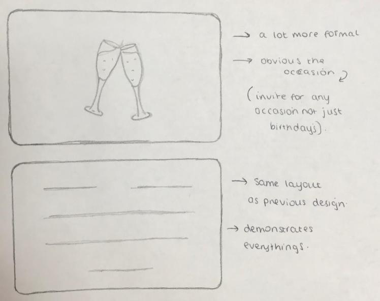
As I wanted to include the champagne glasses, as this is normally linked to a celebration, I decided to create these first- I still wanted to keep with minimalism, so I tried to not add too much detail:

For my invites I liked the idea of having a front and back to them- I feel like this made the designs look more put together and formal. Not only that- but then I could also include all the necessary information without it looking too cramped. I will now start developing my ideas:

I decided to add some colour to my designs just so then it fits in with my other products- as so far they all include an element of colour. I will now decide on the placement of the glasses on the front of the card.

Out of all of them I am going to choose the bottom right hand one as I feel like this one looks the best; mainly because the glasses look like they’re actually ‘cheer-sing’ and it looks very symmetrical. I will now move onto developing the back of the invitation card.


I am happy with the design of my invitations, I will now develop the invitation box. To start, as usual, I will design the small party hat:

I will now move onto choosing which colour I am going to involve.

As I haven’t involved red yet in any of my designs, I will choose red (bottom middle) for this design. Red is also a very eye-catching colour, so for me to have it on the invitation box it is definitely going to grab peoples attention. Especially as everything else will be white- it will make a good centre piece as it draws emphasis onto the image and what it is.

I played around with the placement of the image and message. I am going to choose the second option (going across), as I feel like it looks the most professional as it has a legible layout. Furthermore, it looks similar to some of my previous designs, which is good as it sticks with my theme.

Initial Designs: Gift Bag:
Below are some annotated initial designs for my gift bag:
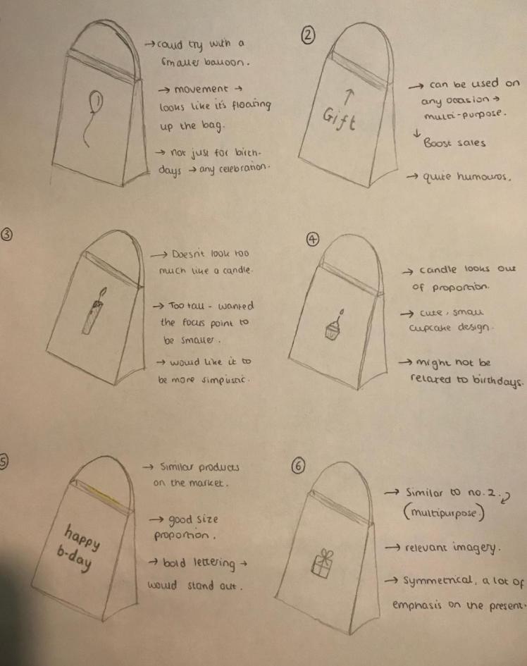
Out of these 6 designs my favourites are numbers 4 and 6. Purely because I prefer these designs over the others, and I feel like they would be more popular within my target audience. As my age is quite close to my target audience I feel like my opinions of which designs I think are good are quite important as I could be a potential customer. So I will next develop these 2 designs further.
Developed Designs: Gift Bag:
I created a basic present design for this bag:

As I have used colours throughout my other designs- I am going to keep this going throughout all of them:

From these different designs I am going to choose the presents on the first row as my main idea. I like the contrast of the white with the colour, it’s similar to my cake card design, and I want this motif to run throughout my products. Out of the top three I am going to choose the turquoise colour as the main colour for this specific design.
Now I have the present shape and colour sorted I need to add the ‘happy birthday’ message onto the design:

For my second design I am going to use the same process but just with a cupcake design:

I will now experiment with colours:

Throughout my previous designs I have stated that I wanted to keep the colours quite neutral, this way I wouldn’t offend any genders. However as I want the colours of each design to vary- I am going to need to use more colours therefore I will just have to look past the stereotypes of different colours being associated to different genders. I’ve decided to choose purple for this design as I believe it to be quite a well used colour within icing- so therefore it’s still relevant and appropriate.

Again, I just added the iconic ‘happy birthday’ message, which runs through all my designs.
Out of these 2 designs I am going to choose the present design as my final design purely because I feel like its more appropriate as you put presents in the bag- not cupcakes. I may still use this cupcake design in my other products though. I will create mockups for each of my designs and display them later in my blog.
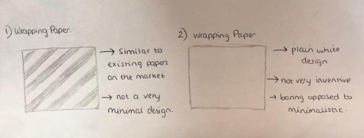
Initial Designs: Gift Wrap Pattern:
Looking back at my primary research of the different gift wraps, I remember them being all very colourful and busy, I want to create the opposite of that but still keep a formal, professional aesthetic. Initially for this design, I am thinking to steer away from the use of colour, and stay towards just the message: ‘happy birthday’. I will create some drawings with this initial design.

Developed Designs: Gift Wrap Pattern:
With my first initial design I decided to develop this further and experiment with different placements of the message:

This idea, in my opinion, looks very messy, I don’t think this idea positively depicts minimalism. Minimalism should have attributes of unity and form, whereas this idea doesn’t portray either of those attributes. So I will continue to develop and make this idea more aligned.

Now that this idea is all aligned and straight, I still don’t think it really portrays minimalism very well. It looks very busy, next I will keep the alignment but make the design less excessive.

I do like this idea, I want to try it on a mock-up though, this way I will be able to clearly visualise what the design would look like on a larger scale.
Before I put this design on a mockup I need to ensure everything is correctly aligned. In order to do this I will use rectangles of equal size to space out al of the words.

Now that I am happy I will be able to put this design onto a mockup.
Initial Designs: Notepad Cover:
Going back to my gift bag designs, I do still like the cupcake design; I could try and involve this piece within my notepad cover. As cupcakes don’t have too much relevance to birthdays- I could use it for my cover because then the notepad can be universal- and it doesn’t just need to be used for birthdays. This way it can boosts sales as more people would be interested in this product. I will draw and annotate a couple initial designs.
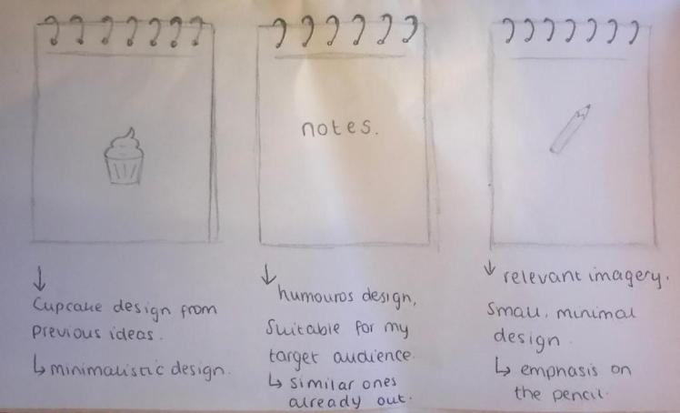
Despite my initial designs, I still think I am going to follow through with my cupcake design, purely because I know that the outcome looks professional and appropriate for the notepad, and for my target audience. I will just slightly tweak this idea by removing the ‘happy birthday’ message.
Developed Designs: Notepad Cover:

I then created a mockup for this design. However, I wasn’t 100% satisfied with the outcome:

Although I do like the design, I feel as if it looks plain opposed to minimal, so I will continue to develop this idea. To improve I think I need to add a message, just to make it more interesting.

I am much happier with this design now, that little message of ‘notes’ makes the overall design look more put together, and relevant to what the product is. Now I have my final design for my notepad I will move onto creating a final mockup for this piece.
Final Designs:
Greeting Cards:
Boxed Notecard Set:
Gift Bag:
Gift Wrap Pattern:

Notepad Cover:

Mockups:
Greeting Cards:


Boxed Notecard Set:


Gift Bag:

Gift Wrap Pattern:

Notepad Cover:

Evaluation:
So to begin with for this unit I decided to look into the brief in more detail, this way I could really understand what I actually needed to create and complete. I always want to analyse the brief so then I can conduct the right research, this way I know I am going to create something that is relevant and appropriate for my chosen audience. What helps me when looking into the brief is including images, this way it helps me to visually break down what I should include in my research. The images I include are just of the website, this way it also helps anyone viewing my blog, as it will give them a better understanding of what I am doing.
When conducting my research I always try to include a large range of topics, including: different artists, art movements (and how these movements are applied in day-to-day life) and existing products. For these different topics I do use secondary research sources such as the internet and books. I used this choice of research due to this context, for example, it would be very difficult for me to find out facts and information about a specific design movement if I had no previous knowledge upon that subject. So using books and google was the most efficient way for me to learn in this instance. I also involved quite a few mood-boards, this is just a way I can show my research findings in a more appealing and intriguing way. For example, including the images of ‘minimalism in everyday life’ allowed me to gain an understanding of how this art movement works in the real world, which helped me a lot.
However, I did still take research into my own hands, by involving primary resources, these include taking pictures of the different criteria (gift bags, wrapping paper etc..) in different shops. This way it made the products that I needed to create more real, as I could apply it to real life. It also allows me to understand what is selling well in the market, and what needs improving, this way I could implement these improvements into my own designs so then they can excel. This definitely influenced my designs as I consciously tried to involve these improvements to better my work. So it was very helpful of me to involve primary research as I could learn more about the subject first hand.
As I used a mixture of both primary and secondary research sources I feel like this positively impacted my work as I could learn more duet my wide range of resources. Next time I could try to involve different videos as a means of research as informative videos tend to involve more opinions, so then I can include different point of views in my work, which may give me a different outlook when on my designing stages.
Moving onto my design work, I did really enjoy this sector. However, there was a lot more pieces involved within this unit, so instead of just creating one or two final products, like I’m used to, there were several final pieces that I had to create. So initially, I knew that there was going to be a lot of design work involved. Despite the amount of designs needed, I still tried my best to make each of them to my normal standard. To ensure this I made sure that I created annotated, initial designs for each product- therefore I could allow myself to develop and better these ideas as I’d be able to see if I was missing anything.
I do believe that all the designs I created were adequate and suitable for this specific unit, as I chose minimalism as my design movement this heavily influenced my designs. I needed to include aspects of this movement in every design so I always tried to follow a specific criteria which became a motif throughout all my final pieces (subtle colours- if at all, the same colloquial typeface throughout, etc..). I also asked for opinions on my designs from my college peers and family members, this guaranteed that I had the best ideas for each of my products, as their opinion would be similar to that of my target audience.
Compared to my previous design work, it is hard to say whether or not I have improved. In some cases, yes, I believe I have, as all my designs have followed a strict movement, meaning I couldn’t be as lenient with my design work, but I could still be expressive. Compared to normal where I usually have free reign in what I can design. This difference of what I’m used to is good though as it allows me to create products to a theme that I wouldn’t of normally explored. So therefore I think my design work went well as I could explore new pathways and give myself boundaries that I have to abide to which makes my designing skills more advanced, this helps me for the future as I have learnt how to work to strict client briefs.
Throughout the designing process I was very aware to the typeface I was going to use. Throughout the project I specified how I wanted a font that sort-of resembled handwriting- but I didn’t want it to look messy. I experimented with multiple different fonts to ensure I could get the most suitable one. In the end I chose ‘noteworthy’ as my typeface. I believe this typeface is appropriate due to it’s legibility. It’s very fit for my audience too, as it’s quite informal but still professional, sticking with the themes of minimalism too. What benefitted me too was the fact that my products don’t actually include too much type. I involved very simplistic, short messages- which made it easier for me to ensure there was no spelling or grammatical mistakes.
Throughout the majority of my previous units I have learnt how to chose appropriates typefaces as I’ve learnt to experiment and try out multiple different fonts, all with different characteristics. So I don’t think there is anyway I could’ve actually improve this part of the process- as I’ve become quite familiar with it over the course of year or two. So overall I am pleased with my chosen typeface and designs in general.
Throughout this process I have constantly kept in mind my target audience. They are the most important part of this whole project. I am creating these products for them, so I need to keep them in mind at all times. Initially I was going to create my products for a different target audience, however as I went more in depth- and researched further I decided to change my target audience. Changing your target audience is quite a positive thing as you will then make more specially tailored products which would be more suited to your new target audience. So changing my audience was all just a part of the process. Not only did I have to think about my target audience for this unit, but also the audience for my blog. When writing on this blog I need to continually think about how I’m wording my work so I can perfectly portray my thought processes across to my readers. I try to use relevant and not too eccentric language throughout my blog so all people, not just graphic designers, will be able to read, understand and learn from these blog posts.
As well as constantly thinking of my target audience, I also had to keep in mind the brief. It is very important to stay working within the brief, otherwise you could steer away and create something unnecessary and irrelevant. To help me stay within the brief I kept constantly checking and referring back to it, ensuring that I wasn’t going on a tangent. I do believe I stayed within the brief as I followed the criteria, purely because I was aware of what I had to do. As I was working to the brief this made certain that the work I was producing was appropriate for all races, religions and genders. So I didn’t have to worry too much about offending anyone as I was working to this set brief.
For this unit, similar to the majority of my units, I used illustrator and photoshop as the two main medias. I do feel confident within both of these medias. My relationship with photoshop has never been that secure, if you were to look back over my previous units you would be able to see how my confidence using photoshop used to be very low. However, as time went on, I have grown a stronger understanding on how to navigate around this platform; I have definitely developed over the past couple months. That led me onto feeling quite self-assured when it came to using photoshop fo this unit, I could easily create different mockups- this led me to be able to create efficient, professional final pieces which boosts this project as I can physically create my visions. In my opinion, all my final pieces came out well, as I had used the correct processes throughout this whole unit, leading me onto creating products that I can be proud of.
Although, an issue I faced within this unit was finding the correct mockups to use, I did have some failure when it came to this as many websites would either charge, or give low quality mockups. I did have to spend quite a lot of time fishing around for professional mockups, I also seeked assistance by one of my teachers, as they helped me to find some mockups that I could use. Overall, this part of the process was lengthy, in the future to help me I need to remember specific websites that are free and have mockups of high quality. This way I could go straight to that website instead of looking on loads- wasting time.
One thing that I’m always proud of is the presentation of my blog. I strongly pride myself within this region as I take time and care for how my blog looks. This blog demonstrates all my work, for it to be messy would drag the quality of all my work down. Also, I constantly strive to produce work to a high standard as this is all the evidence of my work, I would be able to take all of this into my future- so I wan’t it to be neat. To make my blog neat I ensure that everything is in order- from the brief at the beginning to research, to development to my final pieces then finally my evaluation. I do try to keep this layout the same throughout all my units, so then it’s easy to navigate around as you would become familiar with this arrangement. Using this layout also clearly demonstrates my thought process, as you can clearly see when I’ve changed my mind, or when new findings are found, I believe this makes my blog strong as there are no missing spaces of how I got from one place to the next.
To conclude, I am pleased with my final outcome. The designs I have created match the brief and are suitable for my target audience- which are the two most important factors. I have also completed this project within the deadline. We had two other units that we had to work with along-side this unit, so there was definitely a lot of work that we had to do, ensuring that we’re not getting units mixed up, or leaving anything behind. I didn’t allow myself to get stressed as I worked through the projects systematically- prioritising different factors so ensure optimum quality- this is how I always work. So I do believe I used the time I had efficiently, as I didn’t allow myself to get run over by the sheer weight of work I had to produce. My next unit is my FMP, it will be the only unit that I have to focus on- luckily I have no sub-units I need to complete. So I will use the same systematic approach when facing this next unit, that way I know I will be able to get the work done on time.
References:
guggenheim. (2019). /exhibition/dan-flavin-the-architecture-of-light.Available: https://www.guggenheim.org/exhibition/dan-flavin-the-architecture-of-light. Last accessed 12th December 2019.
images. (2019). images.google.com. Available: https://images.google.com. Last accessed 11th December 2019.
tate. (2018). /art/artworks/andre-equivalent-viii-t01534. Available: https://www.tate.org.uk/art/artworks/andre-equivalent-viii-t01534. Last accessed 10th December 2019.
ukgreetings. (2019). /our-story/#Sales. Available: https://www.ukgreetings.co.uk/our-story/#Sales. Last accessed 29th November 2019.
watermarkcards. (2019). /Home/About. Available: https://watermarkcards.ie/Home/About. Last accessed 4th December 2019.
YCN (2015). YCN Student Annual. London: YCN. p39-44.
ycn. (2019). /newnow. Available: https://www.ycn.org/newnow. Last accessed 28th November 2019.
