Project Brief:
“This unit will provide me with an introduction to a wide range of research activities and skills to support Graphic Design. It will also cover the importance of written and oral communication in Graphic Design activities.”
“In this unit I will investigate the various types of research that underpin all artwork produced within Graphic Design.”
Primary and Secondary Research:
Primary Research involves new information, it is a way of finding out information that doesn’t exist on websites or in books. Some examples include, questionnaires, interviews and surveys, you carry out primary research yourself, so it does take a while to produce. Secondary research is any information you gather from ready-made sources, this includes books, websites and reports. Secondary research is a lot easier to gather then primary research, this is because it’s all already made- you do not have to carry out any tasks yourself. Information provided by primary resources tends to get peoples opinions and views rather than facts, this is helpful in some situations like asking people what their favourite design of yours is. In contrast, secondary research is more beneficial in some scenarios, for example if you quickly need to decide what medicine to give someone you can look it up on secondary sources and it would be much faster than trying to figure the answer out yourself. So, in conclusion, primary research can help you understand the points of view on someone or a group of people whereas with secondary research you tend to only get opinions from one person specialising in that field of work, both of these are a good way to find out information, you just need to decide which one is more beneficial in that time.
Definitions:
Authorship- The creator of a written piece, for example, the writer of a book or website,
Bias- when you have a one sided opinion that makes a result unfair. For example, if you were a judge of talent show and you chose the winner to be your daughter just because she was your daughter,
Ethics- Moral principles that make a person who they are. For example, manners and being polite,
Fake news- Stories that or not true/factually based. For example, some magazines say rumours just to boost their public sales,
Harvard Referencing- To create a link regarding the details of information or images to give ownership and credit to the original author,
Integrity- To have morals and to be honest,
Intension- The quality conveyed in any given means. What was the purpose of this? What was this piece trying to convey or evoke?
Objectivity- Not being influenced by opinions. In basic terms, “it is what it is”,
Peer Review- When appropriate others read or look at your work and assess the good and bad parts,
Population- a group of animate things living amongst each other. For example, the people living in a town or city,
Qualitative- Relating to how good something is rather than how much of it there is,
Quantitative- Relating to the amount of something, rather than its quality,
Relevance- To assure that the information is appropriate to the subject,
Reliability- Ensuring you can put faith in someone or something, knowing its accurate and trustworthy,
Triangulation- Using triangles to determine the distance over an area,
Validity- Being clear and acceptable, can others read and understand it?
Methods and Tools to Generate Research:
Books- Books are an example of secondary research. To find information that you know will be reliable it’s probably best to research it in books, the author of the book is most likely a specialist in whatever their book is about so you know that you will be able to gain some knowledge from reading it. However, some books do become outdated and facts become false due to new research and findings; so ensure that the book is up-to-date.
Focus Groups- Focus groups is a form of primary research and it entails gathering a group of people that all know some information regarding a specific topic, you discuss each persons views and opinions on that topic, and ask questions to find out information. Focus groups are good because you can gain a lot of knowledge as there are many people in the group- some people may know things that others do not. From focus groups you will be able to find out what potential consumers like (say if you were promoting a product) and what they don’t like and what you could do to improve. However sometimes there may be disagreements within a group as people may have different opinions on the subject.
Hearsay- Hearsay is a very unreliable source of information, this is because what you heard someone say could easily of been a lie or exaggerated in some way. This source could be beneficial in the form of quotes, but a part from that the things you heard someone say shouldn’t necessarily be taken as the truth.
Internet- There is a lot of information available on the internet, you could literally find out anything, so when it comes to research, the internet is a great source to use. Assure the websites you use are truthful and reliable- as you do not want false information, also make sure you do not copy information word for word as this is a form of plagiarism.
Interviews- Interviews are another great way to gather information, they allow you to feel what others feel, and they give you an insight in-to peoples thought processes. The information you want will depict what questions you ask- so interviews are very versatile and can be used in many different situations. Interviews shouldn’t be used to find out facts- rather they should be used to get peoples opinions or to see how much a person knows.
Journals- Journals hold a lot of knowledge- yet these are not always facts. Journals are where people write they own emotions and feelings on a situation- so it is easy to exaggerate or lie. This suggests that texts in journals can easily be fake or bias, so journals are not the best form of research you could use.
Magazines- Magazines often contain a lot of information regarding a specific topic e.g. beauty magazines. They often contain a lot of rumours and they exaggerate points and blow them out of proportion, however they are a good place to look if you’re wanting to see someone’s opinion on a subject.
Observations- Observations are a form of primary research. There are a lot of downfalls to receiving information from observations, for example: if you’re observing nature in a lake the results you get can drastically change depending on different factors, such as the weather. So gathering research by observing a situation can give unfair and unreliable results.
Rumour- I do not believe rumours are a good source to get information, I think they’re very unreliable and false. Rumours are mostly fake information that gets spread rapidly across people and social media, they are often lies made up by someone to try to make a certain person look bad.
Surveys- Conducting surveys allows you to see what the public thinks on certain situations. In surveys there are normally multiple choice questions on which the user will choose their best suited answer, these allow you to get results and you will be able to see what the majority votes for- from this you can then change the product depending on the results.
Visits- You will be able to view the customer face to face so you will get information straight from them, rather then hearing it from someone else, this is beneficial because you can rely on and believe what they say, furthermore if you were trying to sell a product of some sort, then the customer will be able to see it in live action, meaning they’re more likely going to buy the product. Visits are an example of primary research.
Wikia- I believe this form of secondary research is very unreliable. Many people use this site because it gives rapid, simple answers. However I believe it is unreliable because it is actually very simple to edit Wikipedia, this means that anyone could change “facts” and write whatever they want- meaning some of the information you read could be completely made up.
Conclusion:
I believe that the most effective example of primary research is talking to focus groups, this is because I think that being able to talk to multiple people about a subject is the most beneficial way of gathering information- you get see to many peoples views meaning you will therefore be able to adapt your views accordingly to suit as much of the population as possible. In addition, I think the least effective example of primary research is visits. This is because you only see one persons thoughts- their opinions could be completely different to someone else’s, so I therefore think that it is not a good way to gather information.
I think that the most effective example of secondary research is the internet, purely because you can literally find out anything and there are multiples websites out there so you could get a variety of information on a subject. Lastly, I think the most ineffective method of secondary research is journals, I believe they’re unreliable as they ‘re just somebodies opinions rather than facts.
The Simpsons Movie Back Story:
The Simpsons is a very famous TV series with it’s first ever episode being aired on the 2nd September 1990, the programme has 29 series mounting up to around 650 episodes. The Simpsons Movie came out in 2007, it was produced by Matt Groening, the illustrator and director of The Simpsons. The famous yellow colour of The Simpsons was created by one of Matt Groening’s animators, Matt Groening agreed to this idea because yellow is signified with happiness and warmth, furthermore as people are flicking through the channels the yellow of the Simpsons is very eye-catching so people would automatically know what is on the TV.
Film Poster Analysis:
Current Film Poster Analysis:

The current film poster involves a yellow gradient background, the yellow is symbolised with The Simpsons, which makes this background very relevant. A good film poster involves a background because it allows the viewer to experience depth to the image, it gives them more then one thing to focus on. The Simpsons Character in the film poster, Homer, is a darker, bolder shade of yellow, compared to the background, this gives the character significance and it makes him seem like he’s ‘jumping’ out of the poster. In addition, the current film poster involves shadows and highlights, again, giving the poster depth. I will ensure that I will use shadows and highlights in my poster so the poster looks detailed and the characters look defined. In my opinion I do not really like this film poster, I believe that it’s quite basic as it just involves one character, to improve I feel as if they could’ve including more characters or images to give their audience more things to focus on.
Our focus is drawn to the doughnut replacing the ‘O’ in the title, this viewpoint significates a sense of comedic values to the viewers as it puts a twist on a normal title, this also opens up a larger audience as children will think this idea is funny. By including the famous ‘The Simpsons’ title it gives the poster a sense of memorability and endurance, which are some crucial traits for a good film poster.
Other Film Poster Analysis:

This film poster involves two of the characters (Homer and Bart) in a scene of the movie. This poster involves many visual elements and principles that in theory would make a good film poster. For example balanced elements, by a character being on each side of the poster highlights harmony however this is then juxtaposed by their intentions (Homer strangling Bart), this satire gives the poster a deep dark sense of humour which older audiences may find funny. So this is good because the poster touches people of all audiences. However, the actions the characters are perusing may be offensive to some people, for example young children or protective parents. So when I produce my film poster I need to ensure that my poster does not offend anyone, I will take into consideration all ages, genders and races. The poster also includes a short phrase, “see our family. And feel better about yours”, this is good to include on a poster because it gives a minute insight into the film, it makes you want to know more and the only way to find out more is to watch the movie. The phrase is also quite humorous, which reflects the genre of the movie.
Similarly to the current film poster, the title has a large typeface which is easy to read and is very recognisable. In my opinion the current film poster is more adequate than this one because I feel as if this poster is too inappropriate.
Family Guy Poster Analysis:

In the background there is a nested image, the image in the background is quite confusing as it is not clear what it is, although it’s confusing it gives the poster depth, which is a good value a poster should have. In addition, the background also has a pattern, in posters patterns are intriguing as they allow the brain to recognise and empathise with something, so I like this attribute of the poster. Furthermore the poster involves a large title, this typeface is appropriate because it’s very animated and it reflects the programme as a whole, in my design I will make sure to include an appropriate typeface.
Personally I like this poster because it has multiple viewpoints, the family are well placed and the powerful title almost protrudes the page, as a viewer I find this exciting to see as it gives the poster character.
Conclusion:
By evaluating these film posters I have learnt what I should and shouldn’t include within my design. I will take what I have learnt and imbed these thoughts into my work.
Initial Ideas:
I then drew 24 rough initial designs for poster ideas I had. I annotated each design with visual elements and principles, and what I liked/disliked about each design. Next I need to choose 2 final designs and develop them further.
1)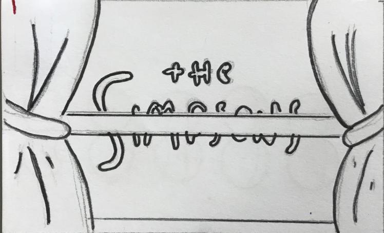
- The Simpsons curtains,
- Nested images,
- Confusing,
- Could be hard to read,
- Framed-gives the eye a viewpoint,
- Create on illustrator.
2)
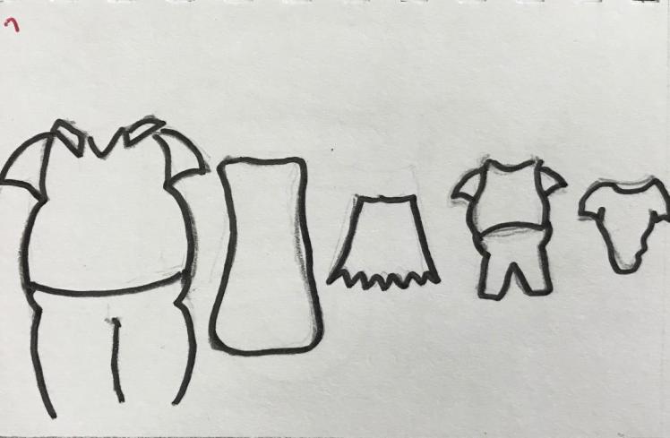
- The Simpsons clothes,
- Balanced,
- Easy on the eye,
- Aligned,
- Recognisable,
- Simplistic/minimalistic/basic.
3)
- Character,
- Simple,
- Clever,
- Memorable/enduring,
- Emotion,
- Basic typeface,
- Visually appealing.
4)
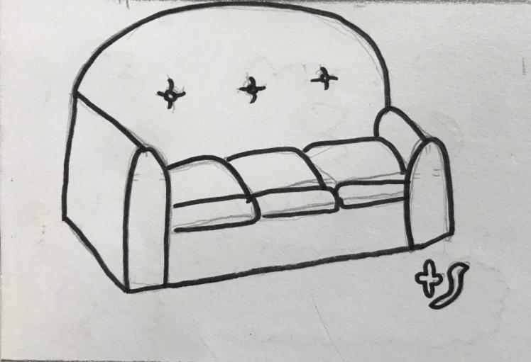
- The Simpsons sofa,
- Unnecessary,
- Portrays no emotion or meaning,
- Too simple,
- Not much to look at,
- Box shape,
- Basic,
- Includes abbreviated name.
5)
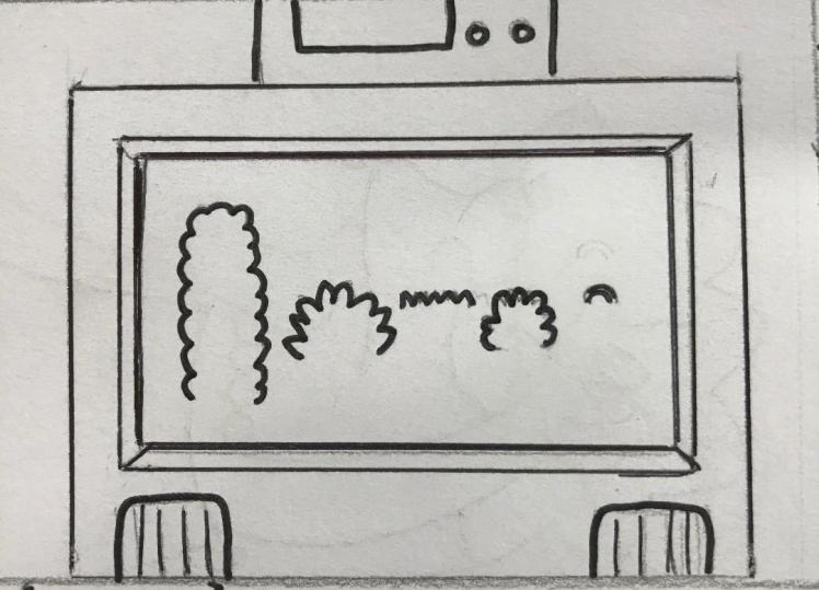
- The Simpsons TV,
- Framed image,
- Depth,
- Recognisable,
- Minimalistic.
6)
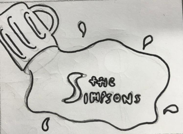
- Spilt beer,
- Involves movement,
- Flowing design,
- Title is framed,
- Negative space,
- Involves a back-ground,
- Could create a prototype.
7)
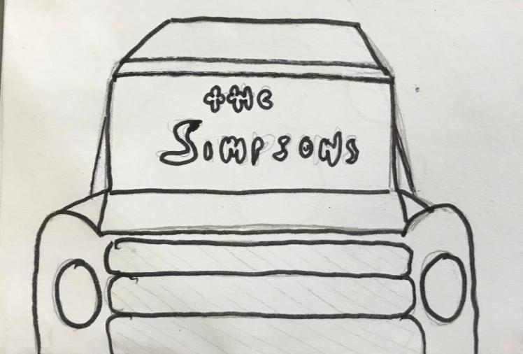
- The Simpsons car,
- Creates depth,
- 3D,
- Title is framed,
- Symmetrical,
- Pleasing to the eye.
8)
- Not balanced,
- Powerful, direct title,
- Hard to read,
- Confusing to younger audiences.
9)
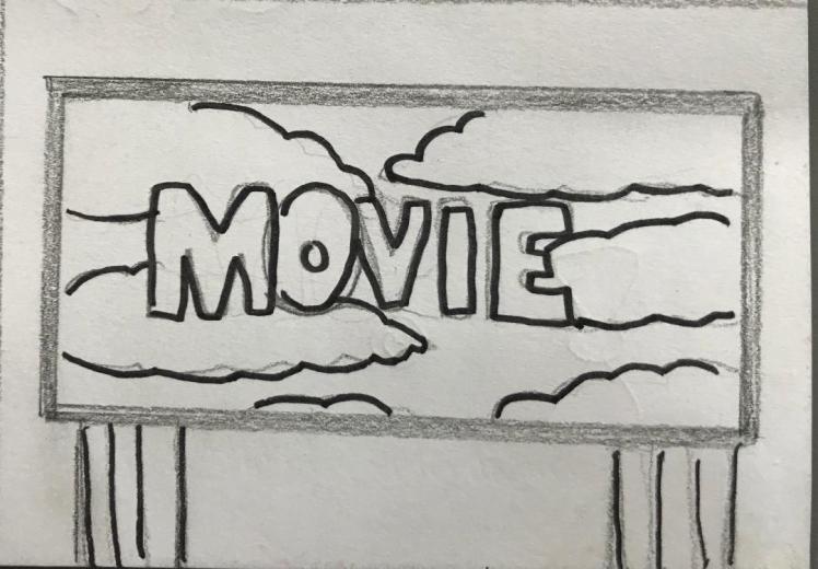
- Bill Board,
- Clouds create depth,
- Frames the title.
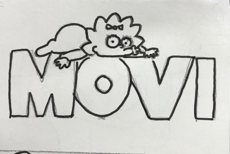
10)
- Maggie’s bow and dummy,
- Not a lot to focus on,
- No depth,
- No back-ground,
- Plain and boring,
- Only recognisable if you know what it is,
- Create on illustrator,
- Minimalistic,
- Simplistic.
11)
- Too similar to current one,
- No frame,
- No back-ground,
- One character,
- Basic,
- Enduring,
12)
- Doesn’t have much relevance,
- No frame or background,
- Too simple.
13)

- Leading lines upwards,
- Clever,
- Memorable,
- Nesting images,
- Gives you a view point,
- Framed,
- Stand out/Different.
14)
- Doesn’t sum up the movie,
- Lacks depth,
- Basic.
15)
- Involves movement,
- Only clever if you know the programme,
- Looks animated.
16)
- Clever as it sums up the movie,
- Gives depth to the image,
- The words are framed by the doughnut.
17)
- All over the place,
- Lack of symmetry,
- Not controlled or balanced.
18)

- The Simpsons eyes,
- Confusing,
- No depth,
- Symmetrical,
- Hard to understand what it is.
19)
- Minimalistic,
- Shows all the characters,
- Simple yet effective,
- Has title so its recognisable,
- Space to add detail,
- Framed.
20)
- Lisa’s saxophone,
- Recognisable,
- No frame,
- Irrelevant to the movie,
- Boring/simple,
- Lack of depth.
21)
- Different buildings in The Simpsons.
- A lot going on,
- Complicated,
- Confusing.
22)
- Complex,
- Clever,
- Can be produced on illustrator,
- Has a background,
- Involves depth,
- Leading lines creates movement,
- Has character.
23)
- Relevant to the movie,
- Has depth,
- Memorable,
- Comedic,
- Enduring.
24)
- Symmetrical
- Highlighted viewpoint,
- Framed,
- Not very relevant,
- Quite confusing
- Rule of thirds.
Developed Designs:
1) 
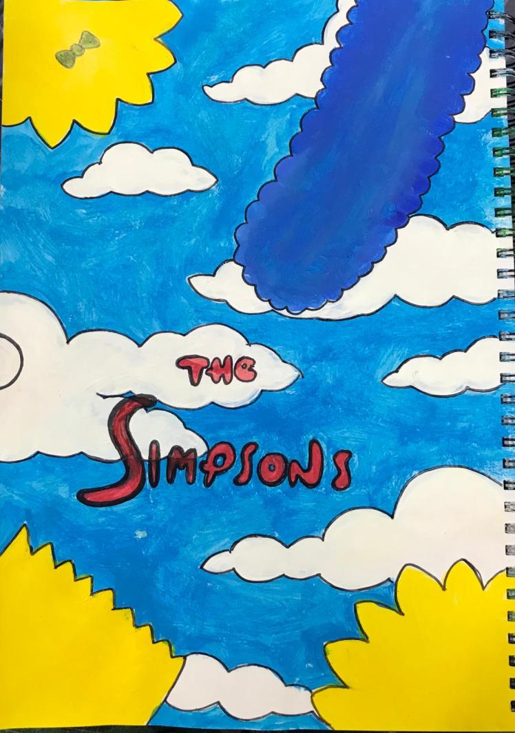
I chose to develop this design because I believe it involves many characteristics of a good film poster, it involves more than one character so it gives the audience many things to focus on, it is quite minimalistic yet the sky background gives the poster depth. Furthermore the unrealistic design reflects how the movie is just a cartoon and nothing should be taken too seriously from it. The red colour of the title highlights the importance of the family as red is a very bright and controlling colour, by the title being red and not yellow it suggests that there may be no normality in the movie- to expect the unexpected. For a movie poster this is good because it entices viewers as they become intrigued in what the movie can offer them.
I like the fact that the poster only shows the characters hair as I believe this puts a comical spin on the poster but also I feel as if there is not much relevance to them being there, its quite complicated as their hair just frames the sky and the sky isn’t a major part of the film so I don’t believe should be highlighted. So in summary, this poster involves many attributes of a good film poster but I am not going to choose it as my final design because I don’t think their is much relevance to it.
2)
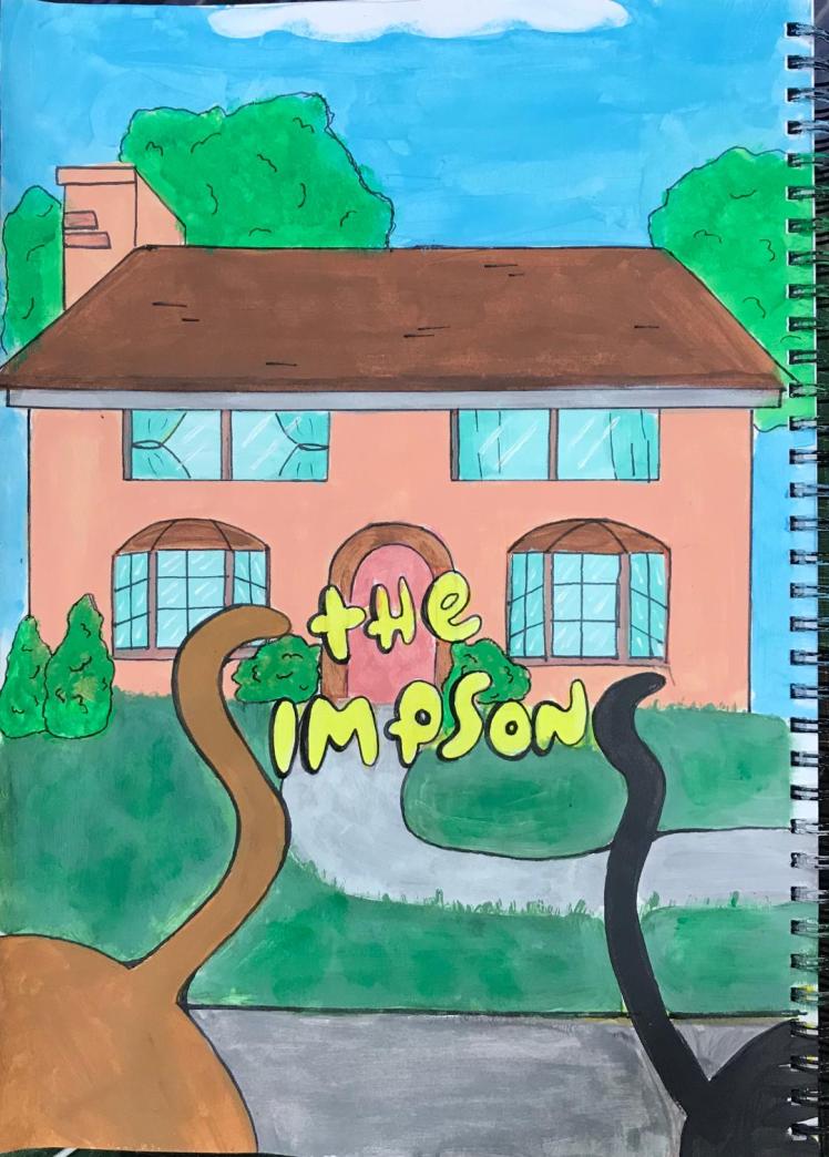
Secondly I chose to develop this idea because I believe that its very unique and different to other film posters out there. By the Simpsons pets creating the ‘s’s’ in the title it gives the poster a wider audience as children will recognise this within the poster and will therefore want to watch the movie. By the pets being larger and by them being in the foreground gives the poster depth, this, again, is a major aspect of a good film poster; this leaves the house to be in the background. I believe that the house is a very relevant attribute as this is where the Simpsons mainly spend their time, in addition the common phrase, ‘the home is where the heart is’ gives the poster a sense of warmth as it indicates that you may begin to feel empathy towards the characters. Again, this is what you want a film poster to evoke- by the audience connecting to the characters before even watching the movie suggests that the poster is well produced. The poster is also symmetrical, as symmetry is very pleasing to the eye this suggests that the poster will be visually appealing and people will want to look at it, furthermore the elements are very balanced, one side isn’t heavier than the other, this further implies that the poster is visually appealing. As the title is yellow and in the centre of the poster this is the main viewpoint, your eyes are straight away drawn to the title, this is good because it informs you what you’re looking at straight away whilst also entertaining you as the yellow colour represents happiness and is very enduring. Thus I chose to use this design as my final design because I feel as if it connects to the audience and it entices them to watch the movie.
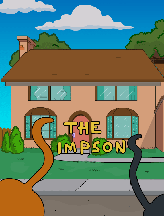
Final Design:
Evaluation:
In order to produce an appropriate film poster for The Simpsons I researched the film in depth, I’ve also been watching the programme for years so I understand the plot. I used secondary research sources such as the internet to help me understand the answers behind some questions like “why are the Simpsons yellow?” this allowed me to further grasp ideas about The Simpsons which I could imbed into my final design. I also used some forms of primary research to help me to produce a poster, when I first drew my 24 initial ideas I produced a questionnaire on which idea where peoples favourites. I noted everybody’s favourite idea (asking friends and family) and in the end that was the idea I chose as my final piece. I believe that a questionnaire is an appropriate form of primary research as it expresses peoples opinions on that given subject. By doing research using both primary and secondary resources it allowed me to further my knowledge and understanding of the movie. I believe I used appropriate forms of research because there are many factual websites regarding The Simpsons on google. As the project was regarding a film poster I think I used relevant research sources because it is quite modern, if the context of the project was different, for example if I was to design a new cover for a really old book, then I would use different research sources like old books and magazines.
To improve I could use even more techniques of primary research like conducting a survey asking people what I could do to improve each design, this would’ve helped because then I could’ve adapted my ideas accordingly. In addition, by researching the movie it taught me how to draw the characters and the Simpson’s house, this helped me because then I knew how to draw it when it came to developing one of my initial designs. To further improve I could’ve researched more than one artist, this would’ve expanded my knowledge on how to draw cartoons and would’ve gave me an insight into the emotions put behind drawing and illustrating.
Regarding my initial designs, I believe they’re all suitable for potential film posters. I laid them out in a way where they are easily viewable and where the annotations are obvious on which design they are about. I discussed what I liked and what I didn’t like about each design and I also listed visual elements and principles of each design, I did this because I feel as if it allowed me to explore each design in depth, to really evaluate what makes each poster a good idea, and what makes each poster a not so good idea. In my two final developed designs I believe I produced them well. The colours are accurate and the poster is in proportion. Although there are some initial ideas I dislike, by drawing and evaluating them it allowed me to learn what I should do different next time, for example- to add more detail when necessary- and to ensure I do not make the same mistakes twice.
To improve in the future for when I am making rough initial designs I will take on board what I have a learnt including evaluating the designs as I am drawing them rather than evaluating them when I am done, I will also include colour where it is not clear what the idea is showing.
I stuck to using the ‘Simpsons’ font because I believe this is what gives the movie an enduring title. The typeface is very memorable and timeless, it is also very recognisable to younger viewers, so I didn’t want to jeopardise that by using a different font. From where I placed the title on the poster I ensured it was in a place where it was still readable, even though I changed some of the letters by using their pets tails, it is still readable and recognisable. In all honestly, I really like how the title came out and I don’t think there is anything I could do to improve the title because I believe it is very appropriate as it is the original font.
I have no doubt that my final design poster is fit for all audiences because, as previously stated, the animal twist on the title gives the younger viewers something to focus on, it also gives the poster as a whole a comedic feel. The poster is also suitable for older audiences as the title tells you what the film is, so people wont be confused on trying to guess what the poster is advertising. I am confident that I have met the brief successfully, as I have produced an appropriate final design and I have also learnt what primary and secondary research is and how I can conduct primary research in the future. The poster I have produced is suitable for all ages, genders and races, I ensured that I didn’t include anything that may be offensive to any of these categories. When annotating my initial designs I may of used language that not everybody would understand, for example, a student who doesn’t study graphic design may be unaware on what ‘rule of thirds’ or ‘leading lines’ may be, to improve I could’ve explained what each of these mean so my work will be understood by a wider range of audiences.
I produced my final design in both my sketchbook and on illustrator. Firstly I drew out my design in my sketchbook, I then used acrylic paints to paint my design, this was a very time consuming process, in addition it was very difficult for me to mix colours in order to get the correct one, although I enjoyed painting my design I much prefer using illustrator; which is what I used next. I chose to use illustrator because I think it is easy to navigate around, you can quickly change different aspects of your design- making things 3D and changing colours- and if you were to make a mistake it is easy to undo, I enjoy using illustrator and I believe I have improved significantly regarding detail and shortcuts since my unit one project. In my final design I ensured I involved shadows as I previously stated, when evaluating the current film poster, that I would imbed these ides into my final design. Whilst using illustrator I also used a graphics tablet, this gave me the freedom to draw bushes/trees in more detail as the lines are smoother. My experience with the graphics tablet is okay, it took me a while to get used to it but now that I know how to use it I will definitely use the tablet again in future work.
I think my final design came out well, it came out exactly how I envisioned it to which I am happy and proud about. Although there are some aspects I could improve upon like the realism of the trees and the outline on the trees, I am still happy with the final outcome. I also believe that I have presented my blog well and that it looks professional. The colours of text against backgrounds is appropriate in by which I mean it is easy to read. My different units are easily accessible and are labelled clearly, so it is easy to find what you’re looking for. All my sketches that I have imported are big, this is so even visually impaired viewers will be able to view and recognise my drawings, and so it is clear to see.
In conclusion I am very happy with my unit 2 project. To improve I could’ve produced three developed designs, this would’ve gave me a wider range of posters to choose from as I would’ve got the full feel for more designs. Furthermore I will try not to overthink my rough initial designs, I think I spent too much time on them and I was trying to make sure each design was good, but in the future I’m allowed to not like some of the designs, this will allow me to know what I do like and to steer away from what I don’t like in the future. Whilst conducting this unit two project I have improved on my illustrator skills, my research skills and my how I portray my work on my blog, I will most definitely carry these skills through onto my next units. Throughout the whole process I considered safety, ensuring that whilst using scissors and scalpels I was very safe, I wasn’t waving anything about and that I used cutting mats to protect the tables. Finally, comparing my work to professional work, mine has a long way to go. However for a beginner I think my work is good and that I do have skill regarding drawing and using the computer/apps on the computer. Comparing my work to my peers I think is difficult to do, everyone’s is good as they’ve all done it to the best of their ability. So in summary I am happy with my unit two project and I am excited to carry on with the next unit.
References:
canadianentrepreneurtraining. (2018). /examples-of-secondary-market-research/.Available: http://canadianentrepreneurtraining.com/examples-of-secondary-market-research/. Last accessed 10th october 2018.
designresearchtechniques. (2018). /casestudies/secondary-research/.Available: http://designresearchtechniques.com/casestudies/secondary-research/. Last accessed 10th October 2018.
factfiend. (2018). /odd-reason-simpsons-yellow/. Available: http://www.factfiend.comodd-reason-simpsons-yellow/. Last accessed 31 Oct 2018.
firstshowing. (2018). /img/simpsonsmovie-poster-1.jpg. Available: https://www.firstshowing.net/img/simpsonsmovie-poster-1.jpg. Last accessed 14th Nov 2018.
fontmeme. (2018). /simpsons-font/. Available: https://fontmeme.com/simpsons-font/. Last accessed 18th Oct 2018.
google. (2018). /search?q=Dictionary.Available: https://www.google.co.uk/search?q=Dictionary. Last accessed 10th October 2018.
imdb. (2018). /title/tt0182576/mediaviewer/rm4040497408. Available: https://www.imdb.com/title/tt0182576/mediaviewer/rm4040497408. Last accessed 14th Nov 2018.
quora. (2018). /What-are-some-examples-of-primary-research.Available: https://www.quora.com/What-are-some-examples-of-primary-research. Last accessed 10th october 2018.
wikipedia. (2018). /wiki/The_Simpsons_Movie#/media/File:Simpsons_final_poster.png.Available: https://en.wikipedia.org/wiki/The_Simpsons_Movie#/media/File:Simpsons_final_poster.png. Last accessed 12th Nov 2018.

Well Done this is very good and inspirational
LikeLike